 nesnoj
commented
6 years ago
nesnoj
commented
6 years ago @pamelagp Concerning the veraiation of storage capacity and PTH power:
It doesn't make sense to post @elisagaudchau 's code here as it is too specific. What you need to do is to vary the parameter in a given range, something like:
import itertools
import numpy as np

# function to create combinations of param values while preserving param names
def product_dict(**kwargs):
    keys = kwargs.keys()
    vals = kwargs.values()
    for instance in itertools.product(*vals):
        yield dict(zip(keys, instance))

# format: 'param': [min, max, step]
params_to_be_varied = {'param1': [1, 3, 0.5], 'param2': [10, 20, 1]}

# create ranges
param_val_ranges = {}
for key, val in params_to_be_varied.items():
    param_val_ranges[key] = list(np.arange(val[0], val[1]+val[2], val[2]))

# create combinations using those ranges
param_val_combinations = list(product_dict(**param_val_ranges))

# do something with the data
for run_no, comb in enumerate(param_val_combinations):
    print('Run no ', str(run_no))
    print('=============')
    for key, val in comb.items():
        print('Parameter', key, '=', val)
        # INSERT MODEL PARAMETERIZATION HERE
Give it a run..
For visualization purposes, here comes a snippet of @elisagaudchau 's heatmap plot:
def heatmap(data, zlab, xlab, ylab):

    #fig = plt.figure(figsize=(10, 10))
    # fig.add_subplot(1, 1, 1)
    # Create heatmap
    x = data.index.values # pth, lines
    y = data.columns.values # sto, columns
    heatmap = np.zeros((10,10),float)
    f = 0
    for i in x:
        h = 0
        for g in reversed(y):
            heatmap[h][f] = data[g][i]
            h += 1
        f += 1

    extent = [x[0], x[-1], y[0], y[-1]]
#    levels = np.linspace(math.ceil(data.min().min()),
#                         math.floor(data.max().max()), 9, endpoint=True)
    levels = np.linspace(data.min().min(),
                         data.max().max(), 9, endpoint=True)

#    bar_width_x = x[9] - x[8]
#    bar_width_y = y[9] - y[8]
#    ind_x = x + bar_width_x/2
#    #ind_x = np.append(ind_x, x[-1]+bar_width_x)
#    ind_y = y + bar_width_y/2
#    print(bar_width_x)

    fig = plt.figure(figsize=(16, 10))
    imshow(heatmap, extent=extent, interpolation='nearest')
    axis('normal')
    ylabel(ylab, size=30)
    xlabel(xlab, size=30)
#    xticks(ind_x, list(x))
#    yticks(ind_y, list(y))
    title(zlab, size=30)
    rcParams.update({'font.size': 24})
    colorbar(ticks=levels)
    show()

    return(fig)
Alternative:
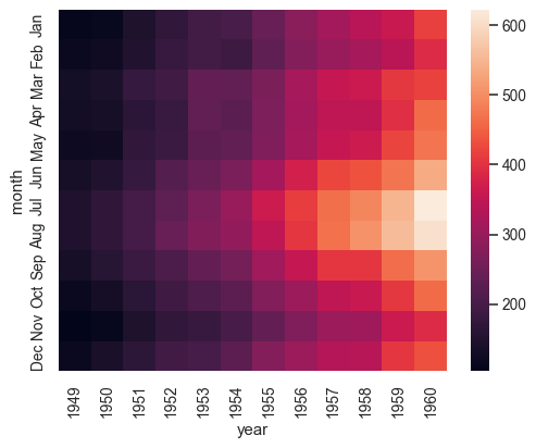
But I'd rather use a package for this, seaborn looks good (many examples included): https://seaborn.pydata.org/generated/seaborn.heatmap.html
Example:
I'll modify the package to allow sensitivity analyses (SA) of arbitrary parameters.
Prior to those steps, @pamelagp will vary th. storage capacity and PTH power.