 tariktokic
commented
6 months ago
tariktokic
commented
6 months ago Same error here! wireui v1.18.9
Open DiegoAlonso27 opened 6 months ago
tariktokic
commented
6 months ago Same error here! wireui v1.18.9
 PH7-Jack
commented
6 months ago
PH7-Jack
commented
6 months ago It was intentional... However, it doesn't looks good in larger width
tariktokic
commented
6 months ago You are right. But it does not only affect select fields. Datepicker looks also a little bit off. Before the picker was centered and now it is aligned to the right side. See before and after screenshots.
Before the update:
After the update:
Thank you very much for your efforts!
PH7-Jack
commented
6 months ago Yes, all components using the popover were updated to look similar, aligning the popover to the trigger button. I'll check it and plan a better way to fit the popover, using it on a larger width is challenging for ui/ux.
The select component is more simple, however, datepicker and color picker can look weird
tariktokic
commented
6 months ago If I may suggest, just leave it the way it was before (revert the changes). The way it was looking in the past was almost the same as the standard HTML components, which is what the common user knows and is used to.
 Joemires
commented
4 months ago
Joemires
commented
4 months ago Add the below css to your css file and you should have the popover on full width again
.w-full + [x-ref="popover"] {
    width: 100% !important;
}

[x-show="popover"][x-ref="popover"] > div:last-child {
    max-width: 100% !important;
    width: 100% !important;
}
I really like the full width display tho
Describe the bug A clear and concise description of what the bug is.
in the new version, the select options drawer does not occupy the full width of the input.
To Reproduce Steps to reproduce the behavior:
Expected behavior A clear and concise description of what you expected to happen.
Screenshots or Videos If applicable, add screenshots or videos to help explain your problem.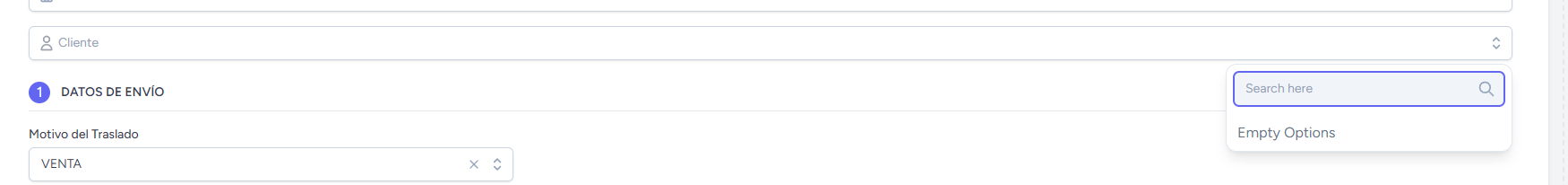
Dependencies
Desktop (If applicable, please complete the following information):
Smartphone (If applicable, please complete the following information):
Additional context Add any other context about the problem here.