The latest updates on your projects. Learn more about Vercel for Git ↗︎
| Name | Status | Preview | Updated (UTC) |
|---|---|---|---|
| docs | ✅ Ready (Inspect) | Visit Preview | May 8, 2024 2:45am |
Open SatanshuMishra opened 1 week ago
The latest updates on your projects. Learn more about Vercel for Git ↗︎
| Name | Status | Preview | Updated (UTC) |
|---|---|---|---|
| docs | ✅ Ready (Inspect) | Visit Preview | May 8, 2024 2:45am |
Thank you for putting this together @SatanshuMishra! Really appreciate you picking it up. I’ve left some initial feedback.
There are probably also two details to discuss:
- Are we happy with this also being added to the homepage? (My gut instinct is yes, it’s nice.)
- Whether we want any extra space between the pagination links and the new footer links. Curious what others think on this one.
I think this looks good too @delucis! Certainly nice to give people to learn about how to contribute, give us feedback or see the amazing community page we have.
Overall, it would look better if both the link lists were always aligned to the center, perhaps even with a top border to separate the footer from the rest of the content. Another thing that might be worthwhile to do is on mobile screens. The links would be excellent if they were bigger and had full-width rows, so it's easy to tap on them.
Description (required)
This PR aims to implement the changes proposed in #6845. The changes made include:
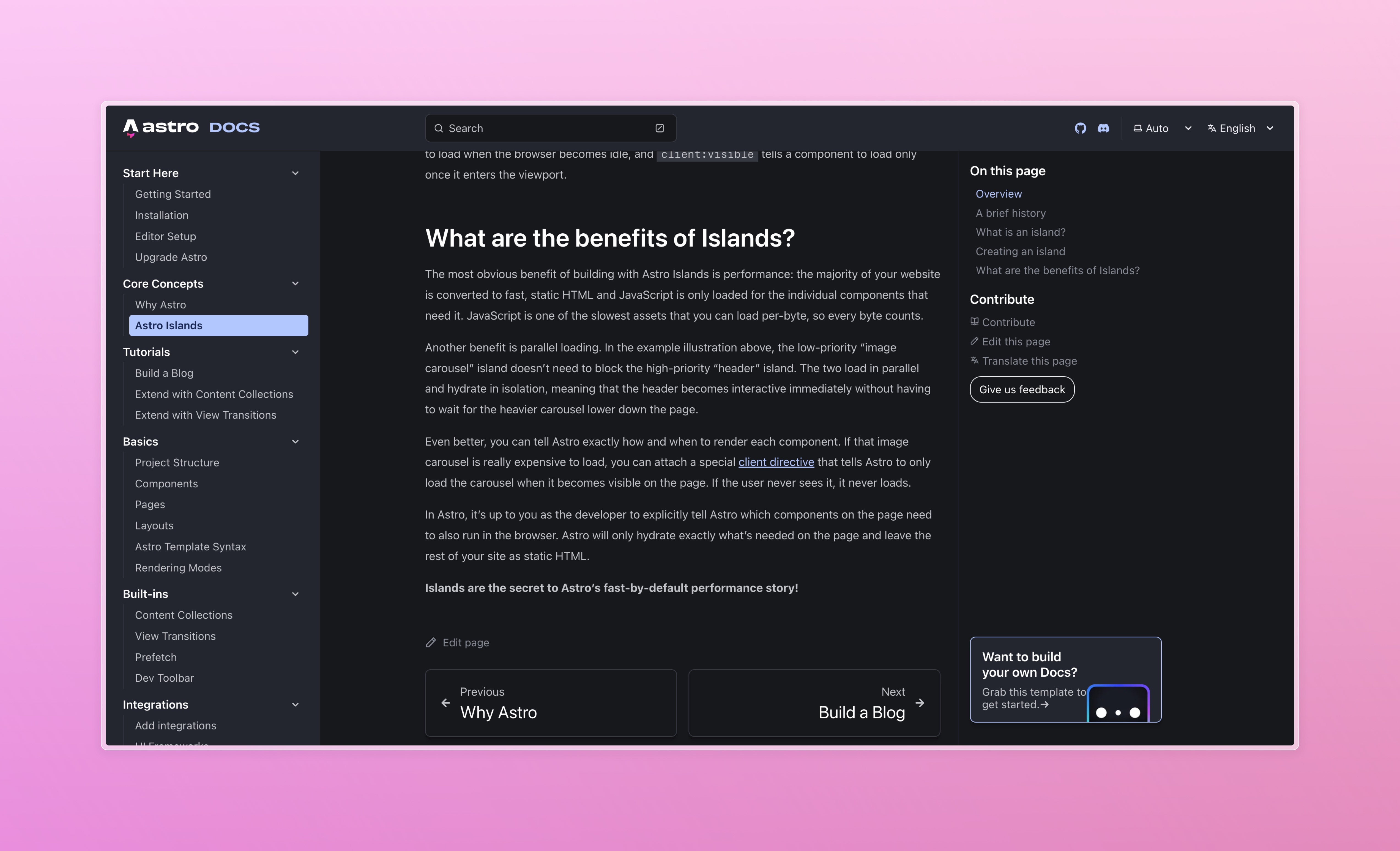
Translateoption was moved beside theEdit Pageoption at the bottom of the page above the Pagination.Referencescomponent was created to hold the links to theContribute,Give Feedback, andCommunitypages.Footercomponent created to override the default Starlight Footer. ThePagination,EditLinks, &Referencescomponents were added to this component (as before). TheLastUpdatedcomponent was also added (commented out) for possible future development.Give FeedbackandCommunityoptions.Related issues & labels (optional)
site-improvementPreview of changed: Current Implementation:
Proposed Changes:
Special thanks to @delucis for coming up with the design and guidance throughout this implementation.