soc-se-bot
commented
10 months ago
soc-se-bot
commented
10 months ago Team's Response
In the "Planned Enhancement" section of the DG, we have already specified the intent of adding the ability to view a patient or specialist by clicking on the record in the list. Removing the UI change is unnecessary.
Items for the Tester to Verify
:question: Issue response
Team chose [response.Rejected]
- [x] I disagree
Reason for disagreement: Even though there are some new updates planned to be done, what is important here is the current version. The team should have removed the current colour change since it is misleading the users to think that it can be pressed every time the user sees it.
## :question: Issue severity Team chose [`severity.VeryLow`] Originally [`severity.Low`] - [x] I disagree **Reason for disagreement:** It is misleading the users to think that it can be pressed every time the user sees it, not just a cosmetic problem.
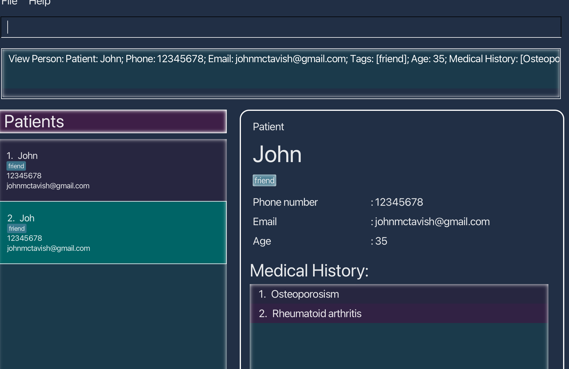
Since it is not possible to look at a person medical history by clicking on the person, the change in colour should not be there since it misguides the user to think it can be clicked. It is also not clear but the usage of the different colours are for.