 nus-se-script
commented
2 years ago
nus-se-script
commented
2 years ago Team's Response
Similar cosmetic issue of sequence diagram to #3384
The 'Original' Bug
[The team marked this bug as a duplicate of the following bug]
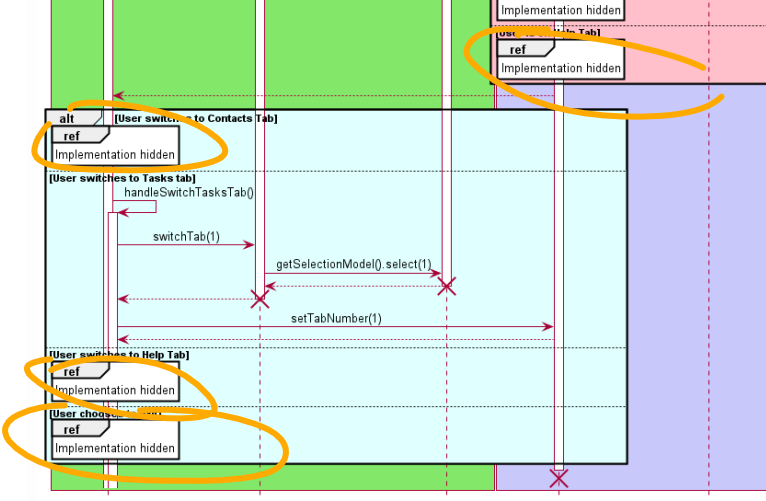
Unnecessary ref boxes used
Note from the teaching team: This bug was reported during the Part II (Evaluating Documents) stage of the PE. You may reject this bug if it is not related to the quality of documentation.
Steps to reproduce:
- Implementation --> Tabs System.
be used to refer to another sequence diagram which is used for understanding. However, here, it is just used to convey "Implementation hidden". This is unnecessary and confuses the reader.
Expected: Shown in diagram.
Actual: Omitted from diagram.
Screenshots:
[original: nus-cs2103-AY2122S1/pe-interim#3444] [original labels: severity.VeryLow type.DocumentationBug]
Their Response to the 'Original' Bug
[This is the team's response to the above 'original' bug]
Bug accepted. A short writeup could be added at the bottom to indicate that other paths in the sequence diagram are omitted for clarity
Items for the Tester to Verify
:question: Issue duplicate status
Team chose to mark this issue as a duplicate of another issue (as explained in the Team's response above)
- [x] I disagree
Reason for disagreement: Thank you for the response.
However, this is not a duplicate because in the duplicate issue, I am referring to the unnecessary usage of the ref boxes.
In this issue, however, I am referring to the fact that the diagram itself is too large, and contains too many details. As stated, it could have been split into different diagrams to increase readability.
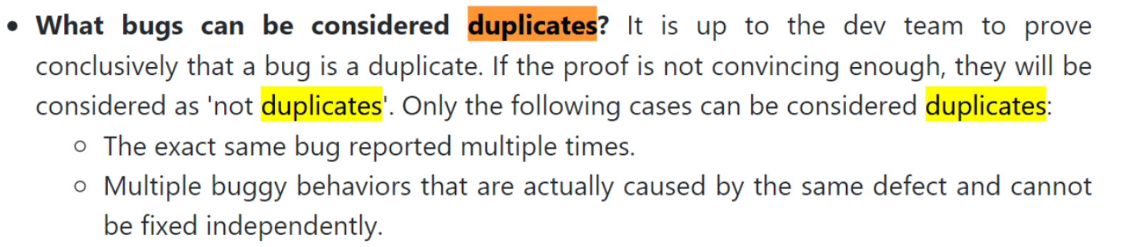
In reference to the image below (describing what counts as duplicates on the module website):
- The bug is not the same as shown above.
- These behaviors can be fixed independently, as the use of unnecessary
refboxes is not related to the fact that there are too many details in the diagram.
The diagram could have been split into multiple diagram or omitted. Cosmetic/presentation issue.