nus-se-bot
commented
3 years ago
nus-se-bot
commented
3 years ago Team's Response
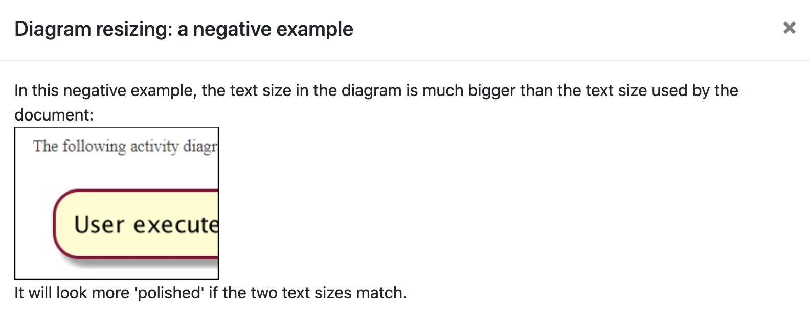
The bigger font sizes for diagram are meant for clarity, as the quality of the images cannot be promised so we have to compensate with large diagrams (compared to font size of text).
Items for the Tester to Verify
:question: Issue response
Team chose [response.Rejected]
- [x] I disagree
Reason for disagreement: Reason for disagreement:
I do agree clarity is important, however, consistency is also important in terms of documentation. Resizing the diagram so that the text size in the diagram matches the the text size of the main text of the diagram is a recommendation under "Deliverable: Developer Guide (DG)" section in the textbook.
 (The last dg tip under https://nus-cs2103-ay2021s1.github.io/website/admin/tp-deliverables.html#deliverable-developer-guide-dg)
If i click on the "see example", the following negative example is shown, which is exactly the case here.
(The last dg tip under https://nus-cs2103-ay2021s1.github.io/website/admin/tp-deliverables.html#deliverable-developer-guide-dg)
If i click on the "see example", the following negative example is shown, which is exactly the case here.
 (website negative example)
 (your dg)
And i do believe that the quality of an image would not compensate when it's made smaller. In most case, the quality drops when a picture is enlarged. In terms of clarity, if the font size of main text is readable, having diagram to have the same font size should be clear enough as well. Thus, i think this issue is relavent and since it's pure cosmetic, the severity level is very low.
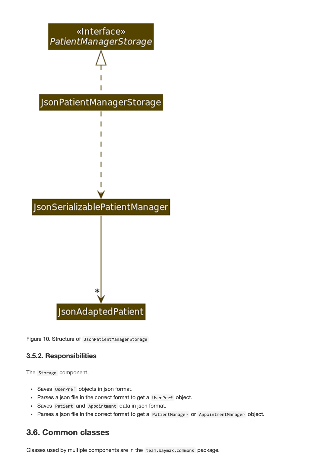
in secition 3.5.1 od dg, the second diagram can be re-sized so that the font in picture is similar to font in text.