Team's Response
Thanks for raising this up
The 'Original' Bug
[The team marked this bug as a duplicate of the following bug]
unable to close help window from the window itself (can not find close button)
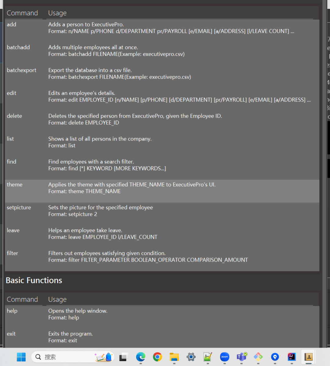
After inputting "help" and enter, the help window if popped up. However, unlike what is displayed in UG, I can not find the close button to close the window (my os is Windows). The screenshot below shows the full image of the window
[original: nus-cs2103-AY2223S2/pe-interim#3714] [original labels: severity.Low type.FunctionalityBug]
Their Response to the 'Original' Bug
[This is the team's response to the above 'original' bug]
Thanks for raising this up. The issue can be resolved by closing the window from the task bar below. The help window can also be resized from the task bar.
Items for the Tester to Verify
:question: Issue duplicate status
Team chose to mark this issue as a duplicate of another issue (as explained in the Team's response above)
- [x] I disagree
Reason for disagreement: My reason for disagreeing with this is not about that I cannot find the close button, but rather, the screenshot in the UG is different from the what is seen when actually operating the application. Of course, this issue is a valid issue but mine focuses more on the inconsistency in the documentation, which is quite significant and can confuse users as they are unsure if they are on the correct window.
## :question: Issue type Team chose [`type.FunctionalityBug`] Originally [`type.DocumentationBug`] - [x] I disagree **Reason for disagreement:** My report is more focused on the difference in the screenshot in the UG versus the one in the app. Since the difference in the UG and the actual app is quite significant, this can confuse users as they are unsure if they are on the correct window, which may affect their user experience significantly.  versus 
## :question: Issue severity Team chose [`severity.Low`] Originally [`severity.Medium`] - [x] I disagree **Reason for disagreement:** The screenshot looks like its from quite a few iteration ago rather than a one-time mistake, and the large difference may confuse users as they are unsure if they are on the correct window, which may affect their user experience significantly.

is different from my app