 soc-pe-bot
commented
5 months ago
soc-pe-bot
commented
5 months ago Team's Response
No details provided by team.
The 'Original' Bug
[The team marked this bug as a duplicate of the following bug]
Difficult to understand diagram under add team implementation section of DG
Note from the teaching team: This bug was reported during the Part II (Evaluating Documents) stage of the PE. You may reject this bug if it is not related to the quality of documentation.
This is the same issue as that of the delete implementation. The activation bar notation is not clear if it is accurate, it is difficult to read and hinders the reader.
[original: nus-cs2103-AY2324S2/pe-interim#1643] [original labels: severity.Medium type.DocumentationBug]
Their Response to the 'Original' Bug
[This is the team's response to the above 'original' bug]
Unfortunately, the DG has a size constraint on the images, thus large diagrams may be difficult to read.
Items for the Tester to Verify
:question: Issue duplicate status
Team chose to mark this issue as a duplicate of another issue (as explained in the Team's response above)
- [x] I disagree
Reason for disagreement: As per the course website, these are similar bugs in different locations which are independently fixable, so I believe that it should not be a duplicate.
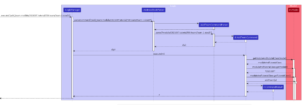
## :question: Issue severity Team chose [`severity.VeryLow`] Originally [`severity.Medium`] - [x] I disagree **Reason for disagreement:** I apologize if the original two bug reports were not clear, but on top of the small font, I am referring to the section on the bottom right as well:  I presume the activation bars are not intended to be as such, and there are an odd number of arrows, so it seems that there is a return value missing. Moreover it is also unclear what `p` refers to. This can possibly be made more readable using the `ref` syntax of sequence diagrams, or through the use of fictitious methods encapsulating lengthy processes. The reader reasonably requires much effort to understand the true mechanism of action, and coupled with the course guidelines on credibility of the diagram, I believe the original assessment of `Medium` is correct.
Description
The details are difficult to make out due to the small text and dense nature of the text. The interaction with model is also unclear as this part of the diagram does not seem to be following UML convention, is it perhaps a mistake? Possible improvement could be to use the "ref" notation or create fictitious methods to encapsulate the idea if there are a lot of fine details.
Screenshot
Reason for Severity
The small text is a
veryLowseverity issue, but the overall hinderance to the user is high, and the possible mistake made in notation reduces the credibility of the documentation.