Team's Response
Use of different words does not hinder the readability of the document. In fact, the third point is to aid the understanding of the users on what COMMAND refers to in the first two points and it does not display any UI. Hence, we do not consider this a bug.
Items for the Tester to Verify
:question: Issue response
Team chose [response.NotInScope]
- [x] I disagree
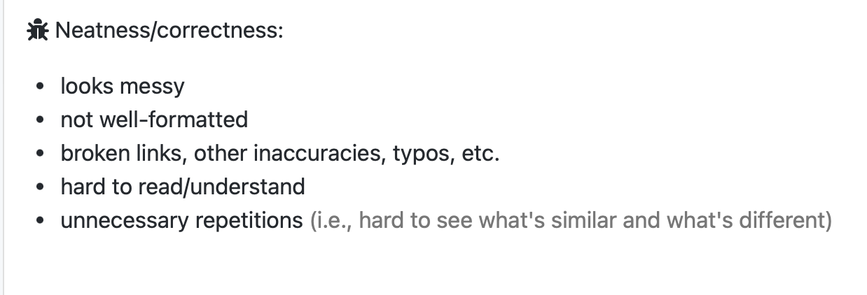
Reason for disagreement: According to the TP guide, this should be considered as a bug since it makes your user guide less neat since it is not well-formatted.

Below is a screenshot of your user guide:
Expected / Possible Improvements: Standardise the formatting here. The third point users "refers..." when it should be "Displays..." based on how the first and second point are phrased.
This is so as to ensure that your reader / user will be able to easily read what you are saying.