Team's Response
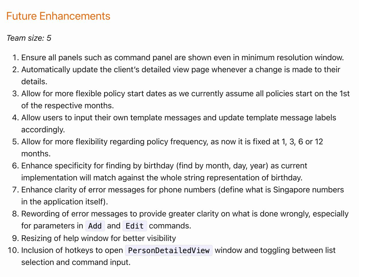
While we agree that the Future Enhancements, under Point 9, could have been better worded, we believe that the Help Window is readable as-is.

Items for the Tester to Verify
:question: Issue response
Team chose [response.NotInScope]
- [x] I disagree
Reason for disagreement: 
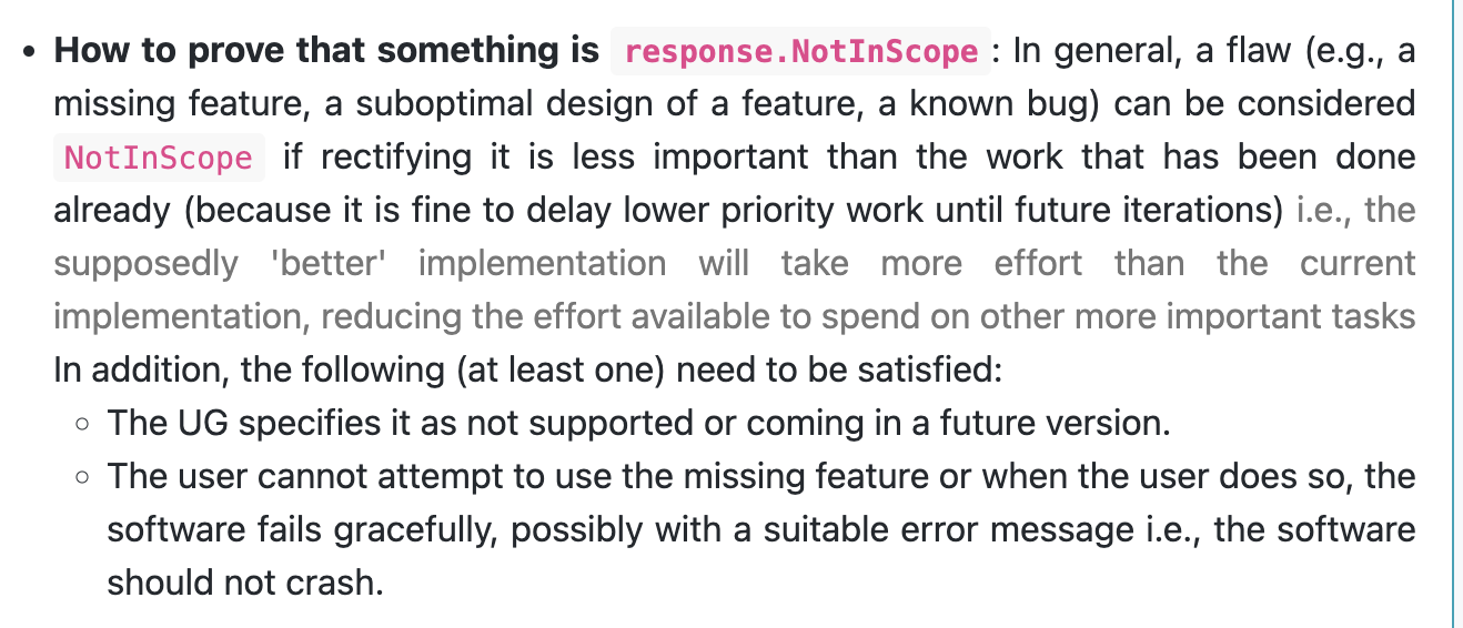
Based on the course website, this bug issue does not satisfy either one of the necessary bullet points shown above for it to be classified as NotInScope, and is also not a grammar issue. Thus, I believe this bug issue should have been accepted instead.
The help window content is unnecessarily cluttered at the left side despite having all of the extra spaces on the right. This makes it a little hard for the user to read. While the resizing of the help window for better visibility is mentioned under Future Enhancements in the Developer Guide, it is unclear if that means allowing the option to minimise the help window which is currently not provided, or improving the current display of the information in the help window.