 soc-se-bot
commented
2 years ago
soc-se-bot
commented
2 years ago Team's Response
No details provided by team.
The 'Original' Bug
[The team marked this bug as a duplicate of the following bug]
Non standard notation for UI Class diagram
Note from the teaching team: This bug was reported during the Part II (Evaluating Documents) stage of the PE. You may reject this bug if it is not related to the quality of documentation.
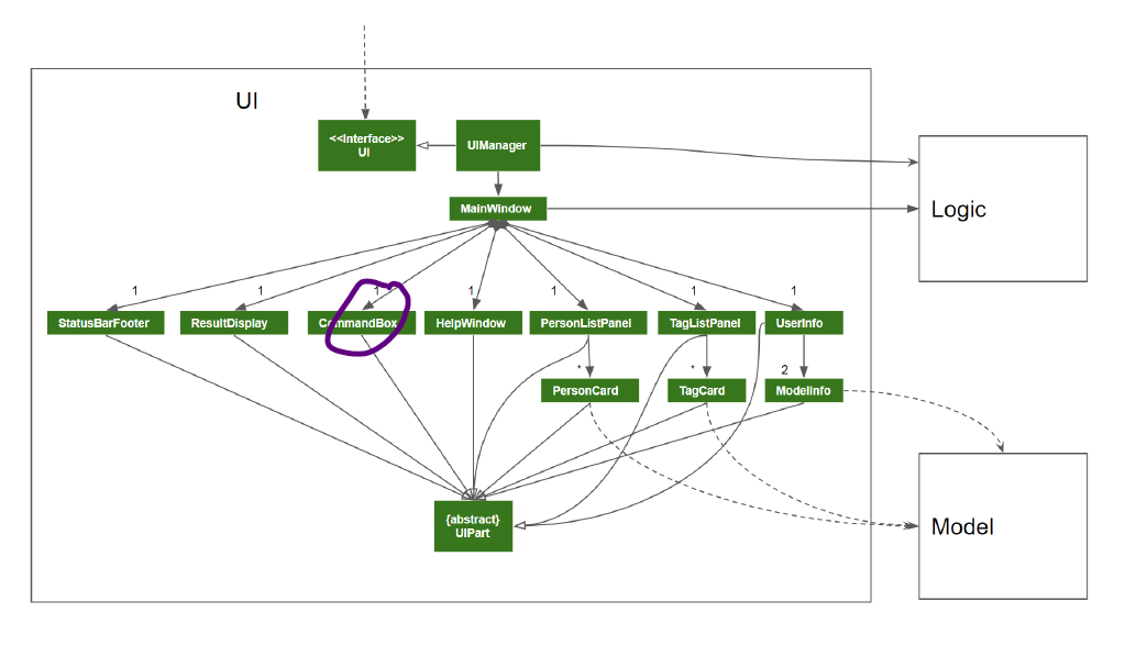
The arrow heads you have used are shaded triangles. We are supposed to use -> as arrow heads in class diagrams to show associations instead. What is shown in the picture above is non standard notation not taught in class
[original: nus-cs2103-AY2122S1/pe-interim#106] [original labels: severity.VeryLow type.DocumentationBug]
Their Response to the 'Original' Bug
[This is the team's response to the above 'original' bug]
No details provided by team.
Items for the Tester to Verify
:question: Issue duplicate status
Team chose to mark this issue as a duplicate of another issue (as explained in the Team's response above)
- [x] I disagree
Reason for disagreement: This is not a duplicate issue.
This issue talks about how the class diagram is too small. (veryLow cosmetic problem)
The other issue talks about non standard notations found in the class diagram. (wrong UML notation problem)
The UI class diagram is too small and messy. It is hard to see which are compositions and which are not because of the overlapping diamonds. I think this could have been resolved if the Logic and Model boxes were smaller, then the rest of the class diagram could have been larger