Team's Response
No details provided by team.
The 'Original' Bug
[The team marked this bug as a duplicate of the following bug]
Command Result box too small
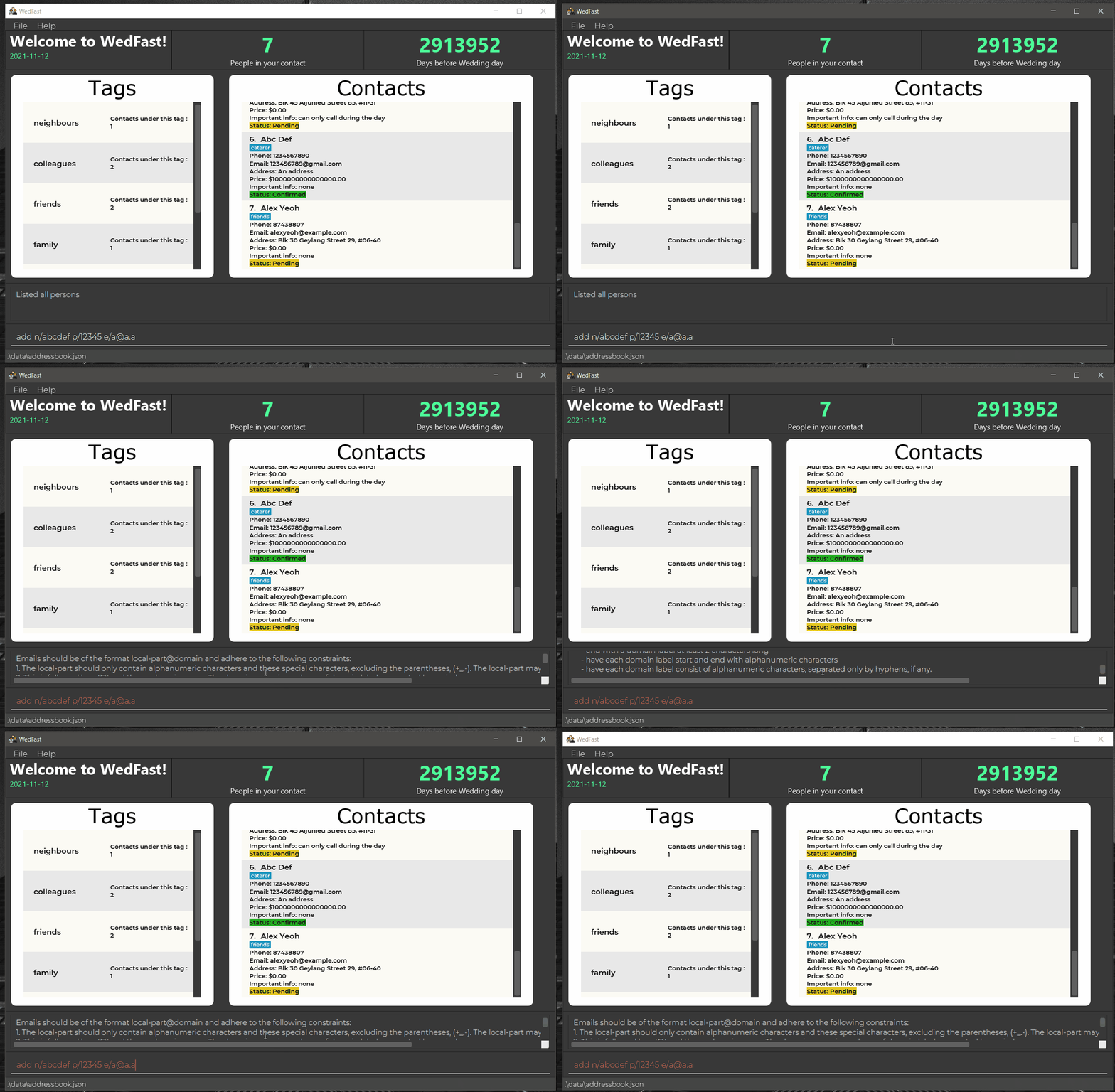
Although not too often, the command feedback/result box can feel too short in terms of length and height. Only 2 lines are shown at any a given time and these lines can overflow horizontally. Can perhaps wrap the lines and increase the height of the box.
[original: nus-cs2103-AY2122S1/pe-interim#5629] [original labels: severity.Low type.FunctionalityBug]
Their Response to the 'Original' Bug
[This is the team's response to the above 'original' bug]
No details provided by team.
Items for the Tester to Verify
:question: Issue duplicate status
Team chose to mark this issue as a duplicate of another issue (as explained in the Team's response above)
- [ ] I disagree
Reason for disagreement: [replace this with your explanation]

Why does the command box overflow updown and leftright? I would think it is better to make them overflow just top to down. Or make the command box bigger