Team's Response
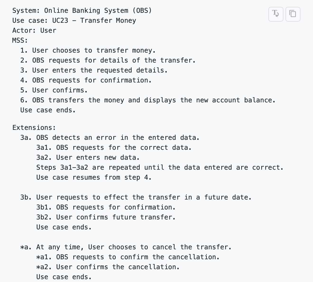
Thank you for your suggestion! We understand that it may not be the most readable to you, however, the team has decided to follow the sample use case provided in the CS2103 website as shown in the screenshot below as strictly as possible, in which case there was no difference in the fonts of the Use case, MSS or Extensions. Not only is it safe to follow the sample (so as not to get penalise for improper formatting), the team also felt that doing so does not hinder the readability to much extent.

We would also like to politely highlight that this bug report could be a suggestion.

Items for the Tester to Verify
:question: Issue response
Team chose [response.Rejected]
- [x] I disagree
Reason for disagreement: > We understand that it may not be the most readable to you
I disagree with this because I strongly believe that readability is something that can be quantified, and I reckon that having the same font formatting for different titles (E.g. Use case vs MSS or Extensions) does negatively impact readability as the reader is less able to visually break the page down into segments.
the team has decided to follow the sample use case provided in the CS2103 website as shown in the screenshot below as strictly as possible, in which case there was no difference in the fonts of the
Use case,MSSorExtensions.
I think this is a justifiable rationale for the formatting that your team used in the DG, but I still believe that this is a valid bug because it is a cosmetic flaw that affects the DG.
Not only is it safe to follow the sample (so as not to get penalise for improper formatting)
I disagree with this because it was mentioned that bugs inherited from AB3 need to be fixed (see screenshot below).

Overall, I believe that this is a valid bug that affects the documentation, even if it is not a major one.
The small significance of the bug is reflected in my choice of severity.VeryLow for the bug severity.
Description
I feel that the readability of the 'Use cases' section in the DG could be improved with better formatting.
Currently, there is no formatting distinction (e.g. font size, bold, italics, etc.) between the use case name (E.g.
Use case: UC4 - List policies of a client) and theMSSandExtensionstext - they are all bolded and have the same font size.This makes it challenging for the reader to keep track of where they stopped reading, especially when scrolling back and forth in the DG to reference other sections.
Screenshot
Page 14 of DG: