Team's Response
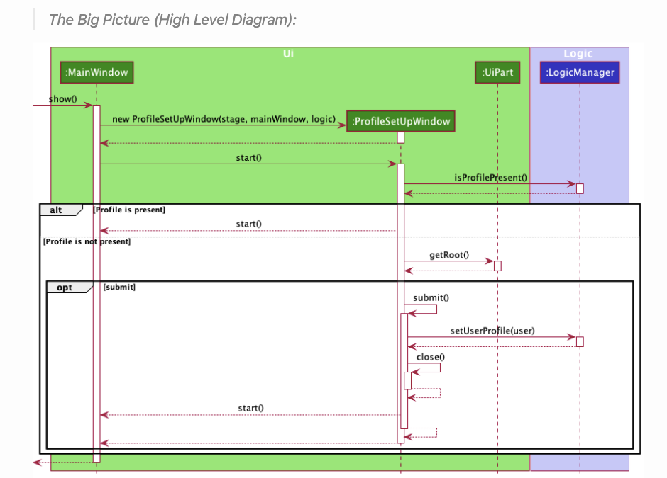
This diagram has been provided to showcase what a typical scenario would like when the app is running.
An alternate high level diagram is provided below that diagram in the DeveloperGuide for reference.

Items for the Tester to Verify
:question: Issue response
Team chose [response.Rejected]
- [x] I disagree
Reason for disagreement: It does not matter that there is a general diagram later. My issue was that the words were small and the diagram was squished up as a result of the complexity. That's why I commented "too complicated" because it was hard to see the diagram properly.
in the DG This diagram seems too complicated. There are lots of details in this diagram but it seems to be too much and causes the image to be squished up. On my computer, I had to zoom in a fair bit to be able to see the words.
Perhaps this could be split into 2 different diagrams...?