 nus-se-bot
commented
4 months ago
nus-se-bot
commented
4 months ago Team's Response
No details provided by team.
The 'Original' Bug
[The team marked this bug as a duplicate of the following bug]
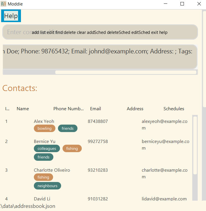
Cluttered UI
UI can get very cluttered when using. Especially when giving suggestions at the prompt, the suggestions can overlap with the prompt "Enter command here", especially when the window is resized to be smaller.
Steps to reproduce: Run the app with an empty input with all suggestions given
Expected: The suggestions doesn't overlap with the prompt.
Actual: They overlap.
This is a minor inconvenience but users may not be able to see the suggestions as a result.
[original: nus-cs2103-AY2324S2/pe-interim#513] [original labels: severity.Low type.FeatureFlaw]
Their Response to the 'Original' Bug
[This is the team's response to the above 'original' bug]
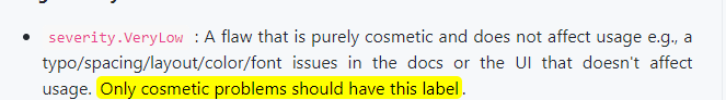
As this is an issue on the spacing and layout of the UI, this is purely cosmetic and the program will still work as intended.
Items for the Tester to Verify
:question: Issue duplicate status
Team chose to mark this issue as a duplicate of another issue (as explained in the Team's response above)
- [ ] I disagree
Reason for disagreement: [replace this with your explanation]
## :question: Issue type Team chose [`type.FeatureFlaw`] Originally [`type.FunctionalityBug`] - [x] I disagree **Reason for disagreement:** This should be a functionality bug because a legitimate user behavior is not handled. In this case, the resizing of the window until the overlapping of words occur. This could have been handled by setting a minimum window size whereby the overlap does not occur. 
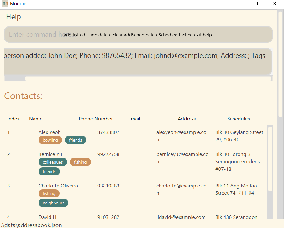
Problem description: The suggestion bar completely overlaps with the "Enter command here" text in the command box. Users cannot see what the words are saying behind the suggestion bar.
Steps to reproduce:
Expected: The words should not overlap each other in the GUI.
Actual: Words are overlapping in the GUI, making it hard to read.