 nus-se-script
commented
2 years ago
nus-se-script
commented
2 years ago Team's Response
No details provided by team.
The 'Original' Bug
[The team marked this bug as a duplicate of the following bug]
Repetition of images
Note from the teaching team: This bug was reported during the Part II (Evaluating Documents) stage of the PE. You may reject this bug if it is not related to the quality of documentation.
Unnecessary repetition of the same image with minor changes, reduces the usefulness of the diagrams.
[original: nus-cs2103-AY2122S1/pe-interim#5308] [original labels: severity.VeryLow type.DocumentationBug]
Their Response to the 'Original' Bug
[This is the team's response to the above 'original' bug]
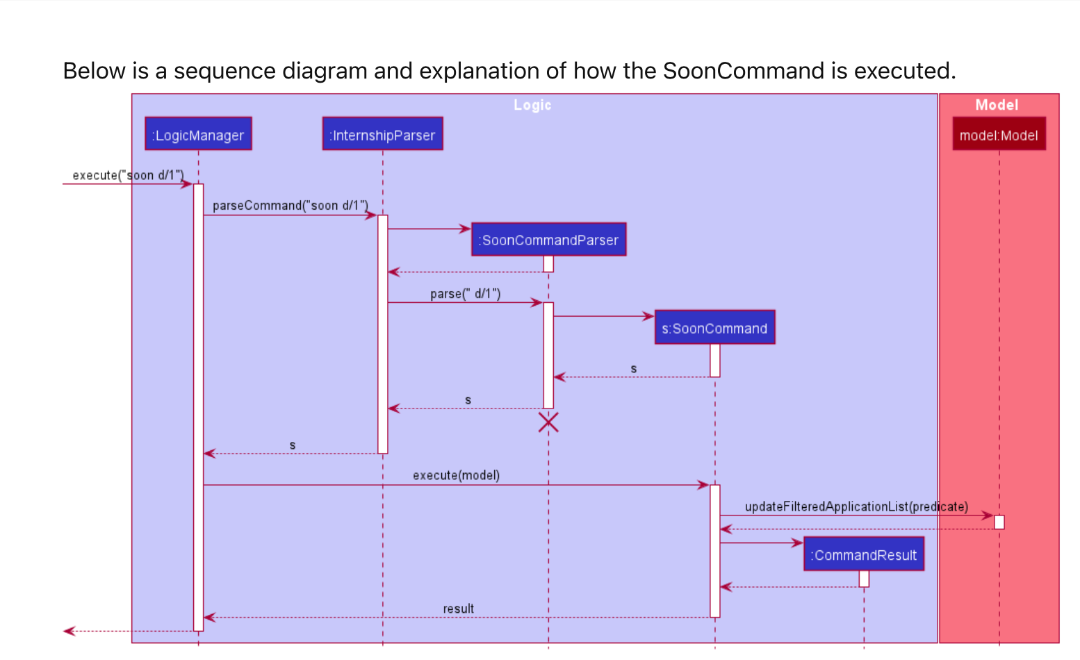
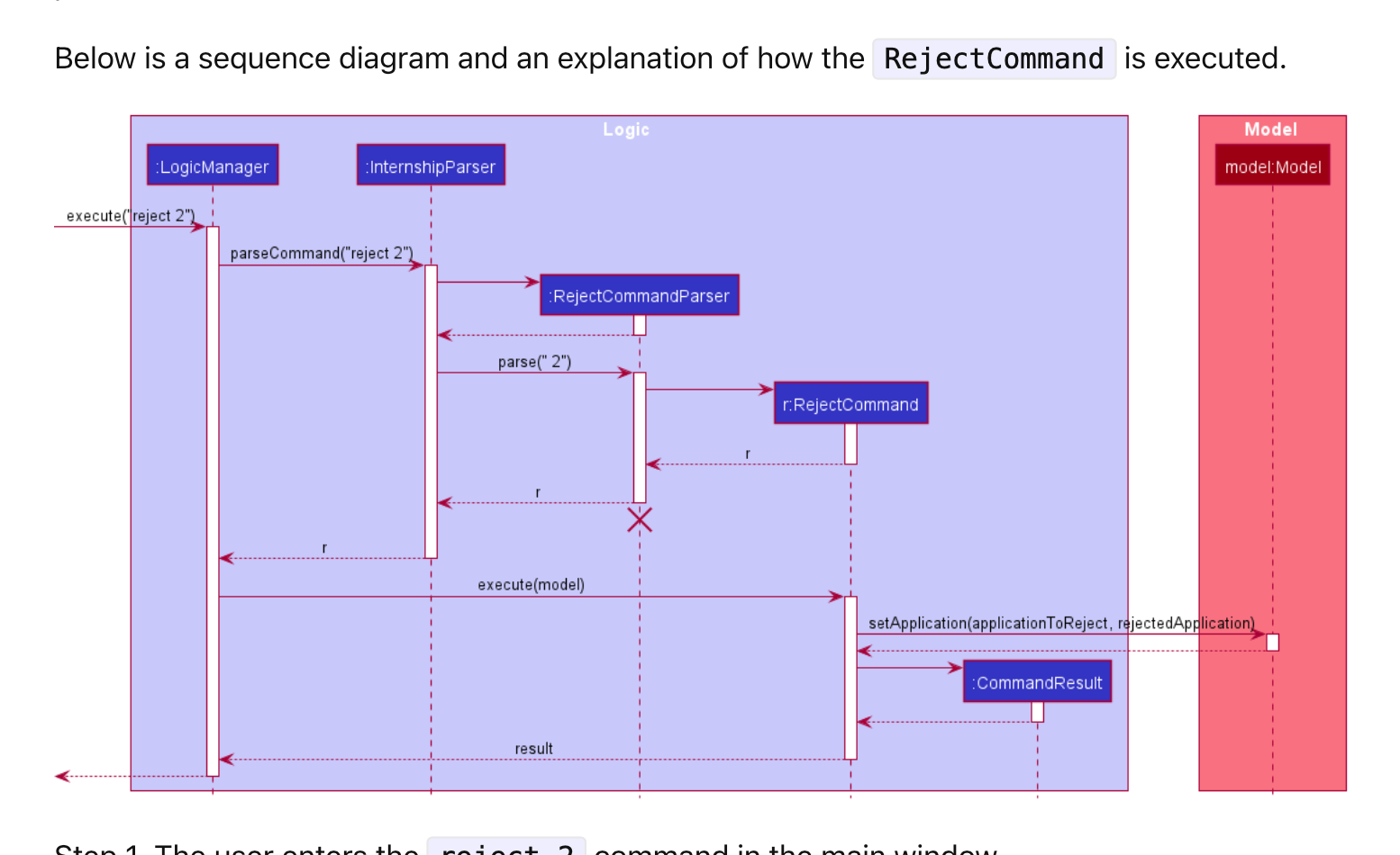
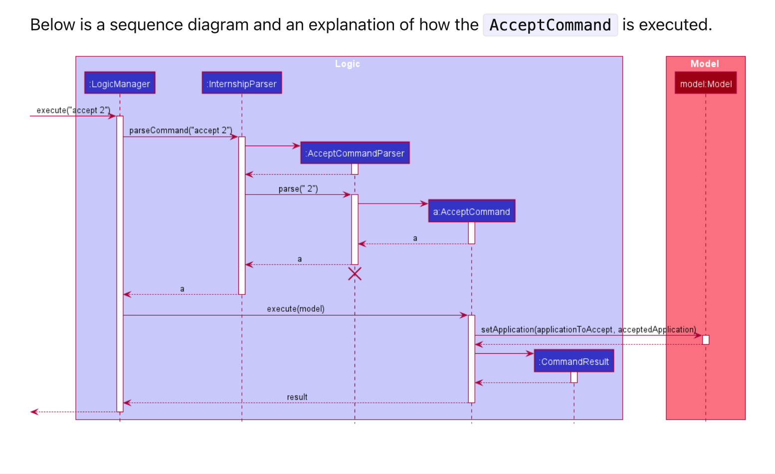
Hi. We have read your review and we understand your concern. We feel that these diagrams are needed because although they differ in small ways, it provides useful information to the reader. For example,
SoonCommand will call Model#updateFilteredApplicationList(predicate) whereas
Accept and Reject will call Model#setApplication(applicationToAccept, acceptedApplication)
These two methods have very different purposes and we thought that it is necessary to keep the diagrams to prevent the reader making false assumptions or even mistakes.
Items for the Tester to Verify
:question: Issue duplicate status
Team chose to mark this issue as a duplicate of another issue (as explained in the Team's response above)
- [ ] I disagree
Reason for disagreement: [replace this with your explanation]
:question: Issue response
Team chose [response.Rejected]
- [x] I disagree
Reason for disagreement: Thank you. Considering the fact that each diagram occupies 35-50% of paces in one A4 size page, using these big diagrams to showcase minor differences (as you have explained in the team's response in two lines) is not justifiable. There would be better ways such as extracting out the overarching structure in a diagram while explaining the minor difference under each command. Moreover, although the writer of DG is clear of where exactly is the difference, having big diagrams with many duplicated information confused reader with too many unnecessay details.
The sequence diagram for command complete, accept and reject are almost identical in process with minor differences in the name of classes, which does not add on to the value of Developer Guide