zooniverse / planktonportal

3 stars 1 forks source link

Opaque marking can cover up small plantkton #61

Closed DarrenMcRoy closed 9 years ago

DarrenMcRoy commented 9 years ago

This from Zuzi:

"The mark obscuring a small plankter.

"Look at the mark, it is too opaque to see the plankter you're going to classify. Most newbies won't be able to remember the shape of the little creature while going through the menu of so many categories.. They need to see what is hidden under the mark! The mark can't be moved which makes it even more difficult. It was possible in the old version so you could place the mark and after you chose the correct category, you could move the mark to the correct place. More over, the marks were transparent so you saw the plankter while classifying even in cases you placed the mark over the creature. I find this as a big complication for new users"

Thoughts? I know that we vetoed mark-moving as too ambitious, but how about the transparency?

jiho commented 9 years ago

I agree with Zuzi.

Currently, the center of the mark (i.e. the white dot) is placed where the user clicks. If the pointy tip of the mark was placed there, it would be both more logical and less obfuscating (the mark looks like a pin). By the look of it, shifting the mark 30px up would work. I dont know if this what you called "mark moving".

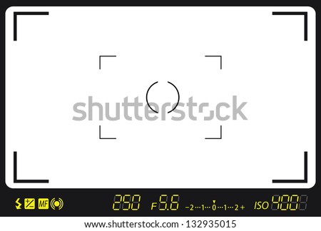
Another solution would be to use a mark with an empty center. Maybe a circle with small crosshairs, such as the third on the second line of this image but thinner, or something more viewfinder looking such as one in the two last rows of this image or something looking like this to show less animosity.

yshish commented 9 years ago

Hi, May I ask you why having the marks movable would be 'too ambitious' there? They were used before and are used at other projects too (like at the Penguin Watch). Thanks, Z.

srallen commented 9 years ago

The alert marker is click and draggable while the tool controls are open, so that should help alleviate some issues with trying to see behind it. I'll discuss the design of the mark itself with @heathv.

Also to clarify, making the mark click and draggable wasn't vetoed as too ambitious, but rather was going to be an enhancement for a later date when I had the time to dedicate to it.

yshish commented 9 years ago

OK, thank you. It doesn't work for me in Firefox (Ubuntu). Once I place the mark and the menu with categories opens, I cannot move the mark anywhere.. But I tried it in the Chromium and it works perfectly there! Going to clear the cache, hope it will help.

srallen commented 9 years ago

The mark itself is repositioned a few pixels up as well now. Is this sufficiently fixed now between the repositioning and being able to drag it around while the tool controls are open?

yshish commented 9 years ago

I cleared the cache and it helped; it works in Firefox for me!

There is just one problem: when the menu is on the right side of the mark, the mark is visible well but when the menu is on the left, the mark is almost overlapped by it. Check the screenshots:

yshish commented 9 years ago

As for repositioning of the mark.. It seems to be too up/too left to me. I'd prefer having the bottom/pointy end of the mark directly where the cursor points. What do you think about it? Now it is placed on the left up from the cursor point (which seems to be causing the overlapping by the menu).

jiho commented 9 years ago

Same here: it is shifted up by the right amount (the pointy part is exactly where I click) but also shifted left when it should not be.

yshish commented 9 years ago

Another problem I can see there.. Try to place the mark close to the bottom of the image - the menu will appear below the mark, in one moment it simply disappear = you cannot see it however the mark is placed in the image.

Would it be possible to make the menu change its position when the cursor is too close to the margin to the opposite side? So it wouldn't appear below the mark but above it (when the mark is placed too close to the bottom).

srallen commented 9 years ago

I've made some adjustments with the positioning. Sorry about that, Webkit browsers and Firefox seem to be different with handling some positioning css. Is it appearing correct for you now?

yshish commented 9 years ago

No, it isn't visible. But(!) when I left the mark there (at the bottom margin) without choosing any category and place another mark somewhere else, the invisible menu suddenly appears (so I can see both menus there) and I can use it.

srallen commented 9 years ago

I should be more clear: I fixed the overlapping of the marker with the controls that was showing up in Firefox.

I haven't replicated the menu not appearing issue yet, but I'm working on another project for the rest of today, so I'll be coming back to this.

yshish commented 9 years ago

Oh, sorry! Yes, it works and I find it much better! :) The pointy end isn't exactly at the same place where the point of my cursor is (not sure whether it should be), but it's almost there!! Perfect. Thank you.

jiho commented 9 years ago

I think this one can be closed thanks to the recent changes.