Team's Response
Thank you for your report.
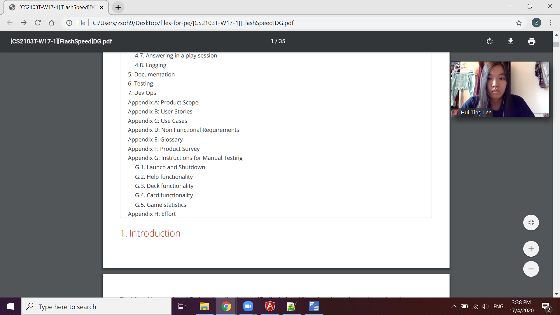
However, based on the guidelines on the CS2103T website, the pdf file must be consistent with the adoc file that it is converted from. This implies that if we were to eliminate the giant space, we will have to add a lot of line breaks before the title, and this will look very weird when viewed as an adoc-turned html file. There will be a giant space between the previous section and the current section when our online UG is viewed online. Since this is not how we want our UG to look like, we will keep our current formatting to maintain the consistency between the pdf and the adoc.
Items for the Tester to Verify
:question: Issue response
Team chose [response.Rejected]
- [x] I disagree
Reason for disagreement: Reasoning for rejection shows how little effort the developer team has put into understanding adoc formatting. It is possible to inject page breaks into adoc using “<<<” and hence remove the need to “add a lot of line breaks before the title”. Additionally, they have also admitted that it was a design decision on their part and that they’d rather not change it. This was reported based on the DG I had received during the PE. Additionally, they could have scaled the image to fit the page seeing as the image is clearly too large.

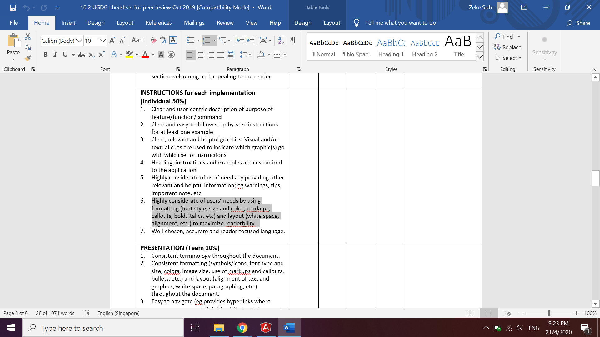
Note the highlighted text where user readability should be maximised. This should be the standard that the team should have followed.
:question: Issue severity
Team chose [severity.VeryLow]
Originally [severity.Low]
- [x] I disagree
Reason for disagreement: Severity of medium level suggests “ A flaw that causes occasional inconvenience to some users but they can continue to use the product.”
The screenshot is just one of the many occurences of this particular bug in the documentation. As the DG was riddled with this bug, the overall user experience for developers was diminished. This bug can be seen at section 1, 3, 3.2, 3.3, 3.4, 3.7, 4.1(execution of command object), 4.2.2, 4.3 (execution of command object), 4.4, 4.5 (Validation...), 4.7 (execution...), 4.8, Appendixes B, C, G, H. These portions should be properly formatted so that users are able to know the section title they are reading else they would have to continuously scroll up and down. Given that this occured more than once and from the team’s response, it is clearly a purposed implementation by the developer team and not some typo/spacing/format error that occured with adoc conversion. Thus, I believe the severity level should be medium.
The severity level should definitely not be very low(purely cosmetic).
There should be a page break at 1.