The banner is small cause i forgot to background-image: none;
I wanna apply this but only for nitro users so no-nitro users just have the small one
i have no nitro so i cant inspect personal nitro things
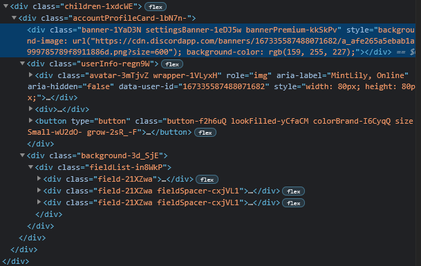
can you tell me, is there more elements after .banner-1YaD3N please?
[this is what i can see so far]


Nitro banners seem a bit too small, in my opinion.
Normal
My edits
#app-mount .accountProfileCard-lbN7n- .banner-1YaD3N { height: 200px; }#app-mount .accountProfileCard-lbN7n- .avatar-3mTjvZ { top: 180px; }Show full banner
#app-mount .accountProfileCard-lbN7n- .banner-1YaD3N { height: 500px; }#app-mount .accountProfileCard-lbN7n- .avatar-3mTjvZ { top: 480px; }Note: I am using Powercord, even though I know this theme is not fully made for Powercord.