 AdrianBZG
commented
6 years ago
AdrianBZG
commented
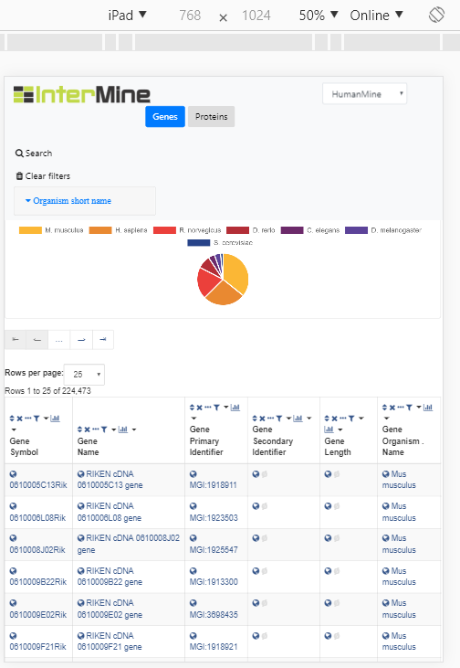
6 years ago @yochannah It looks nice now in small and mobile screen (0978bba), some examples:
My phone:

Other devices:


Closed yochannah closed 6 years ago
AdrianBZG
commented
6 years ago @yochannah It looks nice now in small and mobile screen (0978bba), some examples:
My phone:
Other devices:
 yochannah
commented
6 years ago
yochannah
commented
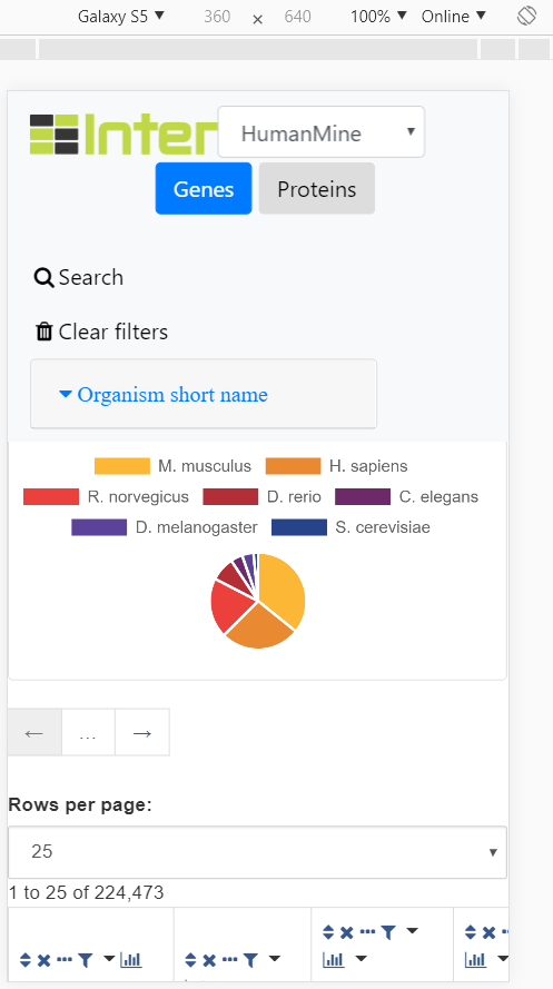
6 years ago @AdrianBZG That is much better but the InterMine logo still gets covered by the dropdown a lot of the time in those screenshots. One option could be to just use a square logo (available here https://intermineorg.wordpress.com/logos/)
The navbar also sometimes covers the graph, like this, between screen widths of around 800px to 992px.

AdrianBZG
commented
6 years ago @yochannah I think it's good now (f5c69c7):
What do you think?
yochannah
commented
6 years ago that does look better - although could you double-check the aspect ratio of the logo is correct? it looks a little bit like it's being squished a bit, or it could be my eyes. I'm not sure ;)
AdrianBZG
commented
6 years ago @yochannah Probably you are right, since the height needs to be 37px... and maybe with 50px width is not correct, now it's 40px so it's almost a square... what do you think?
yochannah
commented
6 years ago For a height of 37 I think it probably needs a width of 36 - try that?
AdrianBZG
commented
6 years ago @yochannah What about now? 😄
AdrianBZG
commented
6 years ago @yochannah PS: For some reason Travis network is 💀
PS2: 👍 now
yochannah
commented
6 years ago looks good!
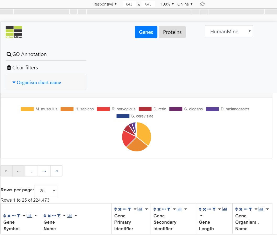
Screenshot attached - the header shrinks nicely for small screens but could use a little bit of improvement where things overlap, and the pie chart seems to be missing entirely (maybe covered by the header?)
Don't worry about imtables overspilling the screen - it's not terribly mobile friendly, but that's not the data browser's fault! so long as users can scroll sideways to see all of the imtable everything should be fine.