 Glimmer DSL for LibUI 0.12.5
Prerequisite-Free Ruby Desktop Development Cross-Platform Native GUI Library (Fukuoka Award Winning)
The Quickest Way From Zero To GUI

If You Liked Shoes, You'll Love Glimmer!
(Fukuoka Ruby Award Competition 2022 Special Award Winner [Award Announcement])
([**RubyConf 2023 Workshop - How To Build Desktop Applications in Ruby](https://github.com/AndyObtiva/how-to-build-desktop-applications-in-ruby)**)
([**RubyConf 2022 Talk - Building Native GUI Apps in Ruby](https://andymaleh.blogspot.com/2023/02/rubyconf-2022-talk-video-for-building.html)**)
(Ruby Rogues Podcast Interview - Desktop Apps in Ruby ft. Andy)
Glimmer DSL for LibUI is a Fukuoka Award Winning prerequisite-free MRI Ruby desktop development cross-platform native GUI (Graphical User Interface) library. No need to pre-install any prerequisites. Just install the gem and have cross-platform native GUI that just works on Mac, Windows, and Linux!
| Mac | Windows | Linux |
|---|---|---|
 |
 |
 |
LibUI is a relatively new C GUI library that renders native controls on every platform (similar to SWT, but without the heavy weight of the Java Virtual Machine). Applications built with Glimmer DSL for LibUI will provide the familiar native look, feel, and behavior of GUI on Mac, Windows, and Linux.
The main trade-off in using Glimmer DSL for LibUI as opposed to Glimmer DSL for SWT or Glimmer DSL for Tk is the fact that SWT and Tk are more mature than mid-alpha libui as GUI toolkits. Still, if there is only a need to build a small simple application, Glimmer DSL for LibUI could be a good convenient choice due to having zero prerequisites (beyond Ruby and the dependencies included in the Ruby gem). Also, just like Glimmer DSL for Tk, its apps start instantly and have a small memory footprint. LibUI is a promising new GUI toolkit that might prove quite worthy in the future.
Glimmer DSL for LibUI aims to provide a DSL similar to the Glimmer DSL for SWT to enable more productive desktop development in Ruby with:
- Declarative DSL syntax that visually maps to the GUI control hierarchy
- Convention over configuration via smart defaults and automation of low-level details
- Requiring the least amount of syntax possible to build GUI
- Custom Component support (Custom Controls, Custom Windows, and Custom Shapes), including Component Slots and external Ruby gems (e.g. Graphs and Charts)
- Bidirectional/Unidirectional Data-Binding to declaratively wire and automatically synchronize GUI Views with Models
- Scaffolding for new custom windows/controls, apps, and gems
- [Far Future Plan] Native-Executable packaging on Mac, Windows, and Linux.
Hello, World!
require 'glimmer-dsl-libui'

include Glimmer

window('hello world').show| Mac | Windows | Linux |
|---|---|---|
 |
 |
 |
Basic Button
require 'glimmer-dsl-libui'

include Glimmer

window('hello world', 300, 200) {
  button('Button') {
    on_clicked do
      msg_box('Information', 'You clicked the button')
    end
  }
}.show
Basic Table Progress Bar
| Mac | Windows | Linux |
|---|---|---|
  |
  |
  |
require 'glimmer-dsl-libui'

include Glimmer

data = [
  ['task 1', 0],
  ['task 2', 15],
  ['task 3', 100],
  ['task 4', 75],
  ['task 5', -1],
]

window('Task Progress', 300, 200) {
  vertical_box {
    table {
      text_column('Task')
      progress_bar_column('Progress')

      cell_rows data # implicit data-binding
    }

    button('Mark All As Done') {
      stretchy false

      on_clicked do
        data.each_with_index do |row_data, row|
          data[row][1] = 100 # automatically updates table due to implicit data-binding
        end
      end
    }
  }
}.show| Mac | Windows | Linux |
|---|---|---|
 |
 |
 |
Form Table
require 'glimmer-dsl-libui'

class FormTable
  Contact = Struct.new(:name, :email, :phone, :city, :state)

  include Glimmer

  attr_accessor :contacts, :name, :email, :phone, :city, :state, :filter_value

  def initialize
    @contacts = [
      Contact.new('Lisa Sky', 'lisa@sky.com', '720-523-4329', 'Denver', 'CO'),
      Contact.new('Jordan Biggins', 'jordan@biggins.com', '617-528-5399', 'Boston', 'MA'),
      Contact.new('Mary Glass', 'mary@glass.com', '847-589-8788', 'Elk Grove Village', 'IL'),
      Contact.new('Darren McGrath', 'darren@mcgrath.com', '206-539-9283', 'Seattle', 'WA'),
      Contact.new('Melody Hanheimer', 'melody@hanheimer.com', '213-493-8274', 'Los Angeles', 'CA'),
    ]
  end

  def launch
    window('Contacts', 600, 600) {
      margined true

      vertical_box {
        form {
          stretchy false

          entry {
            label 'Name'
            text <=> [self, :name] # bidirectional data-binding between entry text and self.name
          }

          entry {
            label 'Email'
            text <=> [self, :email]
          }

          entry {
            label 'Phone'
            text <=> [self, :phone]
          }

          entry {
            label 'City'
            text <=> [self, :city]
          }

          entry {
            label 'State'
            text <=> [self, :state]
          }
        }

        button('Save Contact') {
          stretchy false

          on_clicked do
            new_row = [name, email, phone, city, state]
            if new_row.map(&:to_s).include?('')
              msg_box_error('Validation Error!', 'All fields are required! Please make sure to enter a value for all fields.')
            else
              @contacts << Contact.new(*new_row) # automatically inserts a row into the table due to explicit data-binding
              @unfiltered_contacts = @contacts.dup
              self.name = '' # automatically clears name entry through explicit data-binding
              self.email = ''
              self.phone = ''
              self.city = ''
              self.state = ''
            end
          end
        }

        search_entry {
          stretchy false
          # bidirectional data-binding of text to self.filter_value with after_write option
          text <=> [self, :filter_value,
            after_write: ->(filter_value) { # execute after write to self.filter_value
              @unfiltered_contacts ||= @contacts.dup
              # Unfilter first to remove any previous filters
              self.contacts = @unfiltered_contacts.dup # affects table indirectly through explicit data-binding
              # Now, apply filter if entered
              unless filter_value.empty?
                self.contacts = @contacts.filter do |contact| # affects table indirectly through explicit data-binding
                  contact.members.any? do |attribute|
                    contact[attribute].to_s.downcase.include?(filter_value.downcase)
                  end
                end
              end
            }
          ]
        }

        table {
          text_column('Name')
          text_column('Email')
          text_column('Phone')
          text_column('City')
          text_column('State')

          editable true
          cell_rows <=> [self, :contacts] # explicit data-binding to self.contacts Modal Array, auto-inferring model attribute names from underscored table column names by convention

          on_changed do |row, type, row_data|
            puts "Row #{row} #{type}: #{row_data}"
            $stdout.flush # for Windows
          end

          on_edited do |row, row_data| # only fires on direct table editing
            puts "Row #{row} edited: #{row_data}"
            $stdout.flush # for Windows
          end
        }
      }
    }.show
  end
end

FormTable.new.launch| Mac | Windows | Linux |
|---|---|---|
 |
 |
 |
Area Gallery
require 'glimmer-dsl-libui'

include Glimmer

window('Area Gallery', 400, 400) {
  area {
    path { # declarative stable path (explicit path syntax for multiple shapes sharing attributes)
      square(0, 0, 100)
      square(100, 100, 400)

      fill r: 102, g: 102, b: 204
    }

    path { # declarative stable path (explicit path syntax for multiple shapes sharing attributes)
      rectangle(0, 100, 100, 400)
      rectangle(100, 0, 400, 100)

      # linear gradient (has x0, y0, x1, y1, and stops)
      fill x0: 10, y0: 10, x1: 350, y1: 350, stops: [{pos: 0.25, r: 204, g: 102, b: 204}, {pos: 0.75, r: 102, g: 102, b: 204}]
    }

    polygon(100, 100, 100, 400, 400, 100, 400, 400) { # declarative stable path (implicit path syntax for a single shape nested directly under area)
      fill r: 202, g: 102, b: 104, a: 0.5
      stroke r: 0, g: 0, b: 0
    }

    polybezier(0, 0,
               200, 100, 100, 200, 400, 100,
               300, 100, 100, 300, 100, 400,
               100, 300, 300, 100, 400, 400) { # declarative stable path (implicit path syntax for a single shape nested directly under area)
      fill r: 202, g: 102, b: 204, a: 0.5
      stroke r: 0, g: 0, b: 0, thickness: 2, dashes: [50, 10, 10, 10], dash_phase: -50.0
    }

    polyline(100, 100, 400, 100, 100, 400, 400, 400, 0, 0) { # declarative stable path (implicit path syntax for a single shape nested directly under area)
      stroke r: 0, g: 0, b: 0, thickness: 2
    }

    arc(404, 216, 190, 90, 90, false) { # declarative stable path (implicit path syntax for a single shape nested directly under area)
      # radial gradient (has an outer_radius in addition to x0, y0, x1, y1, and stops)
      fill outer_radius: 90, x0: 0, y0: 0, x1: 500, y1: 500, stops: [{pos: 0.25, r: 102, g: 102, b: 204, a: 0.5}, {pos: 0.75, r: 204, g: 102, b: 204}]
      stroke r: 0, g: 0, b: 0, thickness: 2, dashes: [50, 10, 10, 10], dash_phase: -50.0
    }

    circle(200, 200, 90) { # declarative stable path (implicit path syntax for a single shape nested directly under area)
      fill r: 202, g: 102, b: 204, a: 0.5
      stroke r: 0, g: 0, b: 0, thickness: 2
    }

    text(161, 40, 100) { # declarative stable text
      string('Area Gallery') {
        font family: 'Arial', size: (OS.mac? ? 14 : 11)
        color :black
      }
    }

    on_mouse_event do |area_mouse_event|
      p area_mouse_event
    end

    on_mouse_moved do |area_mouse_event|
      puts 'moved'
    end

    on_mouse_down do |area_mouse_event|
      puts 'mouse down'
    end

    on_mouse_up do |area_mouse_event|
      puts 'mouse up'
    end

    on_mouse_drag_started do |area_mouse_event|
      puts 'drag started'
    end

    on_mouse_dragged do |area_mouse_event|
      puts 'dragged'
    end

    on_mouse_dropped do |area_mouse_event|
      puts 'dropped'
    end

    on_mouse_entered do
      puts 'entered'
    end

    on_mouse_exited do
      puts 'exited'
    end

    on_key_event do |area_key_event|
      p area_key_event
    end

    on_key_up do |area_key_event|
      puts 'key up'
    end

    on_key_down do |area_key_event|
      puts 'key down'
    end
  }
}.show| Mac | Windows | Linux |
|---|---|---|
 |
 |
 |
Check out many more examples over here!


Check out many real apps built with Glimmer DSL for LibUI over here!

NOTE: Glimmer DSL for LibUI is regularly catching up with changes in the C libui-ng library API and in beta mode. The C libui-ng is still mid-alpha, which is why Glimmer DSL for LibUI cannot be declared v1.0.0 yet. Please help make better by contributing, adopting for small or low risk projects, and providing feedback. The more feedback and issues you report the better.
Learn more about the differences between various Glimmer DSLs by looking at the Glimmer DSL Comparison Table.
Table of Contents
- Glimmer DSL for LibUI
- Setup
- Usage
- Experimentation Usage
- Prototyping Usage
- Serious Usage
- Glimmer Command
- Run Application
- Run Examples
- Scaffold Application
- Scaffold Custom Control
- Scaffold Custom Window
- Scaffold Custom Shape
- Scaffold Custom Control Gem
- Scaffold Custom Window Gem
- Scaffold Custom Shape Gem
- List Custom Control Gems
- List Custom Window Gems
- List Custom Shape Gems
- List Glimmer DSLs
- Girb (Glimmer IRB)
- Glimmer GUI DSL Concepts
- API
- Supported Keywords
- Common Control Properties
- Common Control Operations
- LibUI Operations
- Extra Dialogs
- Extra Operations
- Table API
- Area API
- Smart Defaults and Conventions
- Custom Components
- Observer Pattern
- Data-Binding
- API Gotchas
- Original API
- Packaging
- Glimmer Style Guide
- Examples
- Basic Examples
- Advanced Examples
- Applications
- Manga2PDF
- Befunge98 GUI
- i3off Gtk Ruby
- Chess
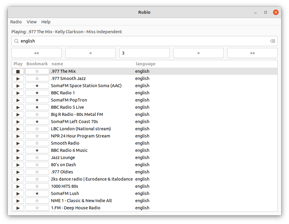
- RubyCrumbler
- Rubio-Radio
- PMV Calc
- Design Principles
- Glimmer Process
- Resources
- Help
- Issues
- Chat
- Planned Features and Feature Suggestions
- Change Log
- Contributing
- Contributors
- License
Setup
Note: the newest Ruby 3.3 is not fully supported yet.
Install glimmer-dsl-libui gem directly into a maintained Ruby version:
gem install glimmer-dsl-libuiOr install via Bundler Gemfile:
gem 'glimmer-dsl-libui', '~> 0.12.5'Test that installation worked by running the Glimmer Meta-Example:
glimmer examplesOr alternatively, run using the explicit Ruby command:
ruby -r glimmer-dsl-libui -e "require 'examples/meta_example'"| Mac | Windows | Linux |
|---|---|---|
 |
 |
 |
Usage
Start by requiring the glimmer-dsl-libui Ruby gem, whether through a Ruby require 'glimmer-dsl-libui statement or Bundler.
Afterwards, to access the Glimmer GUI DSL:
- If you are learning/experimenting/prototyping with Glimmer DSL for LibUI, include the
Glimmermodule into the top-level scope or a Ruby class. - If you are building a serious application, include
Glimmer::LibUI::Applicationinto the main view Ruby class - If you are building a custom control, include
Glimmer::LibUI::CustomControlinto a Ruby class - If you are building a cusotm window, include
Glimmer::LibUI::CustomWindowinto a Ruby class - If you are building a custom shape, include
Glimmer::LibUI::CustomShapeinto a Ruby class.
You may learn more about the different options above with basic examples in the following subsections: Experimentation Usage, Prototyping Usage, Serious Usage.
If you are new to Glimmer DSL for LibUI (beginner), after going through the subsections below, check out the RubyConf 2022 talk "Building Native GUI Apps in Ruby", Glimmer GUI DSL Concepts, Glimmer Style Guide, Glimmer Command (just the basics, how to run an app, and how to run examples to start), Girb and Examples to quickly learn through copy/paste. It is very important for beginners to go through all the Examples from the most basic to the most advanced while reading the README topics that relate to the examples. Alternatively, beginners can learn from the RubyConf 2023 workshop "How To Build Desktop Applications in Ruby", which includes 27 step-by-step exercises. You may refer to the API once you have gotten your feet wet with Glimmer DSL for LibUI and need a more detailed reference.
If you encounter any issues with the documentation, get stuck with code you do not understand, or notice some out-of-date information, you may contact the project maintainers on the Glimmer Gitter Chat. Also, this could be your opportunity to be a good steward of Open-Source Software by contributing a documentation fix in a GitHub Pull Request or reporting a GitHub Issue at least.
For integration with a Relational Database (SQL) via ActiveRecord, you may refer to the blog post that was written about using ActiveRecord with SQLite DB and Glimmer DSL for SWT (altering to fit CRuby and Glimmer DSL for LibUI). Also, @chip created a prototype Git repo for starting a Glimmer DSL for LibUI project with SQLite DB and ActiveRecord: https://github.com/chip/glimmer_dsl_with_active_record
Experimentation Usage
For experimenting and learning, add include Glimmer into the top-level main object and start using the Glimmer GUI DSL directly.
Example including Glimmer at the top-level scope just for some prototyping/demoing/testing (you may copy/paste in girb):
require 'glimmer-dsl-libui'

include Glimmer

window('hello world', 300, 200) {
  button('Button') {
    on_clicked do
      puts 'Button Clicked'
    end
  }
}.show
Prototyping Usage
For prototyping, add include Glimmer into an actual class and start using the Glimmer GUI DSL in instance methods.
Example including Glimmer and manually implementing the #launch method (you may copy/paste in girb):
require 'glimmer-dsl-libui'

class SomeGlimmerApp
  include Glimmer

  def launch
    window('hello world', 300, 200) {
      button('Button') {
        on_clicked do
          puts 'Button Clicked'
        end
      }
    }.show
  end
end

SomeGlimmerApp.new.launch
Serious Usage
For more serious usage, add include Glimmer::LibUI::Application into an actual class (it automatically includes the Glimmer module) to conveniently declare the GUI underneath a body block (with the option of implementing before_body and after_body hooks) and take advantage of the inherited SomeClass::launch method implementation that automatically calls window.show for you.
Example including Glimmer::LibUI::Application (you may copy/paste in girb):
require 'glimmer-dsl-libui'

class SomeGlimmerApp
  include Glimmer::LibUI::Application

  body {
    window('hello world', 300, 200) {
      button('Button') {
        on_clicked do
          puts 'Button Clicked'
        end
      }
    }
  }
end

SomeGlimmerApp.launch
(note: Glimmer::LibUI::Application is an alias for Glimmer::LibUI::CustomWindow since that is what it represents)
Glimmer Command
The glimmer command allows you to conveniently run applications (glimmer app_path), run examples (glimmer examples), and scaffold applications (glimmer "scaffold[app_name]").
You can bring up usage instructions by running the glimmer command without arguments:
glimmerGlimmer DSL for LibUI (Prerequisite-Free Ruby Desktop Development Cross-Platform Native GUI Library) - Ruby Gem: glimmer-dsl-libui v0.8.0
Usage: glimmer [--bundler] [--pd] [--quiet] [--debug] [--log-level=VALUE] [[ENV_VAR=VALUE]...] [[-ruby-option]...] (application.rb or task[task_args])
Runs Glimmer applications and tasks.
When applications are specified, they are run using Ruby,
automatically preloading the glimmer-dsl-libui Ruby gem.
Optionally, extra Glimmer options, Ruby options, and/or environment variables may be passed in.
Glimmer options:
- "--bundler=GROUP" : Activates gems in Bundler default group in Gemfile
- "--pd=BOOLEAN" : Requires puts_debuggerer to enable pd method
- "--quiet=BOOLEAN" : Does not announce file path of Glimmer application being launched
- "--debug" : Displays extra debugging information and enables debug logging
- "--log-level=VALUE" : Sets Glimmer's Ruby logger level ("ERROR" / "WARN" / "INFO" / "DEBUG"; default is none)
Tasks are run via rake. Some tasks take arguments in square brackets (surround with double-quotes if using Zsh).
Available tasks are below (if you do not see any, please add `require 'glimmer/rake_task'` to Rakefile and rerun or run rake -T):
Select a Glimmer task to run: (Press ↑/↓ arrow to move, Enter to select and letters to filter)
‣ glimmer examples # Brings up the Glimmer Meta-Sample app to allow browsing, running, and viewing code of Glimmer samples
glimmer list:gems:customcontrol[query] # List Glimmer custom control gems available at rubygems.org (query is optional) [alt: list:gems:cc]
glimmer list:gems:customshape[query] # List Glimmer custom shape gems available at rubygems.org (query is optional) [alt: list:gems:cs]
glimmer list:gems:customwindow[query] # List Glimmer custom window gems available at rubygems.org (query is optional) [alt: list:gems:cw]
glimmer list:gems:dsl[query] # List Glimmer DSL gems available at rubygems.org (query is optional)
glimmer run[app_path] # Runs Glimmer app or custom window gem in the current directory, unless app_path is specified, then runs it instead (app_path is optional)
glimmer scaffold[app_name] # Scaffold Glimmer application directory structure to build a new app
glimmer scaffold:customcontrol[name,namespace] # Scaffold Glimmer::UI::CustomControl subclass (part of a view) under app/views (namespace is optional) [alt: scaffold:cc]
glimmer scaffold:customshape[name,namespace] # Scaffold Glimmer::UI::CustomShape subclass (part of a view) under app/views (namespace is optional) [alt: scaffold:cs]
glimmer scaffold:customwindow[name,namespace] # Scaffold Glimmer::UI::CustomWindow subclass (full window view) under app/views (namespace is optional) [alt: scaffold:cw]
glimmer scaffold:gem:customcontrol[name,namespace] # Scaffold Glimmer::UI::CustomControl subclass (part of a view) under its own Ruby gem project (namespace is required) [alt: scaffold:gem:cc]
glimmer scaffold:gem:customshape[name,namespace] # Scaffold Glimmer::UI::CustomShape subclass (part of a view) under its own Ruby gem project (namespace is required) [alt: scaffold:gem:cs]
glimmer scaffold:gem:customwindow[name,namespace] # Scaffold Glimmer::UI::CustomWindow subclass (full window view) under its own Ruby gem + app project (namespace is required) [alt: scaffold:gem:cw]On Mac and Linux, it brings up a TUI (Text-based User Interface) for interactive navigation and execution of Glimmer tasks (courtesy of rake-tui).
On Windows and ARM64 machines, it simply lists the available Glimmer tasks at the end (courtsey of rake).
Note: If you encounter an issue running the glimmer command, run bundle exec glimmer instead.
Run Application
Run Glimmer DSL for LibUI applications via this command:
glimmer app_pathFor example, from a cloned glimmer-dsl-libui repository:
glimmer examples/basic_window.rb| Mac | Windows | Linux |
|---|---|---|
|
|
|
Run Examples
Run Glimmer DSL for LibUI included examples via this command:
glimmer examplesThat brings up the Glimmer Meta-Example)
| Mac | Windows | Linux |
|---|---|---|
|
|
|
Scaffold Application
Application scaffolding enables automatically generating the directories/files of a new desktop GUI application that follows the MVC architecture and can be packaged as a Ruby gem that includes an executable script for running the app conveniently. It also ensures that software engineers follow the recommended Glimmer DSL for LibUI conventions and best practices. Application Scaffolding greatly improves software engineering productivity when building desktop applications with Glimmer DSL for LibUI.
Application Scaffolding relies on the juwelier Ruby gem, which expects a local Git config of user.name (git config --global user.name "FirstName LastName") and github.user (git config --global github.user githubusername).
Scaffold Glimmer DSL for LibUI application with this command:
glimmer "scaffold[app_name]"That will automatically generate the general MVC structure of a new Glimmer DSL for LibUI application and launch the application when done.
For example, if we run:
glimmer "scaffold[hello_world]"The following files are generated and reported by the glimmer command:
Created hello_world/.gitignore
Created hello_world/.ruby-version
Created hello_world/.ruby-gemset
Created hello_world/VERSION
Created hello_world/LICENSE.txt
Created hello_world/Gemfile
Created hello_world/Rakefile
Created hello_world/app/hello_world.rb
Created hello_world/app/hello_world/view/hello_world.rb
Created hello_world/app/hello_world/model/greeting.rb
Created hello_world/icons/windows/Hello World.ico
Created hello_world/icons/macosx/Hello World.icns
Created hello_world/icons/linux/Hello World.png
Created hello_world/app/hello_world/launch.rb
Created hello_world/bin/hello_world
They include a basic Hello, World! application with menus and about/preferences dialogs.
Views live under app/app_name/view (e.g. app/hello_world/view)
Models live under app/app_name/model (e.g. app/hello_world/model)
The application runs automatically once scaffolding is done.


Once you step into the application directory, you can run it in one of multiple ways:
bin/app_nameFor example:
bin/hello_worldOr using the Glimmer generic command for running applications, which will automatically detect the application running script:
glimmer run
The application comes with the juwelier gem for auto-generating an application gem from the app Rakefile and Gemfile configuration (no need to manually declare gems in a gemspec... just use Gemfile normally and juwelier takes care of the rest by generating an app gemspec automatically from Gemfile).
You can package the newly scaffolded app as a Ruby gem by running this command:
glimmer package:gemOr by using the raw rake command:
rake buildYou can generate the application gemspec explicitly if needed with this command (though it is not needed to build the gem):
glimmer package:gemspecOr by using the raw rake command:
rake gemspec:generateOnce you install the gem (e.g. gem install hello_world), you can simply run the app with its executable script:
app_nameFor example:
hello_world
Scaffold Custom Control
When you are in a scaffolded application, you can scaffold a new custom control (a control that you can put anything in to represent a view concept in your application) by running this command:
glimmer scaffold:customcontrol[name,namespace]The name represents the custom control view class name (it can be underscored, and Glimmer will automatically classify it).
The namespace is optional and represents the module that the custom control view class will live under. If left off, the main application class namespace is used (e.g. the top-level HelloWorld class namespace for a hello_world application).
You can also use the shorter cc alias for customcontrol:
glimmer scaffold:cc[name,namespace]For example by running this command under a hello_world application:
glimmer scaffold:cc[model_form]That will generate this class under app/hello_world/view/model_form:
class HelloWorld
  module View
    class ModelForm
      include Glimmer::LibUI::CustomControl

      ## Add options like the following to configure CustomControl by outside consumers
      #
      # options :custom_text, :background_color
      # option :foreground_color, default: :red

      # Replace example options with your own options
      option :model
      option :attributes

      ## Use before_body block to pre-initialize variables to use in body
      #
      #
      before_body do
        # Replace example code with your own before_body code
        default_model_attributes = [:first_name, :last_name, :email]
        default_model_class = Struct.new(*default_model_attributes)
        self.model ||= default_model_class.new
        self.attributes ||= default_model_attributes
      end

      ## Use after_body block to setup observers for controls in body
      #
      # after_body do
      #
      # end

      ## Add control content under custom control body
      ##
      ## If you want to add a window as the top-most control,
      ## consider creating a custom window instead
      ## (Glimmer::LibUI::CustomWindow offers window convenience methods, like show and hide)
      #
      body {
        # Replace example content (model_form custom control) with your own custom control content.
        form {
          attributes.each do |attribute|
            entry { |e|
              label attribute.to_s.underscore.split('_').map(&:capitalize).join(' ')
              text <=> [model, attribute]
            }
          end
        }
      }

    end
  end
end
When the generated file is required in another view (e.g. require 'hello_world/view/model_form'), the custom control keyword model_form become available and reusable, like by calling:
window {
  vertical_box {
    label('Form:')
    model_form(model: some_model, attributes: array_of_attributes)
  }
}
Here is an example that generates a custom control with a namespace:
glimmer scaffold:cc[model_form,common]That will generate this class under app/common/view/model_form:
module Common
  module View
    class ModelForm
      include Glimmer::LibUI::CustomControl

      ## Add options like the following to configure CustomControl by outside consumers
      #
      # options :custom_text, :background_color
      # option :foreground_color, default: :red

      # Replace example options with your own options
      option :model
      option :attributes

      ## Use before_body block to pre-initialize variables to use in body
      #
      #
      before_body do
        # Replace example code with your own before_body code
        default_model_attributes = [:first_name, :last_name, :email]
        default_model_class = Struct.new(*default_model_attributes)
        self.model ||= default_model_class.new
        self.attributes ||= default_model_attributes
      end

      ## Use after_body block to setup observers for controls in body
      #
      # after_body do
      #
      # end

      ## Add control content under custom control body
      ##
      ## If you want to add a window as the top-most control,
      ## consider creating a custom window instead
      ## (Glimmer::LibUI::CustomWindow offers window convenience methods, like show and hide)
      #
      body {
        # Replace example content (model_form custom control) with your own custom control content.
        form {
          attributes.each do |attribute|
            entry { |e|
              label attribute.to_s.underscore.split('_').map(&:capitalize).join(' ')
              text <=> [model, attribute]
            }
          end
        }
      }

    end
  end
end
When that file is required in another view (e.g. require 'common/view/model_form'), the model_form keyword becomes available:
window {
  vertical_box {
    label('Form:')
    model_form(model: some_model, attributes: array_of_attributes)
  }
}
If for whatever reason, you end up with 2 custom control views having the same name with different namespaces, then you can invoke the specific custom control you want by including the Ruby namespace in underscored format separated by double-underscores:
window {
  vertical_box {
    label('Form:')
    common__view__model_form(model: some_model, attributes: array_of_attributes)
  }
}
Or another model_form custom control view:
window {
  vertical_box {
    label('Form:')
    hello_world__view__model_form(model: some_model, attributes: array_of_attributes)
  }
}
Scaffold Custom Window
A custom window is a specialization of a custom control that has a window as its body root.
When you are in a scaffolded application, you can scaffold a new custom window (a window that you can put anything in to represent a view concept in your application) by running this command:
glimmer scaffold:customwindow[name,namespace]The name represents the custom window view class name (it can be underscored, and Glimmer will automatically classify it).
The namespace is optional and represents the module that the custom window view class will live under. If left off, the main application class namespace is used (e.g. the top-level HelloWorld class namespace for a hello_world application).
You can also use the shorter cw alias for customwindow:
glimmer scaffold:cw[name,namespace]For example by running this command under a hello_world application:
glimmer scaffold:cw[greeting_window]That will generate this class under app/hello_world/view/greeting_window:
class HelloWorld
  module View
    class GreetingWindow
      include Glimmer::LibUI::CustomWindow

      ## Add options like the following to configure CustomWindow by outside consumers
      #
      # options :title, :background_color
      # option :width, default: 320
      # option :height, default: 240

      ## Use before_body block to pre-initialize variables to use in body and
      #  to setup application menu
      #
      # before_body do
      #
      # end

      ## Use after_body block to setup observers for controls in body
      #
      # after_body do
      #
      # end

      ## Add control content inside custom window body
      ## Top-most control must be a window or another custom window
      #
      body {
        window {
          # Replace example content below with custom window content
          content_size 240, 240
          title 'Hello World'

          margined true

          label {
            text 'Hello World'
          }
        }
      }
    end
  end
end
When the generated file is required in another view (e.g. require 'hello_world/view/greeting_window'), the custom window keyword greeting_window become available and reusable, like by calling:
greeting_window.showHere is an example that generates a custom window with a namespace:
glimmer scaffold:cw[train,station]That will generate this class under app/station/view/train:
module Station
  module View
    class Train
      include Glimmer::LibUI::CustomWindow

      ## Add options like the following to configure CustomWindow by outside consumers
      #
      # options :title, :background_color
      # option :width, default: 320
      # option :height, default: 240

      ## Use before_body block to pre-initialize variables to use in body and
      #  to setup application menu
      #
      # before_body do
      #
      # end

      ## Use after_body block to setup observers for controls in body
      #
      # after_body do
      #
      # end

      ## Add control content inside custom window body
      ## Top-most control must be a window or another custom window
      #
      body {
        window {
          # Replace example content below with custom window content
          content_size 240, 240
          title 'Station'

          margined true

          label {
            text 'Station'
          }
        }
      }
    end
  end
end
When that file is required in another view (e.g. require 'station/view/train'), the train keyword becomes available:
train.showIf for whatever reason, you end up with 2 custom window views having the same name with different namespaces, then you can invoke the specific custom window you want by including the Ruby namespace in underscored format separated by double-underscores:
station__view__train.showOr another train custom window view:
hello_world__view__train.showScaffold Custom Shape
When you are in a scaffolded application, you can scaffold a new custom shape (a shape that you can put anything in to represent a view concept in your application) by running this command:
glimmer scaffold:customshape[name,namespace]The name represents the custom shape view class name (it can be underscored, and Glimmer will automatically classify it).
The namespace is optional and represents the module that the custom shape view class will live under. If left off, the main application class namespace is used (e.g. the top-level HelloWorld class namespace for a hello_world application).
You can also use the shorter cs alias for customshape:
glimmer scaffold:cs[name,namespace]For example by running this command under a hello_world application:
glimmer scaffold:cs[heart]That will generate this class under app/hello_world/view/heart:
class HelloWorld
  module View
    class Heart
      include Glimmer::LibUI::CustomShape

      ## Add options like the following to configure CustomShape by outside consumers
      #
      # options :option1, option2, option3
      option :background_color, default: :red
      option :size_width, default: 100
      option :size_height, default: 100
      option :location_x, default: 0
      option :location_y, default: 0

      ## Use before_body block to pre-initialize variables to use in body
      #
      #
      # before_body do
      #
      # end

      ## Use after_body block to setup observers for shapes in body
      #
      # after_body do
      #
      # end

      ## Add shape content under custom shape body
      #
      body {
        # Replace example content below (heart shape) with custom shape content
        shape(location_x, location_y) {
          # This fill color is shared under all direct children of `shape`
          fill background_color

          bezier(
            size_width - size_width*0.66, size_height/2 - size_height*0.33,
            size_width*0.65 - size_width*0.66, 0 - size_height*0.33,
            size_width/2 - size_width*0.66, size_height*0.75 - size_height*0.33,
            size_width - size_width*0.66, size_height - size_height*0.33
          )

          bezier(
            size_width - size_width*0.66, size_height/2 - size_height*0.33,
            size_width*1.35 - size_width*0.66, 0 - size_height*0.33,
            size_width*1.5 - size_width*0.66, size_height*0.75 - size_height*0.33,
            size_width - size_width*0.66, size_height - size_height*0.33
          )
        }
      }

    end
  end
end
When the generated file is required in another view (e.g. require 'hello_world/view/heart'), the custom shape keyword heart become available and reusable, like by calling:
window {
  area {
    heart
  }
}
You can pass heart options (as defined with option near the top of the class):
window {
  area {
    heart(location_x: 25, location_y: 50)
  }
}
Here is an example that generates a custom shape with a namespace:
glimmer scaffold:cs[heart,acme]That will generate this class under app/acme/view/heart:
module Acme
  module View
    class Heart
      include Glimmer::LibUI::CustomShape

      ## Add options like the following to configure CustomShape by outside consumers
      #
      # options :option1, option2, option3
      option :background_color, default: :red
      option :size_width, default: 100
      option :size_height, default: 100
      option :location_x, default: 0
      option :location_y, default: 0

      ## Use before_body block to pre-initialize variables to use in body
      #
      #
      # before_body do
      #
      # end

      ## Use after_body block to setup observers for shapes in body
      #
      # after_body do
      #
      # end

      ## Add shape content under custom shape body
      #
      body {
        # Replace example content below (heart shape) with your own custom shape content
        shape(location_x, location_y) {
          # This fill color is shared under all direct children of `shape`
          fill background_color

          bezier(
            size_width - size_width*0.66, size_height/2 - size_height*0.33,
            size_width*0.65 - size_width*0.66, 0 - size_height*0.33,
            size_width/2 - size_width*0.66, size_height*0.75 - size_height*0.33,
            size_width - size_width*0.66, size_height - size_height*0.33
          )

          bezier(
            size_width - size_width*0.66, size_height/2 - size_height*0.33,
            size_width*1.35 - size_width*0.66, 0 - size_height*0.33,
            size_width*1.5 - size_width*0.66, size_height*0.75 - size_height*0.33,
            size_width - size_width*0.66, size_height - size_height*0.33
          )
        }
      }

    end
  end
end
When that file is required in another view (e.g. require 'acme/view/heart'), the heart keyword becomes available:
window {
  area {
    heart
  }
}
If for whatever reason, you end up with 2 custom shape views having the same name with different namespaces, then you can invoke the specific custom shape you want by including the Ruby namespace in underscored format separated by double-underscores:
window {
  area {
    acme__view__heart
  }
}
Or another heart custom shape view:
window {
  area {
    hello_world__view__heart
  }
}
Scaffold Custom Control Gem
You can scaffold a Ruby gem around a reusable custom control to expose publicly and make available for multiple projects by running this command:
glimmer scaffold:gem:customcontrol[name,namespace]That will generate a custom control gem project under the naming convention: glimmer-libui-cc-name-namespace
The naming convention helps with discoverability of Ruby gems using the command glimmer list:gems:customcontrol[query] (or alias: glimmer list:gems:cc[query]) where filtering query is optional.
The name is the custom control class name, which must not contain dashes by convention (multiple words can be concatenated or can use underscores between them).
The namespace is needed to avoid clashing with other custom control gems that other software engineers might have thought of. It is recommended not to include dashes between words in it by convention yet concatenated words or underscores between them.
Here is a shorter alias for the custom control gem scaffolding command:
glimmer scaffold:gem:cc[name,namespace]You can package the newly scaffolded project as a Ruby gem by running this command:
glimmer package:gemOr by using the raw rake command:
rake buildYou can generate the application gemspec explicitly if needed with this command (though it is not needed to build the gem):
glimmer package:gemspecOr by using the raw rake command:
rake gemspec:generateTypically, consumers of the gem would include it in their own project, which makes the gem keyword available in the Glimmer GUI DSL anywhere Glimmer. Glimmer::LibUI::Application, Glimmer::LibUI::CustomWindow, Glimmer::LibUI::CustomControl, or Glimmer::LibUI::CustomShape is mixed.
For example:
require 'glimmer-libui-cc-model_form-acme'

...
window {
  vertical_box {
    label('Form:')

    model_form(model: some_model, attributes: some_attributes)
  }
}
...
A real external Custom Control Gem is Graphs and Charts.
Scaffold Custom Window Gem
A custom window is a specialization of a custom control that has a window as its body root.
You can scaffold a Ruby gem around a reusable custom window to expose publicly and make available for multiple projects by running this command:
glimmer scaffold:gem:customwindow[name,namespace]That will generate a custom window gem project under the naming convention: glimmer-libui-cw-name-namespace
The naming convention helps with discoverability of Ruby gems using the command glimmer list:gems:customwindow[query] (or alias: glimmer list:gems:cw[query]) where filtering query is optional.
The name is the custom window class name, which must not contain dashes by convention (multiple words can be concatenated or can use underscores between them).
The namespace is needed to avoid clashing with other custom window gems that other software engineers might have thought of. It is recommended not to include dashes between words in it by convention yet concatenated words or underscores between them.
Here is a shorter alias for the custom window gem scaffolding command:
glimmer scaffold:gem:cw[name,namespace]You can package the newly scaffolded project as a Ruby gem by running this command:
glimmer package:gemOr by using the raw rake command:
rake buildYou can generate the application gemspec explicitly if needed with this command (though it is not needed to build the gem):
glimmer package:gemspecOr by using the raw rake command:
rake gemspec:generateThe project optionally allows you to run the custom window as its own separate app with a executable script (bin/gem_name) to see it, which helps with prototyping it.
But, typically consumers of the gem would include it in their own project, which makes the gem keyword available in the Glimmer GUI DSL anywhere Glimmer. Glimmer::LibUI::Application, Glimmer::LibUI::CustomWindow, Glimmer::LibUI::CustomControl, or Glimmer::LibUI::CustomShape is mixed.
For example:
require 'glimmer-libui-cw-greeter-acme'

...
greeter.show
...
Scaffold Custom Shape Gem
You can scaffold a Ruby gem around a reusable custom shape to expose publicly and make available for multiple projects by running this command:
glimmer scaffold:gem:customshape[name,namespace]That will generate a custom shape gem project under the naming convention: glimmer-libui-cc-name-namespace
The naming convention helps with discoverability of Ruby gems using the command glimmer list:gems:customshape[query] (or alias: glimmer list:gems:cs[query]) where filtering query is optional.
The name is the custom shape class name, which must not contain dashes by convention (multiple words can be concatenated or can use underscores between them).
The namespace is needed to avoid clashing with other custom shape gems that other software engineers might have thought of. It is recommended not to include dashes between words in it by convention yet concatenated words or underscores between them.
Here is a shorter alias for the custom shape gem scaffolding command:
glimmer scaffold:gem:cs[name,namespace]You can package the newly scaffolded project as a Ruby gem by running this command:
glimmer package:gemOr by using the raw rake command:
rake buildYou can generate the application gemspec explicitly if needed with this command (though it is not needed to build the gem):
glimmer package:gemspecOr by using the raw rake command:
rake gemspec:generateTypically, consumers of the gem would include it in their own project, which makes the gem keyword available in the Glimmer GUI DSL anywhere Glimmer. Glimmer::LibUI::Application, Glimmer::LibUI::CustomWindow, Glimmer::LibUI::CustomControl, or Glimmer::LibUI::CustomShape is mixed.
For example:
require 'glimmer-libui-cs-heart-acme'

...
window {
  area {
    heart
  }
}
...
List Custom Control Gems
Custom control gems are scaffolded to follow the naming convention: glimmer-libui-cc-name-namespace
The naming convention helps with discoverability of Ruby gems using the command:
glimmer list:gems:customcontrol[query]Or by using the shorter alias:
glimmer list:gems:cc[query]The filtering query is optional.
List Custom Window Gems
Custom window gems are scaffolded to follow the naming convention: glimmer-libui-cw-name-namespace
The naming convention helps with discoverability of Ruby gems using the command:
glimmer list:gems:customwindow[query]Or by using the shorter alias:
glimmer list:gems:cw[query]The filtering query is optional.
List Custom Shape Gems
Custom shape gems are scaffolded to follow the naming convention: glimmer-libui-cs-name-namespace
The naming convention helps with discoverability of Ruby gems using the command:
glimmer list:gems:customshape[query]Or by using the shorter alias:
glimmer list:gems:cs[query]The filtering query is optional.
List Glimmer DSLs
Glimmer DSLs can be listed with this command:
glimmer list:gems:dsl[query]The filtering query is optional.
Girb (Glimmer IRB)
You can run the girb command (bin/girb if you cloned the project locally) to do some quick and dirty experimentation and learning:
girbThis gives you irb with the glimmer-dsl-libui gem loaded and the Glimmer module mixed into the main object for easy experimentation with GUI.

For a more advanced code editing tool, check out the Meta-Example (The Example of Examples).
Gotcha: On the Mac, when you close a window opened in girb, it remains open until you enter exit or open another GUI window.
Glimmer GUI DSL Concepts
The Glimmer GUI DSL provides object-oriented declarative hierarchical syntax for LibUI that:
- Supports smart defaults (e.g. automatic
on_closinglistener that quitswindow) - Automates wiring of controls (e.g.
buttonis automatically set as child ofwindow) - Hides lower-level details (e.g.
LibUI.mainloop is started automatically when triggeringshowonwindow) - Nests controls according to their visual hierarchy
- Requires the minimum amount of syntax needed to describe an app's GUI
The Glimmer GUI DSL follows these simple concepts in mapping from LibUI syntax:
Keyword(args): LibUI controls may be declared by lower-case underscored name (aka keyword from list of supported keywords) (e.g. window or button). Behind the scenes, they are represented by keyword methods that map to corresponding LibUI.new_keyword methods receiving args (e.g. window('hello world', 300, 200, true)).
Content Block (Properties/Listeners/Controls): Any keyword may be optionally followed by a Ruby curly-brace multi-line content block containing properties (attributes), listeners, and/or nested controls.
Example:
window {
  title 'hello world' # property

  on_closing do # listener (always has a do; end block to signify logic)
    puts 'Bye'
  end

  button('greet') { # nested control
    on_clicked do
      puts 'hello world'
    end
  }
}
Content block optionally receives one arg representing the controll
Example:
button('greet') { |b|
  on_clicked do
    puts b.text
  end
}
If there is ever a need to add more content to a control, you can re-open its content with the control.content { ... } method.
Example:
box1 = vertical_box {
  label('First Name')
}
# re-open content of box1 and add another control
box1.content {
  entry {
    text 'fill in your first name'
  }
}
Content Data-Binding also allows you to use data-binding with content blocks to generate content dynamically based on changes in a model attribute. The only difference in syntax in this case would be to wrap the content with an explicit content(*binding_args) { ... } block (like content(model, attribute) { somecontrols } ) that includes data-binding arguments for a model attribute.
Example:
form {
  stretchy false

  content(@user, :customizable_attributes) {
    # this content will be re-rendered whenever @user.customizable_attributes changes
    @user.customizable_attributes.each do |attribute|
      entry {
        label attribute.to_s.split('_').map(&:capitalize).join(' ')
        text <=> [@user, attribute]
      }
    end
  }
}
The form above will only display fields for a model's customizable attributes, so if they change, the form content will change too.
If you need to rebuild (re-render) content upon changes to multiple model attributes, you can use the computed_by option.
Example:
form {
  stretchy false

  content(@user, :address, computed_by: [:street, :city, :zipcode]) {
    @user.address_attributes.each do |attribute|
      entry {
        label attribute.to_s.split('_').map(&:capitalize).join(' ')
        text <=> [@user, attribute]
      }
    end
  }
}
Now, the content block will get called when changes occur to any of User address ,street, city, or zipcode.
If you do not have a main attribute that is computed by other attributes, you can leave the main attribute out while using computed_by.
Example:
form {
  stretchy false

  content(@user, computed_by: [:street, :city, :zipcode]) {
    @user.address_attributes.each do |attribute|
      entry {
        label attribute.to_s.split('_').map(&:capitalize).join(' ')
        text <=> [@user, attribute]
      }
    end
  }
}
Now, the content block will get called (rerendered) when changes occur to any of User street, city, or zipcode.
Learn more about Content Data-Binding at the Dynamic Form example.
Property: Control properties may be declared inside keyword blocks with lower-case underscored name followed by property value args (e.g. title "hello world" inside group). Behind the scenes, properties correspond to LibUI.control_set_property methods.
Listener: Control listeners may be declared inside keyword blocks with listener lower-case underscored name beginning with on_ and receiving required block handler (always followed by a do; end style block to signify logic).
Example:
button('click') {
  on_clicked do
    puts 'clicked'
  end
}
Optionally, the listener block can receive an arg representing the control.
button('click') {
  on_clicked do |btn|
    puts btn.text
  end
}
Behind the scenes, listeners correspond to LibUI.control_on_event methods.
Method: Controls have methods that invoke certain operations on them. For example, window has a #show method that shows the window GUI. More methods are mentioned under API
Example of an app written in LibUI's procedural imperative syntax:
require 'libui'

UI = LibUI

UI.init

main_window = UI.new_window('hello world', 300, 200, 1)

button = UI.new_button('Button')

UI.button_on_clicked(button) do
  UI.msg_box(main_window, 'Information', 'You clicked the button')
end

UI.window_on_closing(main_window) do
  puts 'Bye Bye'
  UI.control_destroy(main_window)
  UI.quit
  0
end

UI.window_set_child(main_window, button)
UI.control_show(main_window)

UI.main
UI.quit
Example of the same app written in Glimmer object-oriented declarative hierarchical syntax:
require 'glimmer-dsl-libui'

include Glimmer

window('hello world', 300, 200) {
  button('Button') {
    on_clicked do
      msg_box('Information', 'You clicked the button')
    end
  }

  on_closing do
    puts 'Bye Bye'
  end
}.show
Make sure that you follow the Glimmer Style Guide when writing any Glimmer GUI DSL code.
API
Any control returned by a Glimmer GUI DSL keyword declaration can be introspected for its properties and updated via object-oriented attributes (standard Ruby attr/attr= or set_attr).
Example (you may copy/paste in girb):
w = window('hello world')
puts w.title # => hello world
w.title = 'howdy'
puts w.title # => howdy
w.set_title 'aloha'
puts w.title # => aloha
Controls are wrapped as Ruby proxy objects, having a #libui method to obtain the wrapped LibUI Fiddle pointer object. Ruby proxy objects rely on composition (via Proxy Design Pattern) instead of inheritance to shield consumers from having to deal with lower-level details unless absolutely needed. That said, you can invoke any LibUI operation on the Glimmer proxy object directly and it gets proxied automatically to the wrapped Fiddle pointer object (e.g. window_proxy.title gets proxied to LibUI.window_title(window_proxy.libui).to_s automatically), so you rarely have to refer to the wrapped #libui Fiddle pointer object directly.
Example (you may copy/paste in girb):
w = window('hello world') # => #<Glimmer::LibUI::WindowProxy:0x00007fde4ea39fb0
w.libui # => #<Fiddle::Pointer:0x00007fde53997980 ptr=0x00007fde51352a60 size=0 free=0x0000000000000000>
w.title == LibUI.window_title(w.libui).to_s # => true
Supported Keywords
These are all the supported keywords. Note that some keywords do not represent controls. For example, some keywords produce objects that are used as the property values of controls (e.g. image can be used as a control under area or alternatively build objects to use in cell_rows for a table with an image_column)
| Keyword(Args) | Properties | Listeners |
|---|---|---|
about_menu_item |
None | on_clicked |
area |
auto_draw_enabled |
on_draw(area_draw_params), on_mouse_event(area_mouse_event), on_mouse_moved(area_mouse_event), on_mouse_down(area_mouse_event), on_mouse_up(area_mouse_event), on_mouse_drag_started(area_mouse_event), on_mouse_dragged(area_mouse_event), on_mouse_dropped(area_mouse_event), on_mouse_entered, on_mouse_exited, on_key_event(area_key_event), on_key_down(area_key_event), on_key_up(area_key_event) |
arc(x_center as Numeric, y_center as Numeric, radius as Numeric, start_angle as Numeric, sweep as Numeric, is_negative as Boolean) |
x_center (Numeric), y_center (Numeric), radius (Numeric), start_angle (Numeric), sweep (Numeric), is_negative (Boolean) |
None |
background_color_column |
None | None |
bezier(x = nil as Numeric, y = nil as Numeric, c1_x as Numeric, c1_y as Numeric, c2_x as Numeric, c2_y as Numeric, end_x as Numeric, end_y as Numeric) |
x (Numeric), y (Numeric), c1_x (Numeric), c1_y (Numeric), c2_x (Numeric), c2_y (Numeric), end_x (Numeric), end_y (Numeric) |
None |
button(text as String) |
text (String) |
on_clicked |
button_column(name as String) |
enabled (Boolean) |
None |
checkbox(text as String) |
checked (Boolean), text (String) |
on_toggled |
checkbox_column(name as String) |
editable (Boolean) |
None |
checkbox_text_column(name as String) |
editable (Boolean), editable_checkbox (Boolean), editable_text (Boolean) |
None |
checkbox_text_color_column(name as String) |
editable (Boolean), editable_checkbox (Boolean), editable_text (Boolean) |
None |
check_menu_item(text as String) |
checked (Boolean) |
on_clicked |
code_area |
language (String) (default: 'ruby'), theme (String) (default: 'glimmer'), code (String) |
None |
combobox |
items (Array of String), selected (Integer), selected_item (String) |
on_selected |
color_button |
color (Array of red as Float, green as Float, blue as Float, alpha as Float), red as Float, green as Float, blue as Float, alpha as Float |
on_changed |
date_picker |
time (Hash of keys: sec as Integer, min as Integer, hour as Integer, mday as Integer, mon as Integer, year as Integer, wday as Integer, yday as Integer, dst as Boolean) |
on_changed |
date_time_picker |
time (Hash of keys: sec as Integer, min as Integer, hour as Integer, mday as Integer, mon as Integer, year as Integer, wday as Integer, yday as Integer, dst as Boolean) |
on_changed |
editable_combobox |
items (Array of String), text (String) |
on_changed |
entry |
read_only (Boolean), text (String) |
on_changed |
figure(x=nil as Numeric, y=nil as Numeric) |
x (Numeric), y (Numeric), closed (Boolean) |
None |
font_button |
font [read-only] (Hash of keys: :family, :size, :weight, :italic, :stretch), family as String, size as Float, weight as Integer, italic as Integer, stretch as Integer |
on_changed |
form |
padded (Boolean) |
None |
grid |
padded (Boolean) |
None |
group(text as String) |
margined (Boolean), title (String) |
None |
horizontal_box |
padded (Boolean) |
None |
horizontal_separator |
None | None |
image(file as String = nil, width as Numeric = nil, height as Numeric = nil) |
file (String path or URL), width, height |
None |
image_part(pixels as String [encoded image rgba byte array], width as Numeric, height as Numeric, byte_stride as Numeric [usually width*4]) |
None | None |
image_column(name as String) |
None | None |
image_text_column(name as String) |
None | None |
image_text_color_column(name as String) |
None | None |
label(text as String) |
text (String) |
None |
line(x as Numeric, y as Numeric, end_x = nil as Numeric, end_y = nil as Numeric) |
x (Numeric), y (Numeric), end_x (Numeric), end_y (Numeric) |
None |
matrix(m11 = nil as Numeric, m12 = nil as Numeric, m21 = nil as Numeric, m22 = nil as Numeric, m31 = nil as Numeric, m32 = nil as Numeric) |
m11 (Numeric), m12 (Numeric), m21 (Numeric), m22 (Numeric), m31 (Numeric), m32 (Numeric) |
None |
menu(text as String) |
None | None |
menu_item(text as String) |
None | on_clicked |
message_box (alias for msg_box; see for arguments) |
None | None |
message_box_error (alias for msg_box_error; see for arguments) |
None | None |
multiline_entry |
read_only (Boolean), text (String) |
on_changed |
msg_box(window = main_window as Glimmer::LibUI::WindowProxy, title as String, description as String) |
None | None |
msg_box_error(window = main_window as Glimmer::LibUI::WindowProxy, title as String, description as String) |
None | None |
non_wrapping_multiline_entry |
read_only (Boolean), text (String) |
on_changed |
observe(model, property = nil) |
None | None |
password_entry |
read_only (Boolean), text (String) |
on_changed |
path(draw_fill_mode = :winding) |
fill (Hash of :r as 0-255, :g as 0-255, :b as 0-255, :a as 0.0-1.0, hex, or X11 color), stroke (Hash of :r as 0-255, :g as 0-255, :b as 0-255, :a as 0.0-1.0, hex, or X11 color), :cap as (:round, :square, :flat), :join as (:miter, :round, :bevel), :thickness as Numeric, :miter_limit as Numeric, :dashes as Array of Numeric ) |
None |
polygon(point_array as Array of Arrays of Numeric or Array of Numeric) |
point_array (Array of Arrays of Numeric or Array of Numeric) |
None |
polyline(point_array as Array of Arrays of Numeric or Array of Numeric) |
point_array (Array of Arrays of Numeric or Array of Numeric) |
None |
polybezier(point_array as Array of Arrays of Numeric or Array of Numeric) |
point_array (Array of Arrays of Numeric or Array of Numeric) |
None |
preferences_menu_item |
None | on_clicked |
progress_bar |
value (Numeric) |
None |
progress_bar_column(name as String) |
None | None |
quit_menu_item |
None | on_clicked |
radio_buttons |
selected (Integer) |
on_selected |
rectangle(x as Numeric, y as Numeric, width as Numeric, height as Numeric) |
x (Numeric), y (Numeric), width (Numeric), height (Numeric) |
None |
refined_table |
model_array (Array), table_columns (Hash), table_editable (Boolean), per_page (Integer), page (Integer), visible_page_count (Boolean), filter_query (String), filter (Lambda) |
(EARLY ALPHA UNSTABLE API / CHECK SOURCE CODE FOR DETAILS) |
scrolling_area(width = main_window.width, height = main_window.height) |
auto_draw_enabled (Boolean), size (Array of width (Numeric) and height (Numeric)), width (Numeric), height (Numeric) |
on_draw(area_draw_params), on_mouse_event(area_mouse_event), on_mouse_down(area_mouse_event), on_mouse_up(area_mouse_event), on_mouse_drag_started(area_mouse_event), on_mouse_dragged(area_mouse_event), on_mouse_dropped(area_mouse_event), on_mouse_entered, on_mouse_exited, on_key_event(area_key_event), on_key_down(area_key_event), on_key_up(area_key_event) |
search_entry |
read_only (Boolean), text (String) |
on_changed |
separator_menu_item |
None | None |
slider(min as Numeric, max as Numeric) |
value (Numeric) |
on_changed |
spinbox(min as Numeric, max as Numeric) |
value (Numeric) |
on_changed |
square(x as Numeric, y as Numeric, length as Numeric) |
x (Numeric), y (Numeric), length (Numeric) |
None |
string(string = '') |
font, color (Hash of :r as 0-255, :g as 0-255, :b as 0-255, :a as 0.0-1.0, hex, or X11 color), background (Hash of :r as 0-255, :g as 0-255, :b as 0-255, :a as 0.0-1.0, hex, or X11 color), underline, underline_color (Hash of :r as 0-255, :g as 0-255, :b as 0-255, :a as 0.0-1.0, hex, or X11 color), open_type_features, string (String) |
None |
tab |
margined (Boolean), num_pages (Integer) |
None |
tab_item(name as String) |
index [read-only] (Integer), margined (Boolean), name [read-only] (String) |
None |
table |
cell_rows (Array (rows) of Arrays (row columns) of cell values (e.g. String values for text_column cells or Array of image/String for image_text_column)), editable as Boolean, selection_mode (:zero_or_many , :none , :zero_or_one , or :one), selection (Integer for row index or Array of multiple row indexes), header_visible (Boolean) |
on_changed {|row, type, row_data| ...}, on_edited {|row, row_data| ...}, on_row_clicked {|table, row| }, on_row_double_clicked {|table, row| }, and on_selection_changed {|table, selection, added_selection, removed_selection| } |
text(x = 0 as Numeric, y = 0 as Numeric, width = area_width as Numeric) |
align, default_font |
None |
text_column(name as String) |
editable (Boolean), sort_indicator (:ascending [alias: :asc, :a], :descending [alias: :desc, :d], or nil) |
on_clicked {|tc, column_index| } |
text_color_column(name as String) |
editable (Boolean) |
None |
time_picker |
time (Hash of keys: sec as Integer, min as Integer, hour as Integer) |
on_changed |
vertical_box |
padded (Boolean) |
None |
vertical_separator |
None | None |
window(title as String, width as Integer, height as Integer, has_menubar as Boolean) |
borderless (Boolean), content_size (width Numeric, height Numeric), width (Numeric), height (Numeric), focused (Boolean), fullscreen (Boolean), margined (Boolean), title (String), resizable (Boolean) |
on_closing, on_content_size_changed, on_focus_changed, on_destroy |
Common Control Properties
enabled(Boolean)libui(Fiddle::Pointer): returns wrapped LibUI objectparent_proxy(Glimmer::LibUI::ControlProxyor subclass)parent(Fiddle::Pointer)toplevel[read-only] (Boolean)visible(Boolean)stretchy[dsl-only] (Boolean) [default=true]: available in Glimmer GUI DSL when nested underhorizontal_box,vertical_box, orformleft[dsl-only] (Integer) [default=0]: available in Glimmer GUI DSL when nested undergridtop[dsl-only] (Integer) [default=0]: available in Glimmer GUI DSL when nested undergridxspan[dsl-only] (Integer) [default=1]: available in Glimmer GUI DSL when nested undergridyspan[dsl-only] (Integer) [default=1]: available in Glimmer GUI DSL when nested undergridhexpand[dsl-only] (Boolean) [default=false]: available in Glimmer GUI DSL when nested undergridhalign[dsl-only] (:fill,:start,:center, or:end) [default=:fill]: available in Glimmer GUI DSL when nested undergridvexpand[dsl-only] (Boolean) [default=false]: available in Glimmer GUI DSL when nested undergridvalign[dsl-only] (:fill,:start,:center, or:end) [default=:fill]: available in Glimmer GUI DSL when nested undergrid
Common Control Operations
destroy(note that for closing awindow, in addition to callingsomewindow.destroy, you also have to call::LibUI.quit)disableenablehideshow
LibUI Operations
All operations that could normally be called on LibUI can also be called on Glimmer::LibUI, but some have enhancements as detailed below.
Glimmer::LibUI::queue_main(&block): queues an operation to be run on the main event loop at the earliest opportunity possible. When writing multi-threaded code, it is required to wrap all code interacting with GUI objects (likewindoworbutton) from anotherThreadwithGlimmer::LibUI::queue_main { ... }. See Glimmer Meta-Example for an example of usingGlimmer::LibUI::queue_main { ... }inside anotherThread.Glimmer::LibUI::timer(time_in_seconds=0.1, repeat: true, &block): calls block after time_in_seconds has elapsed, repeating indefinitely unless repeat isfalseor anIntegerfor finite number of repeats. Block can returnfalseortrueto override next repetition.
There are additional useful Glimmer::LibUI operations that are not found in LibUI, which mostly help if you would like to do advanced lower level LibUI programming:
Glimmer::LibUI::integer_to_boolean(int, allow_nil: true)Glimmer::LibUI::boolean_to_integer(int, allow_nil: true)Glimmer::LibUI::degrees_to_radians(degrees)Glimmer::LibUI::interpret_color(value): interprets a color in any form likeString,Symbol, or hex into an rgbHash(including0x1f3b5d,'0x1f3b5d','#1f3b5d', and 3-char hex-shorthand variations)Glimmer::LibUI::hex_to_rgb(value): converts a hex color to an rgbHash(including0x1f3b5d,'0x1f3b5d','#1f3b5d', and 3-char hex-shorthand variations)Glimmer::LibUI::enum_names: provides all possible enum names to use withGlimmer::LibUI::enum_symbols(enum_name)Glimmer::LibUI::enum_symbols(enum_name): returns all possible values for an enum.enum_namecan be::draw_brush_type:[:solid, :linear_gradient, :radial_gradient, :image]:draw_line_cap:[:flat, :round, :square]:draw_line_join:[:miter, :round, :bevel]:draw_fill_mode:[:winding, :alternate]:attribute_type: attributes for attributedstrings:[:family, :size, weight, :italic, :stretch, :color, :background, :underline, :underline_color, :features]:text_weight:[:minimum, :thin, :ultra_light, :light, :book, :normal, :medium, :semi_bold, :bold, :ultra_bold, :heavy, :ultra_heavy, :maximum]:text_italic:[:normal, :oblique, :italic]:text_stretch:[:ultra_condensed, :extra_condensed, :condensed, :semi_condensed, :normal, :semi_expanded, :expanded, :extra_expanded, :ultra_expanded]:underline:[:none, :single, :double, :suggestion, :color_custom, :color_spelling, :color_grammar, :color_auxiliary]:underline_color:[:custom, :spelling, :grammar, :auxiliary]:draw_text_align:[:left, :center, :right]:modifier:[:ctrl, :alt, :shift, :super]:ext_key:[:escape, :insert, :delete, :home, :end, :page_up, :page_down, :up, :down, :left, :right, :f1, :f2, :f3, :f4, :f5, :f6, :f7, :f8, :f9, :f10, :f11, :f12, :n0, :n1, :n2, :n3, :n4, :n5, :n6, :n7, :n8, :n9, :n_dot, :n_enter, :n_add, :n_subtract, :n_multiply, :n_divide]:at: for insertinggridcontrols:[:leading, :top, :trailing, :bottom]:align:[:fill, :start, :center, :end]:table_value_type:[:string, :image, :int, :color]:table_model_column:[:never_editable, :always_editable]
Glimmer::LibUI::enum_symbol_to_value(enum_name, enum_symbol, default_symbol: nil, default_index: 0)Glimmer::LibUI::enum_value_to_symbol(enum_name, enum_value)Glimmer::LibUI::x11_colors: returns all X11 colors:[:alice_blue, :antique_white, :aqua, :aquamarine, :azure, :beige, :bisque, :rebecca_purple, :becca_purple, :blanched_almond, :blue, :blue_violet, :brown, :burly_wood, :burlywood, :cadet_blue, :carnation, :cayenne, :chartreuse, :chocolate, :coral, :cornflower_blue, :cornsilk, :crimson, :cyan, :dark_blue, :dark_cyan, :dark_golden_rod, :dark_goldenrod, :dark_gray, :dark_grey, :dark_green, :dark_khaki, :dark_magenta, :dark_olive_green, :darkolive_green, :dark_orange, :dark_orchid, :dark_red, :dark_salmon, :darksalmon, :dark_sea_green, :dark_slate_blue, :dark_slate_gray, :dark_slate_grey, :dark_turquoise, :dark_violet, :darkorange, :deep_pink, :deep_sky_blue, :dim_gray, :dim_grey, :dodger_blue, :feldspar, :fire_brick, :firebrick, :floral_white, :forest_green, :fuchsia, :gainsboro, :ghost_white, :gold, :golden_rod, :goldenrod, :gray, :grey, :gray10, :grey10, :gray20, :grey20, :gray30, :grey30, :gray40, :grey40, :gray50, :grey50, :gray60, :grey60, :gray70, :grey70, :gray80, :grey80, :gray90, :grey90, :green, :green_yellow, :honey_dew, :honeydew, :hot_pink, :indian_red, :indigo, :ivory, :khaki, :lavender, :lavender_blush, :lawn_green, :lemon_chiffon, :light_blue, :light_coral, :light_cyan, :light_golden_rod_yellow, :light_goldenrod_yellow, :light_gray, :light_grey, :light_green, :light_pink, :light_salmon, :lightsalmon, :light_sea_green, :light_sky_blue, :light_slate_blue, :light_slate_gray, :light_slate_grey, :light_steel_blue, :lightsteel_blue, :light_yellow, :lime, :lime_green, :linen, :magenta, :maroon, :medium_aqua_marine, :medium_aquamarine, :medium_blue, :medium_orchid, :medium_purple, :medium_sea_green, :medium_slate_blue, :medium_spring_green, :medium_turquoise, :medium_violet_red, :midnight_blue, :mint_cream, :misty_rose, :moccasin, :navajo_white, :navy, :old_lace, :olive, :olive_drab, :olivedrab, :orange, :orange_red, :orchid, :pale_golden_rod, :pale_goldenrod, :pale_green, :pale_turquoise, :pale_violet_red, :papaya_whip, :peach_puff, :peachpuff, :peru, :pink, :plum, :powder_blue, :purple, :red, :rosy_brown, :royal_blue, :saddle_brown, :salmon, :sandy_brown, :sea_green, :sea_shell, :seashell, :sienna, :silver, :sky_blue, :slate_blue, :slate_gray, :slate_grey, :snow, :spring_green, :steel_blue, :tan, :teal, :thistle, :tomato, :turquoise, :violet, :violet_red, :wheat, :white_smoke, :yellow, :yellow_green, :metallic, :white, :black, :gray_scale, :grey_scale]
Extra Dialogs
open_file(window as Glimmer::LibUI::WindowProxy = ControlProxy::main_window_proxy): returns selected file (String) ornilif cancelledopen_folder(window as Glimmer::LibUI::WindowProxy = ControlProxy::main_window_proxy): returns selected folder/directory (String) ornilif cancelledsave_file(window as Glimmer::LibUI::WindowProxy = ControlProxy::main_window_proxy): returns selected file (String) ornilif cancelled
Extra Operations
ControlProxy::control_proxies: returns all instantiated control proxies in the applicationControlProxy::menu_proxies: returns all instantiatedmenuproxies in the applicationControlProxy::image_proxies: returns all instantiatedimageproxies in the applicationControlProxy::main_window_proxy: returns the first window proxy instantiated in the applicationControlProxy#window_proxy: returns the window proxy parent for a controlControlProxy#content {...}: re-opens control's content to add more nested controls or properties
Table API
The table control must first declare its columns via one of these column keywords (mentioned in Supported Keywords):
background_color_column: expects color cell valuesbutton_column: expectsStringcell values and a nestedon_clickedlistener that gets triggerd when a button is clickedcheckbox_column: expects Boolean cell valuescheckbox_text_column: expects dual-elementArrayof Boolean andStringcell valuescheckbox_text_color_column: expects triple-elementArrayof Boolean,String, and color cell valuesimage_column: expectsimagecell values (produced byimageandimage_partkeywords as per Supported Keywords)image_text_column: expects dual-elementArrayofimageandStringcell valuesimage_text_color_column: expects triple-elementArrayofimage,String, and color cell valuestext_column: expectsStringcell valuestext_color_column: expects dual-elementArrayofStringand color cell valuesprogress_bar_column: expectsIntegercell values
Afterwards, it must declare its cell_rows array (Array of Arrays of column cell values) and whether it is editable (Boolean) for all its columns.
Note that the cell_rows property declaration results in "implicit data-binding" between the table control and Array of Arrays (a new innovation) to provide convenience automatic support for:
- Deleting cell rows: Calling
Array#delete,Array#delete_at,Array#delete_if, or any filtering/deletionArraymethod automatically deletes rows in actualtablecontrol - Inserting cell rows: Calling
Array#<<,Array#push,Array#prepend, or any insertion/additionArraymethod automatically inserts rows in actualtablecontrol - Changing cell rows: Calling
Array#[]=,Array#map!, or any updateArraymethod automatically updates rows in actualtablecontrol
More details about table data-binding can be found in examples/basic_table.rb or other table basic examples and advanced examples.
The table control supports table selection and table sorting automatically as smart defaults, which can also be configured if needed as per the options below.
There are other properties that table supports:
selection_mode(Symbol) [default::zero_or_one]: sets selection mode to:one,:zero_or_one,:zero_or_many, or:noneselection(IntegerorArrayofIntegers): a singleIntegerrow index for:oneand:zero_or_oneselection modes, or anArrayofIntegerrow indexes if selection mode is:zero_or_manyheader_visible(Boolean): shows or hides column headerssortable(Boolean) [default:true]: enables automatic table sorting supporton_changed {|row, type, row_data| ...}: triggered upon a change to a row that happens outside the table in the modelon_edited {|row, row_data| ...}: triggered upon a change to a row that happens in the table GUI through editing.on_row_clicked {|table, row| }: triggered upon clicking a table rowon_row_double_clicked {|table, row| }: triggered upon double-clicking a table rowon_selection_changed {|table, selection, added_selection, removed_selection| }: triggered upon selecting a table row
To handle table sorting manually, the following can be set inside a table column:
sort_indicator(Symbol): sets sort indicator to ascending or descending with the value being:ascending,:descending,:asc,:desc,:a, or:don_clicked(Proc): this listener is triggered when a table column is clicked
More details about table selection and table sorting can be found in examples/basic_table_selection.rb.
(explicit data-binding supports everything available with implicit data-binding too)
Example (you may copy/paste in girb):
require 'glimmer-dsl-libui'

include Glimmer

data = [
  ['Lisa Sky', 'lisa@sky.com', '720-523-4329', 'Denver', 'CO'],
  ['Jordan Biggins', 'jordan@biggins.com', '617-528-5399', 'Boston', 'MA'],
  ['Mary Glass', 'mary@glass.com', '847-589-8788', 'Elk Grove Village', 'IL'],
  ['Darren McGrath', 'darren@mcgrath.com', '206-539-9283', 'Seattle', 'WA'],
  ['Melody Hanheimer', 'melody@hanheimer.com', '213-493-8274', 'Los Angeles', 'CA'],
]

window('Contacts', 600, 600) {
  margined true

  vertical_box {
    form {
      stretchy false

      @name_entry = entry {
        label 'Name'
      }

      @email_entry = entry {
        label 'Email'
      }

      @phone_entry = entry {
        label 'Phone'
      }

      @city_entry = entry {
        label 'City'
      }

      @state_entry = entry {
        label 'State'
      }
    }

    button('Save Contact') {
      stretchy false

      on_clicked do
        new_row = [@name_entry.text, @email_entry.text, @phone_entry.text, @city_entry.text, @state_entry.text]
        if new_row.map(&:to_s).include?('')
          msg_box_error('Validation Error!', 'All fields are required! Please make sure to enter a value for all fields.')
        else
          data << new_row # automatically inserts a row into the table due to implicit data-binding
          @unfiltered_data = data.dup
          @name_entry.text = ''
          @email_entry.text = ''
          @phone_entry.text = ''
          @city_entry.text = ''
          @state_entry.text = ''
        end
      end
    }

    search_entry { |se|
      stretchy false

      on_changed do
        filter_value = se.text
        @unfiltered_data ||= data.dup
        # Unfilter first to remove any previous filters
        data.replace(@unfiltered_data) # affects table indirectly through implicit data-binding
        # Now, apply filter if entered
        unless filter_value.empty?
          data.filter! do |row_data| # affects table indirectly through implicit data-binding
            row_data.any? do |cell|
              cell.to_s.downcase.include?(filter_value.downcase)
            end
          end
        end
      end
    }

    table {
      text_column('Name')
      text_column('Email')
      text_column('Phone')
      text_column('City')
      text_column('State')

      editable true
      cell_rows data # implicit data-binding to raw data Array of Arrays

      on_changed do |row, type, row_data|
        puts "Row #{row} #{type}: #{row_data}"
        $stdout.flush # for Windows
      end

      on_edited do |row, row_data| # only fires on direct table editing
        puts "Row #{row} edited: #{row_data}"
        $stdout.flush # for Windows
      end
    }
  }
}.show| Mac | Windows | Linux |
|---|---|---|
|
|
|
Learn more by checking out examples.
Refined Table
[EARLY ALPHA FEATURE]
refined_table is a custom control provided exclusively by Glimmer DSL for LibUI
that includes filtering and pagination support out of the box and can handle very large amounts of data (e.g. 50,000 rows).
It is currently an early alpha feature, so please test-drive and report issues if you encounter any. And, please keep in mind that the API might undergo big changes.
Options (passed as kwargs hash):
model_array(Array): array of models for which attributes map to table columnsfilter_query(String): query term to filter table by; AND-matching multiple words against all columns (e.g.John Illinoisreturns John Doe from Illinois, USA), a double-quoted exact term match against all columns (e.g."Urbana Champaign"returns only results from the town of "Urbana Champaign"), or a match against specific columns (e.g.first_name:John,"first name":John,first_name:"John Doe", or"first name":"john doe"). You may mix and match different types of filter queries. All matches are case-insensitive. To customize filtering differently, you may set thefilteroption explained below.table_columns(Hash): this maps column types to symbols (e.g.text_columnbecomes:text) with hash options per columntable_editable(Boolean) [default:false]: this indicates if all table columns are editable or not.per_page(Integer) [default:10]: number of rows per pagepage(Integer) [default:1]: initial page displayedpagination(Boolean) [default:true]: pagination is enabled (disabling still keeps the filter field)visible_page_count(Boolean) [default:false]: shows "of PAGE_COUNT pages" after pageentryfieldfilter(Lambda) [default:Glimmer::LibUI::CustomControl::RefinedTable::FILTER_DEFAULT]: enables setting custom filter that acceptsrow_hash(mapping table column names to row values) andquerystring as arguments, and it is supposed to returntrueorfalsefor whether to show a row or filter it out.
API:
refined_model_array(Array):model_arraywith filtering and pagination applied (useful to grab a table row model by index).filtered_model_array(Array):model_arraywith filtering applied, but without paginationtable_proxy: control proxy object for thetablecontained in therefined_tablecustom control
If the initial model_array has no more than a single page of data, then pagination buttons are hidden (but, the filter field remains).
Example code:
refined_table(
  model_array: contacts,
  table_columns: {
    'Name'  => {button: {on_clicked: ->(row) {puts row}}},
    'Colored Email' => :text_color,
    'Phone' => {text: {editable: true}},
    'City'  => :text,
    'State' => :text,
  },
  table_editable: true, # default value is false
  per_page: 20, # row count per page
  # page: 1, # initial page is 1
  # visible_page_count: true, # page count can be shown if preferred
)| Mac | Windows | Linux |
|---|---|---|
 |
 |
 |
Learn more in the Paginated Refined Table example.
Area API
The area control is a canvas-like control for drawing paths that can be used in one of two ways:
- Retained Mode (declaratively via stable shape structures): useful for stable paths that will not change often later on. Simply nest
pathand figures likerectangleand all drawing logic is generated automatically. Path proxy objects are preserved across redraws assuming there would be relatively few stable paths (mostly for decorative reasons). - Immediate Mode (semi-declaratively via
on_drawlistener dynamic shapes): useful for more dynamic paths that will definitely change very often. Open anon_drawlistener block that receives anarea_draw_paramsargument and nestpathand figures likerectangleand all drawing logic is generated automatically. Path proxy objects are destroyed (thrown-away) at the end of drawing, thus having less memory overhead for drawing thousands of dynamic paths.
Note that when nesting an area directly underneath window (without a layout control like vertical_box), it is automatically reparented with vertical_box in between the window and area since it would not show up on Linux otherwise.
Also, note that Canvas graphics performance is a bit slow today due to the Ruby LibUI binding making Canvas drawing calls with FFI. There is currently work under way to re-implement the Canvas drawing calls with C Native Extensions, which should speed up performance by 10x-100x once fully implemented. Still, if the area control is needed to paint simple or mostly static graphics that do not change much (not updating more than once a second), then current area performance should be more than fast enough for those needs.
Here is an example of a declarative area with a stable path (you may copy/paste in girb):
require 'glimmer-dsl-libui'

include Glimmer

window('Basic Area', 400, 400) {
  margined true

  vertical_box {
    area {
      path { # a stable path is added declaratively
        rectangle(0, 0, 400, 400)

        fill r: 102, g: 102, b: 204, a: 1.0
      }
    }
  }
}.show| Mac | Windows | Linux |
|---|---|---|
 |
 |
 |
Here is the same example using a semi-declarative area with on_draw listener that receives a area_draw_params argument and a dynamic path (you may copy/paste in girb):
require 'glimmer-dsl-libui'

include Glimmer

window('Basic Area', 400, 400) {
  margined true

  vertical_box {
    area {
      on_draw do |area_draw_params|
        path { # a dynamic path is added semi-declaratively inside on_draw block
          rectangle(0, 0, 400, 400)

          fill r: 102, g: 102, b: 204, a: 1.0
        }
      end
    }
  }
}.show
Check examples/dynamic_area.rb for a more detailed semi-declarative example.
In Retained Mode, you can still generate area shapes dynamically by relying on Content Data-Binding.
require 'glimmer-dsl-libui'

class LineCollection
  attr_accessor :line_count

  def initialize
    @line_count = 3
  end
end

class View
  include Glimmer::LibUI::Application

  before_body do
    @line_collection = LineCollection.new
  end

  body {
    window('Area Shapes - Line', 400, 400) {
      vertical_box {
        button('Generate Lines') {
          stretchy false

          on_clicked do
            @line_collection.line_count = rand(3..10)
          end
        }
        area {
          content(@line_collection, :line_count) { # generated dynamically
            point_range = (50..350)
            color_range = (0..255)
            @line_collection.line_count.times do
              line(rand(point_range), rand(point_range), rand(point_range), rand(point_range)) {
                stroke rand(color_range), rand(color_range), rand(color_range), thickness: 3
              }
            end
          }
        }
      }
    }
  }
end

View.launch

Scrolling Area
scrolling_area(width as Numeric = main_window.width, height as Numeric = main_window.height) is similar to area, but has the following additional methods:
scroll_to(x as Numeric, y as Numeric, width as Numeric = main_window.width, height as Numeric = main_window.height): scrolls tox/ylocation withwidthandheightviewport size.set_size(width as Numeric, height as Numeric): set size of scrolling area, which must must exceed that of visible viewport in order for scrolling to be enabled.
| Mac | Windows | Linux |
|---|---|---|
  |
  |
  |
Check examples/basic_scrolling_area.rb for a more detailed example.
Area Path Shapes
area can have geometric shapes drawn by adding path elements.
To add path shapes under an area, you can do so:
- Explicitly: by adding
pathunderareaand nesting shapes (e.g.rectangle) underneath that share the samefill/stroke/transformproperties - Implicitly: by adding shapes directly under
areawhen the shapes have uniquefill/stroke/transformproperties (Glimmer DSL for LibUI automatically constructspaths as intermediary parents for shapes directly added underarea)
path can receive a draw_fill_mode argument that can accept values :winding or :alternate and defaults to :winding.
Available path shapes (that can be nested explicitly under path or implicitly under area directly):
rectangle(x as Numeric, y as Numeric, width as Numeric, height as Numeric)square(x as Numeric, y as Numeric, length as Numeric)arc(x_center as Numeric, y_center as Numeric, radius as Numeric, start_angle as Numeric, sweep as Numeric, is_negative as Boolean)circle(x_center as Numeric, y_center as Numeric, radius as Numeric)line(x as Numeric, y as Numeric, end_x = nil as Numeric, end_y = nil as Numeric): must be placed in afigureif onlyx/yare specified or haveend_x/end_yotherwise if outside offigure(checkpolyline/polygonalternatives that do not require afigure)bezier(x = nil as Numeric, y = nil as Numeric, c1_x as Numeric, c1_y as Numeric, c2_x as Numeric, c2_y as Numeric, end_x as Numeric, end_y as Numeric): must be placed in afigureifx/yare not specified or havex/yas start point otherwise if outside offigure(checkpolybezieralternative that does not require afigure)polygon(point_array as Array of Arrays of Numeric or Array of Numeric): shortcut for a closed figure of lines; can receive points as [[x1, y1], [x2, y2], ...] or [x1, y1, x2, y2, ...]polyline(point_array as Array of Arrays of Numeric or Array of Numeric): shortcut for an open figure of lines; can receive points as [[x1, y1], [x2, y2], ...] or [x1, y1, x2, y2, ...]polybezier(point_array as Array of Arrays of Numeric or Array of Numeric): shortcut for an open figure of beziers; can receive points as [[start_x1, start_y1], [c1_x2, c1_y2, c2_x2, c2_y2, end_x2, end_y2], [c1_x3, c1_y3, c2_x3, c2_y3, end_x3, end_y3], ...] or [start_x1, start_y1, c1_x2, c1_y2, c2_x2, c2_y2, end_x2, end_y2, c1_x3, c1_y3, c2_x3, c2_y3, end_x3, end_y3, ...]figure(x=nil as Numeric, y=nil as Numeric)(composite that can contain other shapes) (can setclosed trueto connect last point to first point automatically)
Check examples/area_gallery.rb for an overiew of all path shapes.
| Mac | Windows | Linux |
|---|---|---|
|
|
|
Area Path Shape Methods
::parameters: returns parameters of a shape class#bounding_box: returnsArraycontaining[min_x, min_y, width, height]#contain?(*point, outline: false, distance_tolerance: 0): Returns if point ([x, y]Arrayor args) is inside the shape whenoutlineisfalseor on the outline whenoutlineistrue.distance_toleranceis used whenoutlineistrueas a fuzz factor for declaring a point on the outline of the shape (e.g. helps users select a shape from its outline more easily).#include?(*point): Returns if point ([x, y]Arrayor args) is inside the shape when filled (havingfillvalue) or on the outline when stroked (not havingfillvalue yetstrokevalue only)#perfect_shape: returns PerfectShape object matching the libui-ng shape.#move_by(x_delta, y_delta)(alias:translate): moves (translates) shape by x,y delta#move(x, y): moves (translates) shape to x,y coordinates (in the top-left x,y corner of the shape)#min_x: minimum x coordinate of shape (of top-left corner)#min_y: minimum y coordinate of shape (of top-left corner)#max_x: maximum x coordinate of shape (of bottom-right corner)#max_y: maximum y coordinate of shape (of bottom-right corner)#center_point(Arrayof x,y): center point of shape#center_x: center x coordinate of shape#center_y: center y coordinate of shape
Area Text
To draw text in an area, you simply nest a text(x, y, width) control directly under area or inside a on_draw listener, and then nest attributed string {[attributes]; string_value} controls underneath it returning an actual String (think of them as the <span> or <p> element in html, which contains a string of text). Alternatively, you can nest attributed string(string_value) {[attributes]} if string_value is a short single-line string. An attributed string value can be changed dynamically via its string property.
text has the following properties:
default_font:align::left(default),:center, or:right(aligncurrently seems not to work on the Mac)x: x coordinate in relation to parentareatop-left cornery: y coordinate in relation to parentareatop-left cornerwidth(default: area width - x*2): width of text to display
string has the following properties:
font: font descriptor hash consisting of:family,:size,:weight([:minimum, :thin, :ultra_light, :light, :book, :normal, :medium, :semi_bold, :bold, :ultra_bold, :heavy, :ultra_heavy, :maximum]),:italic([:normal, :oblique, :italic]), and:stretch([:ultra_condensed, :extra_condensed, :condensed, :semi_condensed, :normal, :semi_expanded, :expanded, :extra_expanded, :ultra_expanded]) key valuescolor: rgba, hex, or X11 colorbackground: rgba, hex, or X11 colorunderline: one of:none,:single,:double,:suggestion,:color_custom,:color_spelling,:color_grammar,:color_auxiliaryunderline_color: one of:spelling,:grammar,:auxiliary, rgba, hex, or X11 coloropen_type_features: Open Type Features (https://www.microsoft.com/typography/otspec/featuretags.htm) consist ofopen_type_tags nested in content block, which accept (a,b,c,d,Integer) arguments.string: string value (String)
Example (you may copy/paste in girb):
require 'glimmer-dsl-libui'

include Glimmer

window('area text drawing') {
  area {
    text {
      default_font family: 'Helvetica', size: 12, weight: :normal, italic: :normal, stretch: :normal

      string('This ') {
        font size: 20, weight: :bold, italic: :normal, stretch: :normal
        color r: 128, g: 0, b: 0, a: 1
      }

      string('is ') {
        font size: 20, weight: :bold, italic: :normal, stretch: :normal
        color r: 0, g: 128, b: 0, a: 1
      }

      string('a ') {
        font size: 20, weight: :bold, italic: :normal, stretch: :normal
        color r: 0, g: 0, b: 128, a: 1
      }

      string('short ') {
        font size: 20, weight: :bold, italic: :italic, stretch: :normal
        color r: 128, g: 128, b: 0, a: 1
      }

      string('attributed ') {
        font size: 20, weight: :bold, italic: :normal, stretch: :normal
        color r: 0, g: 128, b: 128, a: 1
      }

      string("string \n\n") {
        font size: 20, weight: :bold, italic: :normal, stretch: :normal
        color r: 128, g: 0, b: 128, a: 1
      }

      string {
        font family: 'Georgia', size: 13, weight: :medium, italic: :normal, stretch: :normal
        color r: 0, g: 128, b: 255, a: 1
        background r: 255, g: 255, b: 0, a: 0.5
        underline :single
        underline_color :spelling
        open_type_features {
          open_type_tag 'l', 'i', 'g', 'a', 0
          open_type_tag 'l', 'i', 'g', 'a', 1
        }

        "This is a demonstration\n" \
        "of a very long\n" \
        "attributed string\n" \
        "spanning multiple lines\n\n"
      }
    }
  }
}.show
You may checkout examples/basic_draw_text.rb and examples/custom_draw_text.rb for examples of using text inside area.
| Mac | Windows | Linux |
|---|---|---|
 |
 |
 |
Area Image
(ALPHA FEATURE)
libui-ng does not support image rendering outside of table yet.
However, Glimmer DSL for LibUI adds a special image(file as String path or web URL, width as Numeric, height as Numeric) custom control that renders an image unto an area pixel by pixel (and when possible to optimize, line by line).
Given that it is very new and is not a libui-ng-native control, please keep these notes in mind:
- It only supports the
.pngfile format. - libui-ng pixel-by-pixel rendering performance is slow.
- Including an
imageinside anareaon_drawlistener improves performance due to not retaining pixel/line data in memory. - Supplying
widthandheightoptions greatly improves performance when shrinking image (e.g.image('somefile.png', width: 24, height: 24)). You can also supply one of the two dimensions, and the other one gets calculated automatically while preserving original aspect ratio (e.g.image('somefile.png', height: 24)) - Glimmer DSL for LibUI lets you optionally specify
xandyin addition tofile,widthandheight(5 arguments total) to offset image location.
Currently, it is recommended to use image with very small width and height values only (e.g. 24x24).
Setting a transform matrix is supported under image just like it is under path and text inside area.
Example of using image declaratively (you may copy/paste in girb):
| Mac | Windows | Linux |
|---|---|---|
 |
 |
 |
require 'glimmer-dsl-libui'

include Glimmer

window('Basic Image', 96, 96) {
  area {
    image(File.expand_path('icons/glimmer.png', __dir__), height: 96) # width is automatically calculated from height while preserving original aspect ratio
#     image(File.expand_path('icons/glimmer.png', __dir__), width: 96, height: 96) # you can specify both width and height options
#     image(File.expand_path('icons/glimmer.png', __dir__), 96, 96) # you can specify width, height as args
#     image(File.expand_path('../icons/glimmer.png', __dir__), 0, 0, 96, 96) # you can specify x, y, width, height args as alternative
#     image(File.expand_path('../icons/glimmer.png', __dir__), x: 0, y: 0, width: 96, height: 96) # you can specify x, y, width, height options as alternative
  }
}.show
Example of better performance via on_draw (you may copy/paste in girb):
require 'glimmer-dsl-libui'

include Glimmer

window('Basic Image', 96, 96) {
  area {
    on_draw do |area_draw_params|
      image(File.expand_path('icons/glimmer.png', __dir__), 96, 96)
    end
  }
}.show
Example of using image declaratively with explicit properties (you may copy/paste in girb):
require 'glimmer-dsl-libui'

include Glimmer

window('Basic Image', 96, 96) {
  area {
    image {
      file File.expand_path('icons/glimmer.png', __dir__)
#       x 0 # default
#       y 0 # default
      width 96
      height 96
    }
  }
}.show
Example of better performance via on_draw with explicit properties (you may copy/paste in girb):
require 'glimmer-dsl-libui'

include Glimmer

window('Basic Image', 96, 96) {
  area {
    on_draw do |area_draw_params|
      image {
        file File.expand_path('icons/glimmer.png', __dir__)
        width 96
        height 96
      }
    end
  }
}.show
If you need to render an image pixel by pixel (e.g. to support a format other than .png) for very exceptional scenarios, you may use this example as a guide, including a line-merge optimization for neighboring horizontal pixels with the same color:
# This is the manual way of rendering an image unto an area control.
# It could come in handy in special situations.
# Otherwise, it is recommended to simply utilize the `image` control that
# can be nested under area or area on_draw listener to automate all this work.

require 'glimmer-dsl-libui'
require 'chunky_png'

include Glimmer

puts 'Parsing image...'; $stdout.flush

f = File.open(File.expand_path('icons/glimmer.png', __dir__))
canvas = ChunkyPNG::Canvas.from_io(f)
f.close
canvas.resample_nearest_neighbor!(96, 96)
data = canvas.to_rgba_stream
width = canvas.width
height = canvas.height
puts "Image width: #{width}"
puts "Image height: #{height}"

puts 'Parsing colors...'; $stdout.flush

color_maps = height.times.map do |y|
  width.times.map do |x|
    r = data[(y*width + x)*4].ord
    g = data[(y*width + x)*4 + 1].ord
    b = data[(y*width + x)*4 + 2].ord
    a = data[(y*width + x)*4 + 3].ord
    {x: x, y: y, color: {r: r, g: g, b: b, a: a}}
  end
end.flatten
puts "#{color_maps.size} pixels to render..."; $stdout.flush

puts 'Parsing shapes...'; $stdout.flush

shape_maps = []
original_color_maps = color_maps.dup
indexed_original_color_maps = Hash[original_color_maps.each_with_index.to_a]
color_maps.each do |color_map|
  index = indexed_original_color_maps[color_map]
  @rectangle_start_x ||= color_map[:x]
  @rectangle_width ||= 1
  if color_map[:x] < width - 1 && color_map[:color] == original_color_maps[index + 1][:color]
    @rectangle_width += 1
  else
    if color_map[:x] > 0 && color_map[:color] == original_color_maps[index - 1][:color]
      shape_maps << {x: @rectangle_start_x, y: color_map[:y], width: @rectangle_width, height: 1, color: color_map[:color]}
    else
      shape_maps << {x: color_map[:x], y: color_map[:y], width: 1, height: 1, color: color_map[:color]}
    end
    @rectangle_width = 1
    @rectangle_start_x = color_map[:x] == width - 1 ? 0 : color_map[:x] + 1
  end
end
puts "#{shape_maps.size} shapes to render..."; $stdout.flush

puts 'Rendering image...'; $stdout.flush

window('Basic Image', 96, 96) {
  area {
    on_draw do |area_draw_params|
      shape_maps.each do |shape_map|
        path {
          rectangle(shape_map[:x], shape_map[:y], shape_map[:width], shape_map[:height])

          fill shape_map[:color]
        }
      end
    end
  }
}.show
One final note is that in Linux, table images grow and shrink with the image size unlike on the Mac where table row heights are constant regardless of image sizes. As such, you may be able to repurpose a table with a single image column and a single row as an image control with more native libui rendering if you are only targeting Linux with your app.

Check out examples/basic_image.rb (all versions) for examples of using image Glimmer custom control.
Colors
fill and stroke accept X11 color Symbols/Strings like :skyblue and 'sandybrown' or 6-char hex or 3-char hex-shorthand (as Integer or String with or without 0x prefix)
Available X11 colors can be obtained through Glimmer::LibUI.x11_colors method.
Check Basic Transform example for use of X11 colors.
Check Histogram example for use of hex colors.
Area Draw Params
The area_draw_params Hash argument for on_draw block is a hash consisting of the following keys:
:context: the drawing context object:area_width: area width:area_height: area height:clip_x: clip region top-left x coordinate:clip_y: clip region top-left y coordinate:clip_width: clip region width:clip_height: clip region height
In general, it is recommended to use declarative stable paths whenever feasible since they require less code and simpler maintenance. But, in more advanced cases, semi-declarative dynamic paths could be used instead, especially if there are thousands of dynamic paths that need maximum performance and low memory footprint.
Area Listeners
area supports a number of keyboard and mouse listeners to enable observing the control for user interaction to execute some logic.
The same listeners can be nested directly under area shapes like rectangle and circle, and Glimmer DSL for LibUI will automatically detect when the mouse lands within those shapes to constrain triggering the listeners by the shape regions.
area supported listeners are:
on_key_event {|area_key_event| ...}: general catch-all key event (recommend using fine-grained key events below instead)on_key_down {|area_key_event| ...}on_key_up {|area_key_event| ...}on_mouse_event {|area_mouse_event| ...}: general catch-all mouse event (recommend using fine-grained mouse events below instead)on_mouse_down {|area_mouse_event| ...}on_mouse_up {|area_mouse_event| ...}on_mouse_drag_started {|area_mouse_event| ...}on_mouse_dragged {|area_mouse_event| ...}on_mouse_dropped {|area_mouse_event| ...}on_mouse_entered {...}on_mouse_exited {...}on_mouse_crossed {|left| ...}(NOT RECOMMENDED; it does whaton_mouse_enteredandon_mouse_exiteddo by returning aleftargument indicating if mouse leftarea)on_drag_broken {...}(NOT RECOMMENDED; varies per platforms; useon_mouse_droppedinstead)
The area_mouse_event Hash argument for mouse events that receive it (e.g. on_mouse_up, on_mouse_dragged) consist of the following hash keys:
:x: mouse x location in relation to area's top-left-corner:y: mouse y location in relation to area's top-left-corner:area_width: area current width:area_height: area current height:down: mouse pressed button (e.g.1is left button,3is right button):up: mouse depressed button (e.g.1is left button,3is right button):count: count of mouse clicks (e.g.2for double-click,1for single-click):modifers:ArrayofSymbols from one of the following:[:command, :shift, :alt, :control]:held: mouse held button during dragging (e.g.1is left button,4is right button)
The area_key_event Hash argument for keyboard events that receive it (e.g. on_key_up, on_key_down) consist of the following hash keys:
:key: key character (String):key_value(alias::key_code): key code value (Integer). Useful in rare cases for numeric processing of keys instead of dealing with as:keycharacterString:ext_key: non-character extra key (Symbol) fromGlimmer::LibUI.enum_symbols(:ext_key)such as:left,:right,:escape,:insert:ext_key_value: non-character extra key value (Integer). Useful in rare cases for numeric processing of extra keys instead of dealing with as:ext_keySymbol:modifier: modifier key pressed alone (e.g.:shiftor:control):modifiers: modifier keys pressed simultaneously with:key,:ext_key, or:modifier:up: indicates if key has been released or not (Boolean)
Area Methods/Attributes
To redraw an area, you may call the #queue_redraw_all method, or simply #redraw.
area has the following Glimmer-added API methods/attributes:
request_auto_redraw: requests auto redraw upon changes to nested stablepathor shapespause_auto_redraw: pause auto redraw upon changes to nested stablepathor shapes (useful to avoid too many micro-change redraws, to group all redraws as one after many micro-changes)resume_auto_redraw: resume auto redraw upon changes to nested stablepathor shapesauto_redraw_enabled/auto_redraw_enabled?/auto_redraw_enabled=: an attribute to disable/enable auto redraw on anareaupon changes to nested stablepathor shapes
Area Transform Matrix
A transform matrix can be set on a path by building a matrix(m11 = nil, m12 = nil, m21 = nil, m22 = nil, m31 = nil, m32 = nil) {operations} proxy object and then setting via transform property, or alternatively by building and setting the matrix in one call to transform(m11 = nil, m12 = nil, m21 = nil, m22 = nil, m31 = nil, m32 = nil) {operations} passing it the matrix arguments and/or content operations.
When instantiating a matrix object, it always starts with identity matrix.
Here are the following operations that can be performed in a matrix body:
identity[alias:set_identity]: resets matrix to identity matrixtranslate(x as Numeric, y as Numeric)scale(x_center = 0 as Numeric, y_center = 0 as Numeric, x as Numeric, y as Numeric)skew(x = 0 as Numeric, y = 0 as Numeric, x_amount as Numeric, y_amount as Numeric)rotate(x = 0 as Numeric, y = 0 as Numeric, degrees as Numeric)
Example of using transform matrix (you may copy/paste in girb):
require 'glimmer-dsl-libui'

include Glimmer

window('Basic Transform', 350, 350) {
  area {
    path {
      square(0, 0, 350)

      fill r: 255, g: 255, b: 0
    }
    40.times do |n|
      path {
        square(0, 0, 100)

        fill r: [255 - n*5, 0].max, g: [n*5, 255].min, b: 0, a: 0.5
        stroke :black, thickness: 2
        transform {
          skew 0.15, 0.15
          translate 50, 50
          rotate 100, 100, -9 * n
          scale 1.1, 1.1
        }
      }
    end
  }
}.show
Keep in mind that this part could be written differently when there is a need to reuse the matrix:
transform {
  translate 100, 100
  rotate 100, 100, -9 * n
}
Alternatively:
m1 = matrix {
  translate 100, 100
  rotate 100, 100, -9 * n
}
transform m1
# and then reuse m1 elsewhere too
You can set a matrix/transform on area directly to conveniently apply to all nested paths too.
Note that area, path, and nested shapes are all truly declarative, meaning they do not care about the ordering of calls to fill, stroke, and transform. Furthermore, any transform that is applied is reversed at the end of the block, so you never have to worry about the ordering of transform calls among different paths. You simply set a transform on the paths that need it and it is guaranteed to be called before all its content is drawn, and then undone afterwards to avoid affecting later paths. Matrix transform can be set on an entire area too, applying to all nested paths.
Area Composite Shape
If you would like to build a composite shape that contains smaller sub-shapes, which would all get treated as a single unit,
you can use the shape (or composite_shape) keyword, and wrap all the sub-shapes within the composite shape.
If you specify the fill, stroke, and transform at the shape level, they will get inherited by all sub-shapes that do not
specify values for fill, stroke, or transform (though if they do, they override their parent's value).
When you use the include?(x, y) or contain?(x, y) method on a composite shape, it automatically includes all its aggregated shapes
in the inclusion or containment check using the corresponding PerfectShape object.
Example of a cube method-based custom shape built using the composite shape keyword:

require 'glimmer-dsl-libui'

class BasicCompositeShape
  include Glimmer::LibUI::Application

  body {
    window {
      title 'Basic Composite Shape'
      content_size 200, 225

      @area = area {
        rectangle(0, 0, 200, 225) {
          fill :white
        }

        7.times do |n|
          x_location = (rand*125).to_i%200 + (rand*15).to_i
          y_location = (rand*125).to_i%200 + (rand*15).to_i
          shape_color = [rand*125 + 130, rand*125 + 130, rand*125 + 130]
          shape_size = 20+n

          cube(
            location_x: x_location,
            location_y: y_location,
            rectangle_width: shape_size*2,
            rectangle_height: shape_size,
            cube_height: shape_size*2,
            background_color: shape_color,
            line_thickness: 2
          ) { |the_shape|
            on_mouse_up do |area_mouse_event|
              # Change color on mouse up without dragging
              if @drag_shape.nil?
                background_color = [rand(255), rand(255), rand(255)]
                the_shape.fill = background_color
              end
            end

            on_mouse_drag_start do |area_mouse_event|
              @drag_shape = the_shape
              @drag_x = area_mouse_event[:x]
              @drag_y = area_mouse_event[:y]
            end

            on_mouse_drag do |area_mouse_event|
              if @drag_shape && @drag_x && @drag_y
                drag_distance_width = area_mouse_event[:x]  - @drag_x
                drag_distance_height = area_mouse_event[:y] - @drag_y
                @drag_shape.x += drag_distance_width
                @drag_shape.y += drag_distance_height
                @drag_x = area_mouse_event[:x]
                @drag_y = area_mouse_event[:y]
              end
            end

            on_mouse_drop do |area_mouse_event|
              @drag_shape = nil
              @drag_x = nil
              @drag_y = nil
            end
          }
        end

        # this general area on_mouse_drag listener is needed to ensure that dragging a shape
        # outside of its boundaries would still move the dragged shape
        on_mouse_drag do |area_mouse_event|
          if @drag_shape && @drag_x && @drag_y
            drag_distance_width = area_mouse_event[:x]  - @drag_x
            drag_distance_height = area_mouse_event[:y] - @drag_y
            @drag_shape.x += drag_distance_width
            @drag_shape.y += drag_distance_height
            @drag_x = area_mouse_event[:x]
            @drag_y = area_mouse_event[:y]
          end
        end

        on_mouse_drop do |area_mouse_event|
          @drag_shape = nil
          @drag_x = nil
          @drag_y = nil
        end
      }
    }
  }

  # method-based custom shape using `shape` keyword as a composite shape containing nested shapes
  # that are declared with relative positioning
  def cube(location_x: 0,
           location_y: 0,
           rectangle_width: nil,
           rectangle_height: nil,
           cube_height: nil,
           background_color: :brown,
           line_thickness: 1,
           &content_block)
    default_size = 28
    rectangle_width ||= rectangle_height || cube_height || default_size
    rectangle_height ||= rectangle_width || cube_height || default_size
    cube_height ||= rectangle_width || rectangle_height || default_size
    foreground_color = [0, 0, 0, thickness: line_thickness]

    # the shape keyword (alias for composite_shape) enables building a composite shape that is treated as one shape
    # like a cube containing polygons, a polyline, a rectangle, and a line
    # with the fill and stroke colors getting inherited by all children that do not specify them
    shape(location_x, location_y) { |the_shape|
      fill background_color
      stroke foreground_color

      bottom = polygon(0, cube_height + rectangle_height / 2.0,
              rectangle_width / 2.0, cube_height,
              rectangle_width, cube_height + rectangle_height / 2.0,
              rectangle_width / 2.0, cube_height + rectangle_height) {
        # inherits fill property from parent shape if not set
        # inherits stroke property from parent shape if not set
      }
      body = rectangle(0, rectangle_height / 2.0, rectangle_width, cube_height) {
        # inherits fill property from parent shape if not set
        # stroke is overridden to ensure a different value from parent
        stroke thickness: 0
      }
      polyline(0, rectangle_height / 2.0 + cube_height,
               0, rectangle_height / 2.0,
               rectangle_width, rectangle_height / 2.0,
               rectangle_width, rectangle_height / 2.0 + cube_height) {
        # inherits stroke property from parent shape if not set
      }
      top = polygon(0, rectangle_height / 2.0,
              rectangle_width / 2.0, 0,
              rectangle_width, rectangle_height / 2.0,
              rectangle_width / 2.0, rectangle_height) {
        # inherits fill property from parent shape if not set
        # inherits stroke property from parent shape if not set
      }
      line(rectangle_width / 2.0, cube_height + rectangle_height,
           rectangle_width / 2.0, rectangle_height) {
        # inherits stroke property from parent shape if not set
      }

      content_block&.call(the_shape)
    }
  end
end

BasicCompositeShape.launch
Area Animation
If you need to animate area vector graphics, you just have to use the Glimmer::LibUI::timer method along with making changes to shape attributes.
Spinner example that has a fully customizable method-based custom control called spinner, which is destroyed if you click on it (you may copy/paste in girb):
require 'glimmer-dsl-libui'

class SpinnerExample
  include Glimmer

  SIZE = 120

  def initialize
    create_gui
  end

  def launch
    @main_window.show
  end

  def create_gui
    @main_window = window {
      title 'Spinner'
      content_size SIZE*2, SIZE*2

      horizontal_box {
        padded false

        vertical_box {
          padded false

          spinner(size: SIZE)
          spinner(size: SIZE, fill_color: [42, 153, 214])
        }

        vertical_box {
          padded false

          spinner(size: SIZE/2.0, fill_color: :orange)
          spinner(size: SIZE/2.0, fill_color: {x0: 0, y0: 0, x1: SIZE/2.0, y1: SIZE/2.0, stops: [{pos: 0.25, r: 204, g: 102, b: 204}, {pos: 1, r: 2, g: 2, b: 254}]})
          spinner(size: SIZE/2.0, fill_color: :green, unfilled_color: :yellow)
          spinner(size: SIZE/2.0, fill_color: :white, unfilled_color: :gray, background_color: :black)
        }
      }
    }
  end

  def spinner(size: 40.0, fill_color: :gray, background_color: :white, unfilled_color: {r: 243, g: 243, b: 243}, donut_percentage: 0.25)
    arc1 = arc2 = nil
    area { |the_area|
      rectangle(0, 0, size, size) {
        fill background_color
      }
      circle(size/2.0, size/2.0, size/2.0) {
        fill fill_color
      }
      arc1 = arc(size/2.0, size/2.0, size/2.0, 0, 180) {
        fill unfilled_color
      }
      arc2 = arc(size/2.0, size/2.0, size/2.0, 90, 180) {
        fill unfilled_color
      }
      circle(size/2.0, size/2.0, (size/2.0)*(1.0 - donut_percentage)) {
        fill background_color
      }

      on_mouse_up do
        the_area.destroy
      end
    }.tap do
      Glimmer::LibUI.timer(0.05) do
        delta = 10
        arc1.start_angle += delta
        arc2.start_angle += delta
      end
    end
  end
end

SpinnerExample.new.launch
Smart Defaults and Conventions
horizontal_box,vertical_box,grid, andformcontrols havepaddedastrueupon instantiation to ensure more user-friendly GUI by defaultgroupcontrols havemarginedastrueupon instantiation to ensure more user-friendly GUI by default- All controls nested under a
horizontal_box,vertical_box, andformhavestretchyproperty (fill maximum space) astrueby default (passed tobox_append/form_appendmethod) - If an event listener is repeated under a control (e.g. two
on_clicked {}listeners underbutton), it does not overwrite the previous listener, yet it is added to anArrayof listeners for the event. Glimmer DSL for LibUI provides multiple-event-listener support unlike LibUI windowinstatiation args can be left off, having the following defaults when unspecified:titleas'',widthas190,heightas150, andhas_menubarastrue)windowhas anon_closinglistener by default that quits application upon hitting close button if window is the main window, not a child window (the behavior can be overridden with a manualon_closingimplementation that returns integer1/truefor closing and0/falsefor remaining open).grouphastitleproperty default to''if not specified in instantiation args, so it can be instantiated without args withtitleproperty specified in nested block (e.g.group {title 'Address'; ...})button,checkbox, andlabelhavetextdefault to''if not specified in instantiation args, so they can be instantiated without args withtextproperty specified in nested block (e.g.button {text 'Greet'; on_clicked {puts 'Hello'}})quit_menu_itemhas anon_clickedlistener by default that quits application upon selecting the quit menu item (can be overridden with a manualon_clickedimplementation that returns integer0for success)- If an
on_closinglistener was defined onwindowand it does not return an integer, default exit behavior is assumed (window.destroyis called followed byLibUI.quit, returning0). - If multiple
on_closinglisteners were added forwindow, and none return an integer, they are all executed. On the other hand, if one of them returns an integer, it is counted as the final return value and stops the chain of listener execution. - If an
on_clickedlistener was defined onquit_menu_itemand it does not return an integer, default exit behavior is assumed (quit_menu_item.destroyandmain_window.destroyare called followed byLibUI.quit, returning0). - If multiple
on_clickedlisteners were added forquit_menu_item, and none return an integer, they are all executed. On the other hand, if one of them returns an integer, it is counted as the final return value and stops the chain of listener execution. - All boolean property readers return
trueorfalsein Ruby instead of the libui-ng original0or1in C. - All boolean property writers accept
true/falsein addition to1/0in Ruby - All string property readers return a
Stringobject in Ruby instead of the libui-ng Fiddle pointer object. - Automatically allocate font descriptors upon instantiating
font_buttoncontrols and free them when destroyingfont_buttoncontrols - Automatically allocate color value pointers upon instantiating
color_buttoncontrols and free them when destroyingcolor_buttoncontrols - On the Mac, if no
menuitems were added, an automaticquit_menu_itemis added to enable quitting with CTRL+Q - When destroying a control nested under a
horizontal_boxorvertical_box, it is automatically deleted from the box's children - When destroying a control nested under a
form, it is automatically deleted from the form's children - When destroying a control nested under a
windoworgroup, it is automatically unset as their child to allow successful destruction - When destroying a control that has a data-binding to a model attribute, the data-binding observer registration is automatically deregistered
- For
date_time_picker,date_picker, andtime_picker, make suretimehash values formon,wday, andydayare 1-based instead of libui-ng original 0-based values, and returndstas Boolean instead ofisdstas1/0 - Smart defaults for
gridchild properties areleft(0),top(0),xspan(1),yspan(1),hexpand(false),halign(:fill),vexpand(false), andvalign(:fill) - The
tablecontrol automatically constructs requiredTableModelHandler,TableModel, andTableParams, calculating all their arguments fromcell_rowsandeditableproperties (e.g.NumRows) as well as nested columns (e.g.text_column) - Table model instances are automatically freed from memory after
windowis destroyed. - Table
cell_rowsdata has implicit data-binding to table cell values for deletion, insertion, and change (done by diffingcell_rowsvalue before and after change and auto-informingtableof deletions [LibUI.table_model_row_deleted], insertions [LibUI.table_model_row_deleted], and changes [LibUI.table_model_row_changed]). When deleting data rows fromcell_rowsarray, then actual rows from thetableare automatically deleted. When inserting data rows intocell_rowsarray, then actualtablerows are automatically inserted. When updating data rows incell_rowsarray, then actualtablerows are automatically updated. imageinstances are automatically freed from memory afterwindowis destroyed.imagewidthandheightcan be left off if it has oneimage_partonly as they default to the samewidthandheightof theimage_part- Automatically provide shifted
:keycharacters inarea_key_eventprovided inareakey listenerson_key_event,on_key_down, andon_key_up scrolling_areawidthandheightdefault to main window width and height if not specified.scrolling_area#scroll_to3rd and 4th arguments (widthandheight) default to main window width and height if not specified.areapaths are specified declaratively with shapes/figures underneath (e.g.rectangle), andareadraw listener is automatically generatedareapath shapes can be added directly underareawithout declaringpathexplicitly as a convenient shorthandlineandbezierautomatically start a new figure if placed outside offigure- Observe figure properties (e.g.
rectanglewidth) for changes and automatically redraw containing area accordingly - Observe
pathfillandstrokehashes for changes and automatically redraw containing area accordingly - Observe
textandstringproperties for changes and automatically redraw containing area accordingly - All controls are protected from garbage collection until no longer needed (explicitly destroyed), so there is no need to worry about surprises.
- All resources are freed automatically once no longer needed or left to garbage collection.
- When nesting an
areadirectly underneathwindow(without a layout control likevertical_box), it is automatically reparented withvertical_boxin between thewindowandareasince it would not show up on Linux otherwise. - Colors may be passed in as a hash of
:r,:g,:b,:a, or:red,:green,:blue,:alpha, or X11 color like:skyblue, or 6-char hex or 3-char hex (asIntegerorStringwith or without0xprefix) - Color alpha value defaults to
1.0when not specified.
Custom Components
Custom components like custom controls, custom windows, and custom shapes can be defined to provide new features or act as composites of existing controls/shapes that need to be reused multiple times in an application or across multiple applications. Custom components save a lot of development time through reuse, improving productivity and maintainability immensely.
For example, you can define a custom address_view control as an aggregate of multiple label controls to reuse multiple times as a standard address View, displaying street, city, state, and zip code.
Component slots are also supported, meaning containers that could accept content within different parts of a component (e.g. address_form can have a header slot and a footer slot to display extra information about the address being entered).
There are two ways to define custom components:
- Method-Based: simply define a method representing the custom component you want (e.g.
address_view) with any options needed (e.g.address(address_model: some_model)). - Class-Based: define a class matching the camelcased name of the custom component by convention (e.g. the
address_viewcustom component keyword would have a class calledAddressView) andinclude Glimmer::LibUI::CustomControl,include Glimmer::LibUI::CustomWindow, orinclude Glimmer::LibUI::CustomShapedepending on if the component represents a standard control, a whole window, or an area canvas graphics shape. Classes add the benefit of being able to distribute the custom components into a separate file for external reuse from multiple views or for sharing as a Ruby gem (e.g. Graphs and Charts Ruby gem). They also support Component Slots.
It is OK to use the terms "custom control", "custom component", and "custom keyword" synonymously though "custom component" is a broader term that covers things other than controls too like custom shapes (e.g. cube), custom attributed strings (e.g. alternating_color_string), and custom transforms (isometric_transform).
Method-Based Custom Controls
Simply define a method representing the custom component you want (e.g. address_view) with any arguments needed (e.g. address(address_model)).
Example that defines form_field, address_form, label_pair, and address_view keywords (you may copy/paste in girb):
require 'glimmer-dsl-libui'
require 'facets'

include Glimmer

Address = Struct.new(:street, :p_o_box, :city, :state, :zip_code)

def form_field(model, attribute)
  attribute = attribute.to_s
  entry { |e|
    label attribute.underscore.split('_').map(&:capitalize).join(' ')
    text <=> [model, attribute]
  }
end

def address_form(address_model)
  form {
    form_field(address_model, :street)
    form_field(address_model, :p_o_box)
    form_field(address_model, :city)
    form_field(address_model, :state)
    form_field(address_model, :zip_code)
  }
end

def label_pair(model, attribute, value)
  horizontal_box {
    label(attribute.to_s.underscore.split('_').map(&:capitalize).join(' '))
    label(value.to_s) {
      text <= [model, attribute]
    }
  }
end

def address_view(address_model)
  vertical_box {
    address_model.each_pair do |attribute, value|
      label_pair(address_model, attribute, value)
    end
  }
end

address1 = Address.new('123 Main St', '23923', 'Denver', 'Colorado', '80014')
address2 = Address.new('2038 Park Ave', '83272', 'Boston', 'Massachusetts', '02101')

window('Method-Based Custom Keyword') {
  margined true

  horizontal_box {
    vertical_box {
      label('Address 1') {
        stretchy false
      }

      address_form(address1)

      horizontal_separator {
        stretchy false
      }

      label('Address 1 (Saved)') {
        stretchy false
      }

      address_view(address1)
    }

    vertical_separator {
      stretchy false
    }

    vertical_box {
      label('Address 2') {
        stretchy false
      }

      address_form(address2)

      horizontal_separator {
        stretchy false
      }

      label('Address 2 (Saved)') {
        stretchy false
      }

      address_view(address2)
    }
  }
}.show
Class-Based Custom Components
Class-Based Custom Controls
Define a class matching the camelcased name of the custom control by convention (e.g. the address_view custom control keyword would have a class called AddressView) and include Glimmer::LibUI::CustomControl. Classes add the benefit of being able to distribute the custom controls into separate files and reuse externally from multiple places or share via Ruby gems.
Example (you may copy/paste in girb):
require 'glimmer-dsl-libui'
require 'facets'

Address = Struct.new(:street, :p_o_box, :city, :state, :zip_code)

class FormField
  include Glimmer::LibUI::CustomControl

  options :model, :attribute

  body {
    entry { |e|
      label attribute.to_s.underscore.split('_').map(&:capitalize).join(' ')
      text <=> [model, attribute]
    }
  }
end

class AddressForm
  include Glimmer::LibUI::CustomControl

  options :address

  body {
    form {
      form_field(model: address, attribute: :street)
      form_field(model: address, attribute: :p_o_box)
      form_field(model: address, attribute: :city)
      form_field(model: address, attribute: :state)
      form_field(model: address, attribute: :zip_code)
    }
  }
end

class LabelPair
  include Glimmer::LibUI::CustomControl

  options :model, :attribute, :value

  body {
    horizontal_box {
      label(attribute.to_s.underscore.split('_').map(&:capitalize).join(' '))
      label(value.to_s) {
        text <= [model, attribute]
      }
    }
  }
end

class AddressView
  include Glimmer::LibUI::CustomControl

  options :address

  body {
    vertical_box {
      address.each_pair do |attribute, value|
        label_pair(model: address, attribute: attribute, value: value)
      end
    }
  }
end

class ClassBasedCustomControls
  include Glimmer::LibUI::Application # alias: Glimmer::LibUI::CustomWindow

  before_body do
    @address1 = Address.new('123 Main St', '23923', 'Denver', 'Colorado', '80014')
    @address2 = Address.new('2038 Park Ave', '83272', 'Boston', 'Massachusetts', '02101')
  end

  body {
    window('Class-Based Custom Keyword') {
      margined true

      horizontal_box {
        vertical_box {
          label('Address 1') {
            stretchy false
          }

          address_form(address: @address1)

          horizontal_separator {
            stretchy false
          }

          label('Address 1 (Saved)') {
            stretchy false
          }

          address_view(address: @address1)
        }

        vertical_separator {
          stretchy false
        }

        vertical_box {
          label('Address 2') {
            stretchy false
          }

          address_form(address: @address2)

          horizontal_separator {
            stretchy false
          }

          label('Address 2 (Saved)') {
            stretchy false
          }

          address_view(address: @address2)
        }
      }
    }
  }
end

ClassBasedCustomControls.launch
Class-Based Custom Control Slots
Component can have Component Slots inside layout container controls: vertical_box, horizontal_box, form, and grid.
Simply designate a layout container control as a Component Slot inside a Custom Control class body block by passing it a slot: slot_name option (in the example below, we have a :header slot and a :footer slot):
  body {
    vertical_box {
      vertical_box(slot: :header) {
        stretchy false
      }
      form {
        form_field(model: address, attribute: :street)
        form_field(model: address, attribute: :p_o_box)
        form_field(model: address, attribute: :city)
        form_field(model: address, attribute: :state)
        form_field(model: address, attribute: :zip_code)
      }
      vertical_box(slot: :footer) {
        stretchy false
      }
    }
  }
Next, in the Custom Control consuming code, open a block matching the name of the Component Slot (e.g. header {} and footer {}):
          address_form(address: @address) {
            header {
              label('Billing Address') {
                stretchy false
              }
            }
            footer {
              label('Billing address is used for online payments') {
                stretchy false
              }
            }
          }
Note that the slotted labels can include properties that apply to their Component Slot container like stretchy false.

Example (Class-Based Custom Control Slots):
require 'glimmer-dsl-libui'
require 'facets'

Address = Struct.new(:street, :p_o_box, :city, :state, :zip_code)

class FormField
  include Glimmer::LibUI::CustomControl

  options :model, :attribute

  body {
    entry { |e|
      label attribute.to_s.underscore.split('_').map(&:capitalize).join(' ')
      text <=> [model, attribute]
    }
  }
end

class AddressForm
  include Glimmer::LibUI::CustomControl

  option :address

  body {
    vertical_box {
      vertical_box(slot: :header) {
        stretchy false
      }
      form {
        form_field(model: address, attribute: :street)
        form_field(model: address, attribute: :p_o_box)
        form_field(model: address, attribute: :city)
        form_field(model: address, attribute: :state)
        form_field(model: address, attribute: :zip_code)
      }
      vertical_box(slot: :footer) {
        stretchy false
      }
    }
  }
end

class LabelPair
  include Glimmer::LibUI::CustomControl

  options :model, :attribute, :value

  body {
    horizontal_box {
      label(attribute.to_s.underscore.split('_').map(&:capitalize).join(' '))
      label(value.to_s) {
        text <= [model, attribute]
      }
    }
  }
end

class AddressView
  include Glimmer::LibUI::CustomControl

  options :address

  body {
    vertical_box {
      vertical_box(slot: :header) {
        stretchy false
      }
      address.each_pair do |attribute, value|
        label_pair(model: address, attribute: attribute, value: value)
      end
    }
  }
end

class ClassBasedCustomControlSlots
  include Glimmer::LibUI::Application # alias: Glimmer::LibUI::CustomWindow

  before_body do
    @address1 = Address.new('123 Main St', '23923', 'Denver', 'Colorado', '80014')
    @address2 = Address.new('2038 Park Ave', '83272', 'Boston', 'Massachusetts', '02101')
  end

  body {
    window('Class-Based Custom Control Slots') {
      margined true

      horizontal_box {
        vertical_box {
          address_form(address: @address1) {
            header {
              label('Shipping Address') {
                stretchy false
              }
            }
            footer {
              label('Shipping address is used for mailing purchases') {
                stretchy false
              }
            }
          }

          horizontal_separator {
            stretchy false
          }

          address_view(address: @address1) {
            header {
              label('Shipping Address (Saved)') {
                stretchy false
              }
            }
          }
        }

        vertical_separator {
          stretchy false
        }

        vertical_box {
          address_form(address: @address2) {
            header {
              label('Billing Address') {
                stretchy false
              }
            }
            footer {
              label('Billing address is used for online payments') {
                stretchy false
              }
            }
          }

          horizontal_separator {
            stretchy false
          }

          address_view(address: @address2) {
            header {
              label('Billing Address (Saved)') {
                stretchy false
              }
            }
          }
        }
      }
    }
  }
end

ClassBasedCustomControlSlots.launch
Class-Based Custom Shapes
Example of a cube custom shape (you may copy/paste in girb):
require 'glimmer-dsl-libui'

# class-based custom shape using Glimmer::LibUI::CustomShape mixin, which automatically
# augments the Glimmer GUI DSL with the underscored version of the class name: `cube`
# while accepting hash options matching the options declared on the class.
# (e.g. `cube(location_x: 50, location_y: 100)` )
class Cube
  include Glimmer::LibUI::CustomShape

  DEFAULT_SIZE = 28

  option :location_x, default: 0
  option :location_y, default: 0
  option :rectangle_width, default: nil
  option :rectangle_height, default: nil
  option :cube_height, default: 75
  option :background_color, default: :brown
  option :foreground_color
  option :line_thickness, default: 1

  # The before_body block executes before building the body
  before_body do
    self.rectangle_width ||= rectangle_height || cube_height || DEFAULT_SIZE
    self.rectangle_height ||= rectangle_width || cube_height || DEFAULT_SIZE
    self.cube_height ||= rectangle_width || rectangle_height || DEFAULT_SIZE
    if foreground_color
      self.foreground_color = Glimmer::LibUI.interpret_color(foreground_color)
      self.foreground_color[:thickness] ||= line_thickness
    else
      self.foreground_color = [0, 0, 0, thickness: line_thickness]
    end
  end

  # Optionally, after_body could be defined to perform operations after building the body
  # like setting up observers.
  #
  # after_body do
  # end

  body {
    # the shape keyword (alias for composite_shape) enables building a composite shape that is treated as one shape
    # like a cube containing polygons, a polyline, a rectangle, and a line
    # with the fill and stroke colors getting inherited by all children that do not specify them
    shape(location_x, location_y) {
      fill background_color
      stroke foreground_color

      bottom = polygon(0, cube_height + rectangle_height / 2.0,
              rectangle_width / 2.0, cube_height,
              rectangle_width, cube_height + rectangle_height / 2.0,
              rectangle_width / 2.0, cube_height + rectangle_height) {
        # inherits fill property from parent shape if not set
        # inherits stroke property from parent shape if not set
      }
      body = rectangle(0, rectangle_height / 2.0, rectangle_width, cube_height) {
        # inherits fill property from parent shape if not set
        # stroke is overridden to ensure a different value from parent
        stroke thickness: 0
      }
      polyline(0, rectangle_height / 2.0 + cube_height,
               0, rectangle_height / 2.0,
               rectangle_width, rectangle_height / 2.0,
               rectangle_width, rectangle_height / 2.0 + cube_height) {
        # inherits stroke property from parent shape if not set
      }
      top = polygon(0, rectangle_height / 2.0,
              rectangle_width / 2.0, 0,
              rectangle_width, rectangle_height / 2.0,
              rectangle_width / 2.0, rectangle_height) {
        # inherits fill property from parent shape if not set
        # inherits stroke property from parent shape if not set
      }
      line(rectangle_width / 2.0, cube_height + rectangle_height,
           rectangle_width / 2.0, rectangle_height) {
        # inherits stroke property from parent shape if not set
      }
    }
  }
end

class BasicCustomShape
  include Glimmer::LibUI::Application

  body {
    window {
      title 'Basic Custom Shape'
      content_size 200, 225

      @area = area {
        rectangle(0, 0, 200, 225) {
          fill :white
        }

        7.times do |n|
          x_location = (rand*125).to_i%200 + (rand*15).to_i
          y_location = (rand*125).to_i%200 + (rand*15).to_i
          shape_color = [rand*125 + 130, rand*125 + 130, rand*125 + 130]
          shape_size = 20+n

          cube(
            location_x: x_location,
            location_y: y_location,
            rectangle_width: shape_size*2,
            rectangle_height: shape_size,
            cube_height: shape_size*2,
            background_color: shape_color,
            line_thickness: 2
          ) { |the_shape|
            on_mouse_up do |area_mouse_event|
              # Change color on mouse up without dragging
              if @drag_shape.nil?
                background_color = [rand(255), rand(255), rand(255)]
                the_shape.fill = background_color
              end
            end

            on_mouse_drag_start do |area_mouse_event|
              @drag_shape = the_shape
              @drag_x = area_mouse_event[:x]
              @drag_y = area_mouse_event[:y]
            end

            on_mouse_drag do |area_mouse_event|
              if @drag_shape && @drag_x && @drag_y
                drag_distance_width = area_mouse_event[:x]  - @drag_x
                drag_distance_height = area_mouse_event[:y] - @drag_y
                @drag_shape.x += drag_distance_width
                @drag_shape.y += drag_distance_height
                @drag_x = area_mouse_event[:x]
                @drag_y = area_mouse_event[:y]
              end
            end

            on_mouse_drop do |area_mouse_event|
              @drag_shape = nil
              @drag_x = nil
              @drag_y = nil
            end
          }
        end

        # this general area on_mouse_drag listener is needed to ensure that dragging a shape
        # outside of its boundaries would still move the dragged shape
        on_mouse_drag do |area_mouse_event|
          if @drag_shape && @drag_x && @drag_y
            drag_distance_width = area_mouse_event[:x]  - @drag_x
            drag_distance_height = area_mouse_event[:y] - @drag_y
            @drag_shape.x += drag_distance_width
            @drag_shape.y += drag_distance_height
            @drag_x = area_mouse_event[:x]
            @drag_y = area_mouse_event[:y]
          end
        end

        on_mouse_drop do |area_mouse_event|
          @drag_shape = nil
          @drag_x = nil
          @drag_y = nil
        end
      }
    }
  }
end

BasicCustomShape.launch
Class-Based Custom Windows (Applications)
You can also define Custom Window keywords, that is custom controls with window being the body root. These are also known as Applications. To define a Custom Window, you include Glimmer::LibUI::CustomWindow or include Glimmer:LibUI::Application and then you can invoke the ::launch method on the class.
The area control can be utilized to build non-native custom controls from scratch by leveraging vector graphics, formattable text, keyboard events, and mouse events. This is demonstrated in the Area-Based Custom Controls example.
Defining custom controls enables unlimited extension of the Glimmer GUI DSL. The sky is the limit on what can be done with custom controls as a result. You can compose new visual vocabulary to build applications in any domain from higher concepts rather than mere standard controls. For example, in a traffic signaling app, you could define street, light_signal, traffic_sign, and car as custom keywords and build your application from these concepts directly, saving enormous time and achieving much higher productivity.
Learn more from custom control usage in Method-Based Custom Controls, Class-Based Custom Controls, Class-Based Custom Control Slots, Area-Based Custom Controls, [Basic Composite Shape](), [Basic Custom Shape](), Basic Scrolling Area, Histogram, and Tetris examples.
Observer Pattern
The Observer Design Pattern (a.k.a. Observer Pattern) is fundamental to building GUIs (Graphical User Interfaces) following the MVC (Model View Controller) Architectural Pattern or any of its variations like MVP (Model View Presenter). In the original Smalltalk-MVC, the View observes the Model for changes and updates itself accordingly.
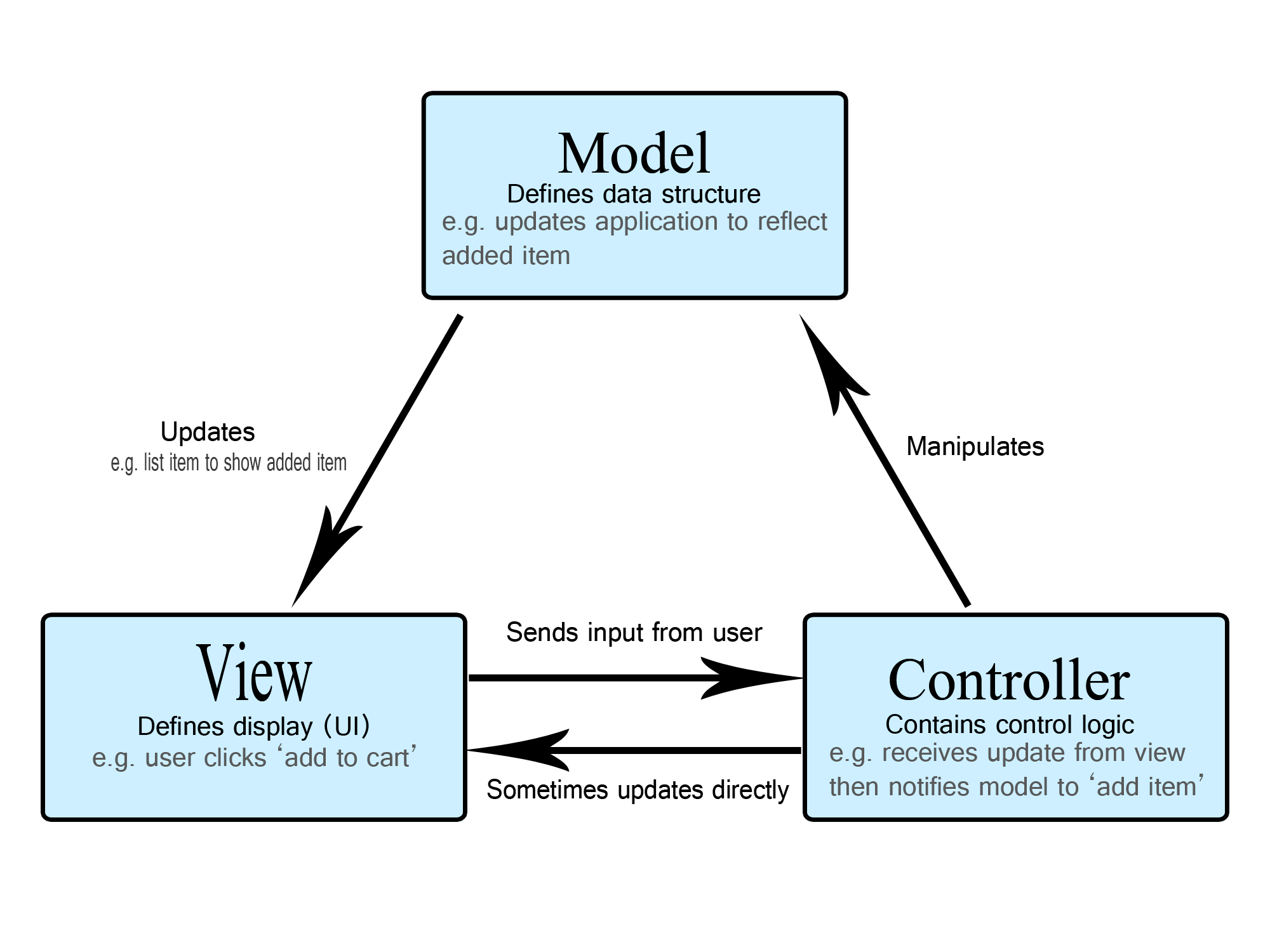
Glimmer DSL for LibUI supports the Observer Design Pattern via control listeners in the View layer (e.g. on_clicked or on_closing) and via the observe(model, attribute_or_key=nil) keyword in the Model layer, which can observe Object models with attributes, Hashes with keys, and Arrays. It automatically enhances objects as needed to support automatically notifying observers of changes via observable#notify_observers(attribute_or_key = nil) method:
ObjectbecomesGlimmer::DataBinding::ObservableModel, which supports observing specifiedObjectmodel attributes.HashbecomesGlimmer::DataBinding::ObservableHash, which supports observing allHashkeys or a specificHashkeyArraybecomesGlimmer::DataBinding::ObservableArray, which supports observingArraychanges like those done withpush,<<,delete, andmap!methods (all mutation methods).
Example:
  observe(person, :name) do |new_name|
    @name_label.text = new_name
  end
That observes a person's name attribute for changes and updates the name label text property accordingly.
See examples of the observe keyword at Color The Circles, Method-Based Custom Keyword, Snake, and Tetris.
Data-Binding
Glimmer DSL for LibUI supports both bidirectional (two-way) data-binding and unidirectional (one-way) data-binding.
Data-binding enables writing very expressive, terse, and declarative code to synchronize View properties with Model attributes without writing many lines or pages of imperative code doing the same thing, increasing productivity immensely.
Data-binding automatically takes advantage of the Observer Pattern behind the scenes and is very well suited to declaring View property data sources piecemeal. On the other hand, explicit use of the Observer Pattern is sometimes more suitable when needing to make multiple View updates upon a single Model attribute change.
Data-binding supports utilizing the MVP (Model View Presenter) flavor of MVC by observing both the View and a Presenter for changes and updating the opposite side upon encountering them. This enables writing more decoupled cleaner code that keeps View code and Model code disentangled and highly maintainable. For example, check out the Snake game presenters for Grid and Cell, which act as proxies for the actual Snake game models Snake and Apple, mediating synchronization of data between them and the Snake View GUI.

Bidirectional (Two-Way) Data-Binding
Glimmer DSL for LibUI supports bidirectional (two-way) data-binding of the following controls/properties via the <=> operator (indicating data is moving in both directions between View and Model):
checkbox:checkedcheck_menu_item:checkedcolor_button:colorcombobox:selected,selected_itemdate_picker:timedate_time_picker:timeeditable_combobox:textentry:textfont_button:fontmultiline_entry:textnon_wrapping_multiline_entry:textradio_buttons:selectedradio_menu_item:checkedsearch_entry:textslider:valuespinbox:valuetable:cell_rows,selectiontablecolumns (e.g.text_column):sort_indicatortime_picker:time
Example of bidirectional data-binding:
entry {
  text <=> [contract, :legal_text]
}
That is data-binding a contract's legal text to an entry text property.
Another example of bidirectional data-binding with an option:
entry {
  text <=> [model, :entered_text, after_write: ->(text) {puts text}]
}
That is data-binding entered_text attribute on model to entry text property and printing text after write to the model.
Table Data-Binding
One note about table cell_rows data-binding is that it works with either:
- Raw data
Array(rows) ofArrays (column cells) (see Form Table example versions 4-5). - Model
Array(rows) of objects having attributes (column cells) matching the underscored names oftablecolumns by convention. Model attribute names can be overridden when needed by passing anArrayenumerating all mapped model attributes in the order oftablecolumns or alternatively aHashmapping only the column names that have model attribute names different from their table column underscored version (see Form Table example versions 1-3). - Raw data
EnumeratororEnumerator::Lazythat generatesArrays (column cells). This option enables rendering a table instantly even if it contained millions of rows, before all its rows have been generated. Rows are gradually generated as the user scrolls through the table. - Model
EnumeratororEnumerator::Lazythat generates objects having attributes (column cells) matching the underscored names oftablecolumns. This option enables rendering a table instantly even if it contained millions of rows, before all its rows have been generated. Rows are gradually generated as the user scrolls through the table (see Lazy Table example).
Example of table implicit data-binding of cell_rows to raw data Array of Arrays (you may copy/paste in girb):
require 'glimmer-dsl-libui'

include Glimmer

data = [
  ['Lisa Sky', 'lisa@sky.com', '720-523-4329', 'Denver', 'CO'],
  ['Jordan Biggins', 'jordan@biggins.com', '617-528-5399', 'Boston', 'MA'],
  ['Mary Glass', 'mary@glass.com', '847-589-8788', 'Elk Grove Village', 'IL'],
  ['Darren McGrath', 'darren@mcgrath.com', '206-539-9283', 'Seattle', 'WA'],
  ['Melody Hanheimer', 'melody@hanheimer.com', '213-493-8274', 'Los Angeles', 'CA'],
]

window('Contacts', 600, 600) {
  table {
    text_column('Name')
    text_column('Email')
    text_column('Phone')
    text_column('City')
    text_column('State')

    cell_rows data
  }
}.show
Example of table explicit data-binding of cell_rows to Model Array (you may copy/paste in girb):
require 'glimmer-dsl-libui'

class SomeTable
  Contact = Struct.new(:name, :email, :phone, :city, :state)

  include Glimmer

  attr_accessor :contacts

  def initialize
    @contacts = [
      Contact.new('Lisa Sky', 'lisa@sky.com', '720-523-4329', 'Denver', 'CO'),
      Contact.new('Jordan Biggins', 'jordan@biggins.com', '617-528-5399', 'Boston', 'MA'),
      Contact.new('Mary Glass', 'mary@glass.com', '847-589-8788', 'Elk Grove Village', 'IL'),
      Contact.new('Darren McGrath', 'darren@mcgrath.com', '206-539-9283', 'Seattle', 'WA'),
      Contact.new('Melody Hanheimer', 'melody@hanheimer.com', '213-493-8274', 'Los Angeles', 'CA'),
    ]
  end

  def launch
    window('Contacts', 600, 200) {
      table {
        text_column('Name')
        text_column('Email')
        text_column('Phone')
        text_column('City')
        text_column('State')

        cell_rows <=> [self, :contacts] # explicit data-binding to self.contacts Model Array, auto-inferring model attribute names from underscored table column names by convention
      }
    }.show
  end
end

SomeTable.new.launch
Example of table explicit data-binding of cell_rows to Model Array with column_attributes Hash mapping for custom column names (you may copy/paste in girb):
require 'glimmer-dsl-libui'

class SomeTable
  Contact = Struct.new(:name, :email, :phone, :city, :state)

  include Glimmer

  attr_accessor :contacts

  def initialize
    @contacts = [
      Contact.new('Lisa Sky', 'lisa@sky.com', '720-523-4329', 'Denver', 'CO'),
      Contact.new('Jordan Biggins', 'jordan@biggins.com', '617-528-5399', 'Boston', 'MA'),
      Contact.new('Mary Glass', 'mary@glass.com', '847-589-8788', 'Elk Grove Village', 'IL'),
      Contact.new('Darren McGrath', 'darren@mcgrath.com', '206-539-9283', 'Seattle', 'WA'),
      Contact.new('Melody Hanheimer', 'melody@hanheimer.com', '213-493-8274', 'Los Angeles', 'CA'),
    ]
  end

  def launch
    window('Contacts', 600, 200) {
      table {
        text_column('Name')
        text_column('Email')
        text_column('Phone')
        text_column('City/Town')
        text_column('State/Province')

        cell_rows <=> [self, :contacts, column_attributes: {'City/Town' => :city, 'State/Province' => :state}]
      }
    }.show
  end
end

SomeTable.new.launch
Example of table explicit data-binding of cell_rows to Model Array with complete column_attributes Array mapping (you may copy/paste in girb):
require 'glimmer-dsl-libui'

class SomeTable
  Contact = Struct.new(:name, :email, :phone, :city, :state)

  include Glimmer

  attr_accessor :contacts

  def initialize
    @contacts = [
      Contact.new('Lisa Sky', 'lisa@sky.com', '720-523-4329', 'Denver', 'CO'),
      Contact.new('Jordan Biggins', 'jordan@biggins.com', '617-528-5399', 'Boston', 'MA'),
      Contact.new('Mary Glass', 'mary@glass.com', '847-589-8788', 'Elk Grove Village', 'IL'),
      Contact.new('Darren McGrath', 'darren@mcgrath.com', '206-539-9283', 'Seattle', 'WA'),
      Contact.new('Melody Hanheimer', 'melody@hanheimer.com', '213-493-8274', 'Los Angeles', 'CA'),
    ]
  end

  def launch
    window('Contacts', 600, 200) {
      table {
        text_column('Full Name')
        text_column('Email Address')
        text_column('Phone Number')
        text_column('City or Town')
        text_column('State or Province')

        cell_rows <=> [self, :contacts, column_attributes: [:name, :email, :phone, :city, :state]]
      }
    }.show
  end
end

SomeTable.new.launch
Unidirectional (One-Way) Data-Binding
Glimmer DSL for LibUI supports unidirectional (one-way) data-binding of any control/shape/attributed-string property via the <= operator (indicating data is moving from the right side, which is the Model, to the left side, which is the GUI View object).
Example of unidirectional data-binding:
square(0, 0, CELL_SIZE) {
  fill <= [@grid.cells[row][column], :color]
}
That is data-binding a grid cell color to a square shape's fill property. That means if the color attribute of the grid cell is updated, the fill property of the square shape is automatically updated accordingly.
Another Example of unidirectional data-binding with an option:
window {
  title <= [@game, :score, on_read: -> (score) {"Glimmer Snake (Score: #{@game.score})"}]
}
That is data-binding the window title property to the score attribute of a @game, but converting on read from the Model to a String.
You can also use unidirectional data-binding with content blocks to generate content dynamically based on changes in a model attribute. The only difference in syntax in this case would be to wrap the content with an explicit content(*binding_args) { ... } block that includes data-binding arguments for a model attribute.
Example:
form {
  stretchy false

  content(@user, :customizable_attributes) {
    @user.customizable_attributes.each do |attribute|
      entry {
        label attribute.to_s.split('_').map(&:capitalize).join(' ')
        text <=> [@user, attribute]
      }
    end
  }
}
The form above will only display fields for a model's customizable attributes, so if they change, the form content will change too. Learn more at the Dynamic Form example.
Data-Binding API
To summarize the data-binding API:
view_property <=> [model, attribute, *read_or_write_options]: Bidirectional (two-way) data-binding to Model attribute accessorview_property <= [model, attribute, *read_only_options]: Unidirectional (one-way) data-binding to Model attribute reader
This is also known as the Glimmer Shine syntax for data-binding, a Glimmer-only unique innovation that takes advantage of Ruby's highly expressive syntax and malleable DSL support.
Data-bound model attribute can be:
- Direct:
Symbolrepresenting attribute reader/writer (e.g.[person, :name]) - Nested:
Stringrepresenting nested attribute path (e.g.[company, 'address.street']). That results in "nested data-binding" - Indexed:
Stringcontaining array attribute index (e.g.[customer, 'addresses[0].street']). That results in "indexed data-binding" - Keyed:
Stringcontaining hash attribute key (e.g.[customer, 'addresses[:main].street']). That results in "keyed data-binding"
Data-binding options include:
before_read {|value| ...}: performs an operation before reading data from Model to update View.on_read {|value| ...}: converts value read from Model to update the View.after_read {|converted_value| ...}: performs an operation after read from Model to update View.before_write {|value| ...}: performs an operation before writing data to Model from View.on_write {|value| ...}: converts value read from View to update the Model.after_write {|converted_value| ...}: performs an operation after writing to Model from View.computed_by attributeorcomputed_by [attribute1, attribute2, ...]: indicates model attribute is computed from specified attribute(s), thus updated when they are updated (see in Login example version 2). That is known as "computed data-binding".
Note that with both on_read and on_write converters, you could pass a Symbol representing the name of a method on the value object to invoke.
Example:
entry {
  text <=> [product, :price, on_read: :to_s, on_write: :to_i]
}
Learn more from data-binding usage in Login (4 data-binding versions), Basic Entry, Form, Form Table (5 data-binding versions), Method-Based Custom Keyword, Snake and Tic Tac Toe examples.
Data-Binding Gotchas
- Never data-bind a control property to an attribute on the same view object with the same exact name (e.g. binding
entrytextproperty toselftextattribute) as it would conflict with it. Instead, data-bind view property to an attribute with a different name on the view object or with the same name, but on a presenter or model object (e.g. data-bindentrytexttoselflegal_textattribute or tocontractmodeltextattribute) - Data-binding a property utilizes the control's listener associated with the property (e.g.
on_changedforentrytext), so although you can add another listener if you want (Glimmer DSL for LibUI will happily add your listener to the list of listeners that will get notified by a certain event), sometimes it is recommended that you add anafter_read: ->(val) {}orafter_write: ->(val) {}block instead to perform something after data-binding reads from or writes to the Model attribute. - Data-binding a View control to another View control directly is not a good practice as it causes tight-coupling. Instead, data-bind both View controls to the same Presenter/Model attribute, and that keeps them in sync while keeping the code decoupled.
API Gotchas
- There is no proper way to destroy
gridchildren due to libui-ng not offering any API for deleting them fromgrid(nogrid_deletesimilar tobox_deleteforhorizontal_boxandvertical_box). textalignproperty seems not to work on the Mac (libui-ng has an issue about it)textstringbackgrounddoes not work on Windows due to an issue in libui.tableprogress_barcolumn on Windows cannot be updated with a positive value if it started initially with-1(it ignores update to avoid crashing due to an issue in libui on Windows.radio_buttonson Linux has an issue where it always selects the first item even if you did not set itsselectedvalue or set it to-1(meaning unselected). It works correctly on Mac and Windows.- It seems that libui does not support nesting multiple
areacontrols under agridas only the first one shows up in that scenario. To workaround that limitation, use avertical_boxwith nestedhorizontal_boxs instead to include multipleareas in a GUI. - Both
multiline_entryandnon_wrapping_multiline_entrydo not seem to play well with being nested in agrid. To get around the problem, I would use a combination ofvertical_boxandhorizontal_boxs instead. - As per the code of examples/basic_transform.rb, Windows requires different ordering of transforms than Mac and Linux.
scrolling_area#scroll_todoes not seem to work on Windows and Linux, but works fine on Mac
Original API
Here are all the lower-level LibUI API methods utilized by Glimmer DSL for LibUI:
alloc_control, append_features, area_begin_user_window_move, area_begin_user_window_resize, area_queue_redraw_all, area_scroll_to, area_set_size, attribute_color, attribute_family, attribute_features, attribute_get_type, attribute_italic, attribute_size, attribute_stretch, attribute_underline, attribute_underline_color, attribute_weight, attributed_string_append_unattributed, attributed_string_byte_index_to_grapheme, attributed_string_delete, attributed_string_for_each_attribute, attributed_string_grapheme_to_byte_index, attributed_string_insert_at_unattributed, attributed_string_len, attributed_string_num_graphemes, attributed_string_set_attribute, attributed_string_string, box_append, box_delete, box_padded, box_set_padded, button_on_clicked, button_set_text, button_text, checkbox_checked, checkbox_on_toggled, checkbox_set_checked, checkbox_set_text, checkbox_text, color_button_color, color_button_on_changed, color_button_set_color, combobox_append, combobox_on_selected, combobox_selected, combobox_set_selected, control_destroy, control_disable, control_enable, control_enabled, control_enabled_to_user, control_handle, control_hide, control_parent, control_set_parent, control_show, control_toplevel, control_verify_set_parent, control_visible, date_time_picker_on_changed, date_time_picker_set_time, date_time_picker_time, draw_clip, draw_fill, draw_free_path, draw_free_text_layout, draw_matrix_invert, draw_matrix_invertible, draw_matrix_multiply, draw_matrix_rotate, draw_matrix_scale, draw_matrix_set_identity, draw_matrix_skew, draw_matrix_transform_point, draw_matrix_transform_size, draw_matrix_translate, draw_new_path, draw_new_text_layout, draw_path_add_rectangle, draw_path_arc_to, draw_path_bezier_to, draw_path_close_figure, draw_path_end, draw_path_line_to, draw_path_new_figure, draw_path_new_figure_with_arc, draw_restore, draw_save, draw_stroke, draw_text, draw_text_layout_extents, draw_transform, editable_combobox_append, editable_combobox_on_changed, editable_combobox_set_text, editable_combobox_text, entry_on_changed, entry_read_only, entry_set_read_only, entry_set_text, entry_text, ffi_lib, ffi_lib=, font_button_font, font_button_on_changed, form_append, form_delete, form_padded, form_set_padded, free_attribute, free_attributed_string, free_control, free_font_button_font, free_image, free_init_error, free_open_type_features, free_table_model, free_table_value, free_text, grid_append, grid_insert_at, grid_padded, grid_set_padded, group_margined, group_set_child, group_set_margined, group_set_title, group_title, image_append, init, label_set_text, label_text, main, main_step, main_steps, menu_append_about_item, menu_append_check_item, menu_append_item, menu_append_preferences_item, menu_append_quit_item, menu_append_separator, menu_item_checked, menu_item_disable, menu_item_enable, menu_item_on_clicked, menu_item_set_checked, msg_box, msg_box_error, multiline_entry_append, multiline_entry_on_changed, multiline_entry_read_only, multiline_entry_set_read_only, multiline_entry_set_text, multiline_entry_text, new_area, new_attributed_string, new_background_attribute, new_button, new_checkbox, new_color_attribute, new_color_button, new_combobox, new_date_picker, new_date_time_picker, new_editable_combobox, new_entry, new_family_attribute, new_features_attribute, new_font_button, new_form, new_grid, new_group, new_horizontal_box, new_horizontal_separator, new_image, new_italic_attribute, new_label, new_menu, new_multiline_entry, new_non_wrapping_multiline_entry, new_open_type_features, new_password_entry, new_progress_bar, new_radio_buttons, new_scrolling_area, new_search_entry, new_size_attribute, new_slider, new_spinbox, new_stretch_attribute, new_tab, new_table, new_table_model, new_table_value_color, new_table_value_image, new_table_value_int, new_table_value_string, new_time_picker, new_underline_attribute, new_underline_color_attribute, new_vertical_box, new_vertical_separator, new_weight_attribute, new_window, on_should_quit, open_file, open_folder, open_type_features_add, open_type_features_clone, open_type_features_for_each, open_type_features_get, open_type_features_remove, progress_bar_set_value, progress_bar_value, queue_main, quit, radio_buttons_append, radio_buttons_on_selected, radio_buttons_selected, radio_buttons_set_selected, save_file, slider_on_changed, slider_set_value, slider_value, spinbox_on_changed, spinbox_set_value, spinbox_value, tab_append, tab_delete, tab_insert_at, tab_margined, tab_num_pages, tab_set_margined, table_append_button_column, table_append_checkbox_column, table_append_checkbox_text_column, table_append_image_column, table_append_image_text_column, table_append_progress_bar_column, table_append_text_column, table_model_row_changed, table_model_row_deleted, table_model_row_inserted, table_value_color, table_value_get_type, table_value_image, table_value_int, table_value_string, timer, uninit, user_bug_cannot_set_parent_on_toplevel, window_borderless, window_content_size, window_focused, window_fullscreen, window_margined, window_on_closing, window_on_content_size_changed, window_on_focus_changed, window_set_borderless, window_set_child, window_set_content_size, window_set_fullscreen, window_set_margined, window_set_title, window_title
To learn more about the LibUI API exposed through Glimmer DSL for LibUI:
- Check out LibUI ffi.rb
- Check out the libui C Headers
- Check out the Go UI (Golang LibUI) API Documentation for an alternative well-documented libui reference.
Packaging
If you are building a productivity tool to help with your work, then packaging the app as a Ruby gem would be a good enough solution (already supported via Application Scaffolding). Otherwise, I am documenting options for native executable packaging, which I have not tried myself, but figured they would still be useful to add to the README.md until I can expand further effort into supporting packaging.
For Windows, OCRAN can build Windows executables from Ruby source code. It is a new maintained alternative version of OCRA (One-Click Ruby Application).
For Mac, you can consider Platypus (builds a native Mac app from a Ruby script) by following the tutorial "Create a MacOS desktop application with pure Ruby" by Joseph Schito.
For Linux, simply package your app as a Ruby Gem and build rpm package from Ruby Gem or build deb package from Ruby Gem.
Also, there is a promising project called ruby-packer that supports all platforms.
One more thing to note is that Ruby recently supported WASM, including the ability to package a Ruby application as a WASI application. You can explore combining that with wasm2native to produce cross-platform native executables.
Otherwise, if you really need comprehensive cross-platform native executable packaging support, consider using Glimmer DSL for SWT, which does offer cross-platform packaging support for apps as MSI/EXE on Windows, APP/DMG/PKG on Mac, and DEB/RPM on Linux out of the box.
Glimmer Style Guide
The code of the Glimmer GUI DSL is not standard imperative Ruby code because it represents a declarative Domain Specific Language for describing the hierarchical structure of a Graphical User Interface, meaning a language embedded within Ruby that is slightly separate from Ruby. So, it is important that it has a declarative style that helps Software Engineers focus on the visual aspect of the Graphical User Interface in a highly productive manner. As such, multi-line blocks intentionally do not use imperative words like do; end that slow readability down, yet the declarative {} style that helps give a quick visual view of GUI component nesting at a glance. However, MVC Views are observed for changes by listeners that then invoke imperative logic in Models, so listener multi-line blocks do have the do; end style to clearly distinguish imperative code from declarative code in Views. In summary, the Ruby Style Guide is not applicable when writing Glimmer GUI DSL code. Software Engineers must adhere to the Glimmer Style Guide for View code instead to cater to the style requirements of both declarative DSL code and imperative Ruby code.
1 - Control arguments are always wrapped by parentheses.
Example:
label('Name')2 - Control blocks are always declared with curly braces to clearly visualize hierarchical view code and separate from logic code.
Example:
  group('Basic Controls') {
    vertical_box {
      button('Button') {
      }
    }
  }
3 - Control property declarations always have arguments that are not wrapped inside parentheses and typically do not take a block.
Example:
  stretchy false
  value 42
4 - Control listeners are always declared starting with on_ prefix and affixing listener event method name afterwards in underscored lowercase form. Their multi-line blocks have a do; end style.
Example:
  button('Click') {
    on_clicked do
      msg_box('Information', 'You clicked the button')
    end
  }
5 - Iterator multi-line blocks always have do; end style to clearly separate logic code from view code.
Example:
  @field_hash.keys.each do |field|
    label(field) {
      stretchy false
    }

    entry {
      on_changed do |control|
        @field_hash[field] = control.text
      end
    }
  end
6 - In a widget's content block, attributes are declared first, with layout management attributes on top (e.g. stretchy false); an empty line separates attributes from nested widgets and listeners following afterwards.
Example:
  group('Numbers') {
    stretchy false

    vertical_box {
      spinbox(0, 100) {
        stretchy false
        value 42

        on_changed do |s|
          puts "New Spinbox value: #{s.value}"
          $stdout.flush # for Windows
        end
      }
    }
  }
7 - Unlike attributes, nested widgets with a content block and listeners are always separated from each other by an empty line to make readability easier except where it helps to group two widgets together (e.g. label and described entry).
Example:
  area {
    path { # needs an empty line afterwards
      square(0, 0, 100) # does not have a content block, so no empty line is needed
      square(100, 100, 400) # does not have a content block, so no empty line is needed

      fill r: 102, g: 102, b: 204
    }

    path { # needs an empty line afterwards
      rectangle(0, 100, 100, 400) # does not have a content block, so no empty line is needed
      rectangle(100, 0, 400, 100) # does not have a content block, so no empty line is needed

      fill x0: 10, y0: 10, x1: 350, y1: 350, stops: [{pos: 0.25, r: 204, g: 102, b: 204}, {pos: 0.75, r: 102, g: 102, b: 204}]
    }

    polygon(100, 100, 100, 400, 400, 100, 400, 400) { # needs an empty line afterwards
      fill r: 202, g: 102, b: 104, a: 0.5 # attributes do not need an empty line separator
      stroke r: 0, g: 0, b: 0 # attributes do not need an empty line separator
    }

    on_mouse_up do |area_mouse_event| # needs an empty line afterwards
      puts 'mouse up'
    end

    on_key_up do |area_key_event| # needs an empty line afterwards
      puts 'key up'
    end
  }
Examples
The following basic and advanced examples include reimplementions of the examples in the LibUI project utilizing the Glimmer GUI DSL (with and without data-binding) as well as brand new examples.
To browse all examples, simply launch the Meta-Example, which lists all examples and displays each example's code when selected. It also enables code editing to facilitate experimentation and learning.
Run with this command from the root of the project if you cloned the project:
ruby -r './lib/glimmer-dsl-libui' examples/meta_example.rbRun with this command if you installed the Ruby gem:
ruby -r glimmer-dsl-libui -e "require 'examples/meta_example'"| Mac | Windows | Linux |
|---|---|---|
|
|
|
New Glimmer DSL for LibUI Version:
require 'glimmer-dsl-libui'
require 'facets'
require 'fileutils'

class MetaExample
  include Glimmer

  ADDITIONAL_BASIC_EXAMPLES = ['Color Button', 'Font Button', 'Form', 'Date Time Picker', 'Simple Notepad']

  attr_accessor :code_text

  def initialize
    @selected_example_index = examples_with_versions.index(basic_examples_with_versions.first)
    @code_text = File.read(file_path_for(selected_example))
  end

  def examples
    if @examples.nil?
      example_files = Dir.glob(File.join(File.expand_path('.', __dir__), '*.rb'))
      example_file_names = example_files.map { |f| File.basename(f, '.rb') }
      example_file_names = example_file_names.reject { |f| f == 'meta_example' || f.match(/\d$/) }
      @examples = example_file_names.map { |f| f.underscore.titlecase }
    end
    @examples
  end

  def examples_with_versions
    examples.map do |example|
      version_count_for(example) > 1 ? "#{example} (#{version_count_for(example)} versions)" : example
    end
  end

  def basic_examples_with_versions
    examples_with_versions.select {|example| example.start_with?('Basic') || ADDITIONAL_BASIC_EXAMPLES.include?(example) }
  end

  def advanced_examples_with_versions
    examples_with_versions - basic_examples_with_versions
  end

  def file_path_for(example)
    File.join(File.expand_path('.', __dir__), "#{example.underscore}.rb")
  end

  def version_count_for(example)
    Dir.glob(File.join(File.expand_path('.', __dir__), "#{example.underscore}*.rb")).select {|file| file.match(/#{example.underscore}\d\.rb$/)}.count + 1
  end

  def glimmer_dsl_libui_file
    File.expand_path('../lib/glimmer-dsl-libui', __dir__)
  end

  def selected_example
    examples[@selected_example_index]
  end

  def run_example(example)
    Thread.new do
      command = "#{RbConfig.ruby} -r #{glimmer_dsl_libui_file} #{example} 2>&1"
      result = ''
      IO.popen(command) do |f|
        sleep(0.0001) # yield to main thread
        f.each_line do |line|
          result << line
          puts line
          $stdout.flush # for Windows
          sleep(0.0001) # yield to main thread
        end
      end
      Glimmer::LibUI.queue_main { msg_box('Error Running Example', result) } if result.downcase.include?('error')
    end
  end

  def launch
    window('Meta-Example', 700, 500) {
      margined true

      horizontal_box {
        vertical_box {
          stretchy false

          tab {
            stretchy false

            tab_item('Basic') {
              vertical_box {
                @basic_example_radio_buttons = radio_buttons {
                  stretchy false
                  items basic_examples_with_versions
                  selected basic_examples_with_versions.index(examples_with_versions[@selected_example_index])

                  on_selected do
                    @selected_example_index = examples_with_versions.index(basic_examples_with_versions[@basic_example_radio_buttons.selected])
                    example = selected_example
                    self.code_text = File.read(file_path_for(example))
                    @version_spinbox.value = 1
                  end
                }

                label # filler
                label # filler
              }
            }

            tab_item('Advanced') {
              vertical_box {
                @advanced_example_radio_buttons = radio_buttons {
                  stretchy false
                  items advanced_examples_with_versions

                  on_selected do
                    @selected_example_index = examples_with_versions.index(advanced_examples_with_versions[@advanced_example_radio_buttons.selected])
                    example = selected_example
                    self.code_text = File.read(file_path_for(example))
                    @version_spinbox.value = 1
                  end
                }

                label # filler
                label # filler
              }
            }
          }

          horizontal_box {
            label('Version') {
              stretchy false
            }

            @version_spinbox = spinbox(1, 100) {
              value 1

              on_changed do
                example = selected_example
                if @version_spinbox.value > version_count_for(example)
                  @version_spinbox.value -= 1
                else
                  version_number = @version_spinbox.value == 1 ? '' : @version_spinbox.value
                  example = "#{selected_example}#{version_number}"
                  self.code_text = File.read(file_path_for(example))
                end
              end
            }
          }

          horizontal_box {
            stretchy false

            button('Launch') {
              on_clicked do
                begin
                  parent_dir = File.join(Dir.home, '.glimmer-dsl-libui', 'examples')
                  FileUtils.mkdir_p(parent_dir)
                  example_file = File.join(parent_dir, "#{selected_example.underscore}.rb")
                  File.write(example_file, code_text)
                  example_supporting_directory = File.expand_path(selected_example.underscore, __dir__)
                  FileUtils.cp_r(example_supporting_directory, parent_dir) if Dir.exist?(example_supporting_directory)
                  FileUtils.cp_r(File.expand_path('../icons', __dir__), File.dirname(parent_dir))
                  FileUtils.cp_r(File.expand_path('../sounds', __dir__), File.dirname(parent_dir))
                  run_example(example_file)
                rescue => e
                  puts e.full_message
                  puts 'Unable to write code changes! Running original example...'
                  run_example(file_path_for(selected_example))
                end
              end
            }
            button('Reset') {
              on_clicked do
                self.code_text = File.read(file_path_for(selected_example))
              end
            }
          }
        }

        @code_entry = non_wrapping_multiline_entry {
          text <=> [self, :code_text]
        }
      }
    }.show
  end
end

MetaExample.new.launch
Basic Examples
docs/examples/GLIMMER-DSL-LIBUI-BASIC-EXAMPLES.md
| Mac | Windows | Linux |
|---|---|---|
|
|
|
Advanced Examples
docs/examples/GLIMMER-DSL-LIBUI-ADVANCED-EXAMPLES.md
| Mac | Windows | Linux |
|---|---|---|
|
|
|
Libraries
Graphs and Charts
This is a Ruby gem that aims at providing support for graphs and charts (custom controls) in Glimmer DSL for LibUI.
https://github.com/AndyObtiva/glimmer-libui-cc-graphs_and_charts

Applications
Here are some applications built with Glimmer DSL for LibUI
Manga2PDF
Download and merge manga images into a single pdf file.
https://github.com/PinGunter/manga2pdf
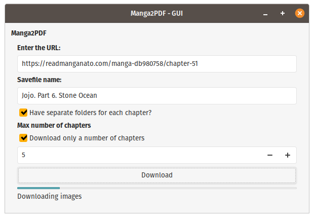
Befunge98 GUI
Ruby implementation of the Befunge-98 programmming language.
https://github.com/AndyObtiva/befunge98/tree/gui
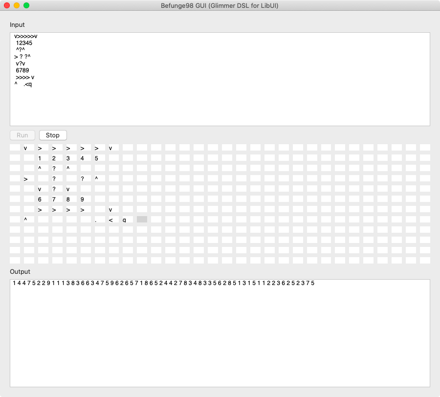
i3off Gtk Ruby
https://github.com/iraamaro/i3off-gtk-ruby
Chess
https://github.com/mikeweber/chess
RubyCrumbler
NLP (Natural Language Processing) App
https://github.com/joh-ga/RubyCrumbler

Rubio-Radio
https://github.com/kojix2/rubio-radio
PMV Calc
https://github.com/bzanchet/pmv-calc
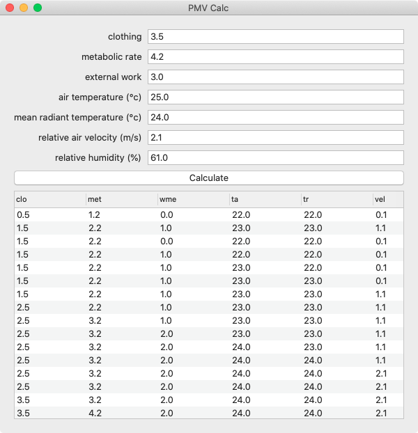
Suika Box
https://github.com/kojix2/suikabox
HTS Grid
https://github.com/kojix2/htsgrid
Electric Avenue
This is built as an exploratory software prototype by Ari Brown (closed source software).

Adamantite
A local password manager written in Ruby:
https://rubygems.org/gems/adamantite

Ruby Go
A simple app for playing Go games with a friend, built by Tim Standen.
https://github.com/timbot1789/rubygo
Kuiq - Sidekiq UI
The Sidekiq dashboard as a desktop application.
https://github.com/mperham/kuiq
Design Principles
- The Ruby Way (including TIMTOWTDI: There Is More Than One Way To Do It)
- Requiring the least amount of syntax possible to build GUI (Graphical User Interface)
- Declarative syntax that visually maps to the GUI control hierarchy
- Ability to mix declarative and imperative code conveniently without needing awkward & verbose technologies (e.g. no XML, HTML, ERB scriptlets, JSX)
- Computers serve Software Engineers (not Software Engineers serve Computers)
- Think only about real world concepts directly relevant to the GUI and interacting with it (no weird non-real-world irrelevant concepts like hooks/effects/immutability)
- The Rails Way Convention over Configuration via smart defaults and automation of low-level details
- Modular Software Design (e.g. support for Components)
- No premature optimizations
Glimmer Process
Resources
- Code Master Blog
- LibUI Ruby Bindings
- libui C Library
- libui-ng C Library (Newer Maintained Fork)
- Go UI (Golang LibUI) API Documentation
Help
Issues
If you encounter issues that are not reported, discover missing features that are not mentioned in TODO.md, or think up better ways to use libui-ng than what is possible with Glimmer DSL for LibUI, you may submit an issue or pull request on GitHub. In the meantime, you may try older gem versions of Glimmer DSL for LibUI till you find one that works.
Chat
If you need live help, try to
Planned Features and Feature Suggestions
These features have been planned or suggested. You might see them in a future version of Glimmer DSL for LibUI. You are welcome to contribute more feature suggestions.
Change Log
Contributing
If you would like to contribute to the project, please adhere to the Open-Source Etiquette to ensure the best results.
- Check out the latest master to make sure the feature hasn't been implemented or the bug hasn't been fixed yet.
- Check out the issue tracker to make sure someone already hasn't requested it and/or contributed it.
- Fork the project.
- Start a feature/bugfix branch.
- Commit and push until you are happy with your contribution.
- Make sure to add tests for it. This is important so I don't break it in a future version unintentionally.
- Please try not to mess with the Rakefile, version, or history. If you want to have your own version, or is otherwise necessary, that is fine, but please isolate to its own commit so I can cherry-pick around it.
Note that the latest development sometimes takes place in the development branch (usually deleted once merged back to master).
Contributors
- Andy Maleh (Founder)
Click here to view contributor commits.
License
Copyright (c) 2021-2024 Andy Maleh
--
Built for Glimmer (DSL Framework).