node-red-contrib-ui-uplot-charts
Chart UI node utilizing the uPlot.js library.
This node-red dashboard node is completely customizable inside the editor.
This is a beta version. Some Features are missing and will be released soon. Some things might be unfinished or buggy. Feedback is appreciated!
* features / options are marked as work in progress
** features / options are marked as planned and not implemented jet
What started as a proof of concept went bigger than I planned. So any help here would be highly appreciated.
First I planned to use dygraphs but later recognized that the development stalled many years ago. After some research I found out that some contributors went on and developed uPlot.
Why another dashboard chart node?
The dashboard is dead, long lives the dashboard!
The goal is to develop a dashboard chart node somewhere between the default chart node and something like grafana. More features than the default chart node without the need of a database and external charting solution. At the same time the node should be configurable via the config ui instead difficult ui_control messages or template nodes in order to hold the "low code" idea up.
- "good" performance on high(er) update frequencies and bigger data bases
- customizable via the config ui dialog
- individual properties of every series (line and fill styles, interpolations, scales)
- stable and individual configuration of data series with topic detection
- multiple adjustable scales and axes in order to compare series with different units over time
- customizable dynamic labels on time axes (X) depending on visible period
- Zoom and pan features (mouse & touch)
- customizable persistent chart data
- data reduction of historic data
- plugin like features like fixed zoom level, tooltips, row highlight, low/high bands, ...
known issues
- there is an bug in the typedInput widgets until Node-Red Version 2.1.2 - please update.
- "wheel zoom" does not work well together with "keep zoom and pan"
- "single use" Plugins can be used more than once with unpredictable results.
- title and legend sizes currently not calculated automatically sometimes resulting in scroll bars (to avoid this increase the height values)
- "legend as tooltip" cannot escape the widget rect resulting in scroll bars. (same as chart node - any ideas?)
- changing the data context or storage results in loss of all previous data.
- new scales are not available in existing series. Reopen config as a workaround
- forward values sometimes have a glitch after deploy forwarding the wrong state.
- limit time does not update chart
- [X] reorder of series seams not to work as planned (fixed - to be tested)
Features planned for the future (in no particular order):
- [ ] refactoring of the data storage for optimal data use and reduced file access (SD card users be warned!)
- [ ] regular data backups
- [ ] transfer data to new storage if context or store changed
- [ ] more input formats like objects or csv data
- [ ] support of non time based charts
- [ ] support of callback functions where suitable (i.e. legend formatting)
- [ ] non UI configuration via
msg.ui_control - [ ] control of the chart via commands (i.e. refresh or delete chart, set zoom levels ...)
- [ ] modal popup to get a bigger picture
- [ ] dropdown burger menu for client controls
- [ ] more zoom & pan features
- [ ] path
sizeand pathalignto be configurable - [ ] average / rolling average and perhaps other statistical functions
- [ ] Editor help screen with essential information and / or tooltips
- [ ] Forwarding values following the trend (any Ideas?)
For latest Updates see the change log in the end of this document.
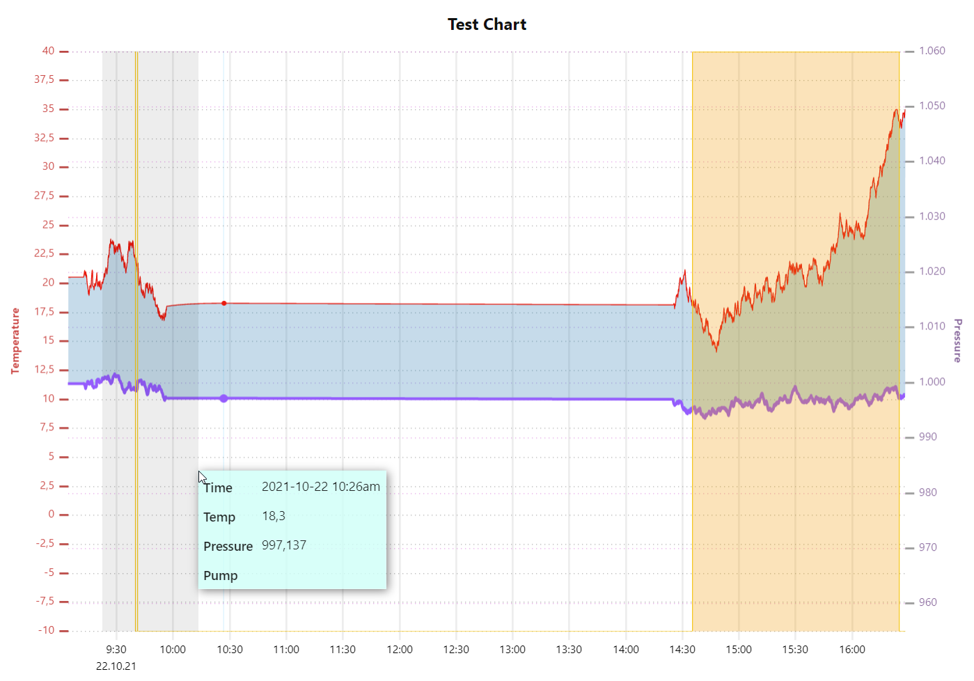
screenshots
Install
Please note: Node 14.x LTS is recommended (and necessary)
currently install the node from github:
npm i Christian-Me/node-red-contrib-ui-uplot-chartsAs soon the node proves itself to be "suitable for all audiences":
Either use the Editor - Menu - Manage Palette - Install option, or run the following command in your Node-RED user directory (typically ~/.node-red) after installing Node-RED-dashboard.
npm i node-red-contrib-ui-uplot-chartsExamples
Examples can be imported via import/examples in the top right menu of the editor
demo(simple demo with artificial data)speedTest(uPlot vs. chart node test setup)reduceData(data maintenance test setup - Data reduction after 5 and 10 seconds, clean every minute)noConfig(test behavior usage without any config. Should act similar to the default chart node)
Inputs
: payload (number) : value to add to the chart
: topic (string) : to this node to add a point to the chart
: timestamp (string) : in epoc time (ms) to specify a custom
timestamp (historic data will be sorted into the chart)
: enable (bool): false to disable the widget.
Outputs
none
Configuration
General
| property | type | description |
|---|---|---|
| size | auto or size of the widget in units | |
| label | sting | text to show on top of the chart |
| title | pixel | vertical space to reserve for the title (will be replaced by a automatic calculation) |
| legend | pixel | vertical space to reserve for the legend (will be replaced by a automatic calculation) |
| console.log | boolean | enable console logs by node on the backend (server) or frontend (browser) |
Series
Data series are defined here. They will be auto added and configured as soon as a new mgs.topic arrives but can be edited or pre defined.
| Default Properties for Series can be defined. | property | type | description |
|---|---|---|---|
| default colors | array | of colors to be used for each new series | |
| default fills | array | of 32bit colors (with alpha) for fills. Set alpha to 00 if no fill is desired. |
Data series can be sorted to have control over the draw order and appearance in the legend*
| property | type | description |
|---|---|---|
| topic | string | unique identifier for that data series. Will be read only as soon as first datapoint with that topic arrived. |
| label | string | label to be shown in the legend or tooltip |
| scale | select | scale as defined in scales (can be left empty) |
| stroke | color | color and alpha value for the line |
| width | pixel | thickness of the chart line |
| pattern | array | dash pattern as described here |
| path | select | path type: linear, points, spline, step before, step after or bars |
| fill | color | color and alpha value to fill the area between the curve and 0 |
| span gaps | bool | span points over null values |
| show | bool | show graph on startup |
| forward* | bool | forward last known value as current value* |
Axes
The X-axes is defined by an JSON object. Two pre defined configuration can be loaded (24h and 12h). More information on how to configure the JSON can be found here. sorry a UI for this would be quite challenging **Loading predefined JSONs will overwrite your customization!
Y axes can be defined:
Order of the axes only for visual convenience.
| property | type | description |
|---|---|---|
| label | string | Label text to be displayed |
| scale | select | scale as defined in scales (can be left empty) |
| label | color | color and alpha value of the label |
| side | select | side to place the axes left, right, bottom*, top* |
| grid | color | color and alpha value for the line |
| grid width | pixel | thickness of the grid line |
| grid pattern | array | dash pattern as described here |
| grid show | bool | show grid |
| tick | color | color and alpha value for the sick line |
| tick width | pixel | thickness of the tick line |
| tick pattern | array | dash pattern as described here |
| tick show | bool | show tick lines |
Scales
Scales can be defined individually and used for data series and axes.
Order of the scales only for visual convenience.
| property | type | description |
|---|---|---|
| id | string | id of the scale. Should not be changed as soon as a scale is used |
| label | string | Label text to be displayed |
| auto | bool | auto scale depending of the received data |
| min | number | lower border |
| max | number | top border |
Plugins
uPlot-charts functionality can be expanded via "plugins". All plugins can be disabled without losing the configuration. Order of the plugins only for visual convenience.
| plugin | property | type | description |
|---|---|---|---|
| bands | Fill the area between the lower and higher band. | ||
| low | series | topic of the lower curve | |
| high | series | topic of the higher curve | |
| fill | color | color and alpha value | |
| keep pan and zoom | keep the zoom scale and position even if new data arrives | ||
| pan | bool | select to pan with new data | |
| default | period | default zoom level on initialization | |
| wheel pan and zoom | zoom and pan with you mouse wheel and middle button (may not work as expected when combined with touch zoom) | ||
| factor | number | scale factor for wheel turns (?) | |
| touch zoom | finger zoom and pitch. | ||
| no options | |||
| highlight columns | highlight the column where the mouse sits | ||
| fill | color | color and alpha value | |
| legend as tooltip | Show the legend as tooltip | ||
| text | color | color and alpha value | |
| background | color | color and alpha value | |
Data
uPlot-charts database is a table (array of arrays [[]]). The database can be stored in node-, flow- or global-context. The data store can be selected. For flow and global context a unique name can be provided.
- 'file system' store data is written to file only at a gracefully shutdown. A crash will result in a loss of data since last Node-Red start.*
- For data maintenance different plugins can be applied.
- Order of the data plugins only for visual convenience.
- General Internal order of execution (if not triggered by timers or messages)
- limit total time period
- reduce data by intervals (beginning at the oldest)
- clean table (delete unused columns)
- limit amount of columns
| plugin | property | type | description |
|---|---|---|---|
| time period | Limit the time stored time period | ||
| last | period | time period to keep. Older values will be deleted | |
| run | period | interval to run the reduction process (in messages or time) | |
| client | period | interval on client side. (0 = check only on incoming data) | |
| max number of columns | Limit the total number of columns | ||
| columns | number | Number of columns to keep | |
| run | period | interval to run the reduction process (in messages or time) | |
| client | period | interval on client side. (0 = check only on incoming data) | |
| reduce old data | Reduce historic data by summing up periods of time. This rules will run at startup and in an time interval same as the period. All reduction rules will be sorted by time and applied from the oldest to the most recent limit | ||
| older than | period | apply rule on data older than this period before current time | |
| period | period | time period to sum up the data | |
| apply to | select | rows to apply this rule (all series or individual selected) | |
| method | select | sum up method: average, minimum, maximum or sum | |
| result | select | position to place the result: begin, end, mid column or mid timestamp of period. Mid time will result in a new column | |
| time precision** | combine data rows if they fall into a reduced precise period. uPlot works by default in seconds but fractional seconds are possible. | ||
| precision | period | period of time to combine the data into a single column | |
| clean table | data reduction can result in empty columns. Clean will delete these. This process is due to the nature of sparse arrays quite time consuming. Clean will always be applied on startup | ||
| period | period | period to run the clean process | |
Behind the scenes
data storage
uPlot-charts use a own library (timeTable) for handling data on the front and backend with a single codebase
To avoid bottlenecks the data is written to file (if configured) currently only at a gracefully shutdown as csv. A crash will result in a loss of data since last Node-Red start.
uPlot-charts use sparse arrays for data storage in order to achieve efficient memory use and performance. It is expected that data arrives with individual time stamps. This results in a new column for every data point. If multiple rows are present in a chart all the other rows would be a undefined value and add to the data consumption if dense arrays where used.
The fasted way to "clean" sparse arrays (get rid of empty columns) as I found out is cloning all data to a new array instead shifting all data "over" the holes.
As JSON can't handle holes in arrays (sparse arrays). uPlot-charts uses more efficient CSV format for server client transfers and data storage.
plugins
uplot supports a kind of plugins to expand its capabilities.
uplot-charts can include these (currently) with some minor changes in the code base only to provide the UI for config data and the initialization on the frontend.
Plugins are loaded to the dashboard "when used only" as modules.
Changelog
0.0.7
- default series can be defined
- default scale can be defined
- default axes can be defined
0.0.6
defaultColorscan be edited (to be tested)0.0.4 & 0.0.5
- fix if no
contextStorageis defined insettings.js0.0.3
- several bugfixes
0.0.2
- several bugfixes
0.0.1
- initial alpha release