Lingallery
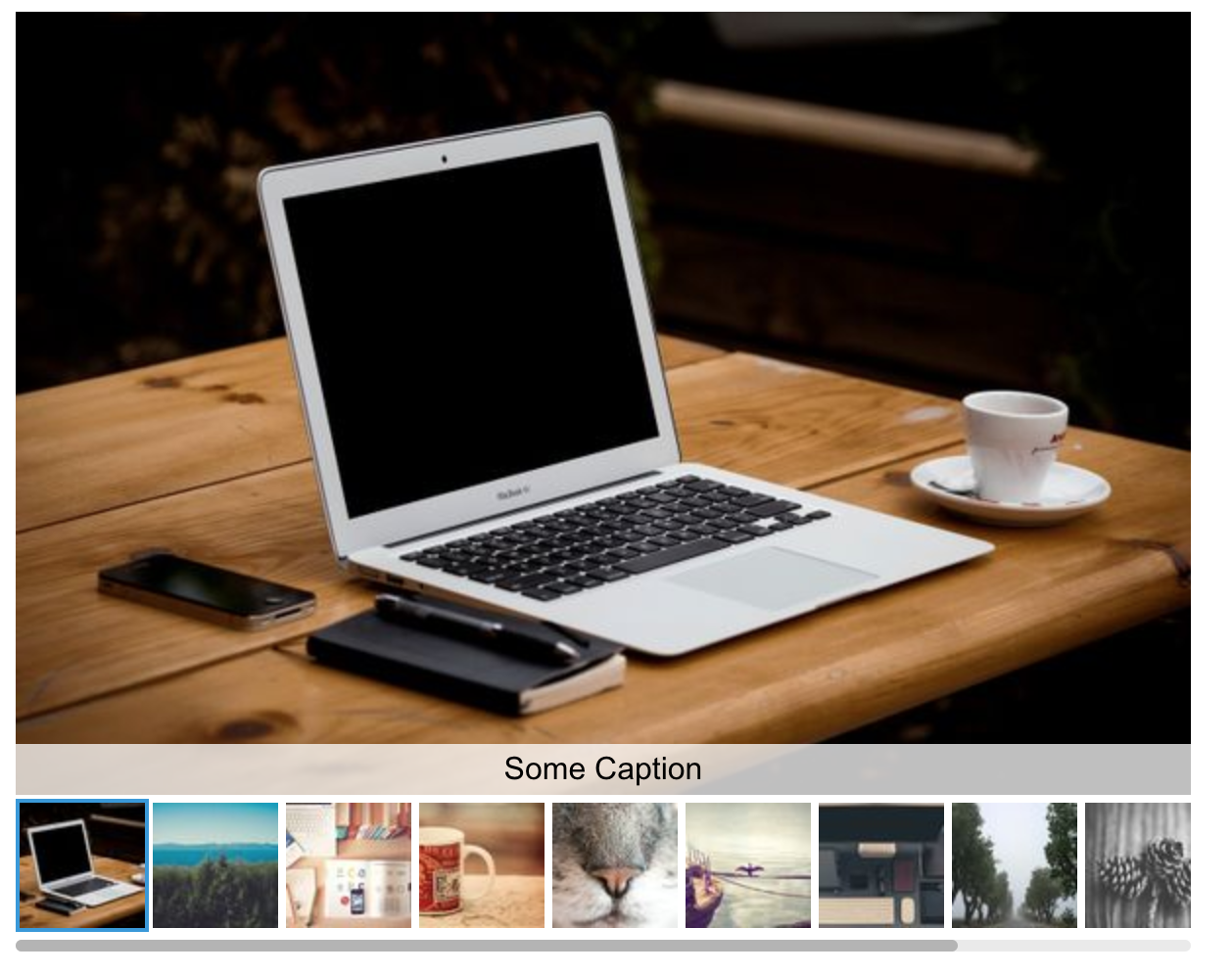
Lingallery is a simple image gallery component for Vue.js. It displays a large image with thumbnails below as you can see in the demo. You can define several settings to adapt the gallery to your needs.
Since Lingallery is at an early development state be carefull when using it in a production project.
Demo

Check out the live demo here: https://lingulo.com/snippet-content/lingallery/
Install
npm i lingalleryUsage
Here are some examples of how to use Lingallery in a .vue file component or inline.
Inline usage
You can use it inline:
<lingallery :iid.sync="currentId" :width="600" :height="400" :items="[
    {id:'someid1', src: 'https://picsum.photos/600/400/?image=0', thumbnail: 'https://picsum.photos/64/64/?image=0', alt: 'Some alt text', caption: 'Some Caption'},
    {id:'someid2', src: 'https://picsum.photos/600/400/?image=10', thumbnail: 'https://picsum.photos/64/64/?image=10', alt: 'Another alt text', caption: 'Another Caption'},
    {id:'someid3', src: 'https://picsum.photos/400/600/?image=20', thumbnail: 'https://picsum.photos/64/64/?image=20'}
]"/>
Remember to register the component:
import Lingallery from 'lingallery';
Vue.component('lingallery', Lingallery);

new Vue({
  el: '#app'
})
Usage in another component
Create a component Example.vue and add this:
<template>
  <lingallery :iid.sync="currentId" :width="width" :height="height" :items="items"/>
</template>
<script>
  import Lingallery from 'lingallery';
  export default {
    data() {
      return {
        width: 600,
        height: 400,
        items: [{
          src: 'https://picsum.photos/600/400/?image=0',
          thumbnail: 'https://picsum.photos/64/64/?image=0',
          caption: 'Some Caption',
          id: 'someid1'
        },
        {
          src: 'https://picsum.photos/600/400/?image=10',
          thumbnail: 'https://picsum.photos/64/64/?image=10'
        },
        currentId: null
      ]};
    },
    components: {
      Lingallery
    }
  }
</script>
Usage with Nuxt.js
Since Lingallery uses features that are available only in the browser make sure to start rendering the component in a hook that is not running on the server like mounted () or to add Lingallery as a plugin with disabled SSR:
plugins: {
  { src: '~/plugins/lingallery', ssr: false }
}
Lingallery options
You can pass some props to adapt the behavior and looks of Lingallery.
| Prop | Description | Default | Type |
|---|---|---|---|
width |
Specifies the width of the main image area in pixels. | 600 | Number |
height |
Specifies the height of the main image area in pixels. | 400 | Number |
responsive |
Defines whether the image gallery should take up all available width space. | false | Boolean |
startImage |
Sets the index of the image the gallery should start with. | 0 | Number |
baseColor |
Defines the base color (at the moment only for the thumbnail border color) | #fff | String |
accentColor |
Defines the accent color (at the moment only for the spinner and the active thumbnail border) | #3498db | String |
textColor |
Defines the text color of the caption. | #000 | String |
showThumbnails |
Defines whether thumbnails should be displayed. | true | Boolean |
showControls |
Defines whether left / right controls should be displayed. | true | Boolean |
mobileHeight |
If set to a number larger than 0 the image height will not exceed that value on mobile devices | 0 | Number |
mobileHeightBreakpoint |
If mobileHeight is defined this prop sets the breakpoint below which the image height will not exceed the mobileHeight value | 0 | Number |
leftControlClass |
If defined adds a class to the left control button to enable custom icons | '' | String |
rightControlClass |
If defined adds a class to the right control button to enable custom icons | '' | String |
disableImageClick |
If set to true a click on the large image will not show the next image | false | Boolean |
squareModeDektop |
If set to true the large image will always be displayed in square format on desktop devices | false | Boolean |
Lingallery addons
I am planning on creating several additional features. Since I try to keep the basic plugin as small as possible those addons will not be part of Lingallery by default. To enable an addon you explicitly have to pass an object prop "addons" to Lingallery containing all the addons you would like to activate as well as their options.
Here is a list of currently existing addons:
Large View
By passing the prop enableLargeView you can enable the large view feature. When clicking on the large main image a modal will open up with the image displaying in full size.
<lingallery :addons="{ enableLargeView: true }" ... />If you want to show a different image (maybe a larger version) in the modal you can add the property largeViewSrc into the items prop.
<lingallery :addons="{ enableLargeView: true }" :items="[{ src: 'image1.jpg', largeViewSrc: 'image1_large.jpg' }]" ... />Picture Element
Sometimes you might want to display different images depending on the user's screen size. Responsive images in Lingallery are possible with this addon. You can specify both a type and a media attribute. Be sure to enable the addon by setting enablePictureElement: true in the addons object.
<lingallery
  :addons="{ enablePictureElement: true }"
  :items="[
    {
      src: 'image1.jpg',
      pictureElement: [
        {
          srcset: 'image1_large.jpg',
          media: '(min-width: 600px)',
          type: 'image/jpg'
        },
        {
          srcset: 'image1_large.webp',
          media: '(min-width: 600px)',
          type: 'image/webp'
        },
        {
          srcset: 'image1_huge.jpg',
          media: '(min-width: 1200px)'
        }
      ]
    }
  ]"
  ...
/>

