paper-datatable
A material design implementation of a data table. Let's call this a pretty solid beta.
Features
-
Custom
<template>'ing of every cell.<paper-datatable-column header="Page" property="page"> <template> <span>{{value}}</span> </template> </paper-datatable-column> -
Two way binding directly into the
paper-datatable<paper-datatable-column header="Page" property="page"> <template> <paper-input value="{{value}}"> </template> </paper-datatable-column> -
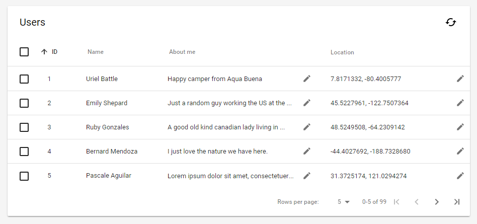
Extremely simple to set up (simple demo)
-
Pretty good styling support (demo)
-
Pagination and external data sources (demo)
-
Supporting both inline editing and in Material Design dialogs.
-
Add new items on the fly (unpolished demo) -
Delightful details in sorting and partial selections. If you have ideas for more: let me know.
-
Usable on mobile. Only tested on Chrome for Android, and it's not great, but it doesn't overflow or overlap anything.
Installation
The element can be installed using bower using
bower install --save paper-datatableImportant: If you wish to use <paper-datatable-card> you need the paper elements listed in devDependencies as well. They are not listed as normal dependencies to prevent them from being pulled in on production if you do not need them.
Usage
Check out the getting started guide.
License
This program is free software: you can redistribute it and/or modify it under the terms of the GNU General Public License version 3 of the License as published by the Free Software Foundation.
This program is distributed in the hope that it will be useful, but WITHOUT ANY WARRANTY; without even the implied warranty of MERCHANTABILITY or FITNESS FOR A PARTICULAR PURPOSE. See the GNU General Public License for more details.
This project uses a fair share license construction, if you wish to use this project commercially you will likely want to continue reading here. If you wish to donate please contact me personally.
Contributing
I absolutely HATE rejecting pull requests, so let me just outline some advice:
- If you are planning on doing anything except a quick fix, it's a wise idea to open an issue first with your plans. That way we can talk it through and check whether it might not already be easily possible and whether it fits with the spirit of the component (I try to keep everything pretty declarative, generic and Polymer-y).
- You absolutely must make every feature you work on at least a separate commit and ideally a separate pull request. This both makes it clearer to me what is what, makes it easier to pull only the relevant parts and prevents situations where I can't give credits to the good parts, because of the bad parts.
- You have to explicitly agree in your pull request to the terms described in the fair share license construction.