 sugam45
commented
5 years ago
sugam45
commented
5 years ago Hi, @rsignell-usgs, I am very interested in working on the project and making a contribution to it. Thank You!
Closed rsignell-usgs closed 4 years ago
sugam45
commented
5 years ago Hi, @rsignell-usgs, I am very interested in working on the project and making a contribution to it. Thank You!
 rsignell-usgs
commented
5 years ago
rsignell-usgs
commented
5 years ago @sugam45, excellent. What is your experience with these components thus far?
 esip-lab
commented
5 years ago
esip-lab
commented
5 years ago Hi all - Quick reminder that we should hold off on discussing projects at-depth until February 26th; that is the date mentor organizations are officially announced. It's okay to say 'hi' though!
AB
Annie Burgess, PhD
Lab Director | Earth Science Information Partners (ESIP)
esipfed.org/lab http://esipfed.org/lab | 585.738.7549
Sign up for the monthly ESIP Lab update here http://eepurl.com/dtKL8z.
On Thu, Feb 14, 2019 at 7:58 AM Sugam Srivastava notifications@github.com wrote:
Hi, @rsignell-usgs https://github.com/rsignell-usgs, I am very interested in working on the project and making a contribution to it. Thank You!
— You are receiving this because you are subscribed to this thread. Reply to this email directly, view it on GitHub https://github.com/ESIPFed/gsoc/issues/14#issuecomment-463617953, or mute the thread https://github.com/notifications/unsubscribe-auth/AG_XwPyjj10TLeVKTf3cCkOzR9oYf_QAks5vNV2SgaJpZM4a0_s0 .
 hdsingh
commented
5 years ago
hdsingh
commented
5 years ago I got to know about Pyviz through this issue. Pyviz is just absolutely amazing!!! It make visualising so much simpler, better and interesting as compared to simply matplotlib, seaborn or other plotting libraries.Thanks a lot for creating this issue and providing such superb resources!!
I would love to contribute to this project for GSOC. I have gone through all the videos mentioned above and finished pyviz tutorials.
There is also personal motivation involved in this project for me since I have several months of minute stock market data for which I wanted to design a dedicated interactive GUI in Python. This project is very much on the similar lines.
This is the task list I have prepared for myself to get started:
Holoviews by doing some more similar plotting tasks.Intake in depth.xarray and dask in depth.Pangeo to understand it better.Pyviz and other packages in much depth and detail.I really wish that ESIP gets selected!!
hdsingh
commented
5 years ago Congratulations, ESIP for getting selected in GSOC 2019 !!!
rsignell-usgs
commented
5 years ago Great news indeed!
sugam45
commented
5 years ago pangeo.pydata.org site showing the error "Server Not Found". I think they have closed the access to it.

rsignell-usgs
commented
5 years ago Yes, that pangeo instance is gone. Leaving it wide open was causing the research credits to be depleted too quickly. You can use the pangeo binder though. Try clicking the launch binder button here, for example: https://github.com/reproducible-notebooks/HRRR_Dashboard
 kunakl07
commented
5 years ago
kunakl07
commented
5 years ago @rsignell-usgs ,I would be thrilled if I get to contribute to this projects as I have done past data visualization projects using Matplotlib,Seaborn,Plotly,Geoplot and also machine learning libraries like sci-kit learn,tensorflow,keras,Categotical Boost and Pybrain
 veer11997
commented
5 years ago
veer11997
commented
5 years ago i am looking to work on the project of the organization and contribute to the opensource
 parthpm
commented
5 years ago
parthpm
commented
5 years ago @rsignell-usgs I am deeply interested in this project.I have done past projects using well known plotting libraries in python.I have gone through the first steps section,Looking forward to contribute.
rsignell-usgs
commented
5 years ago I'm glad to see all the interest here! This will be very interesting and rewarding project!
kunakl07
commented
5 years ago Sir,@rsignell-usgs.Can I contribute to this project? and where can I find the dataset? Or should I download the dataset of some regions from NCDC and show you the result?
rsignell-usgs
commented
5 years ago For reproducibility, better to load data directly from a CF-compliant OPeNDAP endpoint or an S3 bucket (e.g. zarr format), like in:
https://github.com/reproducible-notebooks/HRRR_Dashboard
![]()
kunakl07
commented
5 years ago Thanks sir,@rsignell-usgs!!
rsignell-usgs
commented
5 years ago Part of this project will be figuring out what the lon,lat and time dimensions of an xarray dataset are, instead of assuming that they are in a certain order, as in the HRRR_Dashboard referenced above. The MetPy package can do this: https://stackoverflow.com/questions/53469510/how-to-identify-time-lon-and-lat-coordinates-in-xarray/
kunakl07
commented
5 years ago Hi @rsignell-usgs , With the help of the link that you had provided,I am able to visualize the interactive map.Should,my map also show the latitude and the longitude as the mouse hovers through the region?
rsignell-usgs
commented
5 years ago Yes, it should as long as the hover control is selected. Try running this example:
![]() Note also that we currently need conda packages from development channels to make this work:
https://github.com/reproducible-notebooks/HRRR_Dashboard/blob/master/environment.yml
Note also that we currently need conda packages from development channels to make this work:
https://github.com/reproducible-notebooks/HRRR_Dashboard/blob/master/environment.yml
kunakl07
commented
5 years ago Cool Thanks sir And sir Colab doesn't support pyviz so we need to do in Jupyter Notebook only
 martindurant
commented
5 years ago
martindurant
commented
5 years ago Signing up to this conversation. I am heading up Intake at Anaconda and involved in our development of the GUI for it.
kunakl07
commented
5 years ago Hi @rsignell-usgs ,
As the initial task is to predict weather condtions,I have taken weather data from of 5 cities(NCDC).
Here,we are trying to predict the weather for the Danish city "Odense" 24 hours into the future, given the current and past weather-data from 5 cities.
The cities are 'Aalborg', 'Aarhus', 'Esbjerg', 'Odense' and 'Roskilde.
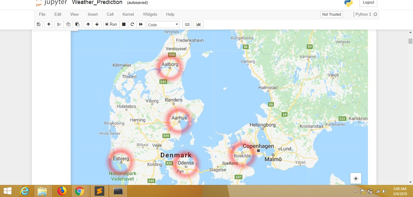
I am using a Recurrent Neural Network (RNN) because it can work on sequences of arbitrary length.
We are going to predict temperature,Pressure and WindSpeed on our test set that the model has never seen during training.
It worked reasonably well for predicting the temperature where the daily oscillations were predicted well, but the peaks were sometimes not predicted so accurately.

The atmospheric pressure was also predicted reasonably well, although the predicted signal was more noisy and had a short lag.

The wind-speed could not be predicted very well,and I think improving dataset would lead to better predictions.

kunakl07
commented
5 years ago @rsignell-usgs , Sir,sorry for responding late,the data filtering from NCDC took a lot of my time. Would the next step be plotting these points on Maps and when we hover the mouse over these co-ordinates it should give us the predicted climate conditions along with longitude and latitude? Sir,please correct me where I am going wrong and what will be the tasks to be further accomplished. Thank you.
rsignell-usgs
commented
5 years ago @kunakl07, predicting weather via neural nets is cool, but we were intending the focus of this GSoC project to be more on making a general GUI for exploring data n-dimensional data on a map.
I think a reasonable initial target would be to build off/improve the examples
https://github.com/reproducible-notebooks/HRRR_Dashboard
https://github.com/reproducible-notebooks/COAWST-ROMS_Dashboards
and try to make the GUI more general, for example, automatically handling a heterogeneous collection of model output such as in the Pangeo Intake catalog:
https://pangeo.io/catalog.html
https://github.com/pangeo-data/pangeo/raw/master/gce/catalog.yaml
(the zarr datasets in this catalog are publicly readable, but not the netcdf files)
An additional step would be to allow the user to extract and plot a time series at a location selected on the map.
Does that make sense?
kunakl07
commented
5 years ago Yes @rsignell-usgs,I got your point. I was going offtrack and thanks for bringing me back on the right track,now my main focus will be creating a general GUI which can be used to show various dimensions on the map and would start by improving this.
martindurant
commented
5 years ago Note for the pangeo Intake catalog linked above: you can also see a nicely rendered version of it at https://pangeo.io/catalog.html .
From the point of view of the visualisation/GUI, you probably need know nothing about the catalog, but I imagine the interface would be passed an xarray object which could come from anywhere. The HRRR Dashboard, above, does not happen to use Intake.
kunakl07
commented
5 years ago Hi @rsignell-usgs ,
 This is the interactive GUI created using holoviews,geoviews,dask,datashader and bokeh of New York Taxi Trip.
When we hover over the image we can see its plot_x and ploy_y's co-ordinates respectively.
The data is loaded in Parquet-format file,Aggregating pickups and dropoffs and then we got hold of xarray arrays and then shaded the region with more drop-offs and pickups
@martindurant ,
This is the interactive GUI created using holoviews,geoviews,dask,datashader and bokeh of New York Taxi Trip.
When we hover over the image we can see its plot_x and ploy_y's co-ordinates respectively.
The data is loaded in Parquet-format file,Aggregating pickups and dropoffs and then we got hold of xarray arrays and then shaded the region with more drop-offs and pickups
@martindurant ,

An interactive GUI that displays latitude and longitude,as we hover over the image. This is created using only Bokeh and google api wherein we get the latitude and longitude as we hover
If any participant participating in GSOC like me,would require the code for above GUI's,I would be happy to share
rsignell-usgs
commented
5 years ago Folks, @martindurant and I had a chat and we will be creating a repo with a toy dashboard panel problem that you will be able to work on to show your familiarity with widget interaction. Should be ready within a few days.
rsignell-usgs
commented
5 years ago @hdsingh, glad to see you trying to test the Panel GUI progress. This GSoC project will definitely be harmonized with that work.
@kunakl07, while the work with the Parquet data is cool, note this GSoC will focus on a GUI for geographic N-dimensional array data (e.g. data that can be loaded in xarray).
rsignell-usgs
commented
5 years ago Here's the little test problem promised: https://github.com/intake/intake-gsoc-gui
martindurant
commented
5 years ago Another good and complete example of a Panel-based dashboard is at https://github.com/jsignell/pydata_dc_2018 , notebook 04 - this one actually uses Intake. You can run this example in Binder.
hdsingh
commented
5 years ago @rsignell-usgs @martindurant I made an interactive dashboard for the test problem here.
Can you please review it and let me know further improvements if any?
rsignell-usgs
commented
5 years ago @hdsingh , awesome job. I tried it and it worked great, within the notebook and the standalone app:

hdsingh
commented
5 years ago @rsignell-usgs Thanks a lot sir!! Glad that you liked it.
hdsingh
commented
5 years ago I created a new dashboard based on data used in GUI.ipynb in https://github.com/intake/intake/pull/286 .
The dasboard is available here Land-Explorer.
Here I have shown three differernt methods of generating same dashboard by:

hdsingh
commented
5 years ago I also created a pull request for this dashboard to be merged in intake's GUI.ipynb (https://github.com/intake/intake/pull/308) .
rsignell-usgs
commented
5 years ago Please submit proposals as soon as possible following this template and remember as stated on the GSoC proposal information for students:
You must create the draft and write an abstract before sharing the draft with the organization. You can edit the draft as many times as you wish before the application deadline.
Note the application deadline is April 9 18:00 UTC, but don't wait until then. Share a draft well before then!
I can be reached via email at rsignell@usgs.gov.
hdsingh
commented
5 years ago @rsignell-usgs Thanks for the reminder sir. I am working on the proposal. The draft would be ready in a couple of days.
@martindurant Sir, Can you please share your email address to so that I can also mail you the draft?
rsignell-usgs
commented
5 years ago @hdsingh , if you share it with me I can share it with Martin.
hdsingh
commented
5 years ago I just installed and had a look at ncview. It must be really very difficult to do research with the help of that tool. Panoply is times better than that. One thing good about ncview is its ability to extract timeseries signal at a particular location. However with the help of Pyviz and intake we can do so much more than just displaying data.
rsignell-usgs
commented
5 years ago @hdsingh , probably the only functionalities that we could use from ncview (that are not already in panoply) are:
martindurant
commented
5 years ago @hdsingh : to be sure, there are many viewers of particular types of data in particular domains, and it is interesting to consider why some have become ubiquitous and others not, which doesn't necessarily map well to range of functionality. It can be that a viewer has only one feature lacking in others, but the users consider it so important that it compensates for other features being poor or absent.
For instance, in my former astronomy career, almost all raw image viewing happened in "ds9", which understands world coordinates well, and has a whole host of keyboard-interactive astro tools written for it.
Meanwhile, my former medical imaging old-guard colleagues were all using imageJ, which has a terrible interface.
Both may be of interest as inspiration/curiosity even when talking geospacial, and we certainly don't want to replicate something that doesn't work well. However, and unfortunately, adoption is much easier had with something that is familiar to the community, so you can get further, faster, by not straying too far... Don't forget, that there is always a lot of inertia when people have a tool that they know and gets the job done. It's when they find they can't do anything that they look around for alternatives.
hdsingh
commented
5 years ago @rsignell-usgs I will figure out a way to implement these functionalities and add these in the proposal. @martindurant Thank you sir, for your valuable insights. I will design the interface keeping these things in mind.
The interface would be designed in a way to integrate best features of Panoply and ncview. I will also look into some other softwares available for NetCDF and Geodata visualization and see what are their features that differentiate them from the others.
esip-lab
commented
5 years ago Hi all - a friendly reminder that there is ONE WEEK LEFT to submit your proposals for this project! Best of luck and we're excited to see what is submitted!
hdsingh
commented
5 years ago Pyviz community is really amazing and great !!. Within a few minutes of discussion I got a way to maximise the screen area for the dashboard.
rsignell-usgs
commented
5 years ago @hdsingh, glad to hear it!
hdsingh
commented
5 years ago @rsignell-usgs @martindurant I updated my proposal according to our discussion. I also completed the remaining sections and highlighted important improvements. Can you please have a look and let me know what else could be changed? Thanks a lot!!
martindurant
commented
5 years ago The proposal is certainly ambitious! I would be very glad to see it all come to fruition.
I promise to have more for you by tomorrow, but a few stylistic initial thoughts:
hdsingh
commented
5 years ago I modified the proposal according to above recommendations and also added Time Availability section. I am waiting to get more feedback.
@rsignell-usgs @martindurant Thanks a lot for the review!
martindurant
commented
5 years ago I think that the abstract can use a little work, it is the most important part of the proposal.
have limited functionality and can only be reasonably extended by the software developers on those projects
"limited functionality" is very vague. Rather, you can say that users wish to apply complex analysis methods to the data they are visualising, which is something you can only do in combination with the python-data stack. Secondly, the latter statement about developers is true for all open-source projects; anyone who contributes to a project is then a developer of that project. I'm not quite sure what you are driving at - is it that you could fairly embed your GUI within other things like Intake's interface, or to use in conjunction with other Python tools like Dask?
controlled data selection
probably: data-set selection and control of fields for plotting ?
Currently only stand-alone applications
Is this strictly true? Pangeo is indeed exploring geospatial data in python already, just not as nicely as this GUI would be. You could instead say that the majority of geospatial data visualisation happens in these apps.
written in Python, but experienced as a dashboard in the browser
"experienced" -> presented "the browser" -> as a standalone browser app or in a notebook environment
..and holds the promise ... explore data
This should be at least two sentences
"Cloud" does not need to be capitalised :)
That's it, good luck!
hdsingh
commented
5 years ago limited functionality - resolvedcan only be reasonably extended by the software developers on those projects - Provided example of Daskcontrolled data selection - meant to say different variables, indexes at particular timestamps or locations, so change to controlled data points selectionI have re-read the Abstract several times so it is becoming a bit difficult for me to approximate the quality of content. Can you please view it one last time before I submit the proposal, just to be sure and let me know?
Thanks a lot!
ESIP Member Organization Name
US Geological Survey
Mentors
Rich Signell, USGS @rsignell-usgs Martin Durant, Anaconda @martindurant
Project Idea
CF-Compliant ndarray datasets can be visualized in tools that understand the NetCDF Data Model and the geospatial metadata they contain. While stand-alone tools like Panoply are often used on the desktop, the goal here is to develop a tool for visualizing and interacting with these datasets in Jupyter Notebooks using xarray, dask and the pyviz collection of widgets, rendering and layout tools.
Idea Title
A next-generation GUI for visualizing big gridded data in Python
Abstract
There have been several important advances that now make it possible to render big gridded data from many different sources with a common Python-based toolset in the browser. The first is the CF conventions that allow non-ambiguous identification of coordinate and data variables, the second is xarray which represents the CF data model in Python, and the third is the pyviz collection of tools, that allows rendering of massive gridded data, widgets to control data selection, and tools to specify layouts of widgets and data displays in the browser.
Technical Details
The GSoC student would build a dashboard using panel that allows the user to specify an intake catalog containing CF-compliant datasets that can be loaded into xarray. The user would select a dataset, which would then display a list of variables contained in that dataset. The user would then select a variable, which would then trigger reading the variable by xarray and displaying on a map using hvplot. Depending on the variable dimensions, widgets containing time steps and/or vertical levels would be displayed which would allow specification of specific index or coordinate values to plot.
Bells and whistles like colormap selection and different types of visualization techniques could be added as time permits.
The work will be coordinated with the overarching "Next-Generation GUI" effort of @martindurant.
The development can be done on a Pangeo environment running on the Amazon cloud, which means the student will not have run anything or install any software locally -- they will only need their browser and a github account.
Helpful Experience
Experience with Python is required, experience with
xarray,pyvizandgithuba big plus.First steps
Video:
Getting Started: