console-gui-tools


A simple Node.js library to create Console Apps like a wizard (or maybe if you like old style colored screen or something like "teletext" programs 😂) Apart from jokes, it is a library that allows you to create a screen divided into a part with everything you want to see (such as variable values) and another in which the logs run. Moreover in this way the application is managed by the input event "keypressed" to which each key corresponds to a bindable command. For example, to change variables you can open popups with an option selector or with a textbox. It's in embryonic phase, any suggestion will be constructive :D
Requirements
Node.js
Version: >= 14.17 18.18.0 (since 3.2.2)
OS
It works well in all os with a terminal that supports styling, colors and other nice features. I've tested it on Linux: Ubuntu LTS, Arch, and Windows 10 and 11 and Mac OS. Since 1.1.4 mouse SGR and X11 protocols are supported. It works well on most linux terminals, but it doesn't work on Windows 10 and 11. You can use it on Windows 10 and 11 with Windows Terminal or Cmder and using WSL (Windows Subsystem for Linux) with Ubuntu LTS or others. In this way you can use mouse also on Windows 10 and 11.
Windows users
In windows you can use it in both 10, and 11 but don't use the old Powershell (💩), make you a favor and use Windows Terminal with Powershell Core (the last official) That is currently installed by default in Windows 11. In alternative i've runned this also with git bash shell.
Installation
Install with:
npm i console-gui-toolsImporting the library
The library is transpiled to ESM and CJS, so you can import it with both syntax.
ESM syntax
import { ConsoleManager } from 'console-gui-tools'CommonJS syntax
const { ConsoleManager } = require('console-gui-tools')OPTIONS
The library has a few options that can be set in the constructor. ### options.title The title of the application. It will be displayed in the top of the screen. ### options.logsPageSize The number of lines that will be displayed in the logs page. ### options.logLocation Choose where the logs are displayed: number (0,1) - to pot them on one of the two layouts, string ("popup") - to put them on a CustomPopup that can be displayed on the window. ### options.showLogKey The key that will be used to show the logs popup if the logLocation is set to "popup". ### options.enableMouse Enable mouse support. It works well on most linux terminals, but it doesn't work on Windows 10 and 11 unless you use WSL (Windows Subsystem for Linux). 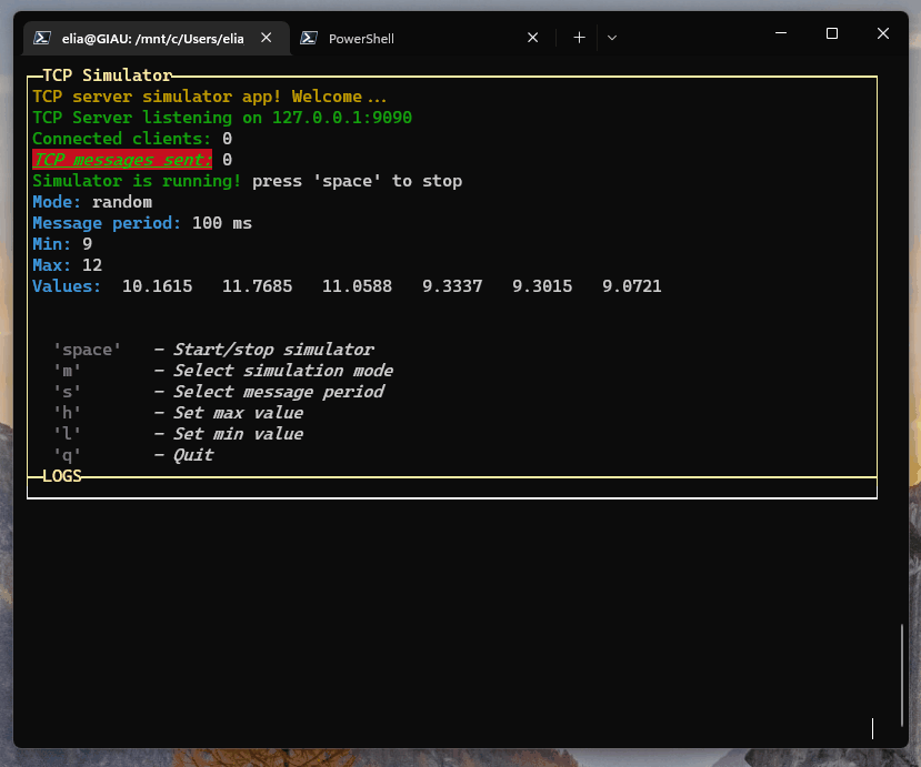 ### options.overrideConsole Override the console.log, console.info, console.warn, console.error, console.debug functions to print the logs on the screen. ### options.layoutOptions The options that will be passed to the layout. ```js const layoutOptions = { boxed: true, // Set to true to enable boxed layout mode showTitle: true, // Set to false to hide titles changeFocusKey: 'ctrl+l', // The key or the combination that will change the focus between the two layouts type: "double", // Can be "single", "double" or "quad" to choose the layout type direction: 'vertical', // Set to 'horizontal' to enable horizontal layout (only for "double" layout) boxColor: 'yellow', // The color of the box boxStyle: 'bold', // The style of the box (bold) fitHeight: true, // Set to false to disable the auto height fit [default: false] (since v3.2.0 - **NEW!**) } ``` ### options.focusKey [v3.0.0] The key that will be used to change the focus between controls in the focused layout. [default: 'tab']EXAMPLE OF USAGE:
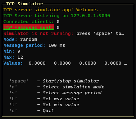
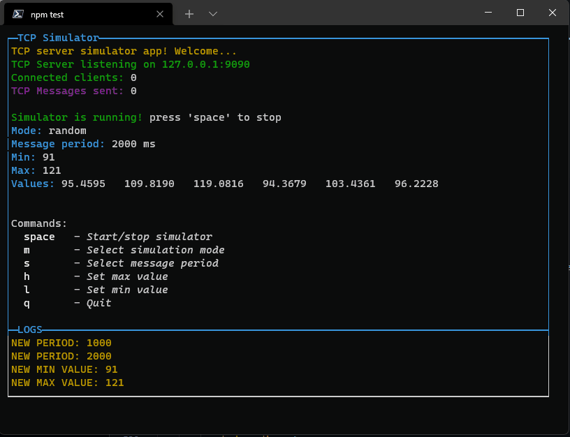
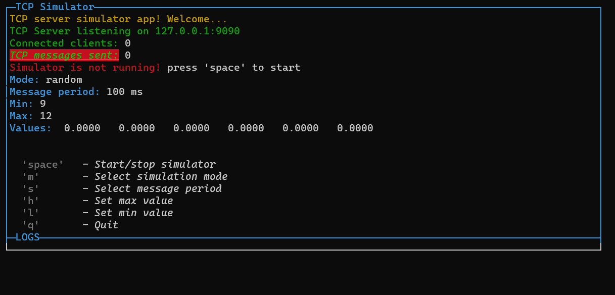
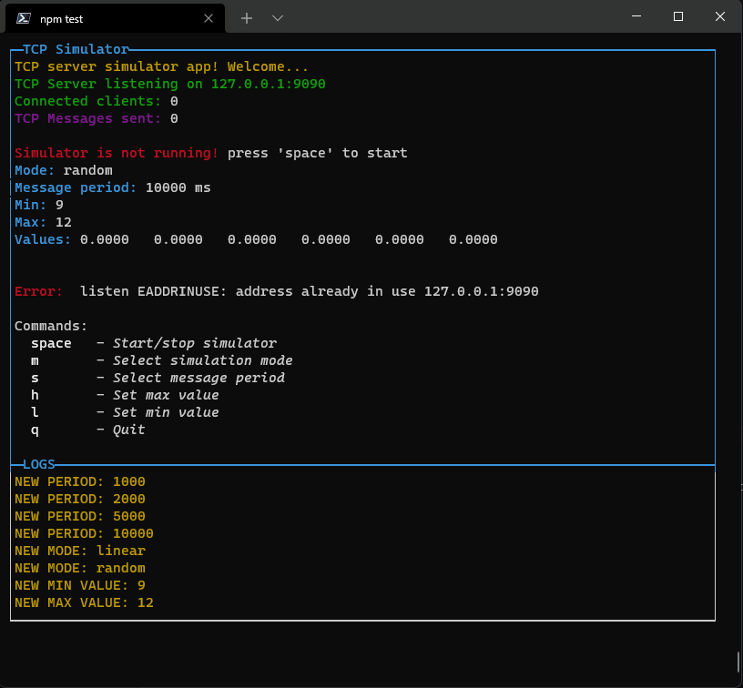
```js // Import module with ES6 syntax import { ConsoleManager, OptionPopup, InputPopup, PageBuilder, ButtonPopup, ConfirmPopup } from 'console-gui-tools' const GUI = new ConsoleManager({ title: 'TCP Simulator', // Title of the console logsPageSize: 8, // Number of lines to show in logs page changeLayoutKey: 'ctrl+l', // Change layout with ctrl+l to switch to the logs page }) // Creating a main page updater: const updateConsole = async() => { const p = new PageBuilder() p.addRow({ text: `TCP server simulator app! Welcome...`, color: 'yellow' }) p.addRow({ text: `TCP Server listening on ${HOST}:${PORT}`, color: 'green' }) p.addRow({ text: `Connected clients:`, color: 'green' }, { text: ` ${connectedClients}`, color: 'white' }) p.addRow({ text: `TCP messages sent:`, color: 'green', bg: 'bgRed', bold: true, italic: true, underline: true }, { text: ` ${tcpCounter}`, color: 'white' }) // Print if simulator is running or not if (!valueEmitter) { p.addRow({ text: `Simulator is not running! `, color: 'red' }, { text: `press 'space' to start`, color: 'white' }) } else { p.addRow({ text: `Simulator is running! `, color: 'green' }, { text: `press 'space' to stop`, color: 'white' }) } // Print mode: p.addRow({ text: `Mode: `, color: 'cyan' }, { text: `${mode}`, color: 'white' }) // Print message frequency: p.addRow({ text: `Message period: `, color: 'cyan' }, { text: `${period} ms`, color: 'white' }) // Print Min and Max p.addRow({ text: `Min: `, color: 'cyan' }, { text: `${min}`, color: 'white' }) p.addRow({ text: `Max: `, color: 'cyan' }, { text: `${max}`, color: 'white' }) // Print current values: p.addRow({ text: `Values: `, color: 'cyan' }, { text: ` ${values.map(v => v.toFixed(4)).join(' ')}`, color: 'white' }) // Spacer p.addSpacer() if (lastErr.length > 0) { p.addRow({ text: lastErr, color: 'red' }) p.addSpacer(2) } p.addRow({ text: "Commands:", color: 'white', bg: 'black' }) p.addRow({ text: ` 'space'`, color: 'gray', bold: true }, { text: ` - Start/stop simulator`, color: 'white', italic: true }) p.addRow({ text: ` 'm'`, color: 'gray', bold: true }, { text: ` - Select simulation mode`, color: 'white', italic: true }) p.addRow({ text: ` 's'`, color: 'gray', bold: true }, { text: ` - Select message period`, color: 'white', italic: true }) p.addRow({ text: ` 'h'`, color: 'gray', bold: true }, { text: ` - Set max value`, color: 'white', italic: true }) p.addRow({ text: ` 'l'`, color: 'gray', bold: true }, { text: ` - Set min value`, color: 'white', italic: true }) p.addRow({ text: ` 'q'`, color: 'gray', bold: true }, { text: ` - Quit`, color: 'white', italic: true }) GUI.setPage(p) } GUI.on("exit", () => { closeApp() }) // And manage the keypress event from the library GUI.on("keypressed", (key) => { switch (key.name) { case "space": if (valueEmitter) { clearInterval(valueEmitter) valueEmitter = null } else { valueEmitter = setInterval(frame, period) } break case "m": new OptionPopup({ id: "popupSelectMode", title: "Select simulation mode", options: modeList, selected: mode }).show().on("confirm", (_mode) => { mode = _mode GUI.warn(`NEW MODE: ${mode}`) drawGui() }) break case "s": new OptionPopup({ id: "popupSelectPeriod", title: "Select simulation period", options: periodList, selected: period }).show().on("confirm", (_period) => { const msgMultiLine = `Changing period from ${period} to ${_period} ms.${EOL}This will restart the simulator.${EOL}Do you want to continue?` new ButtonPopup({ id: "popupConfirmPeriod", title: "Confirm period", message: msgMultiLine, buttons: ["Yes", "No", "?"] }).show().on("confirm", (answer) => { if (answer === "Yes") { period = _period GUI.warn(`NEW PERIOD: ${period}`) } else if (answer === "?") { GUI.info("Choose ok to confirm period") } drawGui() }) }) break case "h": new InputPopup({ id: "popupTypeMax", title: "Type max value", value: max, numeric: true }).show().on("confirm", (_max) => { max = _max GUI.warn(`NEW MAX VALUE: ${max}`) drawGui() }) break case "l": new InputPopup({ id: "popupTypeMin", title: "Type min value", value: min, numeric: true }).show().on("confirm", (_min) => { min = _min GUI.warn(`NEW MIN VALUE: ${min}`) drawGui() }) break case "1": { const p = new PageBuilder(5) // Add a scroll limit so it will be scrollable with up and down p.addRow({ text: "Example of a custom popup content!", color: "yellow" }) p.addRow({ text: "This is a custom popup!", color: "green" }) p.addRow({ text: "It can be used to show a message,", color: "green" }) p.addRow({ text: "or to show variables.", color: "green" }) p.addRow({ text: "TCP Message sent: ", color: "green" }, { text: `${tcpCounter}`, color: "white" }) p.addRow({ text: "Connected clients: ", color: "green" }, { text: `${connectedClients}`, color: "white" }) p.addRow({ text: "Mode: ", color: "green" }, { text: `${mode}`, color: "white" }) p.addRow({ text: "Message period: ", color: "green" }, { text: `${period} ms`, color: "white" }) new CustomPopup({ id: "popupCustom1", title: "See that values", content: p, width: 32 }).show() } break case "f": new FileSelectorPopup({ id: "popupFileManager", title: "File Manager", basePath: "./" }).show() break case "q": new ConfirmPopup({ id: "popupQuit", title: "Are you sure you want to quit?" }).show().on("confirm", () => closeApp()) break default: break } }) const drawGui = () => { updateConsole() } ```How to draw the application page?
New drawing algorytm
All the page is prerendered before printing on the console to prevent noisy flickering.
Introduced new styling design pattern: Each page need to be created with the new class
const p = new PageBuilder()and to add a styled row it's neccessary to call:
p.addRow({ text: ` 'm'`, color: 'gray', bold: true }, { text: ` - Select simulation mode`, color: 'white', italic: true })The arguments of that function is an array of object (function arguments syntax, no []!), so in a row you can add different phrases with different styles.
The styles are converted to the Chalk modificator:
COLORS AND FORMATTERS
### HEX color (since 1.4.0) ```js { text: ` 'm'`, color: '#FF0000' } ``` ### RGB color (since 1.4.0) ```js { text: ` 'm'`, color: 'rgb(255,0,0)' } ``` ### Standard Chalk colors: - black - red - green - yellow - blue - magenta - cyan - white - blackBright (alias: gray, grey) - redBright - greenBright - yellowBright - blueBright - magentaBright - cyanBright - whiteBright ### Standard Chalk Background colors ('bg') - bgBlack - bgRed - bgGreen - bgYellow - bgBlue - bgMagenta - bgCyan - bgWhite - bgBlackBright (alias: bgGray, bgGrey) - bgRedBright - bgGreenBright - bgYellowBright - bgBlueBright - bgMagentaBright - bgCyanBright - bgWhiteBright ### Formatters (Each is a prop): - italic - bold - dim - underline - overline - inverse - hidden - strikethrough eg: ```js p.addRow({ text: `TCP messages sent:`, color: 'green', bg: 'bgRed', bold: true, italic: true, underline: true }, { text: ` ${tcpCounter}`, color: 'white' }) ```And so, we can add the PageBuilder to the first page
GUI.setPage(p, 0)Layout
The application instance needs to output the content through a layout class. In the "layoutOptions" provided to the ConsoleManager, we can set the layout:
boxed: Set to true to enable boxed layout mode (default: true)
| boxed: true | boxed: false | | ----------- | ------------ | | 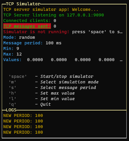 | 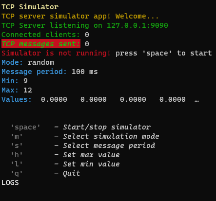 |- showTitle: Set to false to hide titles (default: true, on title per page)
- changeFocusKey: The key or the combination that will change the focus between the pages of the layout (default: 'ctrl+l')
type: Can be "single", "double" or "quad" to choose the layout type (default: "double")
| type: "single" | type: "double" | type: "quad" |
|---|---|---|
 |
 |
 |
- direction: Set to 'horizontal' to enable horizontal layout (only for "double" layout)
- boxColor: The color of the box (default: 'yellow')
- boxStyle: The style of the box (default: 'bold')
-
fitHeight: Set to false to disable the auto height fit [default: false] (since v3.2.0 - NEW!)
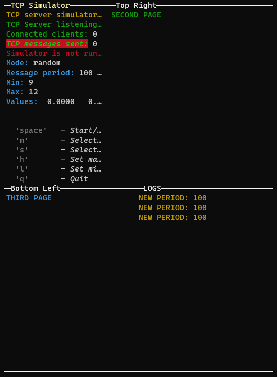
To draw multiple pages, we need to use the setPage or setPages methods:
GUI.setPage(p, 0) // Add the first page without explicit name (default: application title)

const p1 = new PageBuilder()
p1.addRow({ text: "SECOND PAGE", color: "green" })

const P2 = new PageBuilder()
P2.addRow({ text: "THIRD PAGE", color: "cyan" })

GUI.setPage(p1, 1, "Top Right")
GUI.setPage(P2, 2, "Bottom Left")

// Or if we want to add the pages in the same order (only one render):
GUI.setPages([p, p1, P2], ["App Title", "Top Right", "Bottom Left"])
Changing the layout aspect ratio
If we are in quad layout mode or double horizontal layout, we can change the aspect ratio of the layout rows by pressing the "left" and "right" keys: 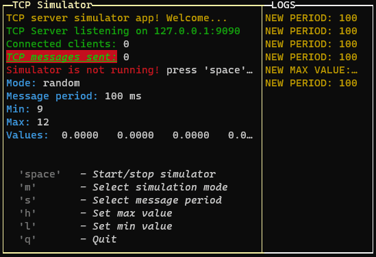 > If you are using the quad layout mode the arrow keys will change the aspect ratio of the layout selected row (the top or the bottom row, depending on the selected page)Widgets
There are two types of widgets: the "popup" widgets and the "control" widgets.
Control widgets (since 1.1.42) New!
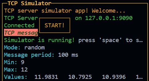
The control widgets are the widgets that are displayed on the page and are not "popup" widgets. They has an absolute position and size and are not affected by the layout. Introduced since the version 1.1.42 of the library. Currently there is only the base class for the control widgets, "Control" class and the "Button" class. It is possible to create a custom control widget by extending the Control class and implementing the draw method. Example:
const widget1 = new InPageWidgetBuilder()
widget1.addRow({ text: "┌────────┐", color: "yellow", style: "bold" })
widget1.addRow({ text: "│ START! │", color: "yellow", style: "bold" })
widget1.addRow({ text: "└────────┘", color: "yellow", style: "bold" })

const button1 = new Control({
   id: "btn1",
   visible: false,
   attributes: { x: 30, y: 18, width: 10, height: 3 },
   children: widget1
})
button1.on("relativeMouse", (event) => {
    if (event.name === "MOUSE_LEFT_BUTTON_RELEASED") console.log("Button clicked!")
})
Since the version 3.0.0 of the library, this constructor has been changed. See the v3.0.0 Release Note for more information.
Result:
Box (since 3.0.0) New!
The box is a control widget that allows you to create a box with a title and a content. The content is a InPageWidgetBuilder object, so you can add rows to it. It can have a title and can be boxed or not. It can be used to place some texts in a specific position of the screen, without using the layout. It also can be draggable.
new Box({
    id: "box1",
    x: 22,
    y: 3,
    width: 28,
    height: 3,
    draggable: true,
    style: {
        boxed: true,
    }
}).setContent(new InPageWidgetBuilder().addRow({ text: "This is a draggable Box!", color: "rgb(255,0,0)", bg: "rgb(0,0,255)"}))
See the Box documentation for more information. or try the Box example.
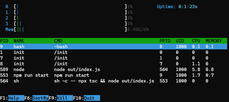
This example is inspired by the htop command line tool.
Button (since 1.2.0) New!
The button is a control widget that basically do the previous example for you in a simpler way.
new Button(id, text, width, height, x, y, style, visible, enabled, onClick, onRelease)
This class is an overload of Control that is used to create a button.
Emits the following events:
- "click" when the user confirm
- "relese" when the user cancel
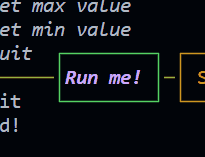
new Button({
    id: "btnRun",
    text: "Run me!",
    x: 48,
    y: 1,
    style: {
        color: "magentaBright",
        bold: true,
        italic: true,
        borderColor: "green"
    },
    onRelease: () => {
        GUI.log("Button clicked!")
    },
    draggable: true,
})
See the Button documentation for more information. or try the Button example.
Since the version 3.0.0 of the library, this constructor has been changed. See the v3.0.0 Release Note for more information.
Progress (since 1.3.0) New!
This is a control widget that is used to draw a customizable progress bar.
It can also be used as interactive control (slider) by setting the interactive option to true.
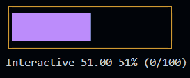
const p2 = new Progress({
    id: "prog1",
    x: 2,
    y: 1,
    label: "Mem",
    length: 40,
    min: 0,
    max: 100,
    unit: "G",
    style: {
        boxed: true,
        theme: "htop",
        showMinMax: false,
    }
})
p2.setText("Interactive")
p2.on("valueChanged", (value) => {
    console.log(`Value changed: ${value}`)
})
Since the version 3.0.0 of the library, this constructor has been changed. See the v3.0.0 Release Note for more information.
Example
See the Progress documentation for more information. or try the Progress example.
In the next versions of the library, more control widgets will be added as Control extensions.
Popup widgets
To create an option popup (select)
new OptionPopup({
    id: "popupSelectPeriod",
    title: "Select simulation period",
    options: periodList,
    selected: period
}).show().on("confirm", (_period) => {
    period = _period
    GUI.warn(`NEW PERIOD: ${period}`)
    drawGui()
})
Class OptionPopup:
constructor(id, title, options, selected)
- id: string
- title: string
- options: Array<string | number>
- selected: string | number
The response is triggered via EventEmitter using "on" The result is this:
Pressing enter it will close the popup and set the new value. If the list is too long, it will scroll reaching the bottom or top. Now you can also use "pageup" amd "pagedown" keys to navigate faster.
To create an input popup (numeric or string)
new InputPopup({
    id: "popupTypeMax",
    title: "Type max value",
    value: max,
    numeric: true,
    maxLen: 5,
    placeholder: "Type a number" // since v3.1.0
}).show().on("confirm", (_max) => {
    max = _max
    GUI.warn(`NEW MAX VALUE: ${max}`)
    drawGui()
})
Class InputPopup (updated in v3.4.0):
constructor(id, title, value, isNumeric)
- id: string
- title: string
- value: string | number
- isNumeric: boolean
- maxLen: number (since v3.4.0)
- placeholder: string (since v3.1.0)
You can use it for example to set a numeric threshold:
If you set isNumeric to true, only numbers are allowed. All class of components will be destroyed when the popup is closed. The event listeners are removed from the store. Then the garbage collector will clean the memory.
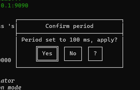
To create a button popup
new ButtonPopup({
    id: "popupConfirmPeriod",
    title: "Confirm period",
    message: `Period set to ${period} ms, apply?`,
    buttons: ["Yes", "No", "?"]
}).show().on("confirm", (answer) => {
    if (answer === "Yes") {
        period = _period
        GUI.warn(`NEW PERIOD: ${period}`)
    } else if (answer === "?") {
        GUI.info(`Choose ok to confirm period`)
    }
    drawGui()
})
Class ButtonPopup:
constructor(id, title, message, buttons = ["Ok", "Cancel", "?"])
- id: string
- title: string
- message: string
- buttons: Array
- The text of the buttons
You can use it for example to make a question:
To create a confirm popup (if you only need a yes or no answer)
new ConfirmPopup({ id: "popupQuit", title: "Are you sure you want to quit?" }).show().on("confirm", () => closeApp())Class ConfirmPopup:
constructor(id, title)
- id: string
- title: string
You can use it for example to confirm before quit the app:
To create a Custom Content Popup (Free content inside)
const p = new PageBuilder(5) // Add a scroll limit so it will be scrollable with up and down
p.addRow({ text: `Example of a custom popup content!`, color: 'yellow' })
p.addRow({ text: `This is a custom popup!`, color: 'green' })
p.addRow({ text: `It can be used to show a message,`, color: 'green' })
p.addRow({ text: `or to show variables.`, color: 'green' })
p.addRow({ text: `TCP Message sent: `, color: 'green' }, { text: `${tcpCounter}`, color: 'white' })
p.addRow({ text: `Connected clients: `, color: 'green' }, { text: `${connectedClients}`, color: 'white' })
p.addRow({ text: `Mode: `, color: 'green' }, { text: `${mode}`, color: 'white' })
p.addRow({ text: `Message period: `, color: 'green' }, { text: `${period} ms`, color: 'white' })
new CustomPopup({ id: "popupCustom1", title: "See that values", content: p, width: 32 }).show()
Class CustomPopup:
constructor(id, title, content, width)
- id: string
- title: string
- content: PageBuilder
- width: number
You can use it for example to snow some custo text or values. If you declare it as a global variable, you can update it anytime. In the next steps I will add a new kind of components: InPageComponents, that will be added as a child of a PageBuilder class. That means that they allows to build a custom popup widget with components inside.
To create a File Selector popup
new FileSelectorPopup({
    id: "popupFileManager",
    title: "File Manager",
    basePath: "./"
}).show().on("confirm", (file) => {
    GUI.warn(`File selected: ${file}`)
    drawGui()
})
Class FileSelectorPopup:
constructor(id, title, content, width)
- id:
string - title:
string - basePath:
string- The main path of the popup. re case sensitive. - limitToPath:
boolean- If true, the user can select a directory. Otherwise, only files are selectable. When true, to enter a directory, the user must press the space key instead of the enter key. - allowedExtensions:
Array<string>
This class is used to create a popup with a file input to select a file or a directory. It will run a promise with fs.readdir to get the list of files and directories. The user can select a file or a directory and the popup will be closed.
Emits the following events:
- "confirm" when the user confirm the file or directory selection. The file or directory path is passed as parameter like this: {path: "path/to/file", name: "file.ext"}
- "cancel" when the user cancel the file or directory selection.
- "exit" when the user exit
All class of components will be destroyed when the popup is closed. The event listeners are removed from the store. Then the garbage collector will clean the memory.
Since the version 3.0.0 of the library, all the popup constructors has been changed. See the v3.0.0 Release Note for more information.
Console.log and other logging tools
By default (since version 1.1.42) the console.log|warn|error|info are replaced by a custom function that will show the message in the apposite GUI space. To disable this override you can set the option overrideConsole to false in the options object of the constructor.
They are replaced by theese functions (that are also available in the ConsoleManager instance):
GUI.log(`NEW MIN VALUE: ${min}`)
GUI.warn(`NEW MIN VALUE: ${min}`)
GUI.error(`NEW MIN VALUE: ${min}`)
GUI.info(`NEW MIN VALUE: ${min}`)
And then written to the bottom of the page.
You can switch to the log view by pressing the "changeLayoutKey" key or combination: The maximum number of lines is set to 10 by default but you can change it by setting the option "logsPageSize". When the logs exceed the limit, you can scroll up and down with up and down arrows (if you are in the log view).
This library is in development now. New componets will come asap.
License and copyright
MIT License Copyright (c) 2022 Elia Lazzari
Colors and styles are managed using Chalk

Code Documentation
To see the code documentation, please click on the following link:
How To Contribute
Any kind of contribution is welcome! Feel free to help, but first read CONTRIBUTING.md