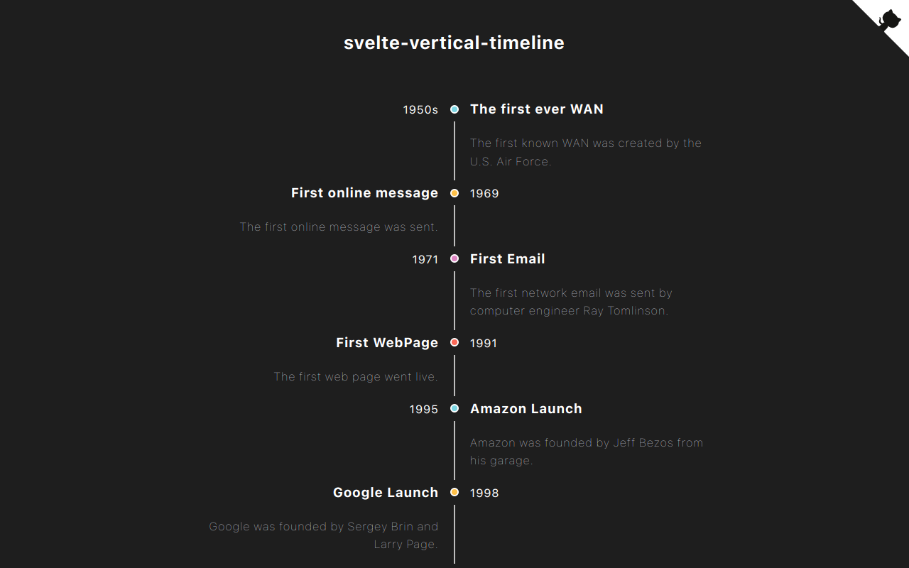
svelte-vertical-timeline

Svelte components for creating a vertical timeline.
Check out the demo.
Demo
Installation
yarn add svelte-vertical-timelineor
npm install svelte-vertical-timelineUsage
A timeline consists of components below.
<Timeline/><TimelineItem/><TimelineSeparator/><TimelineDot/><TimelineConnector/><TimelineContent/><TimelineOppositeContent/>
I listed some examples of timelines you can create with this library below.
Basic Timeline
A basic timeline showing list of events.

CODE
```svelte
{option.title}
Left positioned timeline
The main content of the timeline can be positioned on the left side.

CODE
```svelte
{option.title}
Alternating timeline
The timeline can display the events on alternating sides.

CODE
```svelte
{option.title}
Opposite content
The timeline can display content on opposite sides.
Please make sure to add slot="opposite-content" to the <TimelineOppositeContent/> component.

CODE
```svelte
{option.time}{option.title}
Customization
You can customize the timeline anyway you want. Check here for furthur information.

CODE
```svelte
09:30 am You need to eat. 10:30 am You need to take a nap. 11:00 am Svelte is Awesome. 01:00 am You need to treat yourself.![]()
Eat
Sleep
![]()
Code
![]()
Snack
API
<Timeline/>
Props
| Name | type | isRequired | Description |
|---|---|---|---|
| position | right, left or alternate |
x | The position where the TimelineContent should appear |
| style | string | x | Custom style for this component |
<TimelineItem/>
Props
| Name | type | isRequired | Description |
|---|---|---|---|
| position | right or left |
x | The position where the timeline's item should appear |
| style | string | x | Custom style for this component |
<TimelineSeparator/>
Props
| Name | type | isRequired | Description |
|---|---|---|---|
| style | string | x | Custom style for this component |
<TimelineDot/>
Props
| Name | type | isRequired | Description |
|---|---|---|---|
| style | string | x | Custom style for this component |
<TimelineConnector/>
Props
| Name | type | isRequired | Description |
|---|---|---|---|
| style | string | x | Custom style for this component |
<TimelineContent/>
Props
| Name | type | isRequired | Description |
|---|---|---|---|
| style | string | x | Custom style for this component |
<TimelineOppositeContent/>
Props
| Name | type | isRequired | Description |
|---|---|---|---|
| style | string | x | Custom style for this component |