 budislav
commented
8 years ago
budislav
commented
8 years ago Thanks Ivan but this is more for community than for me and motivation for developers to start working on this.
Open budislav opened 9 years ago
budislav
commented
8 years ago Thanks Ivan but this is more for community than for me and motivation for developers to start working on this.
 suhr
commented
8 years ago
suhr
commented
8 years ago @budislav Very nice, though a way too Bitwig-alike.
budislav
commented
8 years ago Thanks @suhr. Yes, present UI is a way too Fl Studio-alike.
suhr
commented
8 years ago Can we be different? Not yet another Fl Studio/Ableton/Bitwig/etc, but a cool open source DAW with its own spirit.
 tresf
commented
8 years ago
tresf
commented
8 years ago Can we be different? Not yet another Fl Studio/Ableton/Bitwig/etc, but a cool open source DAW with its own spirit.
We appreciate the enthusiasm, but we could do without the banter, please.
suhr
commented
8 years ago But seriously, a program is much nicer to use when it have it's own UI. Though this is not critical, this is an issue nevertheless.
I believe I'm not the only man that may be triggered by the fact that the new LMMS UI reminds Bitwig UI.
 Umcaruje
commented
8 years ago
Umcaruje
commented
8 years ago We appreciate the enthusiasm, but we could do without the banter, please.
@suhr is right though, the mockups look a bit too much like Bitwig.
tresf
commented
8 years ago @suhr is right though, the mockups look a bit too much like Bitwig.
Which part? The rainbow track palette? I find that minor. There's only so many ways to preset an interface. Lotus 1,2,3 vs. Excel. KDE 3.5 vs. Windows 95. Android vs. IOS. @budislav's mock-ups are original and are based on our the original LMMS gui design.
suhr
commented
8 years ago Which part?

budislav
commented
8 years ago BitWig is the latest and most modern DAW. It have the smartest UI till this day you like that or not. If that isn't enough reason to look up on Bitwig when I tried to redesign LMMS then I don't know which DAW have the best UI? Keep in mind UI without floating windows.
@tresf thank you so much! I spent so much time into this and I know exactly what looks on bitwig and what not, so if someone have something against bitwig or with this designs I can't help him.
"Can we be different? Not yet another Fl Studio/Ableton/Bitwig/etc, but a cool open source DAW with its own spirit." What kind of spirit? This is not human being. You can't invent hot water. If you want to put all instruments in one rack that will definitely looks like A.Live, Bitwig, Reason, Tracktion, Renoise..
This discussion have no sense. 99% of users would like to have this UI. I can't invent cold fusion here please.
@suhr do you have better mockup?
budislav
commented
8 years ago Yes and I can show you more things that looks like bitwig and you didn't notice. What do you want actually?
Umcaruje
commented
8 years ago if someone have something against bitwig or with this designs I can't help him.
I'm a bitwig user. I love bitwig. This design is infinitely better than the current one, but you don't need to bash someone for stating that your design looks a bit too much like Bitwig. Everyone is entitled to their opinion.
suhr
commented
8 years ago Oh, and Note – Automation – Devices/Plugins – Mixer have the same order you can find in Bitwig.
@budislav
What kind of spirit? This is not human being. You can't invent hot water. If you want to put all instruments in one rack that will definitely looks like A.Live, Bitwig, Reason, Tracktion,..
Somehow commercial DAWs all look different. Somehow Radium looks different. Somehow Helm and Dexed look different. Somehow Blender 3D looks different. Somehow... well, the list can be long.
99% of users would like to have this UI.
That's why I said it's not critical. You mockup is still infinitely better than current LMMS UI, even though it looks like Bitwig. But again, this is still an issue.
What do you want actually?
Creativity.
budislav
commented
8 years ago @suhr "But again, this is still an issue" No this is only issue for you.
"Creativity." So why don't you make something creatively and show all of us? If you want something so original spend some time on this problem.
I am not going to argue with you any more I see you don't know nothing about UI. You just come here in trying to stop some progress and that is not cool.
suhr
commented
8 years ago Well, I'm not going to continue this ad hominem discussion too.
 Spekular
commented
8 years ago
Spekular
commented
8 years ago @budislav I like your mockup but I think @suhr has a point, and you're being very defensive. Critique is a good thing.
budislav
commented
8 years ago @Spekular Suhr was very rude when said he expect more creativity like someone paid me to do something. I spent thousands of hours on trying to fix LMMS UI, and how I see this will never be new UI. Someone will always take care for that.
I don't need critique from non designers, especially not from someone who does not doing anything about this. Imagine I start to speak like that to developers what is good in their code and what is bad, like I know something about programming. Should I also say thanks for marked my design as plagiarism?
For the last time, some things from designs are similar or same because they are existing in both of programs. It would be normal if I borrow better things.
 michaelgregorius
commented
8 years ago
michaelgregorius
commented
8 years ago Critique is a good thing.
I would like to extend this to "Constructive critique is a good thing." To me the critique boiled down to "LMMS should be different for the sake of being different" which in my opinion is not a good thing.
If LMMS tried to be totally edgy and different from all other DAWs this would ruin the usability especially for experienced end users. There are certain expectations that users of DAWs have and if an application disregards too many of them users will not feel at home and rather ditch the whole thing to look for something that's more familiar. So there will (an IMHO should) always be elements that look familiar to other applications, e.g. each DAW has Mute/Solo, has a concept of tracks, a mixer, etc. How many ways are there to present these elements?
@budislav Don't let this discourage you. I (and I assume many others) really appreciate all the work that you have put into this. About this never becoming the new UI: never say never. However, it doesn't seem to suffice to post new images into this thread to kickstart the realization of your UI. There might be several reasons for this.
To me one of the current main problems of LMMS is the missing separation between the core code and the GUI code. If it were separated better I think it would be much simpler to switch the UI piece by piece to the new design because developers would only be concerned with GUI related code and there wouldn't be much other non GUI code that could get in the way. Unfortunately doing such a separation with hindsight at the current size of the code base is rather hard and "non-sexy" compared to other tasks so there might not be many people willing to work on such an undertaking.
The other problem seems to be of organizational nature. Even if we tried to implement the new GUI with the current code base this would definitively take an orchestrated effort which does not seem to be that simple to organize with the current tools at our disposal.
budislav
commented
8 years ago @michaelgregorius
If LMMS tried to be totally edgy and different from all other DAWs this would ruin the usability especially for experienced end users. There are certain expectations that users of DAWs have and if an application disregards too many of them users will not feel at home and rather ditch the whole thing to look for something that's more familiar. So there will (an IMHO should) always be elements that look familiar to other applications, e.g. each DAW has Mute/Solo, has a concept of tracks, a mixer, etc. How many ways are there to present these elements?
Exactly!
I understand the problem about separation between the core code and the GUI code, thank you for detail explanation. I think @Wallacoloo started working on this separation if I remember good? It would be very good if more developers are willing to help him with this.
This would probably increase performance of LMMS? I don't see more important thing if that is correct. Even this cool UI is not important like stability of software.
When I changing size of mixer or song editor a whole graphics just freeze. I have i5 3ghz, 8gb RAM and radeon r9 270. Don't understand why whole GUI reacting so slow. Adding a new features, that can just make things more complicated for this separation right?
 musikBear
commented
8 years ago
musikBear
commented
8 years ago "Constructive critique is a good thing."
Actually the only good form of critique
imo the only issue is: Could the design be deemed a direct copy, and hence be ground for a law-suit for stealing intellectual rights as plagiarism? If so, not good! If not, forgedaboudid, the design is stunning!
budislav
commented
8 years ago @musikBear Nobody goes to jail. This is an open source project and we don't sell anything. Otherwise BitWig is A. Live copy so if they are not subject of property debate nobody isn't. Design is borrowing ideas in many cases. Look at just on web world, show me one original design. If I start listing all softwares which one looks on other I would need a whole year. Look at new Da Vinci Resolve GUI http://310.ch/_freespace/blackmagicdesign/RESOLVE_12_INTERFACE_ORIG.jpg
Spekular
commented
8 years ago @michaelgregorious that's why I said "critique" and not criticism. Criticism doesn't necessarily have to be useful, hence "constructive criticism". In my mind, however, "critique" is usually more analytical in nature and somewhat above ordinary criticism.
Of course we don't have to be "edgy", but I don't think that stops us from being unique. While usability is obviously the primary goal I think there's a middle ground between "exactly like every other program" and "edgy unuseable crap".
I'm not saying @budislavs work is bad, but I think both sides have valid arguments and we could do with less aggression.
budislav
commented
8 years ago @Spekular aggression from me comes because of non respecting and "I am so smart to say this is not good without giving better solution". If you really want to help then instead of saying just this is not good than show me what is good.
Make that good thing and show me so we can make better solution together. The best option for peoples who does not like something is to to show their better solution. Maybe there is a thousands of reasons why I needed to borrow those things from Bitwig.
I'm not saying @budislavs work is bad, but I think both sides have valid arguments and we could do with less aggression.
Sorry I don't see any solution from other side. I see peoples who playing some kind of detective and judges.
If you know some of developers who are willing to help with this code stuff, call him to participate. If you are developer you are also welcome! I would not open your code and start investigating your code logic believe me.
musikBear
commented
8 years ago The best option for peoples who does not like something is to to show their better solution
:+1:
michaelgregorius
commented
8 years ago @budislav Yes, @Wallacoloo started working on using OSC (Open Sound Control) to decouple the GUI code from the core code such that no critical real time code is called from the GUI code (see #2252). Unfortunately this effort is currently stalled due to some kind of vicious cycle: he feels uncomfortable making changes to a code base that has no unit tests but on the other hand to have unit tests the code should be decoupled. I can completely understand his position.
I have also started work to decouple the core from the GUI in some other areas but the corresponding pull requests will only make it into the code once the is a 1.2 branch or another strategy for the next release. @tresf Would it perhaps make sense to create a WIKI page for 1.2 and to list everything there that has to be done, e.g. open bugs and pull requests that would need to be integrated? Right now I have no idea how far we are from a 1.2 release.
Concerning the slow GUI updates: LMMS uses a lot of custom drawing code and I assume that some of that code is not very efficient. The labels on the mixer strips for example are painted using Painter::drawText which calculates a layout each time the method is called (see FxLine::drawFxLine). This layout calculation consumes quite some time. A more efficient solution would be to draw these labels using QPainter::drawStaticText which does not calculate the layout for each call. Instead a QStaticText instance would only have to be updated and have its layout calculated when the text changes (which is not often). There might be more places with similar problems.
@Spekular I agree with regards to the middle ground. If it wasn't like this there would be no progress.
budislav
commented
8 years ago @michaelgregorius everything I read is really a good progress :thumbsup: Looks like you guys launched a rocket :rocket: WIKI page you mentioned above is also nice idea for progress monitoring :bulb:
Concerning the slow GUI updates: LMMS uses a lot of custom drawing code and I assume that some of that code is not very efficient. The labels on the mixer strips for example are painted using Painter::drawText which calculates a layout each time the method is called (see FxLine::drawFxLine). This layout calculation consumes quite some time. A more efficient solution would be to draw these labels using QPainter::drawStaticText which does not calculate the layout for each call. Instead a QStaticText instance would only have to be updated and have its layout calculated when the text changes (which is not often). There might be more places with similar problems.
This sounds like we will have faster GUI since you know how to fix it :thumbsup:
michaelgregorius
commented
8 years ago This sounds like we will have faster GUI since you know how to fix it
I have issued pull request #2579 that deals with the repeated layout calculations and a performance problem related to calculating the peaks.
 StakeoutPunch
commented
8 years ago
StakeoutPunch
commented
8 years ago I am not going to argue with you any more I see you don't know nothing about UI. You just come here in trying to stop some progress and that is not cool.
I don't need critique from non designers, especially not from someone who does not doing anything about this. Imagine I start to speak like that to developers what is good in their code and what is bad, like I know something about programming.
This is not a good comparison, for everyone one has eyes and can form opinions about what they see in a UI design, but not a whole lot of people can look at code and understand what they are looking at. Everyone has the right to opinion about design whether they have the skill to make something better or not. You can accept their ideas or you can ignore them, but telling someone their opinion is worthless because they are not a designer/not at the same skill level is very rude.
I agree that criticism should bring something new to the table, but sometimes the criticism itself is the substance brought.
budislav
commented
8 years ago @michaelgregorius :thumbsup:
@StakeoutPunch this starts to be funny. I can't go more into this. What you would say to him on my place? Imagine yourself to spends about three months of work on something and then I (guy who didn't contribute in that problem on any way before, plus you are in that field five years and I don't know anything about that field) come to you and say "you just make exactly copy of something and look on this picture I marked all of bad things! You should be more creative! I want only original solutions!"
Is that respect for you? You will respect that opinion? What you would answer?
This is not a good comparison, for everyone one has eyes and can form opinions about what they see in a UI design, but not a whole lot of people can look at code and understand what they are looking at.
They can form opinions about what they like or don't like in particular design, but what is good and what is not good that is ridiculously.
You can accept their ideas or you can ignore them, but telling someone their opinion is worthless because they are not a designer/not at the same skill level is very rude.
Which ideas? I would like to see some ideas from him or anybody. I respect all ideas but I don't see them so I don't know why you are saying that.
There is a saying that goes: "Opinion is like an ass, everybody has it."
 softrabbit
commented
8 years ago
softrabbit
commented
8 years ago They can form opinions about what they like or don't like in particular design, but what is good and what is not good that is ridiculously.
Ok, here's some opinion.
I thought level meters (not saying VU, as they aren't AFAIK) having red at the top makes it easier to see which mixer channel has the hottest levels. Likewise for the solo and mute buttons, color lets you see at a glance what's going on. Do the traffic lights in your part of the world display text in the same color for "stop" and "go" or is it red and green like in most places?
I also thought different icons for different instruments were informative. But if those icons are going away, please at least use your designer superpowers to make it so that a user-set channel name remains even after loading a new preset. That doesn't seem to be the case now.
budislav
commented
8 years ago @softrabbit
I thought level meters (not saying VU, as they aren't AFAIK) having red at the top makes it easier to see which mixer channel has the hottest levels.
Absolutely. I didn't design full level meters to the top so you can't see this but it should go in red.
Likewise for the solo and mute buttons, color lets you see at a glance what's going on
Thanks for explanation I didn't know that!! Yes they are red and yellow when they are active.
Do the traffic lights in your part of the world display text in the same color for "stop" and "go" or is it red and green like in most places?
Yes in "my part of the world display text" buttons "stop" and "go" are in same "traffic lights" color.
like in most places
Like in LMMS

I also thought different icons for different instruments were informative.
In other DAWs I didn't saw different icons for different instruments. I saw same icons for instrument or plugin type (all vst plugins have one icon, all effects on icon,..) If I am right in Logic and FL you can set icon based on preset or sound you design not on instrument itself.
superpowers ??
You don't need to be sarcastic dude, should I say to you "\ you"? Edited @tresf** And now someone will tell me I am rude. I just don't know how to finish with this kind of people and I don't know why does everyone starts to feel hurt?
@softrabbit did I said something bad to you, because your comment (opinion) looks like some kind of answer to me or you trying to defend someone?
tresf
commented
8 years ago This thread will be locked if we can't be civil.
I agree with @softrabbit, the icons for our instruments are very identifiable and something we're very proud of, if we can talk about keeping some more identity for each instrument type, hopefully we can reach a middle ground.
@budislav you're right, other DAWs don't do this, but we're ok diverging from the norm, which I think is part of the backlash you're receiving here. This is a normal part of the process, but we need to work together to make things happen, and that means dealing with some valid requests and some outrageous requests.
superpowers ??
Take it as a compliment, or with a grain of salt. @softrabbit is an asset to our team and if you read his commit and comment history, he's not one to sling mud around. :heart: :earth_asia:
softrabbit
commented
8 years ago did I said something bad to you, because your comment (opinion) looks like some kind of answer to me or you trying to defend someone?
Just some observations based on what info (i.e. mockups) is available. If red at the top of the meters and colors for the buttons is indeed planned, great. But TBH, what has been shown has been fairly colorless so far, so I thought that particular cat needed to be pulled out of the bag.
not the first to sling mud around.
FTFY. :smiling_imp:
@budislav, I'm sorry if you took the superpower comment as negative. It was totally meant as positive, as you clearly have a lot of skill in that area.
budislav
commented
8 years ago @tresf if you really insist that every lmms instrument should have own icon then I think those icons must be redesigned. TBH I don't see anything special about them. Don't know how to fit them into any new design. If we develop option to change color of each track (instrument) we don't need anything else to identity instrument except maybe of one icon for lmms instrument, vst and other plugin types.
@softrabbit
what has been shown has been fairly colorless so far, so I thought that particular cat needed to be pulled out of the bag.
I agree. There is a place for more colors but we need to go smart with that. I don't like FL studio kindergarten look. He is counteract to all modern UI principles.
I'm sorry if you took the superpower comment as negative. It was totally meant as positive, as you clearly have a lot of skill in that area.
In that case I am sorry because of my reaction. Previous comments were bad for me so I thought you are in chain to slap me. :v: :heart:
tresf
commented
8 years ago @tresf if you really insist that every lmms instrument should have own icon then I think those icons must be redesigned. TBH I don't see anything special about them. Don't know how to fit them into any new design. If we develop option to change color of each track (instrument) we don't need anything else to identity instrument except maybe of one icon for lmms instrument, vst and other plugin types.
Well, insist is a strong word. :)
On the contrary, I think we'd all be interested to see what the artwork and/or colors may look like if streamlined into this single-window theme and what types of problems we'd encounter if we were to try. :+1:

budislav
commented
8 years ago @tresf I need to make 18 different icons for each instrument to fit size 16x16. I would like to present them in some abstract shapes because it's easier to make crisp small icon and will look modern I hope so. Also all icons would be in combination of 4/5 same colors. So this mean all instruments will got new identity. Goal is to be extremely simple
musikBear
commented
8 years ago Have to mention that colors are important for sight-impaired users. Current instrument-sidebar is visually a great help, and a wanted instrument can be found with one glance. I would have real difficulties with buttons like the ones in @tresf inserted image in the post above. I have already used this sentence before: Design should never be weighted over function
So imo some kind of colored icons or a customizeable /theme option is needed, if sidebars are to flat colored, like in the above image.
 DeRobyJ
commented
8 years ago
DeRobyJ
commented
8 years ago I've got several questions about a single window UI... First: what if I want to open more than one plugin, like 5 plugins, together? Second: dual monitor Third: smaller screens, are we going to state "1280x720" in minimum requirements? Fourth: right now we have a FLstudio-like ui, so those users (mostly audio production newbies) can easily switch from one another. But having a flstudio workflow in an ableton ui would prevent that without helping ableton users either. Fifth: a lot of users would need to re-learn things, and some would probably go away, mostly newcomers from the last two years
It's cool and everything, but I don't see the need of it and it would also slow down other improvements (unless we start working on this feature after we get more human resource)
budislav
commented
8 years ago @DeRobyJ just to say something to you and everybody. I am done with this. I spent in this so much time and effort for nothing. I am not blame anyone it's all about what users want. Some of you want ugly and non user friendly UI, some of you don't want to learn new things, some of you don't want any progress in this field and you know what I can't understand that. One thing is for sure. If developers continue to listen only what users want instead off what users really need (what are good things) there will never be a progress. You can afraid of new things for forever if you think that is cool. If you love 15 years old UI workflow go ahead!
So @DeRobyJ to answer on your questions like I did to others above.
First: what if I want to open more than one plugin, like 5 plugins, together?
First you didn't understand this concept at all. Look at my comment on Aug 7, 2015 there is your answer.
Second: dual monitor
Again answer is about somewhere I made proposal for that also but In short you can set your second screen like you want. I have question for you. Dual monitor in present UI design?
Third: smaller screens, are we going to state "1280x720" in minimum requirements?
This is your the best question because you really didn't read anything above. If you open second image from the top under Latest Update you can see that picture is 1366x768 if you can't imagine this on 1280x720 then I am really sorry, I can't help you.
Fourth: right now we have a FLstudio-like ui, so those users (mostly audio production newbies) can easily switch from one another.
No they can't. LMMS is a far far from FLstudio-like ui. Only similar thing are patterns and floating windows and FL have a really big problem with that right now. Good idea I will propose new system to FL studio. That would be really funny just for fun. Question for you, why you care about FL studio users?
But having a flstudio workflow in an ableton ui would prevent that without helping ableton users either.
I do not want to insult your intelligence. But this is a freedom of speech so everyone can speak like he knows everything. Yes man you are right, thank you!! I made a big mistake.
Fifth: a lot of users would need to re-learn things, and some would probably go away, mostly newcomers from the last two years
Yes, humans learning whole life. This is UI for next 10 years and it's easier to learn it than present UI. No, no one will go away, especially newcomers.
It's cool and everything, but I don't see the need of it and it would also slow down other improvements
I am really sorry if you don't see a need for this. I would suggest you to go back in 90's and stay there. You are not ready for the future. Question for you: What other improvements you are talking about?
Unless someone want to build new DAW, or redesign this with new standards and the best possible UI/UX workflow , I am done with this. New Zynaddsubfx will have completely new UI and you will need to learn it but you will use it for sure because you will see it is so much easier to learn and use it then present UI.
tresf
commented
8 years ago @budislav When we pull this off we'll need your help.
If opinions on this are too strong or causing too much conflict, we can lock the thread to prevent overly opinionated comments.
Under the covers, this theme is more than just how the software looks, but also about how the GUI component code is written. The libraries we would hypothetically be using would improve the stability and complexity of our code.
Furthermore, focus on a centralized theme would give the software better flow, identity and consistency.
I think the user's concerns are born in merit, as are the designers concerns, but if we can't respect each other's feelings, we'll have to lock this and work on it without public comment.
I spent in this so much time and effort
We all do, it's part of the gig.
 fundamental
commented
8 years ago
fundamental
commented
8 years ago @DeRobyJ
smaller screens, are we going to state "1280x720" in minimum requirements?
There certainly is some tradeoff with moving towards a design which is mostly focused on a single window, but I don't think talking about this in terms of pixels is a particularly helpful measure. Small window sizes in terms of inches or centimeters makes a lot more sense IMO given that things should be able to resize smoothly. To me the mockup is readable to about a 10.5 in diagonal size (880x510 pixels for the record) which is going to be a lot smaller than most screens that people already have. This would mean that it would be impractical to use this design on something like a smartphone sized screen, but I don't imagine that there's that may workflows which would attempt to use a DAW in those environments.
In the case of my work with the zyn UI I could imagine smaller screens getting some use (perhaps in the case where the software might be embedded in a hardware device), but even then I wouldn't expect the screen to go much smaller than a 7 inch diagonal. Beyond that point it's not a challenge of seeing the pixels, but it's difficult to input information using a harder to track cursor or a touch surface.
If you still think this would be a major issue, please take a look at the multi-display detach workflow that unfa has posed near the beginning of the thread.
DeRobyJ
commented
8 years ago Thanks for the replies and I'm really sorry I couldn't find what had already been discussed during the last year. I had read half of this duscussion, and I had no more time, so I didn't get to the bottom. Also I'm not a native English speaker so reading sometimes takes some time.
Now, I'm not here to stop anything of course, I was just concerned.
Why am I concerned? Because some of us (lazerblade, cubician, bearsoundz and many others) run tutorial series on youtube. I personally spent tents of hours on a tutorial series in my native language with thousands of views. I'm concerned because most of the episodes of these tutorial series would go to waste after this big change.
And sorry if I don't understand what I don't know, I'm not a programmer yet, but this doesn't mean that I can't take part to such an important discussion.
I now understand that making this big step will be a huge progress performance-wise, so thank you all for your hard work, I'm ok with this change now, because I've been updated on the status, which is quite hard to understand unless you spend half an hour reading.
I was surprised because I just got to know about this. Did I miss some kind of poll somewhere?
Oh, and I'm not "generally tweaking one single instrument at a time". Simply because it happens that I need to link two knobs from two different windows together, or I need to copy some parameters from an effect that were in a instrument to one in another instrument or in a channel strip. I happen to do these things from time to time, and I would like to be able to do it!
So, I'd like to contribute by suggesting the option to detach windows, if possible.
Last question: any chance about zynaddsubfx automations? I couldn't understand from the previous posts.
fundamental
commented
8 years ago @DeRobyJ I agree at this point there really should be some nice summary of the more frequently discussed tradeoffs. Traditionally I've seen long discussions like this have a basic FAQ appended to the original posting, but this issue seems to have enough different sides to it that something more flexible like a few wiki pages could make more sense.
Simply because it happens that I ...
Excellent. Workflow based critique and concerns. These are what should really be emphasized in this whole process (IMO) as they address whether the changes make something more or less usable to musicians.
any chance about zynaddsubfx automations?
This is somewhat offtopic, but from the prospective of zynaddsubfx outside of lmms they work (mostly) fine in a number of spots mostly via midi learn and then later CC based control of parameters. There's going to be another release soon enough (~1 week) with cleaned up VST/LV2 support. If you're on one of the platforms supported (linux/osx) then I'd check that out when it comes out.
tresf
commented
8 years ago @fundamental's response came in just in time, mine wasn't as diplomatic.
On the topic of YouTube videos, if your tutorials are so highly demanded, consider joining our social media team and being part of the big picture solution.
@DeRobyJ but I want to remind you of something... there are 107 subscribers to this bug tracker, so keep that in mind when you grow concerned about losing 30 minutes of your time, as starting controversy with the designer can burn right past that 30 minutes (as it already has). All of our time is worth something. :+1:
tresf
commented
8 years ago If you're on one of the platforms supported (linux/osx) then I'd check that out when it comes out.
Agreed, off-topic.... is this statement in regards to Zyn + LV2 + Carla perhaps? We have carla disabled on OSX currently, but since that decision was made, @falkTX created binaries for Windows and Mac here: http://kxstudio.linuxaudio.org/Applications:Carla. Perhaps we re-investigate that decision (preferably on a dedicated topic).
fundamental
commented
8 years ago @tresf this statement refers to plain old ZynAddSubFX i.e.https://github.com/zynaddsubfx/zynaddsubfx which as of the last release officially builds to a standalone program, a vst lib, a dssi lib, and a lv2 lib. VST and LV2 support were done by @falkTX and they're now part of the official distribution. There were some noteworthy bugs in the plugins at the last release (heh, when aren't there), but they have all been resolved to the best of my knowledge. Right now the release is waiting on fixing up the packaging of the LV2/VST libs for OSX which is done by the OSX build scripts https://github.com/zynaddsubfx/zyn-build-osx .
tresf
commented
8 years ago Thanks @fundamental for clarification, I had read over:
outside of lmms
:+1:
 rubiefawn
commented
8 years ago
rubiefawn
commented
8 years ago Tres, I'm reconsidering. I think it wouldn't hurt to have the navigation and usage tutorials on the official LMMS channel. I can do specifics like mixing and sound design on mine.
As far as redoing tutorials, I planned on it anyway considering the amount of changes that have already taken place in lmms and the quality I can now produce. If the UI went through this overhaul, id be glad to redo the tutorials again and again.
tresf
commented
8 years ago If the UI went through this overhaul, id be glad to redo the tutorials again and again
@cubician great. This is what developers as well as designers need to hear.
 ashafq
commented
8 years ago
ashafq
commented
8 years ago I really like this UI. Is it currently being implemented in a branch?
(Click to enlarge)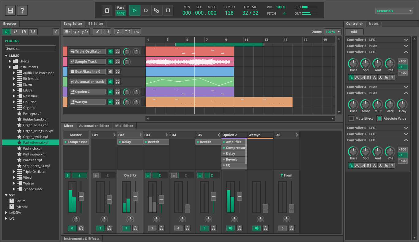
Hi all, My previous work for Zynaddsubfx has same purpose to dock all windows in one (link is dead)
http://budislavtvp.deviantart.com/art/ZynAddSubFX-UI-Concept-2014-455890191It is in development phase > https://github.com/fundamental/zyn-ui-two
Link to full concept:
http://budislavtvp.deviantart.com/art/LMMS-UI-UX-Design-Concept-Single-Window-523696539https://www.behance.net/gallery/38503021/LMMS-UIUX-Design-Concept-Single-Window-Interfacehttps://www.behance.net/gallery/194917259/LMMS-Redesign-ConceptFull version (mirror): full version