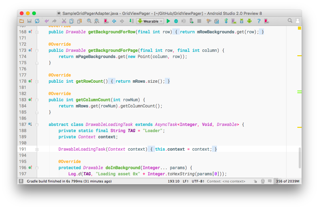
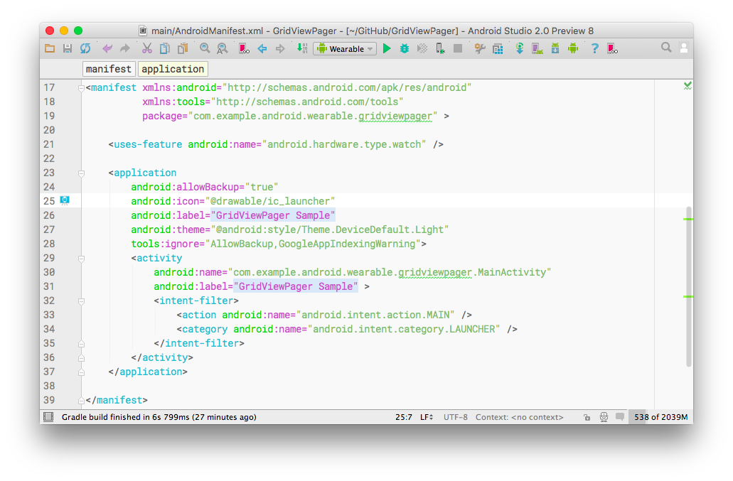
Google Developers color scheme
This color scheme brings the color scheme seen on Google Developers website to Android Studio, and IntelliJ IDEA.
I like this one because it's a both light and colorful color scheme, and I made it show in favorite IDE.
Usage
This color scheme works better with a light Look & Feel (default on Mac OS X).
To add it to your IDE, just hit File>Import Settings in your IDE, and select the file you can download below.
To apply it, go under Editor>Color & Fonts in the Settings window.
Compatibility
This color scheme works starting from version 1.5.1 of Android Studio, and has also been tested on version 2.0 beta.
It has not been tested on other Jetbrains IDEs such as IntelliJ, Webstorm, PhpStorm, etc, but should be compatible with recent versions as of early 2016 January.
Download
Version 1.0.1 is available here. You can see the changelogs in the releases tab.
Screenshots


Which font on the screenshots?
I have been asked the font I use. It's Roboto Mono by Google Design.
It looks very well including on Windows (if the font size isn't too small), even if font anti-aliasing isn't working properly. Note that I'm using Apple's JDK 6 to run Android Studio, and JDK 1.8 for Android Development itself.
Why a light color scheme?
A light color scheme will reduce eyestrain, compared to a dark one. Why? On a dark background, your eyes will adapt to low light conditions, so your pupils will open wide to let more light enter your eye. Fine. But the bright text on the dark background will burn your retina (not forever hopefully) as more light is allowed to enter your eye, which will cause eyestrain after extended watching. On a light background, your eyes don't allow that much light to go in your eyes, but you'll still see where the light is missing, i.e. the text.
Contributing
If you want to improve this color scheme, feel free to open an issue, or contact me by Twitter, or anything else you'll find by typing my name on Google.
This little project is under MIT license.