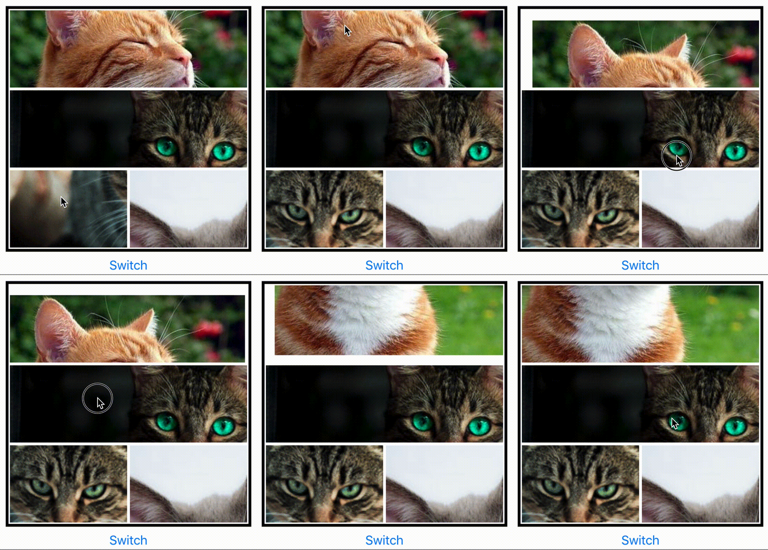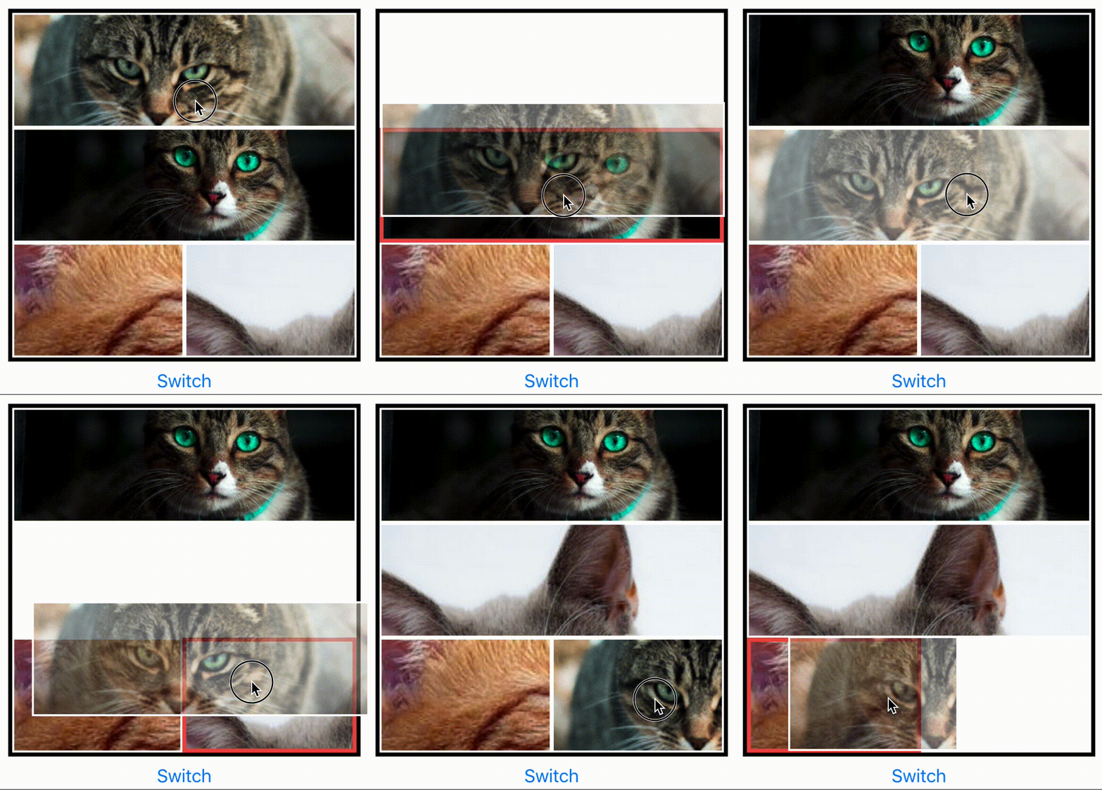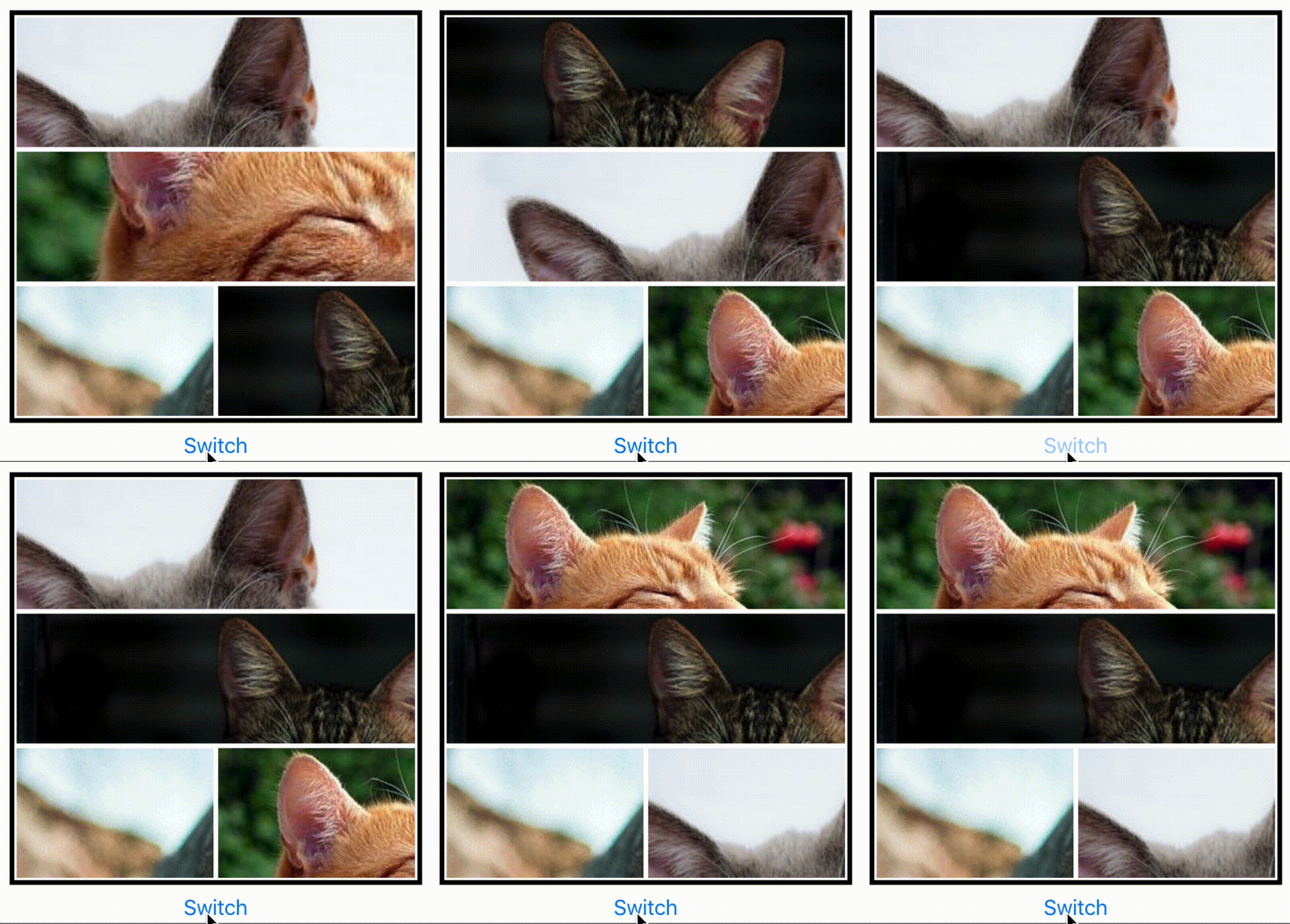


To keep up to date with the latest fixes. See CHANGELOG.md.
Install
Install via npm:
npm install @qeepsake/react-native-images-collage --saveUsage
To use in React Native. Import:
import { DynamicCollage, StaticCollage } from "react-native-images-collage";Dynamic Collage
A dynamic collage includes panning, scaling, replacing and image arrangement.
  <DynamicCollage
    width={400}
    height={400}
    images={ photos }
    matrix={ [ 1, 1, 1, 1 ] }
    isEditButtonVisible: { true | false },
    EditButtonComponent: {() => <YourCustomComponent/>}
    editButtonPosition: { 'top-left' | 'top-right' | 'bottom-left' | 'bottom-right' },
    onEditButtonPress: { (m, i) => { collageRef.current.replaceImage( 'NewImage' , m , i ) } }
    />
Static Collage
A static collage does not include any panning, scaling or arrangement logic. Use this if you want to render multiple non-interactive collages. Same props as the dynamic collage.
<StaticCollage width={400} height={400} images={photos} matrix={[1, 1, 1, 1]} />Layouts
Instead of building your own matrix of collage layouts. There is a JSON file you can import which includes multiple layouts. Up to 6 images.
import { LayoutData } from "react-native-images-collage";You can then access a layout like so:
 matrix={ LayoutData[NumberOfImages][i].matrix }
 direction={ LayoutData[NumberOfImages][i].direction }
The number in the first bracket will be the configuration you want to access. E.g. configuration for 5 images. The second number is the specific layout you want to access e.g. [2, 2, 1]. You will have to inspect the JSON file to find this out.
Notes
- If you want to capture the collage as a single image. Take a look at react-native-view-shot.
- The number of images has to be equal to the sum of the matrix. e.g. Matrix is [ 1, 2, 1 ] ( 1 + 2 + 1 = 4), there has to be 4 images.
- The collage scaling will not work when in a Modal component. Multiple touches are not registered.
- Do NOT update height or width props dynamically to change the size of the collage (as image sizes won't be re-calculated correctly, this is due to a race condition in measuring the layout of the collage). Use
ref.current.updateCollageSize({ width, height })instead to adjust size dynamically.
Replacing Images
There is a API in DynamicCollage which can be used to replace images. It can be accessed via reference. Setup the ref with the DynamicCollage like so:
const collageRef = useRef(null);

<DynamicCollage
  ref={collageRef}
  ...
You can then pass the source (url or file asset) m (matrix index) and i (relative image index) to the replaceImage function:
collageRef.current.replaceImage("https://picsum.photos/200", m, i);Props
| Prop | Type | Optional | Default | Description |
|---|---|---|---|---|
| width | float | No | Width of component. REQUIRED. Used to calculate image boundaries for switching. | |
| height | float | No | Height of component. REQUIRED. Used to calculate image boundaries for switching. | |
| images | array | No | Images for the collage. | |
| matrix | array | No | An array [ 1, 1, 1 ] equal to the number of images. Used to define the layout. | |
| isEditButtonVisible | boolean | No | A boolean value for the edit button. Used to display the edit button on layout. | |
| EditButtonComponent | function | Yes | Custom Edit button component to be displayed on each image in the layout if the value isEditButtonVisible will be true. |
|
| editButtonPosition | enum | Yes | top-left | Enum value to set the position of EditButtonComponent on each collage image layout. |
| editButtonIndent | number | Yes | 20 | Number value to set the indentation of EditButtonComponent on each collage image layout. |
| onEditButtonPress | function | Yes | EditButtonComponent when pressed will be triggered to replace the respective image. |
|
| direction | string | Yes | row | Direction of the collage: 'row' or 'column'. |
| panningLeftPadding | number | Yes | 15 | Distance image can go beyond the left edge before it is restricted. |
| panningRightPadding | number | Yes | 15 | Distance image can go beyond the right edge before it is restricted. |
| panningTopPadding | number | Yes | 15 | Distance image can go beyond the top edge before it is restricted. |
| panningBottomPadding | number | Yes | 15 | Distance image can go beyond the bottom edge before it is restricted. |
| scaleAmplifier | number | Yes | 1.0 | Amplifier applied to scaling. Increase this for faster scaling of images. |
| retainScaleOnSwap | boolean | Yes | true | Keep the scale (width/height) of image when it is swapped. |
| longPressDelay | number | Yes | 500 | Delay before long press is activated. |
| longPressSensitivity | number | Yes | 3 | Sensitivity of the long press, float of 1 (low) to 10+ (high). |
| imageStyle | object | Yes | style | Default image style. |
| imageSelectedStyle | object | Yes | style | The style applied to the image when it has been selected. Long Pressed. |
| imageSwapStyle | object | Yes | style | The style applied to the target image which is being swapped. E.g red borders |
| imageSwapStyleReset | object | Yes | style | The reverse of imageSwapStyle to reset style after swap. Vital for direct manipulation. |
| separatorStyle | object | Yes | style | Style applied to image container. Use border width to create margin between images. |
| containerStyle | object | Yes | style | Style applied to the container of the collage. Collage border can be applied here. |
| imageContainerStyle | object | Yes | style | Style applied to each image container. |
| imageFocussedStyle | object | Yes | style | Style applied to the focused image container. |
API Reference
updateCollageSize({ width, height })
Updates the collage width or height (NOTE: width and height props should always be static)
size: Object- new size for collage to be calculated. Currently supported options are:width : numbernew width of the collage.height : numbernew height of the collage.
replaceImage(source, m, i)
Replaces an image at the matrix and index of the collage
source: string | number- A local file asset or urim : numberthe matrix of the collage (you can think of this as the row or column).i : numberindex inside the matrix (you can think of this as index inside the row or column)
Showcase
If you use the collage in your application then create a pull request to feature it here.
License
This project is licensed under the MIT License
Contributors ✨
Thanks goes to these wonderful people (emoji key):
Luke Brandon Farrell 💻 📖 🚇 |
Amogh Jahagirdar 🐛 |
Muhammad Jasim 💻 📖 |
Henry Arbolaez 💻 📖 |
This project follows the all-contributors specification. Contributions of any kind welcome!


