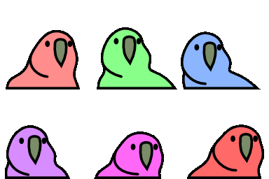
party-css
I love party parrots. My boss regrettably does not. I made this to try to convert him over to liking them, by partifying the frontend of the product I work on (it didn't work, somehow he hates party parrots even more).
On a basal level, this repo has a 🦜 css class which will make whatever html element its applied to 'partified'.
It makes HTML elements bob in an oval and change rainbow colours.
Neat!
The implementation is very simple.
It's fundamentally just two animations, a 🎉 and a 🎨.
.🦜 {
  animation: 🎉 0.7s infinite linear, 🎨 0.7s infinite linear;
  transform-origin: bottom center;
}
The 🎨 animation is responsible for the colour.
It was created by sampling the party parrot gif for each frame.
To sample the party parrot gif yourself, run extract-colours.py.
🎉 on the other hand is responsible for the motion.
It is created by party_skew_gen.py, which calculates X skew and Y scale components to make a seamless, partyparrot esque monstrosity.
It's not perfect, but for that reason you have multiple parameters to tune the animation to your liking. The following parameters are available:
  --max-translation: 0px;  /* pixels */
  --translation-phase: -3; /* radians */
  --max-skew: 18;          /* degrees */
  --max-scale-diff: 0.15;  /* scale factor */
--anim-freq: 2; /* Hz */-
--max-translationis the maximum amount of horizontal translation the element will undergo in pixels. -
--translation-phaseallows you to phase shift the translation. It's in radians, so 0 is no phase shift, pi is a half cycle shift, etc, relative to the skew. -
--max-skewis the maximum amount of skew the element will undergo in degrees. Skew is a bit weird as it is a transvection. It looks weird for large values. -
--max-scale-diffis the maximum difference in vertical scale the element will undergo. It's a scale factor, so 0.1 is a +/-10% difference in scale. -
Finally,
--anim-freqis the frequency of the animation in Hz. The traditional party parrot gif is 2Hz, but you can change this to whatever you like.
Party or die!

