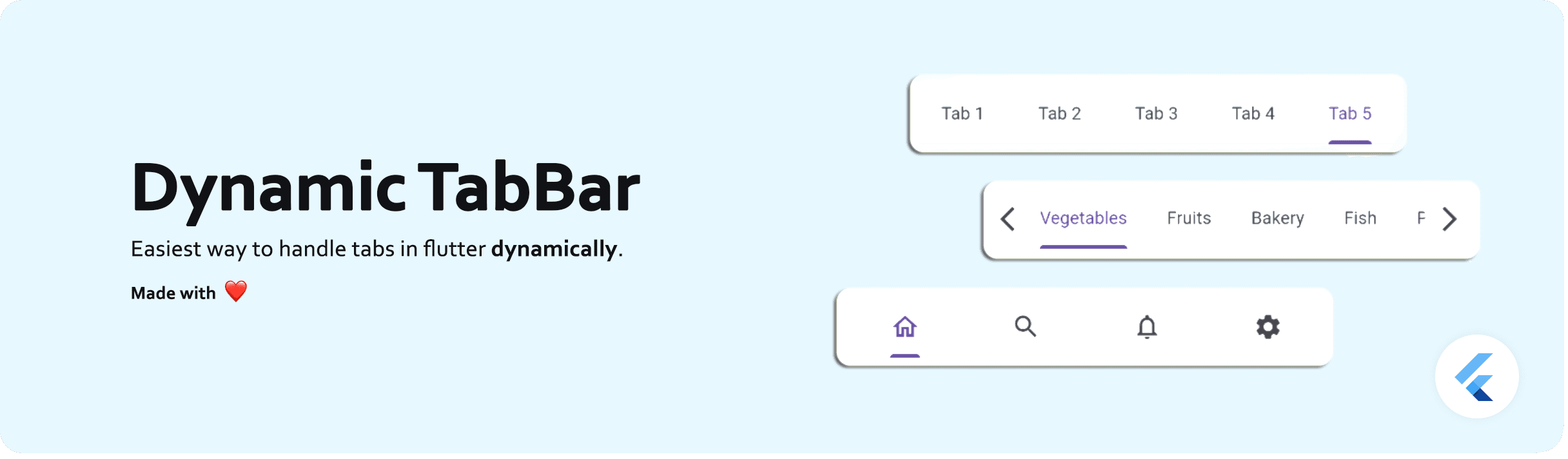
Dynamic TabBar
A Flutter package that simplifies the implementation of dynamic TabBar in your application.
With DynamicTabBarWidget, users can effortlessly manage and navigate through a list of Tabs. The widget is designed to auto-update as Tabs are added or removed, providing a seamless and dynamic user experience.
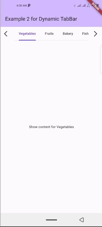
🚀 Demo: Dynamic Tabbar
📱 Screenshots
🛠 Installation
- Add dependency to
pubspec.yamlfile: Get the latest version from the 'Installing' tab on pub.dev
dependencies:
dynamic_tabbar: ^latest_version- Import the package
import 'package:dynamic_tabbar/dynamic_tabbar.dart';- Adding DynamicTabBarWidget
With required parameters
 DynamicTabBarWidget(
    dynamicTabs: tabs,
);
With optional parameters
 DynamicTabBarWidget(
    dynamicTabs: tabs,
    isScrollable: isScrollable,
    onTabControllerUpdated: (controller) {},
    onTabChanged: (index) {},
    onAddTabMoveTo: MoveToTab.last,
    onAddTabMoveToIndex : null,
    backIcon: Icon(Icons.arrow_back),
    nextIcon: Icon(Icons.arrow_forward),
    showBackIcon: showBackIcon,
    showNextIcon: showNextIcon,
    leading : leadingWidget,
    trailing : trailingWidget,

    // Default Tab properties can also be updated
    padding: padding,
    indicatorColor: indicatorColor,
    automaticIndicatorColorAdjustment: automaticIndicatorColorAdjustment,
    indicatorWeight: indicatorWeight,
    indicatorPadding: indicatorPadding,
    indicator: indicator,
    indicatorSize: indicatorSize,
    dividerColor: dividerColor,
    dividerHeight: dividerHeight,
    labelColor: labelColor,
    labelStyle: labelStyle,
    labelPadding: labelPadding,
    unselectedLabelColor: unselectedLabelColor,
    unselectedLabelStyle: unselectedLabelStyle,
    dragStartBehavior: dragStartBehavior,
    overlayColor: overlayColor,
    mouseCursor: mouseCursor,
    enableFeedback: enableFeedback,
    onTap: onTap,
    physics: physics,
    splashFactory: splashFactory,
    splashBorderRadius: splashBorderRadius,
    tabAlignment: tabAlignment,

    // Default TabBarView properties can also be updated
    physicsTabBarView: physicsTabBarView,
    dragStartBehaviorTabBarView: physicsTabBarView,
    viewportFractionTabBarView: viewportFractionTabBarView,
    clipBehaviorTabBarView: clipBehaviorTabBarView,
);
🌟 Features
-
Dynamic Tab Management: Users can push or pop items in the
List<TabData> tabsarray, and the DynamicTabBarWidget will auto-update accordingly. -
Tab Navigation: Implement the
onTabChangedcallback to handle tab change events. -
Customization Options: Customize the appearance and behavior of the DynamicTabBarWidget using parameters like
backIcon, nextIcon, showBackIcon, and showNextIcon. -
Tab Position : Specify the position to which cursor moves to after adding new Tab using the
onAddTabMoveToproperty.
🧰 Parameters
-
dynamicTabs: List of TabData objects representing the dynamic tabs.
-
isScrollable: Set to true to enable scrollable tabs.
-
onTabChanged: Callback function triggered when a tab is changed.
-
onAddTabMoveTo: Enum value (
MoveToTab.idol,MoveToTab.last) specifying where a tab navigator should move when Tab is added. -
backIcon: Custom icon for the "Back" button, If
isScrollableis false, this property is ignored. -
nextIcon: Custom icon for the "Next" button.
-
showBackIcon: Boolean to show or hide the
Back iconbutton, IfisScrollableis false, this property is ignored. -
showNextIcon: Boolean to show or hide the
Next iconbutton, IfisScrollableis false, this property is ignored. -
leading: Custom
leading Widgetif needed. -
trailing: Custom
trailing Widgetif needed. -
TabBardefault properties... -
and
TabBarViewdefault properties...
📚 How to use
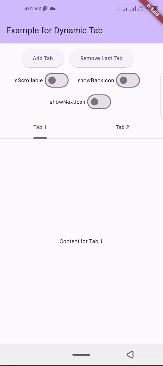
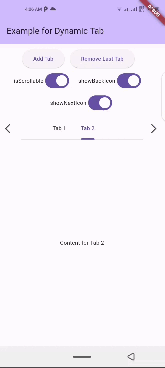
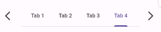
isScrollable
isScrollable: false |
isScrollable: true |
|---|---|
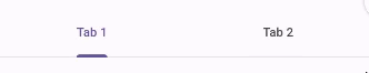 |
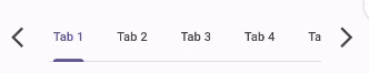 |
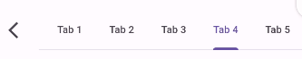
showBackIcon
If isScrollable is false, this property is ignored.
showBackIcon: false |
showBackIcon: true |
|---|---|
 |
 |
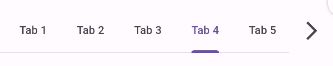
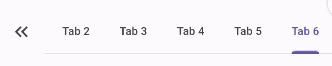
showNextIcon
If isScrollable is false, this property is ignored.
showNextIcon: false |
showNextIcon: true |
|---|---|
 |
|
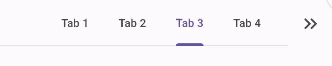
backIcon
We can use custom Icon for back button, If isScrollable is false, this property is ignored.
backIcon: Icon() |
backIcon: null |
|---|---|
Icon(Icons.keyboard_double_arrow_left) |
Default back icon will be used |
 |
|
nextIcon
We can use custom Icon for next button, If isScrollable is false, this property is ignored.
nextIcon: Icon() |
nextIcon: null |
|---|---|
Icon(Icons.keyboard_double_arrow_right) |
Default back icon will be used |
 |
|
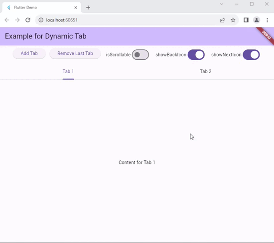
💻 Example
Check out the example app in the example directory for a complete example with additional parameters.
import 'package:flutter/material.dart';
import 'package:dynamic_tabbar/dynamic_tabbar.dart';

class DynamicTabExample extends StatefulWidget {
  const DynamicTabExample({super.key});
  @override
  State<DynamicTabExample> createState() => _DynamicTabExampleState();
}

class _DynamicTabExampleState extends State<DynamicTabExample> {
  bool isScrollable = false;
  bool showNextIcon = true;
  bool showBackIcon = true;

  List<TabData> tabs = [
    TabData(
      index: 1,
      title: const Tab(
        child: Text('Tab 1'),
      ),
      content: const Center(child: Text('Content for Tab 1')),
    ),
    TabData(
      index: 2,
      title: const Tab(
        child: Text('Tab 2'),
      ),
      content: const Center(child: Text('Content for Tab 2')),
    ),
    // Add more tabs as needed
  ];

  @override
  Widget build(BuildContext context) {
    return Scaffold(
      appBar: AppBar(
        title: Text('Example for Dynamic Tab'),
      ),
      body: Column(
        mainAxisSize: MainAxisSize.min,
        children: <Widget>[
          Padding(
            padding: const EdgeInsets.all(8.0),
            child: Wrap(
              direction: Axis.horizontal,
              alignment: WrapAlignment.center,
              children: [
                ElevatedButton(
                  onPressed: addTab,
                  child: const Text('Add Tab'),
                ),
                const SizedBox(width: 12),
                ElevatedButton(
                  onPressed: () => removeTab(tabs.length - 1),
                  child: const Text('Remove Last Tab'),
                ),
                const SizedBox(width: 16),
                Row(
                  mainAxisSize: MainAxisSize.min,
                  children: [
                    const Text('isScrollable'),
                    Switch.adaptive(
                      value: isScrollable,
                      onChanged: (bool val) {
                        setState(() {
                          isScrollable = !isScrollable;
                        });
                      },
                    ),
                  ],
                ),
                const SizedBox(width: 16),
                Row(
                  mainAxisSize: MainAxisSize.min,
                  children: [
                    const Text('showBackIcon'),
                    Switch.adaptive(
                      value: showBackIcon,
                      onChanged: (bool val) {
                        setState(() {
                          showBackIcon = !showBackIcon;
                        });
                      },
                    ),
                  ],
                ),
                const SizedBox(width: 16),
                Row(
                  mainAxisSize: MainAxisSize.min,
                  children: [
                    const Text('showNextIcon'),
                    Switch.adaptive(
                      value: showNextIcon,
                      onChanged: (bool val) {
                        setState(() {
                          showNextIcon = !showNextIcon;
                        });
                      },
                    ),
                  ],
                ),
              ],
            ),
          ),
          Expanded(
            child: DynamicTabBarWidget(
              dynamicTabs: tabs,
              isScrollable: isScrollable,
              onTabControllerUpdated: (controller) {},
              onTabChanged: (index) {},
              onAddTabMoveTo: MoveToTab.last,
              showBackIcon: showBackIcon,
              showNextIcon: showNextIcon,
            ),
          ),
        ],
      ),
    );
  }

  void addTab() {
    setState(() {
      var tabNumber = tabs.length + 1;
      tabs.add(
        TabData(
          index: tabNumber,
          title: Tab(
            child: Text('Tab $tabNumber'),
          ),
          content: Column(
            mainAxisAlignment: MainAxisAlignment.center,
            children: [
              Text('Dynamic Tab $tabNumber'),
              const SizedBox(height: 20),
              ElevatedButton(
                onPressed: () => removeTab(tabNumber - 1),
                child: const Text('Remove this Tab'),
              ),
            ],
          ),
        ),
      );
    });
  }

  void removeTab(int id) {
    setState(() {
      tabs.removeAt(id);
    });
  }
}
📝Contribution
Of course the project is open source, and you can contribute to it repository link
-
If you found a bug, open an issue.
-
If you have a feature request, open an issue.
-
If you want to contribute, submit a pull request.
💳 License
This project is LICENSED under the MIT License. Use it freely, but let's play nice and give credit where it's due!
🎉 Conclusion
I will be happy to answer any questions that you may have on this approach, If you liked this package, don't forget to show some ❤️ by smashing the ⭐.