alphagov / govuk-design-system-backlog

GOV.UK Design System Community Backlog
30 stars 2 forks source link

Notification banner #2

Open govuk-design-system opened 6 years ago

govuk-design-system commented 6 years ago

Also known as: alert

What

An on-screen alert to notify users that something important has happened.

For example:

Why

Anything else

NickColley commented 6 years ago

One proposal:

The alert component would be a top level component that is generic that does not have any understanding of the context it's used in.

This component would have different variants called 'danger', 'success'. Similar to the digital marketplace implementation.

We'd then move 'Error summary' component and 'Confirmation panel' component into patterns that use 'danger' variant and 'success' variant respectively.

stevenaproctor commented 6 years ago

@nickcolley Should we be using colour, especially red, this way? Because red can cause stress, especially when a page loads and it is not connected to what they have done, like the way error messages work. Should we be recommending this amount of red?

There is something about the red button that would make me think I was doing something destructive like deleting something.

I realise the red, amber, green and blue are enhancements and everything should make sense without the colour so should not affect people who are colour blind.

NickColley commented 6 years ago

@stevenaproctor thanks for the points. 👍 💯

Should we be using colour, especially red, this way?

One nice thing about the current error summary component is that it indicates it's usage in the name, so you wouldn't accidentally use it to display something that is not an error.

If we were to do this I suspect we'd need to be careful with the guidance to help people choose the right variant for their use case.

In terms of increased amount of colour, we could consider doing alerts more in line with the current error summary component, which does not change the text colour.

There is something about the red button that would make me think I was doing something destructive like deleting something.

We could remove the buttons from the scope of this component, then consider updates to the 'Button' component separately in the future.

markhurrell commented 6 years ago

I'd like to do some work with making these more consistent and maybe reducing them down to a simpler set of banners and notifications, but I'm not sure they would make sense as a single component;

  1. I think the information design requirements for the different types of banners and notifications probably needs to be different, they're doing different things and have different urgencies. An error message preventing you from submitting a form probably needs be different from a generic site-wide notification banner, or a success confirmation with follow actions.
  2. There's probably a case that the markup would need to be different for different types of notification too? or at least have very different levels of urgency within the document tree?
tombye commented 6 years ago

I've done some research on this pattern that might prove useful, talking to the designers involved and looking through the references in the description.

Themes

Across all the references linked to in the description, I found the following themes:

Visual patterns

Alerts in transactions have a complete solid border:

Success alert on the Digital Marketplace

Most of those on content pages just have a different background colour:

content_informative_dm

GOV.UK has a variant called notice, like those for transactions but with a thiner border:

govuk_notice

Those on dashboards have a border on the left, like the inset text pattern, with a background colour to match the border but with a lighter hue.

Service notice on Universal Credit

Icons

Rural payments, Pay, Notify and Registers all also use tick and cross icons to indicate success and failure.

Colour

Colour is used fairly consistently.

Where orange is used, the intention was often unclear and in a few place it indicated the alert contained information which should just be part of the page content.

Types of alert

The types of alert seem tied to the type of page.

Description Type of page Services
Your action was successful Transaction Digital Marketplace, Notify, Rural Payments (DEFRA)
Your action was not successful Transaction Digital Marketplace, Notify, Rural Payments (DEFRA)
Information you need before using this page Transaction Digital Marketplace
Information you need before reading this page Content Digital Marketplace, GOV.UK
Notice about the service process Dashboard Prepare for Universal Credit (DWP)
Notice to draw attention to a part of the page Dashboard Bereavement Support Payment (DWP), Rural Payments (DWP)

Your action was successful

Digital Marketplace success alert Rural Payments success alert

success_notify

Your action was not successful

Digital Marketplace error alert Rural Payments error alert

error_notify

This banner should include information (including links) on how to be successful.

Digital Marketplace, Registers, Notify and Pay use this to ask users to confirm an action and so include a button for that confirmation.

Information you need before using this page

Digital Marketplace transaction information alert

Use cases

Digital Marketplace have forms with pre-filled fields, based on information users have already given them. They use a banner to let users know where the answers came from.

Information you need before reading this page

Digital Marketplace content information alert

content_informative_govuk

Use cases

Digital Marketplace show services that are no longer available to buy on their procurement frameworks. They use this banner to mark them as different to those still available.

GOV.UK display policies from previous governments and so use this banner to mark them as different from those of the current government.

Notice about the service process

Universal Credit service notice alert Universal Credit service warning alert

Notice to draw attention to a part of a dashboard

Rural Payments notice about part of the page Bereavement Payments notice about part of the page

Technical implementation

ARIA use

ARIA attributes should be added to give alerts accessible names.

Those that need immediate attention should have a role of alert.

Other alerts should have a role of region and an aria-label attribute set to "notice".

Focus

Alerts that need immediate attention should have focus shifted to them when the page loads or when the action they relate to completes, if that doesn't involve a new load.

Additional notes

@abbott567 mentioned the DWP patterns page isn't used for all DWP projects, just the 'Prepare for Universal Credit' service.

The following people helped out with this (thanks!) and all have experience of implementing this pattern:

stevenaproctor commented 6 years ago

@tombye Impressively comprehensive.

Red works well with validation error messages and similar use cases where the red is connected to something you have just done. But when a page, like a dashboard, loads and the red is there in a notice it could inadvertently cause people stress. It might not be obvious why the red is there.

If the colour is there to draw attention, all notices could be blue to signify 'this is a notice' without any extra effects. The meaning will come from the content.

If we want to use red, we could be less intrusive but still effective. We want people to do something but we do not want to cause stress. In the HMRC example mentioned in the description, the alert would be better and more accessible without all the red content.

In the example under 'Your action was not successful' with the red button, you cannot say no. And it is not as accessible as it could be.

The button is not linked to the question in any obvious way and the label does not make sense out of context. It could say 'Yes, delete testing' and you could have another button that says 'No, do not delete testing' but that is not how yes-no questions are usually handled.

This type of action would be more accessible as a separate, standard yes-no question with radio buttons. The screen would come immediately after someone tries to delete something.

abbott567 commented 6 years ago

@stevenaproctor we had a blue notice at the top in bereavement to inform agents that a claim needed attention, and it tanked in session after session. Agents just couldn’t see it. It was like they were banner blind or something. Literally staring at the page and not seeing it for minutes. Was really awkward.

However, the red notice in the example above about the overpayments did work, they saw that straight away. But we do use it sparingly. It’s only ever shown under really niche conditions. Most people will never see it.

I think that we’d have to be really careful in the guidance if we go ahead, because alerts are really open to being abused when plain content may actually be better.

stevenaproctor commented 6 years ago

@abbott567 I have no doubt it draws people's attention and guidance about when to use and not to use it is super important.

When we tested alerts in tax credits, people rarely saw those at the top of the screen because they do look a little banner-y. But when we moved them further down the screen so they were under the <h1> they were seen more often that not.

quis commented 6 years ago

@tombye This is an awesome piece of work 👏

abbott567 commented 6 years ago

For anyone interested, this is the blue banner we tried that nobody saw. I can't remember the exact figures, but it was definitely more than 50% of people that didn't interact with it or even see it.

It got to the point where we literally sat in research sessions saying "Do you think there might be anything else you need to do on this page?" and... nothing. haha

image

kr8n3r commented 6 years ago

Alert/Notification on Civil service Live screen shot 2018-04-27 at 09 43 03

joelanman commented 6 years ago

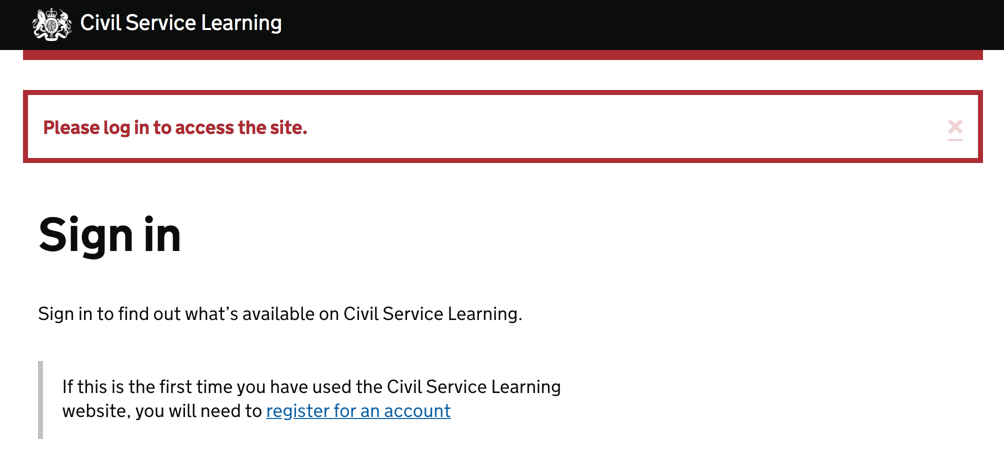
Civil Service Learning

image

joelanman commented 6 years ago

Also Civil Service Learning image

jfranciswebdesign commented 6 years ago

Companies House

We're testing this pattern as part of our accounts filing service (currently in Beta) - testing well with all users so far (including those reliant on assistive technology and those with low digital skills) - the common reactions tend to be "Yes, I've seen this type of thing before" or "Yes, that's what I expected".

ch-accounts

trevorsaint commented 5 years ago

For what it's worth these are two of the patterns we may be using on the HMCTS Design System. Yet to be discussed.

image
fofr commented 5 years ago

This is what DfE are using on "Publish teacher training courses". The green colour matches the button green. It's very similar to the error summary but we kept links blue rather than make them green.

screen shot 2018-08-21 at 11 23 56

timpaul commented 5 years ago

We'd like to explore the idea of using a 'success' alert style on confirmation pages, in place of the panel style we currently use.

So, replacing this:

image

With this:

image

Our hypothesis is that doing this will improve the readability of confirmation pages, and also make for a more consistent user experience.

However, this feels like quite a significant change. Would any teams be willing and able to test this approach in user research (or in their service)?

abbott567 commented 5 years ago

@timpaul I’d be willing to test this. The caveat is that we’re designing a case working system not a service that citizens use.

SineadFluent commented 5 years ago

On Multiplication tables check (MTC) we used the error message design and made it green for positive notifications. After users do an action they get a notification to say that their action has been received by the system and we used links and green indents to show which items those actions have been applied to. From our research, there has been no issues, some positive feedback such as links and the green colour help. We don't have video footage of this but it has been taken to many schools without any problems raised about this. screen shot 2018-08-31 at 16 58 17

timpaul commented 5 years ago

Thanks @abbott567 - let us know how we can support you

jfranciswebdesign commented 5 years ago

@timpaul We've got two rounds of testing later this week (Companies House - 'File your CIC report and accounts'), happy to try the new pattern out. Is there anything specific you want to find out, or shall we just test as usual and see what sort of responses we get?

companies-house-current companies-house-updated

timpaul commented 5 years ago

Thanks @jfranciswebdesign. Some possible research questions include:

More generally- we'd like to consolidate our banner and alert styles but not if there's a good reason for them to be different. We're trying to find out if there's a reason the 'confirmation panel' style needs to be different from a more generic 'success' alert.

abbott567 commented 5 years ago

@timpaul that's an interesting point about people that are colourblind. Especially as red / green colourblindness is the most common form. I'm wondering if stylistically the border should be subtly different. Wider, narrower or something?

timpaul commented 5 years ago

Ideally the content alone should be unambiguous - but if it turns out that it does confuse some users then we'll need to look at making them more visually distinct (borders, backgrounds, tick icons etc.)

JohnnyLoz commented 5 years ago

We were discussing the print option for our confirmation page last week and I mentioned I'd probably not bother as it would use a lot of (expensive!) toner ink. This new pattern would be good for tightwads like me!

Ash-Wilson commented 5 years ago

@timpaul we are testing our confirmation pages at the moment so happy to test this version? But we are in the same boat as @abbott567 in that it is for DWP staff in job centres. Here's an example of what we have at the moment:

screen shot 2018-09-03 at 11 03 17

chrisadesign commented 5 years ago

If the goal is to move towards something similar to the error summary and other possible alerts, should the font sizes on the test version be reduced to be inline? Especially considering they were increased to make them readable on the green background, which isn't an issue anymore?

image

andyjones1981 commented 5 years ago

We'd be willing to test this approach for a service were working on and putting through user research now.

Is it up to us to style it, or does someone have CSS / SCSS we can utilise for consistency? I'm leaning towards the suggestion from @chdesign but with the green from @jfranciswebdesign I'm blue/green color blind and I really struggle even looking at teal/blue-green shades

jfranciswebdesign commented 5 years ago

@andyjones1981 I used Colorzilla on the Tim's original post (to identify the border color), then added some (temporary) custom CSS:

/* testing out potential GDS styles */ .govuk-panel { color: black; background-color: white; border: 5px solid #008A3C; }

charlesrt commented 5 years ago

Should we declare a background-color or should it be omitted to respect the background of the body?

andyjones1981 commented 5 years ago

I would assume it would inherit as we generally don't set backgrounds.

gavinwye commented 5 years ago

@timpaul I'm just putting this in a prototype for some testing next week. I'll post results here.

timpaul commented 5 years ago

Massive thanks to everyone who's agreed to test this idea out.

jfranciswebdesign commented 5 years ago

We tested our service with 5 users over the last week (a mixture of accountants and company 'administrators').

The updated version of the notification banner caused no issues:

(We didn't test with any visually impaired/colour blind users I'm afraid)

I wouldn't say it improved the user experience, I'd judge it to be a neutral change - so is the fact it made no difference enough to justify the update?

andyjones1981 commented 5 years ago

I reiterate @jfranciswebdesign comment. We tested with 8 research participants last week and they didn't have any issues with the updated version either. People were clear that they had completed their application.

If the change is to bring it in line with error summary styling, (ie, being in a bordered section, with a different border color), in which case I'd consider this to be an alert? Is the real aim for the confirmation summary to be seen as something different? In which case, I'd stick with the original style for this component.

timpaul commented 5 years ago

Thanks, both of you. We certainly wouldn't roll out a change like this unless there were significant benefits. As a few of you have pointed out - changing a very common component like this would initially introduce inconsistency as teams update their services at very different rates.

owenm6 commented 5 years ago

Examples from passports

default alert success alert
abbott567 commented 5 years ago

image

I'm using this in my prototype at the moment. I noticed @joelanman make some comments about the button-green colour so I opted for the light-green instead. The Sass and HTML are below if anyone needs it.

Probably worth noting this is linked to #55 and #40 Feedback or input would be great.

.app-panel {
  @include govuk-responsive-margin(9, 'bottom');
  border: 5px solid govuk-colour('black');
  padding: 2em;
  text-align: center;
  width: 100%;
}

.app-panel--success {
  border-color: govuk-colour('light-green');
}
<div class="app-panel app-panel--success">
  <h1 class="govuk-heading-l">Claim allowed</h1>
  <p class="govuk-!-font-size-24 govuk-!-margin-bottom-0">
      Payment schedule created
  </p>
</div>
penx commented 5 years ago

We have a need for a toast notification system and it's something we may add to govuk-react. This is for internal use only, though we are following govuk design system where we can. We're currently using react-toast-notifications though would be looking to style or replace this at a later date.

penx commented 5 years ago

The style posted by @owenm6 above looks ideal for toast notifications

adamsilver commented 5 years ago

Throwing the HMCTS Banner (previously named Alert) component into the mix: http://hmcts-design-system.herokuapp.com/components/banner

image

davidolsan commented 5 years ago

I have a question. Should the notification message go above the H1 (such as error message summary) or below H1 as in the "Examples from passports" above?

adamsilver commented 5 years ago

We put our alerts (at HMCTS) in the same location as error summary. Above the H1.

On Wed, 13 Mar 2019, 14:08 David Olsan, notifications@github.com wrote:

I have a question. Should the notification message go above the H1 (such as error message summary) or below H1 as in the "Examples from passports" above?

— You are receiving this because you commented. Reply to this email directly, view it on GitHub https://github.com/alphagov/govuk-design-system-backlog/issues/2#issuecomment-472435447, or mute the thread https://github.com/notifications/unsubscribe-auth/AACRKw2Fd5IoBGTVSZTQVKqloDVMOq4Sks5vWQZ7gaJpZM4RbKKb .

edwardhorsford commented 5 years ago

My service (an internal casework system) has now adopted the HMCTS banners too. Like @adamsilver, they're placed above the h1, after breadcrumbs and other main page nav.

sdh100shaun commented 5 years ago

is there any insight into how far this is up the backlog - and any front runner alert components ?

joelanman commented 5 years ago

Hi @sdh100shaun - components and patterns in the backlog are prioritised here:

https://github.com/alphagov/govuk-design-system-backlog/projects/1

Alerts are number 10, to give you an idea we have recently been publishing at a rate of roughly 1 per month.

I don't think there is a frontrunner as such - I would browse this thread and weigh up the different approaches. If you try any it would be really helpful to hear any research.

dommn commented 5 years ago

One of the services I work on - an internal facing case system - has long suffered from banner blindness. There are a variety of different reasons for this but we recently usability tested an alternative style and found it helped significantly with providing clearer success messaging.

Screen Shot 2019-06-11 at 08 35 33

We found that the style similar to this was readily ignored by users.

matthewsolle commented 4 years ago

Following on from mentioning this on a recent xgov design systems catchup call, here at Defra we are working on a multi-file upload pattern which will include an alert component. We currently have the challenge of designing it for multiple user cases. One being the uploading of files as attachments as part of an application and one being the uploading of multiple photos.

Examples below of alerts for multiple files (with context):

Screenshot 2020-02-06 at 13 48 42 Screenshot 2020-02-06 at 14 06 49 Screenshot 2020-02-06 at 13 50 58 Screenshot 2020-02-06 at 13 49 15
adamsilver commented 4 years ago

Been speaking to @matthewsolle offline about showing an alert at the top of the multi-file uploader.

With JavaScript available, the multi-file uploader will use AJAX without causing a page refresh.

So each file dropped/added will appear just above (or below as in Matthew's screenshot) the dropzone showing each file being uploaded. After it's uploaded it will turn into a success or error state.

So this means the user sees the state of each file in context of uploading the file in real time.

Therefore, I'd say that adding an alert is redundant because it draws the user's attentions in 2 directions to provide the same information that's already available beside the dropzone.

Also, to make sure the alert is seen means having to set focus to it which means taking the user away from the file uplading itself which could cause a problem while they're looking at it or trying to upload additional files perhaps.

Here's how the MOJ pattern handles it: image

Demo: https://moj-design-system.herokuapp.com/components/multi-file-upload/examples/default

A note on this behaviour without JavaScript

Without JavaScript, the file upload works as you'd expect as any other field. The page refreshes and any errors are shown using the standard pattern.

And similarly to how forms should persist any correct answers, the successfully uploaded files should also be persisted.

This would mean that users are drawn to the error summary at the top (like normal) to fix errors and don't need to be drawn to any successful uploads.

timpaul commented 4 years ago

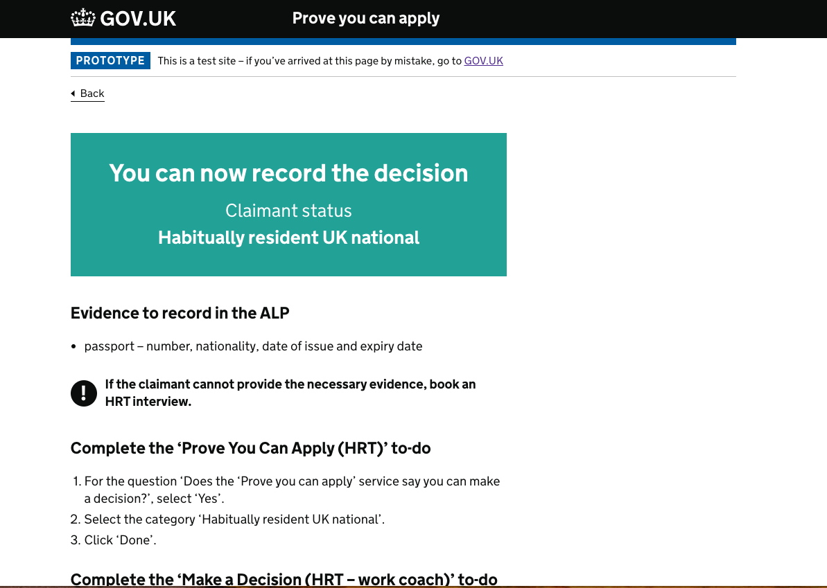
Another kind of alert. Not as a result of user action, but because of some external event image