alphagov / govuk-design-system-backlog

GOV.UK Design System Community Backlog
31 stars 2 forks source link

Task list #72

Open govuk-design-system opened 6 years ago

govuk-design-system commented 6 years ago

Use this issue to discuss this pattern in the GOV.UK Design System.

abbott567 commented 6 years ago

Thought I'd just weigh in with a tweak we have had to implement for this pattern.

We are currently using it in a case working system and we had an issue where if one agent went in and chose some options that meant the task was not complete, to other agents it looked like no work had been done at all.

So, we needed a way to differentiate between a section that had not been looked at and a section that could not be completed. So we have added a grey 'not complete' badge to say 'yes, i've looked at it, but it's missing some information' vs 'nobody has looked at this section at all'.

screenshot-localhost-3000 2018 05 30 12-41-14

peteblakemore commented 6 years ago

Interesting to see you've also removed the numbers from the side of each task, @abbott567 . On the service I'm working on we will also use a task list, but the tasks needn't be completed in order, so this approach would work well for us.

kubabartwicki commented 6 years ago

We just finished a mission in which we worked on a part of Digital Marketplace where users can search for cloud hosting, software and support. We redesigned an existing task list and put it at the start of the service: https://www.digitalmarketplace.service.gov.uk/buyers/direct-award/g-cloud/start


Things we knew before

Things we learned

Put a static version of task list at the start of the service

screenshot-www digitalmarketplace service gov uk-2018 07 18-15-09-43

We had a hypothesis that task list would be a great way to explain how to use our service. To test, we replaced our old start page which had a search bar on it, with a task list.

This performed really well: it made the process transparent and cleared up a few confusions. We previously tried doing this with a start page pattern, but users found it annoying and a barrier to search.

Our static task list has no badges and is treated as static content rather than something users can interact with.

Put guidance alongside tasks

We modelled our task list around the idea that each step has a single task associated with it and some guidance. This is different to the task list in GOV.UK Elements, which assumes that each step consists of a bunch of tasks.

Doing it this way ensures that users can access guidance at all times but they don’t to tell us they read it each time they use it.

Use badges

“Completed” and “Can’t start yet” worked really well. They helped users realise what to do next and a few times made them realise that the page they are looking at is interactive and changes as they walk throughout the process.

screen shot 2018-07-18 at 15 08 19

It’s not always obvious what the steps are

The hardest part of this work was getting the steps right – we tested 5 different iterations of the task list before we ended up with the 5 steps we have now.

The most interesting one here is step 3, which refers to a lengthy offline process which a lot of our users currently get wrong. Returning users found it annoying to have to confirm "I've done this" each time, so we had to tweak the way the step is explained and acted upon.

We went with “Confirm you have read and understood how to assess services”. This means that the step is about reading our guidance about a process, rather than completing the process, which can take weeks and has very blurry edges as to where it ends and begins.

PeteWilliams commented 6 years ago

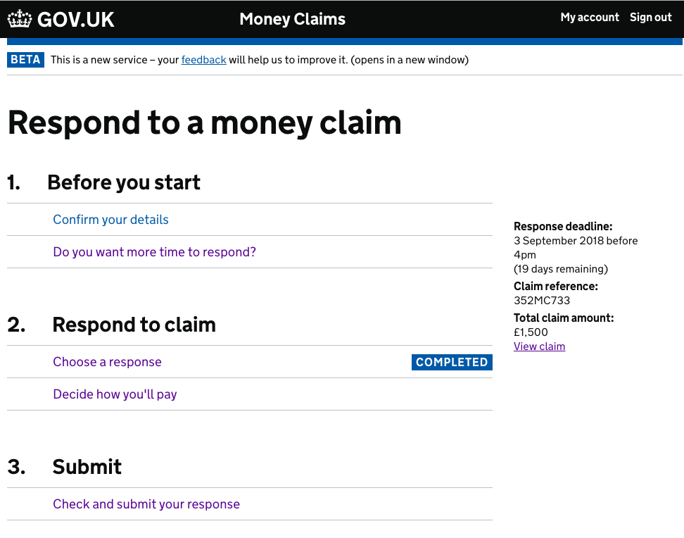
Thought I'd log a couple issues we've seen In the Civil Money Claims project. The first of which has had quite serious consequences for the user involved, and led to a complaint.

image

'Completed' marker misleading A defendant in the live service was responding to a claim saying that they owed some money. They completed the required task in order to defend their claim, then were returned to the task list where that task was marked ‘completed’. The user thought this meant they’d filed their response, so they didn’t continue to the ‘Check and submit your response’ task. As a result they were issued with a CCJ for not responding. This user was partially sighted and using a screen reader, but we think that may be a red herring, as apparently this has come up in testing with sighted users too.

Users not completing all sections Over 20% of users in our live service got the error telling them to complete all tasks before continuing. We've seen a few causes of this in testing:

Any thoughts on how to resolve these issues would be much appreciated. My current thinking is to try adding 'You must complete all tasks before continuing' to the top, which may help both issues if people actually read it.

kr8n3r commented 6 years ago

Has anyone tried/tested by moving the tag to the left, below the task description?

charge-valtech commented 6 years ago

Working on the "Apply for a Blue Badge" service.

We started testing with this in our prototype from last week. Overall, it's tested really well - it helps users realise how far along the application they are, and prepares them for what is coming up. We take users to the task list for the first time after they complete the "Check eligibility" section. 5 out of 5 users understood this on first land, they see the "Completed" tag and understand what the next section is that they need to complete.

One issue we did see though, was once a few tasks had been completed in the list, it becomes more difficult to see the sections that are incomplete. The page becomes more difficult to scan.

We are toying with the idea of a subtle "Not started" tag which is a light blue or something.

All users spotted and understood that they needed to hit "Submit and pay" at the end of the list for the application to be submitted.

anna-kayPA commented 6 years ago

We use the tasklist in the probate service.

User needs

Differences between ours and the beta tasklist

including why and how we've tackled it

Users can't complete items in any order. They can't for example pay before they've filled in the application.

Our service is in public beta and we have had a tasklist in our service for over a year.

probate-tasklist-2

Users will have been screened and created an account before they land on the tasklist.

Ongoing challenges

For some users, there is a step in the process where they need to wait for someone else's response before being able to proceed to the next task. When this happens, we do not show the green button. Instead we include content below that section header informing the user that they can't proceed yet. We believe this causes users confusion until they read the content. We are working on a way to help users easily understand that they need to pause for now.

kubabartwicki commented 6 years ago

@PeteWilliams

That's a really interesting issue – I wonder if it's to do with users recognition of the steps as things they need to do? That's what we struggled with the most on Digital Marketplace (https://github.com/alphagov/govuk-design-system-backlog/issues/72#issuecomment-405944730)... eg maybe if "Submit" was more about "Submit response" and "Respond to claim" about "Prepare response" it could be more effective and clearer to users what the badges mean and refer to? 🤔

helenadt commented 6 years ago

@PeteWilliams it seems like there may have been a number of things at work there. I have not used this pattern so can only add some thoughts.

I wonder if it is worth trying to reintroducing the green button for the final task? I.e. for 'Check and submit a response'. Might make it clearer how you finish. Has anyone tried this?

It also feels like there might be something about the first set of tasks being 'Before you start'. By being at the task list am I not already started?

sunilkathare commented 6 years ago

We are using the task list pattern to design an online version of the C110A application, which is 22 pages long, where local authorities can apply for a care, supervision or emergency protection order.

Local authority solicitor or legal assistant can use this application to start the process to place a child at risk of harm under the care of the local authority.

Why we are using this pattern?

During user research we found users liked to see all the sections in the application in the form. One question per page pattern, shows just the first few questions. You must answer these before moving to the next section. It can be reassuring to know all the questions. So, you know what to do. It helps to know what information you need to gather if you know that questions.

If you can’t yet answer question 3 – maybe you are still gathering information – you can still answer question 8. One question per page pattern online forms progress linearly – you must answer one question before seeing the next. With the task list pattern you can answer question in any order.

With the task list pattern you can add information as and when you get it. For example, in international cases, you have to wait till you get important information. As it is not linear, you don’t have to enter all information in one go.

Users don’t need to go through all the questions in the application form and can skip entire sections like the international section. Users don’t need to waste time saying no to questions that they don’t need to answer and fill only sections they need to. Fewer pages to load and fewer buttons to click means that they end up saving time!

apply-for-care-order-desktop

apply-for-care-supervison-or-epo

apply-for-care-order-phone apply-for-care-order-tablet

quis commented 6 years ago

We’re trying this variation of the task list pattern on GOV.UK Notify:

image

There’s some more detail in this pull request: https://github.com/alphagov/notifications-admin/pull/2250

I’ll update this comment once it’s been live for at least a month and we can measure how effective it’s been.

charge-valtech commented 6 years ago

We noticed screen reader users getting a bit frustrated by having to tab through every section each time they came back to the task list.

I've prototyped this solution to see if it helps things. A hidden link similar to the "Skip to main content" that takes the focus to the first incomplete link on the page.

Screen recording of it in action

timpaul commented 6 years ago

Great idea @charge-valtech ! If you try it out in research let us know how it performs.

joelanman commented 6 years ago

@sunilkathare thanks for sharing that! Do you have any findings from user research? Are you finding any of the same problems as some other teams? For example users not realising which sections they have to complete

sunilkathare commented 6 years ago

@joelanman We have tested the task list pattern with 7 users in sprints 1-3

It is really working well for us! We have mostly made changes to the content, after user testing. We have had to change the order of questions, add and remove questions based on the user feedback. We are also using check your answers pattern in the end. Think, it really helps to have the check your answers as the last item on the task list. Users can review all there answers before submitting the application.

Cheers, Sunil

On Mon, Sep 17, 2018 at 4:02 PM Joe Lanman notifications@github.com wrote:

@sunilkathare https://github.com/sunilkathare thanks for sharing that! Do you have any findings from user research? Are you finding any of the same problems as some other teams? For example users not realising which sections they have to complete

— You are receiving this because you were mentioned. Reply to this email directly, view it on GitHub https://github.com/alphagov/govuk-design-system-backlog/issues/72#issuecomment-422050883, or mute the thread https://github.com/notifications/unsubscribe-auth/Ah0Hk7aGd3ErRz1cyfsW1XE025NiZM7Bks5ub7mYgaJpZM4Rckjo .

phillipsr commented 6 years ago

Hi everyone - just thought that it might be useful to contribute to this chat. We've been working on Register as a Childminder for a while at Ofsted (in private beta) and have gone through multiple iterations of the task list. Our complicating factor is that we can have 6 legitimate statuses of a task (Done, Started, Waiting (to progress the task someone else has to do something), Flagged (a reviewer has flagged a problem they need to correct), To Do, and Do Last). The image below shows how we've created new statuses in a similar vein - although its not actually possible to have all of them shown at once, so take that with a pinch of salt.

suggested_tasklist_colours_black

In our testing these have all worked really well, and now that we have tweaked the colour scheme for some earlier contrast issues we would pass our accessibility audit (combining the statuses with alternative descriptions). Without being able to use the task list pattern, our application is very long and involves lots of different areas - so this brings them together nicely. We also have the challenge that tasks can be done in any order (except for the last one), and users frequently (want and need to) complete the form over multiple visits and over a long period of time. So having the task list as a check point of where everything is up to is incredibly useful for them.

We'd be really happy to share any of our findings with anyone that is interested, or to hear any other observations. Rich - richphillips_ofsted on slack

joelanman commented 6 years ago

We've heard a lot of research to say that some users don't know they have to complete all tasks. It's also the case that screen reader users can't easily get an idea of their progress, whereas sighted users can get an impression by seeing the 'completed' tags.

So, we'd like to suggest a change and get some research on it:

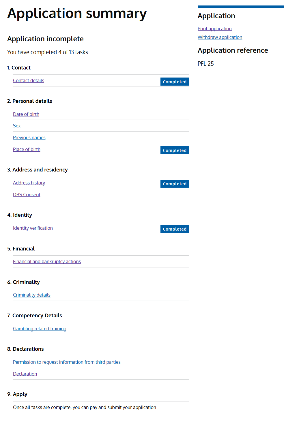
Once a user has completed at least one task, add a summary line above the task list to say how many tasks have been completed.

"You have completed 2 of 6 tasks"

PeteWilliams commented 6 years ago

One potential problem with that is that, in our case at least, the number of tasks can be dynamic. You might start with 'You have completed 1 of 4 tasks', which then becomes 'You have completed 3 of 7 tasks'. So it could be quite misleading - though that may be better than the alternative.

marthaboggins commented 6 years ago

Have performed two sets of tests with this pattern being part of the flow. The numbering left user's thinking they had to do the tasks in order - which is not the case. Otherwise they had no issues with it.

From my POV I'd like to see how you intended the links to work once the user has Completed a section. Do they simply go back to same pages with the fields pre-filled?

phillipsr commented 6 years ago

@marthaboggins I think that's an interesting question. In our register as a childminder service, we had a summary page at the end of each task. Therefore, if the task was complete, clicking the link would take them to the completed summary page - thus allowing users to select which question they need to revisit. We found this to be better than navigating users to the beginning of the task. Has anyone else tried any other approaches?

stevenaproctor commented 6 years ago

@marthaboggins A couple of services in HMRC removed the numbers when the sections could be completed in any order. The order they appear in the list should be based on user research and what makes sense to users.

@phillipsr When a section is incomplete, the services I mentioned take people back through pre-populated versions of the screens they have seen. This was because partially completed check answers pages confused people and also to remove the task-list-inside-a-task-list feeling.

When a section is complete, when they go back in it is to a complete check answers section that allows them to change their answers. If this leads to a change in journey, they would be taken through the screens in the normal way and given a new check answers page at the end.

From what I understand, this has tested well with users in different services.

joelanman commented 6 years ago

@PeteWilliams hmm good point, though isn't that already implied by the task list itself, even without a summary?

chrisadesign commented 6 years ago

We've heard a lot of research to say that some users don't know they have to complete all tasks. It's also the case that screen reader users can't easily get an idea of their progress, whereas sighted users can get an impression by seeing the 'completed' tags.

So, we'd like to suggest a change and get some research on it:

Once a user has completed at least one task, add a summary line above the task list to say how many tasks have been completed.

"You have completed 2 of 6 tasks"

Hey @joelanman how does this work with sections? What counts as a task here, the numbered items or the sub-items within?

joelanman commented 6 years ago

@chdesign it would be total number of sub items - the rows that eventually get Completed tags

chrisadesign commented 6 years ago

Brill, we're looking at one at the moment, I'll test it out.

frankieroberto commented 6 years ago

Has anyone considered whether COMPLETED should be displayed in block caps or not? Some of the variants above use title case instead.

Our content designers have heard of some research suggesting that block caps present accessibility issues, but I don’t know whether that still applies for single words, as in this context?

The GOV.UK Style guide only suggests not using block caps for large amounts of text.

stevenaproctor commented 6 years ago

@frankieroberto Block capitals create readability issues on some level but most typography manuals mention entire sentences or paragraphs like the GOV.UK style guide says. But all capital letters are harder to read because we are less familiar with them, they have more uniform shapes and are harder to recognise. This is why we use sentence case and only capitalise words that should be capitalised.

I cannot think of a reason for putting the content in a status tag in all caps. If it is to make it stand out, I think the background already does that.

I think using normal sentence case, 19px content would be as if not more readable. I am not sure they need to be bold either.

image

andyjones81 commented 6 years ago

Our service has tested very well with the task list, we haven't had any specific feedback about the tag styling, however, we did set it to sentence case. Our reason for this was that the shape of the letters helps users scan words more easily and capitalised letters doesn't really add anything.

Throughout user testing users intuitively knew what to do and which tasks to complete. While tasks can be done in any order, no one deviated from doing them in order.

A few participants commented they like the tasks x of x completed header and it gave them a quick summary of what was left to do.

No-one had any issues with the pay task having text saying "Once all tasks are complete, you can pay and submit your application" The task becomes active when all tasks are done.

We also had it tested by DAC this last week and there was only one issue and that was that the appropriate orange background wasn't being set on the links when focused. We have added the govuk-link class which has resolved this.

image

charge-valtech commented 5 years ago

We've been testing the task list pattern in our prototype for a number of months now. All in all it works well. However, we've noticed a few people get a little bit stuck. Particularly, it seems, on mobile. Here's a description of what happens.

Has anybody else noticed this behaviour? Perhaps something like the above, "2 out of 10 tasks completed" may help.

Here's a screenshot of the page at the point where they become stuck. I do have a recording of it too if anybody is interested.

screenshot 2019-02-18 at 11 26 54
abbott567 commented 5 years ago

We've noticed the same thing. A grey not complete has been used in a few DWP services to remedy it. But it would be good for consistency to iron this out at a higher level.

charge-valtech commented 5 years ago

Yeah I did wonder about doing something like that. I can see how the user is getting confused

quis commented 5 years ago

@charge-valtech My instinct is that visually the association is between the boldest parts of the page:

1. Check before you start COMPLETED 2. Prepare application COMPLETED

This is exacerbated by only having one task in the first section.

I’d also suggest trying a ‘not complete’ indicator and seeing how that tests.

charge-valtech commented 5 years ago

Yep that's my thinking too. Cheers @quis 👍

PeteWilliams commented 5 years ago

We've seen similar issues (see my comments above). We have being trying out two changes to the pattern:

image

Seems to have worked well. Since making these changes a couple months ago, we've not seen any repetition of what were previously quite common problems.

abbott567 commented 5 years ago

@PeteWilliams we originally had almost exactly the same design as you, but we found with screen-readers 'incomplete' and 'complete' were hard to distinguish. 'not complete' or 'not done' seemed to be more accessible content. But that was just what we found.

charge-valtech commented 5 years ago

I was thinking of trying "To do"

nicprice commented 5 years ago

In ONS - for people with a list of business surveys to complete - we use(d):

On Mon, 18 Feb 2019 at 11:48, Henry Charge (valtech uk) < notifications@github.com> wrote:

I was thinking of trying "To do"

— You are receiving this because you are subscribed to this thread. Reply to this email directly, view it on GitHub https://github.com/alphagov/govuk-design-system-backlog/issues/72#issuecomment-464702606, or mute the thread https://github.com/notifications/unsubscribe-auth/AAzIQK9g-nYaunLrBF9H9uw-VkjekE8Vks5vOpMjgaJpZM4Rckjo .

StephenHill-NHSBSA commented 5 years ago

Just wondering whether anyone had discovered a user need for each section to be given an estimated time taken to complete.

I know at the beginning of the service we tell them how long this is likely to take them - but I think it would be useful (once people are into the service) to let them know what the average time taken to complete each section is:

image

This links into another user need of ours where people would like to save and continue their application later.

HarryTrimble commented 5 years ago

Hey Stephen - at the same time we tested and iterated the task list page, we did the same for the Check a service is suitable pattern, which include working out estimated time for users by asking them questions - you can see an example of this linked from the pattern page in the Design System

mrkwrght commented 5 years ago

we have modified our status tags on the tasklist to be easy to read by making them lower case and upping the font size to 19px like the rest of the text.

we have also created a 'In Progress' tag because it wasn't clear to our users which tasks had been started when navigating back to the tasklist.

we haven't done a lot of UR around this but the feedback we have got has been positive.

Screenshot 2019-04-01 at 16 10 20

mrkwrght commented 5 years ago

we have seen when testing our tasklist with screen readers that it reads end list twice, we believe this is because of the <ul> within the <ol> because our tasklist is not numbered we wanted to remove the <ol>

After talking to @timsb we came up with this

<section  aria-labelledby="scheme-info">
  <h3 id="scheme-info">scheme information</h3>
  <ul>
    <li>information about your scheme</li>
  </ul>
</section>

thoughts?

dashouse commented 5 years ago

Example from Blue Badge service

Screen Shot 2019-05-08 at 08 53 02
charge-valtech commented 5 years ago

Cheers @dashouse - our most notable iterations through research were:

We're also due to introduce "Save and return" imminently, which will vastly improve the service and goes hand-in-hand with the task list.

I have to say the task list has been one of the most well-received/understood patterns I've ever seen. Well done to everybody involved.

edwardhorsford commented 5 years ago

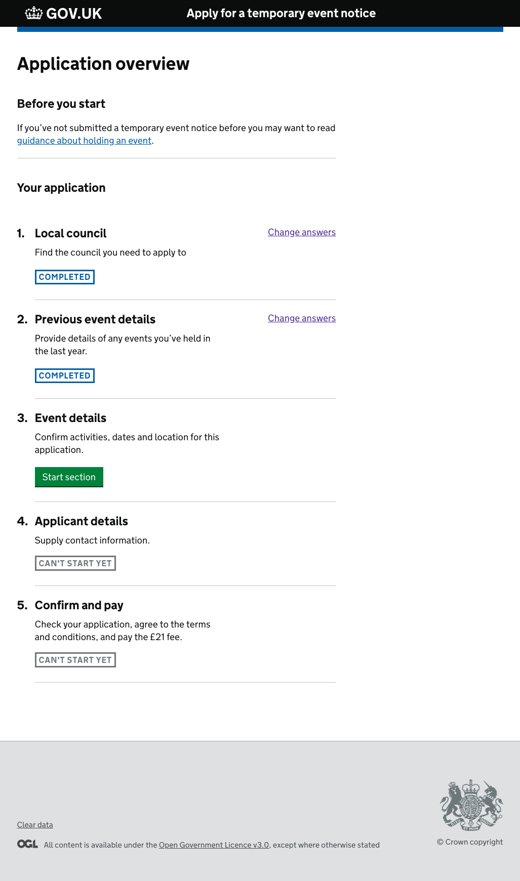
The patterns team at GDS (inc me) did some exploration of the task list 2 years ago. It wasn't finished, but here's some screen shots which others might find useful.

Some aims / things we were looking at:

2019 07 29-16-16-16-https-govuk-temporary-event-notice herokuapp com-local-council 2019 07 29-16-17-05-Task list

edwardhorsford commented 5 years ago

We've added a task list for our latest round of testing.

v1 looked like this: Screenshot 2019-08-19 at 12 10 23

Notes on implementation:

Findings:

Problems:

Things I want to try next:

grahamharper commented 5 years ago

Has anyone included or experimented with a way to navigate directly to the task list from within a task? This would be as a way to allow a user who has realised they made a mistake in a previous task and want to jump back to correct the mistake.

phillipsr commented 5 years ago

I've been involved in a couple of services now that have used a link below the continue button to allow users to return to the task list. This presents two questions though:

  1. What do you call the page that the user is returning to in the link text - we haven't always found that users naturally call that task list page the task list or anything else (we're currently asking users this in some UR at the moment)
  2. Do users expect any data that they have entered on the page to be saved? If they do and what they have put in does not comply with validation - should you stop users from navigating to the task list if form validation fails.
edwardhorsford commented 5 years ago

@grahamharper I added this link below the continue button, which takes the user 'up' on level. So where they're just in a wizard it takes them back to the task list. Where they're in a nested thing, it takes them to the next category up.

Screenshot 2019-08-20 at 11 43 57

It's something I feel should be there - but didn't see users use it much - I think we'd have to craft a careful task to see if users saw it.

Edit - actually we did see one user use it when they got stuck on something.

grahamharper commented 5 years ago

Thanks for sharing!

Any rationale about your chosen location for the link? i.e. why at the bottom of the page as opposed to the top?

Thinking out loud about the reading order here, when the user gets to the bottom of the page, is returning to a level up a likely choice they'll make? I guess maybe in a documentation page they're done reading and maybe want to go back to an index page to read something else. If they've just filled in a form, it might be an unlikely choice to make?

edwardhorsford commented 5 years ago

Thanks for sharing!

Any rationale about your chosen location for the link? i.e. why at the bottom of the page as opposed to the top?

Thinking out loud about the reading order here, when the user gets to the bottom of the page, is returning to a level up a likely choice they'll make? I guess maybe in a documentation page they're done reading and maybe want to go back to an index page to read something else. If they've just filled in a form, it might be an unlikely choice to make?

A few reasons:

Thus for me it's less about 'will they need this action when they're done with the page' and more that it's an uncommon action and I don't want to give it too much priority or confuse the page. With that in mind, it could have gone in the right hand column - but thus far I've avoided putting anything there.

It's essentially similar to a breadcrumb - but as my service already has back links (which are more commonly used) having both breadcrumbs and backlinks didn't seem right. If someone came up with a design that worked well with both breadcrumbs and back links we'd certainly consider it.