gatsby-remark-vscode

A syntax highlighting plugin for Gatsby that uses VS Code’s extensions, themes, and highlighting engine. Any language and theme VS Code supports, whether built-in or via a third-party extension, can be rendered on your Gatsby site.
Includes OS dark mode support 🌙
v3 is out now! 🎉
If you’re updating from v2.x.x (or v1), see MIGRATING.md. New features are line numbers and diff highlighting (thanks @janosh for the latter!).
Table of contents
- Why gatsby-remark-vscode?
- Getting started
- Multi-theme support
- Built-in languages and themes
- Using languages and themes from an extension
- Styles
- Extra stuff
- Options reference
- Contributing
Why gatsby-remark-vscode?
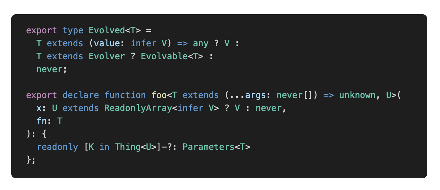
JavaScript syntax highlighting libraries that were designed to run in the browser, like Prism, have to make compromises given the constraints of their intended environment. Since they get downloaded and executed whenever a user visits a page, they have to be ultra-fast and ultra-lightweight. Your Gatsby app, on the other hand, renders to HTML at build-time in Node, so these constraints don’t apply. So why make tradeoffs that don’t buy you anything? There’s no reason why the syntax highlighting on your blog should be any less sophisticated than the syntax highlighting in your code editor. And since VS Code is built with JavaScript and CSS, is open source, and has a rich extension ecosystem, it turns out that it’s pretty easy to use its highlighting engine and extensions and get great results. A few examples of where gatsby-remark-vscode excels:
| Scenario | Others | gatsby-remark-vscode |
|---|---|---|
| Embedded languages |  |
 |
| Complex TypeScript |  |
 |
| Tricky template strings |  |
 |
| Uncommon languages | 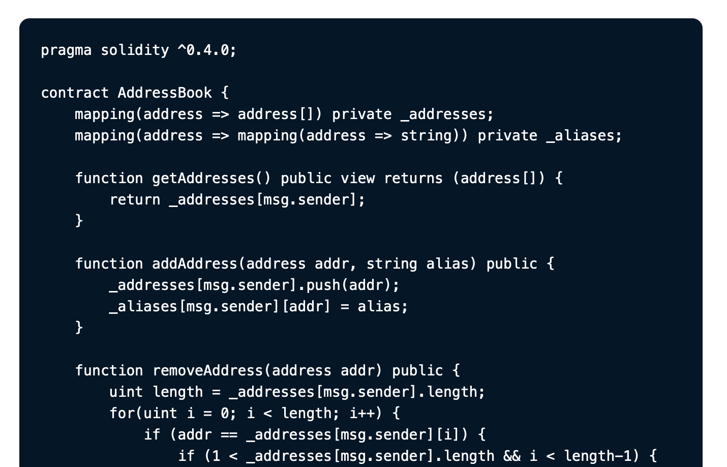 |
 |
Getting started
Install the package:
npm install --save gatsby-remark-vscodeAdd to your gatsby-config.js:
{
  // ...
  plugins: [{
    resolve: `gatsby-transformer-remark`,
    options: {
      plugins: [{
        resolve: `gatsby-remark-vscode`,
        options: {
          theme: 'Abyss' // Or install your favorite theme from GitHub
        }
      }]
    }
  }]
}
Write code examples in your markdown file as usual:
```js
this.willBe(highlighted);
## Multi-theme support

You can select different themes to be activated by media query or by parent selector (e.g. a class or data attribute on the `html` or `body` element).

### Reacting to OS dark mode with `prefers-color-scheme`

```js
{
  theme: {
    default: 'Solarized Light',
    dark: 'Monokai Dimmed'
  }
}
Reacting to a parent selector
{
  theme: {
    default: 'Solarized Light',
    parentSelector: {
      // Any CSS selector will work!
      'html[data-theme=dark]': 'Monokai Dimed',
      'html[data-theme=hc]': 'My Cool Custom High Contrast Theme'
    }
  }
}
Reacting to other media queries
The dark option is shorthand for a general-purpose media option that can be used to match any media query:
{
  theme: {
    default: 'Solarized Light',
    media: [{
      // Longhand for `dark` option.
      // Don’t forget the parentheses!
      match: '(prefers-color-scheme: dark)',
      theme: 'Monokai Dimmed'
    }, {
      // Proposed in Media Queries Level 5 Draft
      match: '(prefers-contrast: high)',
      theme: 'My Cool Custom High Contrast Theme'
    }, {
      match: 'print',
      theme: 'My Printer Friendly Theme???'
    }]
  }
}
Built-in languages and themes
The following languages and themes can be used without installing third-party extensions:
Languages
See all 55 languages
- Batch/CMD - Clojure - CoffeeScript - C - C++ - C Platform - C# - CSS - Dockerfile - F# - Git Commit - Git Rebase - Diff - Ignore - Go - Groovy - Handlebars - Hlsl - HTML - CSHTML - PHP HTML - INI - Java - JavaScript - JSX - JSON - JSON with Comments - Less - Log - Lua - Makefile - Markdown - Objective-C - Objective-C++ - Perl - Perl 6 - PHP - Powershell - Pug - Python - R - Ruby - Rust - Sass - SassDoc - ShaderLab - Shell - SQL - Swift - TypeScript - TSX - ASP VB .NET - XML - XML XSL - YAMLLanguage names are resolved case-insensitively by any aliases and file extensions listed in the grammar’s metadata. For example, a code fence with C++ code in it can use any of these language codes. You could also check the built-in grammar manifest for an exact list of mappings.
Themes
Pro tip: a good way to preview themes is by flipping through them in VS Code. Here’s the list of included ones:
- Abyss
- Dark+ (default dark)
- Light+ (default light)
- Dark (Visual Studio)
- Light (Visual Studio)
- High Contrast
- Kimbie Dark
- Monokai Dimmed
- Monokai
- Quiet Light
- Red
- Solarized Dark
- Solarized Light
- Tomorrow Night Blue
Using languages and themes from an extension
If you want to use a language or theme not included by default, the recommended approach is to npm install it from GitHub, provided its license permits doing so. For example, you can use robb0wen/synthwave-vscode by running
npm install robb0wen/synthwave-vscodeThen, in gatsby-config.js, use the options
{
  theme: `SynthWave '84`, // From package.json: contributes.themes[0].label
  extensions: ['synthwave-vscode'] // From package.json: name
}
You can also clone an extension into your project, or build a .vsix file from its source, and specify its path in extensions:
{
  theme: {
    default: 'My Custom Theme',
    dark: 'My Custom Dark Theme'
  },
  extensions: ['./vendor/my-custom-theme', './vendor/my-custom-dark-theme.vsix']
}
Styles
The CSS for token colors and background colors is generated dynamically from each theme you use and included in the resulting HTML. However, you’ll typically want at least a small amount of additional styling to handle padding and horizontal scrolling. These minimal additional styles are included alongside the dynamically generated token CSS by default, but can be disabled by setting the injectStyles option to false. If you prefer bundling the styles through your app’s normal asset pipeline, you can simply import the CSS file:
import 'gatsby-remark-vscode/styles.css';Class names
The generated HTML has ample stable class names, and you can add your own with the wrapperClassName and getLineClassName option. All (non-token-color) included styles have a single class name’s worth of specificity, so it should be easy to override the built-in styles.
Variables
The styles also include a few CSS variables you can define to override defaults. The included CSS is written as:
.grvsc-container {
  padding-top: var(--grvsc-padding-top, var(--grvsc-padding-v, 1rem));
  padding-bottom: var(--grvsc-padding-bottom, var(--grvsc-padding-v, 1rem));
  border-radius: var(--grvsc-border-radius, 8px);
}

.grvsc-line {
  padding-left: var(--grvsc-padding-left, var(--grvsc-padding-h, 1.5rem));
  padding-right: var(--grvsc-padding-right, var(--grvsc-padding-h, 1.5rem));
}

/* See “Line Highlighting” section for details */
.grvsc-line-highlighted {
  background-color: var(--grvsc-line-highlighted-background-color, transparent);
  box-shadow: inset var(--grvsc-line-highlighted-border-width, 4px) 0 0 0 var(--grvsc-line-highlighted-border-color, transparent);
}
The padding values are written with cascading fallbacks. As an example, let’s consider the top and bottom padding of .grvsc-container. Each is set to its own CSS variable, --grvsc-padding-top and --grvsc-padding-bottom, respectively. Neither of these is defined by default, so it uses the value of its fallback, which is another CSS variable, --grvsc-padding-v, with another fallback, 1rem. Since --grvsc-padding-v is also not defined by default, both padding properties will evaluate to the final fallback, 1rem.
So, if you want to adjust the vertical padding, you could add the following to your own CSS:
:root {
  --grvsc-padding-v: 20px; /* Adjust padding-top and padding-bottom */
}
If you want to adjust the padding-top or padding-bottom independently, you can use those variables:
:root {
  --grvsc-padding-top: 24px; /* Adjust padding-top by itself */
}
Tweaking or replacing theme colors
Since the CSS for token colors is auto-generated, it’s fragile and inconvenient to try to override colors by writing more specific CSS. Instead, you can use the replaceColor option to replace any value specified by the theme with another valid CSS value. This is especially handy for replacing static colors with variables if you want to support a “dark mode” for your site:
{
  replaceColor: oldColor => ({
    '#ff0000': 'var(--red)',
    '#00ff00': 'var(--green)',
    '#0000ff': 'var(--blue)',
  })[oldColor.toLowerCase()] || oldColor
}
Extra stuff
Inline code highlighting
To highlight inline code spans, add an inlineCode key to the plugin options and choose a marker string:
{
  inlineCode: {
    marker: '•'
  }
}
Then, in your Markdown, you can prefix code spans by the language name followed by the marker string to opt into highlighting that span:
Now you can highlight inline code: `js•Array.prototype.concat.apply([], array)`.The syntax theme defaults to the one selected for code blocks, but you can control the inline code theme independently:
{
  theme: 'Default Dark+',
  inlineCode: {
    marker: '•',
    theme: {
      default: 'Default Light+',
      dark: 'Default Dark+'
    }
  }
}
See inlineCode in the options reference for more API details.
Line highlighting
gatsby-remark-vscode offers the same line-range-after-language-name strategy of highlighting or emphasizing lines as gatsby-remark-prismjs:
| Markdown | Rendered result |
|---|---|
| ````md ```js{1,3-5} this.isLine(1); // highlighted this.isLine(2); this.isLine(3); // highlighted this.isLine(4); // highlighted this.isLine(5); // highlighted ``` ```` | ![][line-highlighting-meta] |
Comment directives are also supported:
| Markdown | Rendered result |
|---|---|
| ````md ```js function constant(value) { return () => value; // highlight-line } // highlight-next-line const alwaysFour = constant(4); // highlight-start const zero = [0, 1, 2, 3, 4, 5] .map(alwaysFour) .filter(x => x !== 4) .length; // highlight-end ``` ```` | ![][line-highlighting-comment] |
You can customize the default background color and left border width and color for the highlighted lines by setting CSS variables:
:root {
  --grvsc-line-highlighted-background-color: rgba(255, 255, 255, 0.2);
  --grvsc-line-highlighted-border-color: rgba(255, 255, 255, 0.5);
  --grvsc-line-highlighted-border-width: 2px;
}
Line numbers
With code fence info:
```js {numberLines}
import * as React from 'react';

React.createElement('span', {});
![Rendered result of the example code above][line-numbering-with-code-fence-info]

With code fence info specifying a starting line:

````md
```js {numberLines: 21}
  return 'blah';
![Rendered result of the example code above][line-numbering-starting-line]

With a comment:

````md
```ts
function getDefaultLineTransformers(pluginOptions, cache) {
  return [
    one, // L4
    two,
    three
  ];
}
![Rendered result of the example code above][line-numbering-with-a-comment]

With both:

````md
```ts {numberLines}
import * as React from 'react';

// ...

function SomeComponent(props) { // L29
  return <div />;
}
![Rendered result of the example code above][line-numbering-with-both]

The line number cell’s styling can be overridden on the `.grvsc-line-number` class.

### Diff highlighting

You can combine syntax highlighting with diff highlighting:

<table>
<thead><tr><th>Markdown</th><th>Rendered result</th></thead>
<tbody>
<tr>
<td>

````md
```ts {diff}
function add(x, y) {
-  return x + x;
+  return x + y;
}
</td>
<td>

![][diff-highlighting]

</td>
</tr>
</tbody>
</table>

The highlight color can be customized with the CSS variables `--grvsc-line-diff-add-background-color` and `--grvsc-line-diff-del-background-color`. The default color is static and might not be accessible with all syntax themes. Consider contrast ratios and choose appropriate colors when using this feature.

### Using different themes for different code fences

The `theme` option can take a function instead of a constant value. The function is called once per code fence with information about that code fence, and should return either a string or [an object](#dark-mode-support-via-prefers-color-scheme). See the [following section](#arbitrary-code-fence-options) for an example.

### Arbitrary code fence options

Line numbers and ranges aren’t the only things you can pass as options on your code fence. A JSON-like syntax is supported:

````md
```jsx{theme: 'Monokai', someNumbers: {1,2,3}, nested: {objects: 'yep'}}
<Amazing><Stuff /></Amazing>
`gatsby-remark-vscode` doesn’t inherently understand these things, but it parses the input and allows you to access it in the `theme`, `wrapperClassName` and `getLineClassName` functions:

```js
{
  theme: ({ parsedOptions, language, markdownNode, node }) => {
    // 'language' is 'jsx', in this case
    // 'markdownNode' is the gatsby-transformer-remark GraphQL node
    // 'node' is the Markdown AST node of the current code fence
    // 'parsedOptions' is your parsed object that looks like this:
    // {
    //   theme: 'Monokai',
    //   someNumbers: { '1': true, '2': true, '3': true },
    //   nested: { objects: 'yep' }
    // }
    return parsedOptions.theme || 'Dark+ (default dark)';
  },
  wrapperClassName: ({ parsedOptions, language, markdownNode, node }) => '';
}
Usage as a remark plugin without Gatsby
This package exports a remarkPlugin property that accepts the same options as the main Gatsby plugin and is usable as a remark plugin in any unifiedjs processing pipeline.
First, install the required dependencies:
npm install unified remark-parse gatsby-remark-vscode remark-rehype rehype-raw rehype-stringifyThen, in an ES Module file, e.g., index.mjs:
import { unified } from 'unified'
import remarkParse from 'remark-parse'
import remarkVscode from 'gatsby-remark-vscode'
import remarkToRehype from 'remark-rehype'
import rehypeRaw from 'rehype-raw'
import rehypeStringify from 'rehype-stringify'

const markdownSource = `
# Code example with awesome syntax highlighting

\`\`\`ts {numberLines}
export function sum(a: number, b: number): number {
  return a + b;
}
\`\`\`

This is a paragraph after the code example.
`

const processor = unified()
  // parse markdown to remark AST
  .use(remarkParse)
  // apply syntax highlighting using `remarkPlugin`
  // with your preferred options
  .use(remarkVscode.remarkPlugin, {
    theme: 'Default Light+',
  })
  // convert remark AST to rehype AST
  .use(remarkToRehype, { allowDangerousHtml: true })
  .use(rehypeRaw)
  // stringify
  .use(rehypeStringify, {
    allowDangerousHtml: true,
    closeSelfClosing: true,
  });

const vfile = await processor.process(markdownSource);
console.log(vfile.value); // logs resulting HTML
Options reference
theme
The syntax theme used for code blocks.
-
Default:
'Default Dark+' -
Accepted types:
string: The name or id of a theme. (See Built-in themes and Using languages and themes from an extension.)ThemeSettings: An object that selects different themes to use in different contexts. (See Multi-theme support.)(data: CodeBlockData) => string | ThemeSettings: A function returning the theme selection for a given code block.CodeBlockDatais an object with properties:language: The language of the code block, if one was specified.markdownNode: The MarkdownRemark GraphQL node (not available if used asremarkPlugin)node: The Remark AST node of the code block.parsedOptions: The object form of of any code fence info supplied. (See Arbitrary code fence options.)
wrapperClassName
A custom class name to be set on the pre tag.
- Default: None, but the class
grvsc-containerwill always be on the tag. - Accepted types:
string: The class name to add.(data: CodeBlockData) => string: A function returning the class name to add for a given code block. (See thethemeoption above for the details ofCodeBlockData.)
languageAliases
An object that allows additional language names to be mapped to recognized languages so they can be used on opening code fences.
-
Default: None, but many built-in languages are already recognized by a variety of names.
-
Accepted type:
Record<string, string>; that is, an object with string keys and string values. -
Example:
{
languageAliases: {
  fish: 'sh'
}
}
Then you can use code fences like this: ```fish ls -laAnd they’ll be parsed as shell script (
sh).
extensions
A list of third party extensions to search for additional langauges and themes. (See Using languages and themes from an extension.)
- Default: None
- Accepted type:
string[]; that is, an array of strings, where the strings are the package names of the extensions.
inlineCode
Enables syntax highlighting for inline code spans. (See Inline code highlighting.)
- Default: None
- Accepted type: An object with properties:
theme: A string orThemeSettingsobject selecting the theme, or a function returning a string orThemeSettingsobject for a given code span. The type is the same as the one documented in the top-level theme option. Defaults to the value of the top-level theme option.marker: A string used as a separator between the language name and the content of a code span. For example, with amarkerof value'•', you can highlight a code span as JavaScript by writing the Markdown code span as`js•Code.to.highlight("inline")`.className: A string, or function returning a string for a given code span, that sets a custom class name on the wrappercodeHTML tag. If the function form is used, it is passed an object parameter describing the code span with properties:language: The language of the code span (the bit before themarkercharacter).markdownNode: The MarkdownRemark GraphQL node. (not available if used asremarkPlugin)node: The Remark AST node of the code span.
injectStyles
Whether to add supporting CSS to the end of the Markdown document. (See Styles.)
- Default:
true - Accepted type:
boolean
replaceColor
A function allowing individual color values to be replaced in the generated CSS. (See Tweaking or replacing theme colors.)
- Default: None
- Accepted type:
(colorValue: string, theme: string) => string; that is, a function that takes the original color and the identifier of the theme it came from and returns a new color value.
logLevel
The verbosity of logging. Useful for diagnosing unexpected behavior.
- Default:
'warn' - Accepted values: From most verbose to least verbose,
'trace','debug','info','warn', or'error'.
Contributing
Please note that this project is released with a Contributor Code of Conduct. By participating in this project you agree to abide by its terms.
See CONTRIBUTING.md for development instructions.