Looking for someone to take over the project as I've recently changes jobs and had a child and am no longer capable of supporting this dependency. If anyone is interested, please feel free to take ownership of it
React Coverflow

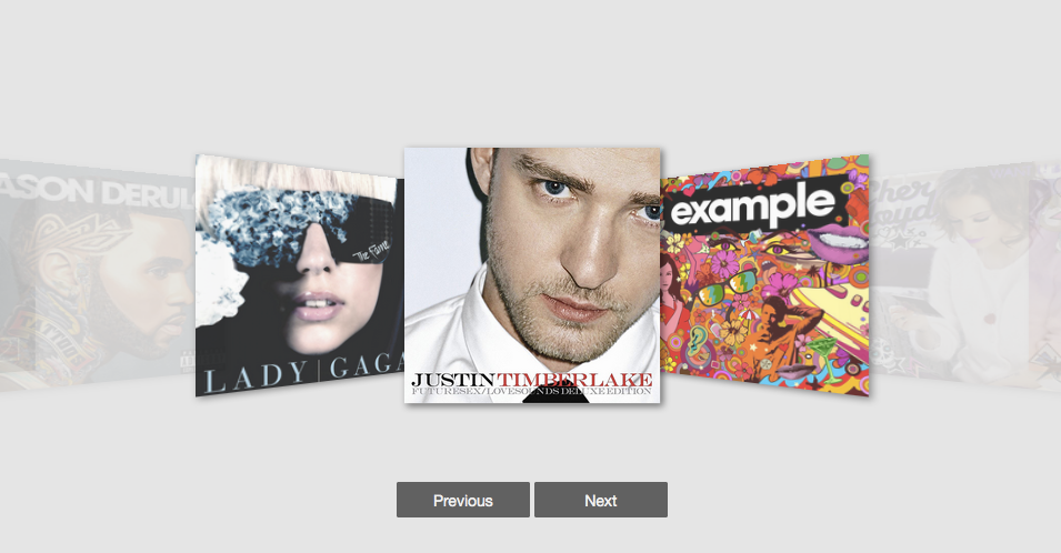
React Coverflow is a React component for building cover flow style carousel in a convenient way.
Features of react-coverflow
- Flexbox styles of CSS 3.
- Support scroll in the component.
- Support navigation buttons optional
- Using css-module
- Support mobile
Getting started
Install react-coverflow using npm.
$ npm install react-coverflowThe required stylesheet using css-module and include in package(js file), so you don't need include other stylesheet.
Usage
import React from 'react';
import ReactDOM from 'react-dom';
import Coverflow from 'react-coverflow';

const fn = function () {
  /* do your action */
}

ReactDOM.render(
  <Coverflow width="960" height="500" classes={{background: 'rgb(233, 23, 23)'}} className=''
    displayQuantityOfSide={2}
    navigation={false}
    enableScroll={true}
    clickable={true}
    active={0}
  >
    <div
      onClick={() => fn()}
      onKeyDown={() => fn()}
      role="menuitem"
      tabIndex="0"
    >
      <img
        src='image/path'
        alt='title or description'
        style={{
          display: 'block',
          width: '100%',
        }}
      />
    </div>
    <img src='image/path' alt='title or description' data-action="http://andyyou.github.io/react-coverflow/"/>
    <img src='image/path' alt='title or description' data-action="http://andyyou.github.io/react-coverflow/"/>
  </Coverflow>,

  document.querySelector('.content')
);
In order to pass functions to the images, you can simply wrap the <img /> in a <div>. You should make sure to give your img specific styling properties to confine it to the parent div.
For more examples, on how to use React Coverflow, please visit http://andyyou.github.io/react-coverflow/
Properties
| Name | Type | Default | Description |
|---|---|---|---|
| children | node | should be <img /> nodes |
|
| infiniteScroll | boolean | false | Allows the carousel to scroll from the last image to the (upon clicking the next button) or from the first to the last (by clicking the previous button). infiniteScroll is not supported by mouse scrolling. |
| displayQuantityOfSide | number | The number of display image from center to the one side end. | |
| navigation | boolean | false | Enable navigation arrows. This will disable image-click navigation. |
| enableHeading | boolean | true | Shows the img alt as the label for the img. |
| enableScroll | boolean | true | Enable scrolling feature. |
| media | object | To support media query, if you want responsive with parent element you can ignore width and height props or set it to auto. |
|
| active | number | middle child node | The index of the image you want to be active. |
| clickable | boolean | true | Makes images clickable, setting to false will disable clickability of images. |
| currentFigureScale | number | 1.5 | The scale factor (float) to be applied on the active image. |
| otherFigureScale | number | .8 | The scale factor (float) to be applied on the inactive images. |
| classes | object | To support style changes for customization. | |
| className | string | To add css class to the coverflow to customize. |
Responsive
Now, you can use media props to support responsive design. The syntax part is come form Radium
You can reference to this doc.
- 2016-09-13 If you need RWD you should add
<StyleRoot>
ReactDOM.render(
  <StyleRoot>
    <Coverflow
      displayQuantityOfSide={2}
      navigation={true}
      enableHeading={true}
      active={0}
      media={{
        '@media (max-width: 900px)': {
          width: '600px',
          height: '300px'
        },
        '@media (min-width: 900px)': {
          width: '960px',
          height: '600px'
        }
      }}
      >
      <img src='images/album-1.png' alt='Album one' data-action="https://facebook.github.io/react/"/>
      <img src='images/album-2.png' alt='Album two' data-action="http://passer.cc"/>
      <img src='images/album-3.png' alt='Album three' data-action="https://doce.cc/"/>
      <img src='images/album-4.png' alt='Album four' data-action="http://tw.yahoo.com"/>
    </Coverflow>
  </StyleRoot>
  ,
  document.querySelector('.example_2')
);
Contributors
Use Github issues for requests
react-coverflow is a community project and wouldn't be what it is without contributions! We encourage and support contributions. The react-coverflow source code is released under the MIT License.
Feel free to fork and improve/enhance react-coverflow any way you want. If you feel that react-coverflow will benefit from your changes, please open a pull request.
Development
If you want to custom the component there are some commands that can help you.
# Compile component to dist/
$ npm run build-npm

# Build source of site
$ npm run build-site

# Clean
$ npm run clean

# Development Server
$ npm run dev

# Deploy examples to gh-pages
$ npm run build-npm
$ npm run build-site
$ git subtree push --prefix site origin gh-pages
$ npm version patch
$ npm publish
Release History
- 2019-04-13
- Removed button navigation for arrow navigation. Using arrow navigation now disables the image-click navigation that had previously existed.
- 2018-03-04
- Added Infinite Scrolling Option that allows users to scroll from first to last option continuously using the arrow buttons. Buttons dynamically rendered based on current position of img
- 2018-02-24
- Fixed deprecation errors / warnings, updated packages.
- 2016-09-29
- Add
clickableprops to on/off click of image.
- Add
- 2016-09-22
- Fix issue change
activecan updatecurrentimage.
- Fix issue change
- 2016-09-16
- Add keypress events for prev/next
- 2016-09-13
- Fix Unknown Prop Warning
- Radium updated that if you need RWD feature you need to wrap
<StyleRoot> - Remove img
urlattribute, usedata-actioninstead. when value is string will redirectin url otherwise can put function will be execute. - Add
activeattribute
- 2016-09-10
- Use
postcss-loaderinstead ofautoprefixer-loader - Update babel to v6+
- Use
- 2015-12-12 Fix React 0.14.3 two copies issue
- 2015-12-10 Update React version.
- 2015-11-13
- v0.1.9 Support responsive props.
- Update eslint with babel-eslint.
- 2015-11-11
- v0.1.8 Fix some issues and add option to enable/disable scroll ability.
- Add displayName to fix react-devtool show t tag.
- 2015-11-10
- v0.1.6 Support react 0.14.2
- 2015-10-09
- v0.1.4 Add propTypes and enableHeading options for mobile.
- Add example of responsive.
- 2015-10-07 v0.1.3 Support even number of images, Fix bugs
- 2015-09-22 v0.1.0
Issues
- If you get the errors as follow
Warning: Any use of a keyed object should be wrapped in React.addons.createFragment(object) before being passed as a child. Warning: t(...): React component classes must extend React.Component.That because of React 0.14.2 got some change and the component not update before.
Error: To use plugins requiring addCSS (e.g. keyframes, media queries), please wrap your application in the StyleRoot componentTodo
- Write test case
- Add further customization options
- Add Prev/Next Arrows instead of Buttons