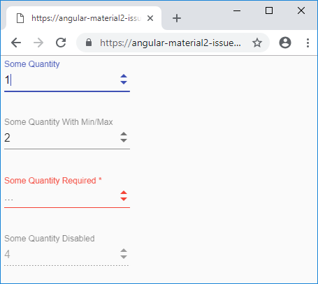
I updated my examples to color the arrows correctly whether the input is active, inactive, invalid, or disabled, as well as correctly disable the arrows while the input is disabled.
Open dannye opened 6 years ago
I updated my examples to color the arrows correctly whether the input is active, inactive, invalid, or disabled, as well as correctly disable the arrows while the input is disabled.
This seems like we'd be polyfilling the native number inputs. The intention with matInput is only to style it like a Material Design input, with as little intervention as possible.
I respect your philosophy towards the role/responsibility of Material, and I'll be honest, I don't really understand the relationship between Material Design and Material.
However, given how bad the native number input handling is/how bad it looks, I think little intervention is a bad thing. From my point of view, this feels like a prime example of something Material should unify.
Also, my point isn't just that different browsers handle number input arrows differently, but also that a page that has a mat-select next to a matInput with type="number" results in two inputs that are seemingly matching but have one big jarring difference, and I think this is kind of a big curve ball to the user.
Feel free to close this issue. At the very least, hopefully other people who are dissatisfied with number inputs will stumble upon this issue and find my code helpful.
I see your point and I appreciate the detailed workaround, but the problem is that if we decided to do this for type="number", we'd have to start doing it for every single other type of input (datetime, color, tel etc.).
Just a heads up that we kicked off a community voting process for your feature request. There are 20 days until the voting process ends.
Find more details about Angular's feature request process in our documentation.
Thank you for submitting your feature request! Looks like during the polling process it didn't collect a sufficient number of votes to move to the next stage.
We want to keep Angular rich and ergonomic and at the same time be mindful about its scope and learning journey. If you think your request could live outside Angular's scope, we'd encourage you to collaborate with the community on publishing it as an open source package.
You can find more details about the feature request process in our documentation.
It is mid of 2022 and nothing is done regarding number input. I think it is a shame, that Angular team leaves such basic things as "non important". After all people are using Angular Material because of well done GUI. And you dont want to provide usable basic features. Even when somebody did the whole development and gave you a code. LOL, what? Product owner felt asleep behind the wheel. It is the same story as with FormControl that does not support remembering of the original value and so every programmer has to re-implement this feature again and again. Somebody in Angular said: we dont think it is important to be able to reset to the original value. LOL and tears once again.
Thx @dannye. You saved me probably a day of work.
Bug, feature request, or proposal:
Feature request/proposal
What is the expected behavior?
All browsers handle
<input type="number">very inconsistently. Firefox and Safari show a "step up" and "step down" button at all times. Chrome shows the buttons only during hover or focus on the element. Internet Explorer and Edge have no such buttons. In addition, Firefox, Chrome, and Safari support.stepUp()and.stepDown()onHTMLInputElements while Internet Explorer and Edge do not. The buttons provided by Firefox, Chrome, and Safari have a style that is very inconsistent with Material. I suggest mimicing these buttons in a cross-browser compatible way but with a "Material" style.What is the current behavior?
Currently, these buttons are handled by the browser and behave/look very inconsistent.
What are the steps to reproduce?
https://stackblitz.com/edit/angular-material2-issue-e9juzn This is my functional mock-up of the behavior I have in mind. My code is probably hackish but the end result is nice. HTML:
SCSS:
Typescript:
The result of this stackblitz:
What is the use-case or motivation for changing an existing behavior?
The arrows for stepping up and stepping down should be styled consistently with the arrow used in
mat-selects and should work on all major browsers.Which versions of Angular, Material, OS, TypeScript, browsers are affected?
I tested this mock-up on Firefox, Chrome, IE 11, Edge, and Safari.
Is there anything else we should know?
This SCSS rule:
doesn't work in the stackblitz, but it works otherwise. Its purpose is to reduce the width of the
mat-labelso that a long label doesn't overlap the new step buttons.Lastly, in Firefox, a "number" input with "textfield" appearance that is also disabled will allow you to click on the textbox or tab into it and edit it, even though it is disabled. This is a Firefox bug. To prevent clicking, set its
pointer-eventstonone. To prevent tabbing, somewhat manually set thetabindexto -1: