 DaSchTour
commented
5 years ago
DaSchTour
commented
5 years ago I've also noticed, that label and placeholder are somehow positioned differently for outline and fill appearance. Label is somehow placed a bit to higher than the placeholder. Alignment to prefix and suffix is not right.
 SergeyCherman
 stevebor1
The styles available for the text field do not match the Material Design Spec itself and the MDC.
Material Design Spec
Material Design Spec Text Field Example1 (border-color: rgba(0,0,0,.54))
Example2 (border-color: rgba(0,0,0,.24) - padding not 16px)
Example3 (border-color: rgba(0,0,0,.54))
Example4 (border-color: rgba(0,0,0,.54))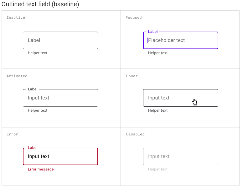
Example5 (border-color: rgba(0,0,0,.54))
Example 6 Padding value is set to 16px as in MDC example for samples 1, 3, 4, and 5 when the above examples are not 16px for 2.
Material Design Components (MDC)
MDC Text Field Example (border-color: rgba(0,0,0,.24))