react-native-range-slider-expo

Customizable range slider for react native apps
Getting started
npm i react-native-range-slider-expo
Usage
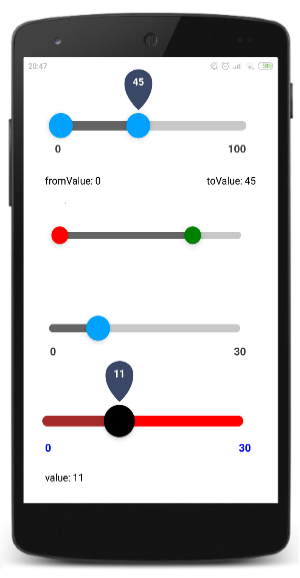
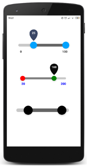
Examples - display
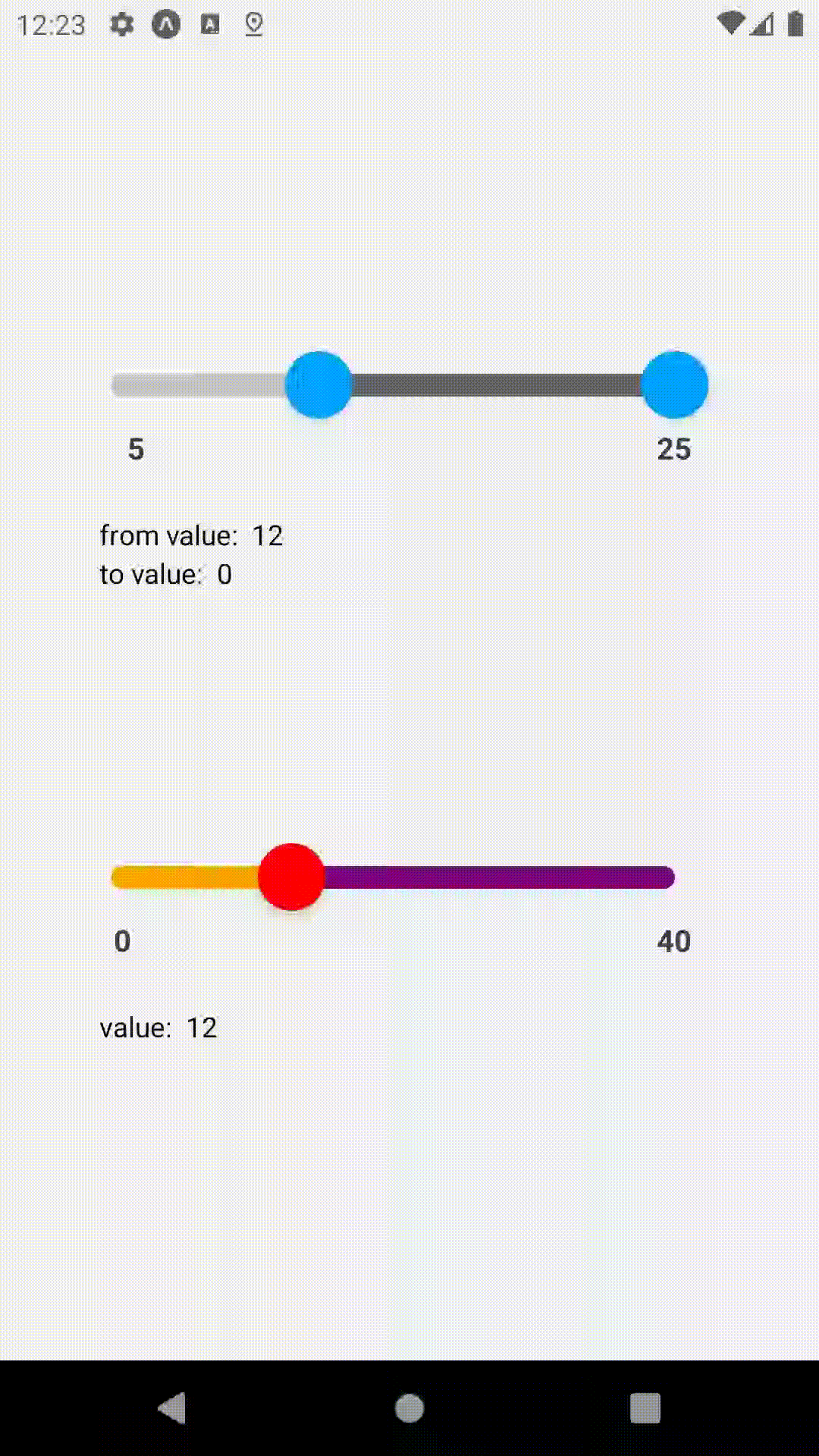
Examples - code (reflects the short video above)
import RangeSlider, { Slider } from 'react-native-range-slider-expo'; const [fromValue, setFromValue] = useState(0);
const [toValue, setToValue] = useState(0);
const [value, setValue] = useState(0);
return (
<View style={styles.container}>
<View>
<RangeSlider min={5} max={25}
fromValueOnChange={value => setFromValue(value)}
toValueOnChange={value => setToValue(value)}
initialFromValue={11}
/>
<Text>from value: {fromValue}</Text>
<Text>to value: {toValue}</Text>
</View>
<View>
<Slider min={0} max={40} step={4}
valueOnChange={value => setValue(value)}
initialValue={12}
knobColor='red'
valueLabelsBackgroundColor='black'
inRangeBarColor='purple'
outOfRangeBarColor='orange'
/>
<Text>value: {value}</Text>
</View>
</View>
);API - RangeSlider (default import)
| Property | Type | Required | Default |
|---|---|---|---|
| min | number | yes | - |
| max | number | yes | - |
| fromValueOnChange | callback | yes | - |
| toValueOnChange | callback | yes | - |
| step | number | no | 1 |
| styleSize | string ( 'small' | 'medium' | 'large' | number ) | no | 'medium' |
| fromKnobColor | string (color) | no | '#00a2ff' |
| toKnobColor | string (color) | no | '#00a2ff' |
| inRangeBarColor | string (color) | no | 'rgb(100,100,100)' |
| outOfRangeBarColor | string (color) | no | 'rgb(200,200,200)' |
| valueLabelsBackgroundColor | string (color) | no | '#3a4766' |
| rangeLabelsTextColor | string (color) | no | 'rgb(60,60,60)' |
| showRangeLabels | boolean | no | true |
| showValueLabels | boolean | no | true |
| initialFromValue | number | no | as 'min' value |
| initialToValue | number | no | as 'max' value |
| knobSize | number | no | 24/34/44 |
| containerStyle | style | no | - |
| barHeight | number | no | 8/11/15 |
| labelFormatter | (value: number) => string | no | - |
API - Slider (1 knob)
| Property | Type | Required | Default |
|---|---|---|---|
| min | number | yes | - |
| max | number | yes | - |
| valueOnChange | callback | yes | - |
| step | number | no | 1 |
| styleSize | string ( 'small' | 'medium' | 'large' | number ) | no | 'medium' |
| knobColor | string (color) | no | '#00a2ff' |
| inRangeBarColor | string (color) | no | 'rgb(200,200,200)' |
| outOfRangeBarColor | string (color) | no | 'rgb(100,100,100)' |
| valueLabelsTextColor | string (color) | no | 'white' |
| valueLabelsBackgroundColor | string (color) | no | '#3a4766' |
| rangeLabelsTextColor | string (color) | no | 'rgb(60,60,60)' |
| showRangeLabels | boolean | no | true |
| showValueLabels | boolean | no | true |
| initialValue | number | no | as 'min' value |
| containerStyle | style | no | - |
| barHeight | number | no | 8/11/15 |
| labelFormatter | (value: number) => string | no | - |
API - Textual Slider
| Property | Type | Required | Default |
|---|---|---|---|
| values | [ItemType] | yes | - |
| valueOnChange | callback | yes | - |
| styleSize | string ( 'small' | 'medium' | 'large' | number ) | no | 'medium' |
| knobColor | string (color) | no | '#00a2ff' |
| inRangeBarColor | string (color) | no | 'rgb(200,200,200)' |
| outOfRangeBarColor | string (color) | no | 'rgb(100,100,100)' |
| valueLabelsTextColor | string (color) | no | 'white' |
| valueLabelsBackgroundColor | string (color) | no | '#3a4766' |
| rangeLabelsTextColor | string (color) | no | 'rgb(60,60,60)' |
| showRangeLabels | boolean | no | true |
| showValueLabels | boolean | no | true |
| initialValue | number | no | - |
License
This project is licensed under the MIT License
Todo
- [X] Add plain slider (with 1 knob)
- [X] Add initial values
- [X] Add numeric style size
- [X] Add textual values
- [ ] Add prefix/suffix to numeric values
- [ ] Beautify styling