| :warning: This svg node for the old AngularJs dashboard won't be maintained anymore! Due to lack of free time I can only work on the new svg node for the new VueJs dashboard. Note that the new svg node is still in experimental phase! |
|---|
node-red-contrib-ui-svg
A Node-RED widget node to show interactive SVG (vector graphics) in the dashboard
Special thanks to Stephen McLaughlin, my partner in crime for this node!
And also, lots of credits to Joseph Liard, the author of DrawSvg for his assistance!
| :warning: Please have a look at the "Getting started" tutorial on the wiki |
|---|
Install
Run the following npm command in your Node-RED user directory (typically ~/.node-red):
npm install node-red-contrib-ui-svgIt is advised to use Dashboard version 2.16.3 or above.
Introduction to SVG
Scalable Vector Graphics (SVG) is an XML-based vector image format for two-dimensional graphics with support for interactivity and animation. We won't explain here how it works, because the internet is full of information about it.
An SVG drawing contains a series of SVG elements, which will be rendered by the browser from top to bottom. For example:
<svg ...>
  <image .../>
  <circle .../>
  <text .../>
</svg>
The browser will first draw the (background) image, then the circle (on top of the image), and so on ...
Each of those SVG elements has attributes (fill colour, ...), can respond to events (clicked, ...) and can be animated (e.g. shrink...).
Node usage
| :boom: HAVE A LOOK AT THE WIKI FOR STEP-BY-STEP TUTORIALS |
|---|
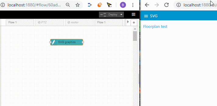
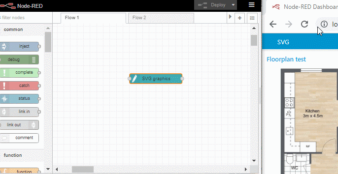
This node can be used to visualize all kind of graphical stuff in the Node-RED dashboard. This can range from simple graphics (e.g. a round button, ...) to very complex graphics (floorplans, industrial processes, piping, wiring, ...). But even those complex graphics will consist out of several simple graphical shapes. For example, a floorplan is in fact a simple image of your floor, and a series of other SVG elements (e.g. Fontawesome icons) drawn on top of that (background) image.
Simply deploy your SVG string in the config screen, and the Node-RED dashboard will render your vector graphics:
But what if you are not familiar with the SVG syntax. Do not worry, we have integrated a DrawSvg drawing editor in the config screen of our node.
Config screen tabsheets
The node's config screen consists of a series of tab sheets:
- Editor tab sheet
- SVG tab sheet
- Animation tab sheet
- Event tab sheet
- JS tab sheet
- Binding tab sheet
- Settings tab sheet
- CSS tab sheet
Control via messages
Most of the SVG information can be manipulated by sending input messages to this node.
Some general msg guidelines:
-
In most messages, you need to specify on which SVG element(s) the control message needs to be applied. To specify a single element, the
elementIdfield can be specified:"payload": { "command": "update_text", "elementId": "some_element_id", "textContent": "my title" }However it is also possible to specify one or more elements via a CSS selector. This is a very powerful query mechanism that allows you to apply the control message to multiple SVG elements at once! For example, set all texts with class 'titleText' to value 'my title':
"payload": {
    "command": "update_text",
    "selector": ".titleText", //standard dom selector '#' for id, '.' for class etc.
    "textContent": "my title"
}
This can be used to do the same update on multiple elements with a single message. Note that a
selectorcan also be used to specify a single element id (similar toelementId), by using a hashtag like "#some_element_id". -
A message can contain a single command. For example:
"payload": {
   "command": "update_attribute",
   "selector": "#cam_living_room",
   "attributeName": "fill",
   "attributeValue": "orange"
}
But it is also possible to specify multiple commands (as an array) in a single control message. For example:
"payload": [ { "command": "update_attribute", "elementId": "cam_kitchen", /*use elementId or selector*/ "attributeName": "fill", "attributeValue": "orange" }, { "command": "set_attribute", "selector": "#cam_living", /*use elementId or selector*/ "attributeName": "fill", "attributeValue": "red" } ] -
When multiple identical commands are being used in a single message, the message might be simplified by specifying the command inside the
msg.topic:"payload": [ { "elementId": "cam_kitchen", /*use elementId or selector*/ "attributeName": "fill", "attributeValue": "orange" }, { "selector": "#cam_living", /*use elementId or selector*/ "attributeName": "fill", "attributeValue": "red" }, ], "topic": "update_attribute"This can be used to do multiple commands with a single message.
-
To further simplify the message, the CSS selector - when it is required - can also be added to the topic (separated by
|):{ "topic": "update_text|#myRect > .faultMessage", "payload": "hello" }This way the message becomes yet shorter, but you can only use 1 selector or command value (even when the payload contains an array).
Supported commands:
- Update/set an attribute value via msg
- Update/set a style attribute value via msg
- Remove an attribute via msg
- Replace an attribute value via msg
- Set text content via msg
- Get text content via msg
- Start/stop animations via msg
- Add events via msg
- Remove events via msg
- Add Javascript events via msg
- Remove Javascript events via msg
- Add elements via msg
- Remove elements via msg
- Update (input) value via msg
- Set entire SVG via msg
- Get entire SVG via msg
- Zoom in/out via msg
- Panning via msg
- Reset pan/zoom via msg
Enable/disable the SVG
The Node-RED dashboard allows to enable/disable ui widgets by injecting a message with msg.enabled set to a boolean true or false. This can also be used to enable or disable all user input in an SVG drawing. Note that all next injected messages will keep being processed while the node is disabled, like with all other UI nodes (i.e. standard behaviour).
[{"id":"8734fd29475b3ca3","type":"inject","z":"bf0833e74936a0c1","name":"Enable","props":[{"p":"enabled","v":"true","vt":"bool"}],"repeat":"","crontab":"","once":false,"onceDelay":0.1,"topic":"","_mcu":{"mcu":false},"x":750,"y":80,"wires":[["662f5a4f61d45302"]]},{"id":"0793ba691f3622e3","type":"debug","z":"bf0833e74936a0c1","name":"Events","active":true,"tosidebar":true,"console":false,"tostatus":false,"complete":"payload","targetType":"msg","statusVal":"","statusType":"auto","_mcu":{"mcu":false},"x":1090,"y":80,"wires":[]},{"id":"7f880977992bf324","type":"inject","z":"bf0833e74936a0c1","name":"Disable","props":[{"p":"enabled","v":"false","vt":"bool"}],"repeat":"","crontab":"","once":false,"onceDelay":0.1,"topic":"","_mcu":{"mcu":false},"x":750,"y":140,"wires":[["662f5a4f61d45302"]]},{"id":"662f5a4f61d45302","type":"ui_svg_graphics","z":"bf0833e74936a0c1","group":"e8509dc7be30844e","order":1,"width":0,"height":0,"svgString":"<svg x=\"0\" y=\"0\" height=\"100%\" xmlns=\"http://www.w3.org/2000/svg\" xmlns:svg=\"http://www.w3.org/2000/svg\" xmlns:xlink=\"http://www.w3.org/1999/xlink\">\n <text id=\"clickable_text\" x=\"40\" y=\"30\" style=\"font: italic 40px serif; fill: red;\">Click me!</text>\n</svg>","clickableShapes":[{"targetId":"#clickable_text","action":"click","payload":"Text clicked","payloadType":"str","topic":"clicked"}],"javascriptHandlers":[],"smilAnimations":[],"bindings":[],"showCoordinates":false,"autoFormatAfterEdit":false,"showBrowserErrors":false,"showBrowserEvents":false,"enableJsDebugging":false,"sendMsgWhenLoaded":false,"noClickWhenDblClick":false,"outputField":"payload","editorUrl":"//drawsvg.org/drawsvg.html","directory":"","panning":"disabled","zooming":"disabled","panOnlyWhenZoomed":false,"doubleClickZoomEnabled":false,"mouseWheelZoomEnabled":false,"dblClickZoomPercentage":150,"cssString":"div.ui-svg svg{\n color: var(--nr-dashboard-widgetColor);\n fill: currentColor !important;\n}\ndiv.ui-svg path {\n fill: inherit;\n}","name":"","_mcu":{"mcu":false},"x":920,"y":80,"wires":[["0793ba691f3622e3"]]},{"id":"e8509dc7be30844e","type":"ui_group","name":"Svg disable demo","tab":"d8520920.0128d8","order":4,"disp":true,"width":"12","collapse":false,"className":"","_mcu":{"mcu":false}},{"id":"d8520920.0128d8","type":"ui_tab","name":"Home","icon":"dashboard","order":3,"disabled":false,"hidden":false}]Various stuff
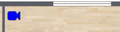
Fontawesome icons
Fontawesome icons are used widely in Node-RED and are in fact little SVG drawings on their own. They are a very easy way e.g. to represent devices on a floorplan. Such an icon can easily be added via DrawSvg, as demonstrated in this animation:
By specifying an identifier for the icon (like in the above animation), the icon can be updated afterwards via input messages (like any other SVG element).
When you want to enter your SVG source manually (without using DrawSvg), there is another mechanism provided:
-
Search the Fontawesome website for an icon that fits your needs. For example, 'fa-video-camera'.
-
Create a text element (with font family "FontAwesome") containing that icon name:
<text id="camera_living" x="310" y="45" font-family="FontAwesome" fill="blue" stroke="black" font-size="35" text-anchor="middle" alignment-baseline="middle" stroke-width="1">fa-video-camera</text> -
The result will be the FontAwesome icon at the specified location:
Some remarks:
-
The node will automatically lookup the unicode value for that icon, based on this list:
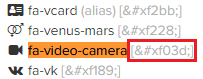
As a result, in the generated dashboard html you will see only the unicode value (instead of the original fa-video-camera value):
<text id="camera_living" x="310" y="45" font-family="FontAwesome" fill="blue" stroke="black" font-size="35" text-anchor="middle" alignment-baseline="middle" stroke-width="1"></text> -
Currently DrawSvg doesn't support the FontAwesome font. See this issue.
! This means in the current DrawSvg version you will see "fa-xxx" instead of the FontAwesome icon: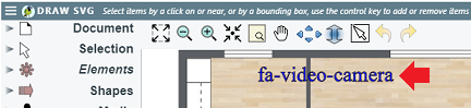
-
Since FontAwesome icons are displayed in
<text>SVG elements, it is very easy to change the icon using a update_text (see 'Control messages' section above):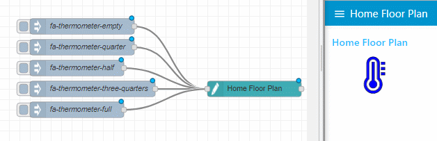
[{"id":"f369eb92.6c5558","type":"ui_svg_graphics","z":"553defb0.b99fb","group":"9ec8b304.368cc","order":0,"width":"15","height":"15","svgString":"<!--<svg height=\"100\" width=\"100\"></svg>-->\n\n<svg preserveAspectRatio=\"none\" x=\"0\" y=\"0\" viewBox=\"0 0 900 710\" xmlns=\"http://www.w3.org/2000/svg\" xmlns:svg=\"http://www.w3.org/2000/svg\" xmlns:xlink=\"http://www.w3.org/1999/xlink\">\n <text id=\"my_text\" x=\"100\" y=\"50\" font-family=\"FontAwesome\" fill=\"blue\" stroke=\"black\" font-size=\"80\" text-anchor=\"middle\" alignment-baseline=\"middle\" stroke-width=\"1\">fa-thermometer-empty</text>\n</svg>","clickableShapes":[{"targetId":"#camera_living","action":"click","payload":"#camera_living","payloadType":"str","topic":"#camera_living"},{"targetId":"#camera_balcony","action":"click","payload":"#camera_balcony","payloadType":"str","topic":"#camera_balcony"},{"targetId":"#camera_entry","action":"click","payload":"#camera_entry","payloadType":"str","topic":"#camera_entry"}],"smilAnimations":[],"bindings":[{"selector":"#camera_living","bindSource":"payload.attributeValue","bindType":"attr","attribute":"fill"},{"selector":"#camera_entry","bindSource":"payload.attribueValue","bindType":"attr","attribute":"fill"},{"selector":"#camera_balcony","bindSource":"payload.attributeValue","bindType":"attr","attribute":"fill"}],"showCoordinates":true,"autoFormatAfterEdit":false,"outputField":"anotherField","editorUrl":"","directory":"","name":"Home Floor Plan","x":1130,"y":520,"wires":[[]]},{"id":"866e2e46.ba033","type":"inject","z":"553defb0.b99fb","name":"fa-thermometer-three-quarters","topic":"","payload":"{\"command\":\"update_text\",\"selector\":\"#my_text\",\"textContent\":\"fa-thermometer-three-quarters\"}","payloadType":"json","repeat":"","crontab":"","once":false,"onceDelay":0.1,"x":820,"y":520,"wires":[["f369eb92.6c5558"]]},{"id":"68c4730b.af00bc","type":"inject","z":"553defb0.b99fb","name":"fa-thermometer-full ","topic":"","payload":"{\"command\":\"update_text\",\"selector\":\"#my_text\",\"textContent\":\"fa-thermometer-full\"}","payloadType":"json","repeat":"","crontab":"","once":false,"onceDelay":0.1,"x":790,"y":560,"wires":[["f369eb92.6c5558"]]},{"id":"46183ab5.42fd54","type":"inject","z":"553defb0.b99fb","name":"fa-thermometer-empty","topic":"","payload":"{\"command\":\"update_text\",\"selector\":\"#my_text\",\"textContent\":\"fa-thermometer-empty\"}","payloadType":"json","repeat":"","crontab":"","once":false,"onceDelay":0.1,"x":800,"y":400,"wires":[["f369eb92.6c5558"]]},{"id":"501c7f9a.08ac4","type":"inject","z":"553defb0.b99fb","name":"fa-thermometer-half ","topic":"","payload":"{\"command\":\"update_text\",\"selector\":\"#my_text\",\"textContent\":\"fa-thermometer-half\"}","payloadType":"json","repeat":"","crontab":"","once":false,"onceDelay":0.1,"x":790,"y":480,"wires":[["f369eb92.6c5558"]]},{"id":"d3ea2538.fa9458","type":"inject","z":"553defb0.b99fb","name":"fa-thermometer-quarter","topic":"","payload":"{\"command\":\"update_text\",\"selector\":\"#my_text\",\"textContent\":\"fa-thermometer-quarter\"}","payloadType":"json","repeat":"","crontab":"","once":false,"onceDelay":0.1,"x":800,"y":440,"wires":[["f369eb92.6c5558"]]},{"id":"9ec8b304.368cc","type":"ui_group","z":"","name":"Home Floor Plan","tab":"bb4f2a94.83b338","disp":true,"width":"15","collapse":false},{"id":"bb4f2a94.83b338","type":"ui_tab","z":"","name":"Home Floor Plan","icon":"dashboard","disabled":false,"hidden":false}]
Display images
In an SVG drawing, an "image" element can be used to display an image inside an SVG drawing. See this tutorial on the wiki for more information!
Troubleshooting
Some tips and tricks to solve known problems:
-
When SVG path elements get the same colour as the dashboard theme, like in this example where the shapes become blue:

You can avoid this by applying the fill colour as a
styleattribute (e.g. <element style="fill:red" ... />) to the path, instead of as a normal attribute (e.g. <element fill="red" ... />). And the normalfillattribute on an SVG path will get overwritten by the dashboard theme colour...Remark: drawings created with DrawSvg are already correct, but some third-party editors use the
fillattribute. -
Some basic input messages validation has been added on the server-side, and validation errors will be showed in the debug side-panel.
-
See the DrawSvg how to show client-side errors in your Node-RED debug panel.
Remark: when N drawings are visible now (e.g. running in N dashboards simultaneously), then N duplicate messages will be displayed (where N can be 0 is no dashboards are open...).
-
If you have doubts that this node is generating the requested SVG DOM structure, you might have a look at it. Here is briefly explained how to do it using Chrome:
- Open the developer tools of your browser, starting from your dashboard window.
- Right click on your SVG drawing in the dashboard, and select "Inspect".
- Now you should be able to see the generated SVG DOM tree.
-
When the "show browser errors on the server" has been activated, the error messages will appear in the left Debug sidebar. However if lots of messages are being injected, it is difficult to determine which error belongs to which message. To assist with that, the error message will contain the message id (which caused that error). So simply put a debug node (to display the input messages), and compare the message id to find the related message:
