Could you please copy/paste (or screenshot) the playstore reviews you mention? Thanks! :-)
Closed 97balakrishnan closed 6 years ago
Could you please copy/paste (or screenshot) the playstore reviews you mention? Thanks! :-)

You raise a very valid point. These people want to browse Commons pictures. On the opposite, our app is 100% focused on uploading pictures.
Among our possible strategies:
I'm trying to understand what these users want. I think they are actually asking for a "Search and browse" option in the sidebar. As a non-programmer, I am not sure how complex it is to include a search field in the app and then output the results of the search in a nice way (not sure if webview could do that).
@VojtechDostal It would probably take quite a lot of work to allow users to "browse" Commons entirely within the app, especially if they want all of the details that are visible in the browser. Possibly a compromise could be to do the API calls and display the results in the app (basic stuff like the image thumbnails and the author), but if the user wants more details they will be redirected to a webview? Like @nicolas-raoul said though, that might not satisfy the users and breaks the flow somewhat.
@97balakrishnan has a good point though. This is possibly the request/complaint that I see the most in our Google Play reviews.
If we hadn't already chosen our topic for GSoC/Outreachy (or if we were allowed more than 1 intern ;)), IMO this could be a great GSoC project. @maskaravivek what do you think?
Yeah I agree, it would be a good potential task for GSoC project, though I am not sure about its priority. I believe that one of the tasks mentioned in this comment is might be a better choice. :)
https://github.com/commons-app/apps-android-commons/issues/815#issuecomment-357275828
Actually we already plan to add featured images also, so this feature would also be nice. And I think its scope is appropriate for GSoC/Outreachy
This would be a really cool feature 👍
I am about to create a proposal for GSoC/Outreachy of this task, hence everyone looks agreed. But We might need to clarify:
@misaochan Yeah, I think we can implement the searching similar to nearby activity with a list of results showing partial info and giving a link to the webpage which can be loaded in-app using webview. This can be our first level target and later improved to completely in app.
I went through these links: https://commons.wikimedia.org/w/api.php?action=help&modules=query%2Bsearch https://www.mediawiki.org/wiki/API:Search
Using this, i think it is possible to implement a general search first.It would be nice if someone can send more references to understand the api?
I think it would be good if we can imitate, to some extent, what users expect when they search https://commons.wikimedia.org .
For instance, inspired by today's picture of the day, I searched for "butterfly" - https://commons.wikimedia.org/wiki/Butterfly . If I'm not wrong, the search seems to return images in the category "Butterfly", and splits the results up by various subcategories? @nicolas-raoul @whym any idea if that's how it actually works?
To make it work with featured images, I'm personally thinking of an activity (perhaps titled "Browse Commons") where when the user first visits it, featured images are displayed (with a subtitle saying "Featured Images"). There could be a search text field above the featured images, and if the user searches for something, the featured images below are replaced by the results of their search (with the appropriate subtitles). What do you guys think?
First showing recently featured images + a search bar (or round search button in the lower right) is a great idea.
By default if you search for "butterfly" you get this: https://commons.wikimedia.org/w/index.php?title=Special:Search&search=butterfly&fulltext=Search It is a list that contains:
You can tweak the search to get:
I believe the best would be to limit ourselves to search by media file name and category name.
I would propose this schedule, probably just the good volume for a GSoC:
That proposed schedule sounds great to me. :) We are going to be implementing featured images in our grant, but the activity will need a bit of tweaking to work with the browsing addition, so that can take up Week 1 regardless.
I would also recommend allocating at least a week in each half of the schedule for testing, documentation, and bug fixing.
@misaochan I updated the proposed schedule based on your feedback, how it it now? Does your grant also cover "Link to the Media Details activity to see an image's details"? In which case the step should be removed, and maybe another small enhancement can be added in compensation, for instance changing sorting order.
@nicolas-raoul Nice! Looks good to me. I cannot guarantee I will be around to do the alpha releases on the appropriate weeks (although I will try), will you be able to do it otherwise?
For Step 4 "Make search button list the results (by file name only for now).", I would probably add, "and replace featured images with them".
Edit: Talked to Nicolas, we agreed to leave out Step 2 for GSoC/Outreachy.
@nicolas-raoul Is it also possible to use the current location of the user to fetch images that were taken at the location? I'd love to see other pictures taken in the same area. I feel a lot of people would feel the same way.
Hello everyone.
I am in contact with @maskaravivek since a couple of days as I want to apply for a Commons app project for the GSoC. Firstly, I asked to him if there are some issues to resolve but then I decided to implement a "browse" page as I would have liked to show to you my skills with Java and android programming.
However, Yesterday I spent a couple of hours coding, I made a new simple activity and after that I sent a message to @maskaravivek, I copy it here:
I had thought about make a mockup but I was a bit frustrated because I don't have enough time to do it and make also an issue and furthermore I'd like to show you some code instead of show mockups. As a result, I decided to implement a new simple activity for browse the images. (I know that in a normal situation you won't do this, never!) I was thinking about where to put the page launcher and I realised it could be good a new item in the drawer, just next to the "nearby" item. After that, I created a new activity that is (for now) quite similar of the "nearby" activity. It shows a recyclerview containing cardview(s). It is a basic activity but I used all the structures I found in the app, I like a lot the way the code is structured 😁 I will send you a short video of the result. The cardview is basically a textview above an imageview, if you like it I can enrich it.
The video I sent to @maskaravivek is at this link: https://photos.app.goo.gl/WcBPFMFlZej7O5RR2
Surprisingly, I had the same ideas that went out in this issue (new menu item, new activity similar to the nearby one) but I didn't know about this issue until @maskaravivek linked it to me after the implementation.
If you don't mind I'll go on in the next days and I'll keep you updated.
Here is my LinkedIn profile: https://www.linkedin.com/in/riccardo-grigoletto-72475412b/ if you want to know more about me.
Thank you and thanks to @maskaravivek for his appreciations and willingness.
@RiccardoGrigoletto Good to see your enthusiasm for the project. The mock activity that you created was a good way to get started.
Before you start implementing anything it would be great to first describe in detail how you have planned to go about it. It can be debated and discussed with other community members. :)
I had a doubt. If we load search results with recycler view, the activity will load only after it fetches all the results , even if it is do it asynchronously it will be slow. I though we could use pagination, similair to facebook, Instagram. We will load search results dynamically if the user scrolls down a fixed number of results. I saw these articles on how to implement it
https://medium.com/@etiennelawlor/pagination-with-recyclerview-1cb7e66a502b
https://github.com/codepath/android_guides/wiki/Endless-Scrolling-with-AdapterViews-and-RecyclerView
I think this will be useful in making our app faster and more efficient. Please give your opinion on this.
@97balakrishnan yes I think it would be great. In fact, as @nicolas-raoul reported, if you search "butterfly" you get thousands of pictures. Furthermore, if you want to show the recently featured images, an endless scrolling is needed.
It could work like this: Here "limit" is the number of pictures requested each time and "offset" is the position of the first picture that will be downloaded ("offset"=0 in the beginning )
In the website the page is reloaded when the user request the upcoming pictures (passing the "limit" and "offset" values as parameters commons.wikimedia.org/w/index.php?title=Special:Search&limit=20&offset=40&profile=default&search=butterfly&searchToken=3brv9b75622idr9ef2vp76tgt ) , here we should add the pictures at the end of the list.
Yeah that's the best option we have.
CirrusSearch works on Wikimedia Commons: https://www.mediawiki.org/wiki/Help:CirrusSearch Some very basic filtering is possible.
@harisankerPradeep That's the topic of another issue: #28 :-)
Ok, so I think we need to discuss a Class diagram for the "browse" feature.
As I wrote in the previous message I tried to implement the activity similarly to the existing ones, I created 3 classes inside the "browse" package
I saw that there are already classes that fetch media and handle them but I don't know if you can already fetch an arbitrary number of media asynchronously.
If you are using a tool to create class diagram we should use it.
@RiccardoGrigoletto I don't think we have an UML tool yet, feel free to propose one, ideally free/open source, or collaborative online not needing registration to view :-)
I have created it and added some classes. I am using draw.io tool in Google Drive, the file is here: https://drive.google.com/file/d/1WTaigiccHn3-3h-T42oe3XmLikgg3bNR/view?usp=sharing .
You can view, comment and modify the file.
As you can see I added a browseController that has the LIMIT number and its functions need an "offset" parameter. I was thinking about adding a class that make queries and request them to the server and a cardView extension for the browse list.
@nicolas-raoul Great! I'll look into it !!
@nicolas-raoul @neslihanturan Will it be nice if we add a save option and share option to individual search result items with proper license and usage details displayed?
Yes indeed, if users search for an image I guess they want to do something with it. How about just reusing the existing image viewing activity? It has all of this already :-)
On Thu, Mar 15, 2018 at 6:05 PM, Balakrishnan S notifications@github.com wrote:
@nicolas-raoul https://github.com/nicolas-raoul @neslihanturan https://github.com/neslihanturan Will it be nice if we add a save option and share option to individual search result items with proper license and usage details displayed?
— You are receiving this because you were mentioned. Reply to this email directly, view it on GitHub https://github.com/commons-app/apps-android-commons/issues/1221#issuecomment-373307074, or mute the thread https://github.com/notifications/unsubscribe-auth/AAGFBkImoo-6BGyfMa7Q5awX8IxeAwliks5tei7YgaJpZM4SVOVY .
Ok thanks :-)
Hello Everyone. I am Hemant and I am an 2nd year undergraduate from India. I would very much like to work on this project. Could you just tell me how to get started? @nicolas-raoul Also should the search bar contain auto-complete option?
I think we can try to expand the scope of the GSoC project created on this basis and allow users who aren't logged in to browse Commons as well. It won't require a very drastic refactoring of the application, since MediaWiki and the APIs support anonymous edits (in a manner of speaking, it attributes it to the IP address of the user, instead).
I think search is a very powerful feature. We should have a separate activity for search.
Advantages of having a different Search Activity instead of integrating it with featured Category Activity.
I’ve been working on this feature for some time now. I had made a small prototype for the same.(still improving it)
Also, we can reuse FeaturedImage fragment for ImageSearchFragment.
nice work bro. Its good to see everyone s enthusiasm, we can discuss the implementation ideas here , But I don't know why everyone is trying to build a prototype for this. Its not required that we have to build something to showcase our idea .. just a mock ui is enough .Please dont mistake me, I think this project is meant to be done by someone during GSoC , there are a lot of issues which can be solved in this repository. This is my humble request. I think the mentors will also agree.
@97balakrishnan Yup, I agree with you bro. What are your thoughts on my implementation idea?
yes search feature can be implemented as a separate activity,But i feel Search and category search can be integrated. btw i Don't think there is going to be any featured categories. If you see the featuredImages i don't see any featured categories. The other features that you suggested also sound good.
@neslihanturan @nicolas-raoul What are your views?
@hjoshi123 Auto-complete would be nice to have indeed, great idea :-)
@97balakrishnan You are right, a prototype is not required. I was quite surprised (but in a good way) to see one before GSoC has even started.
I have no strong preferences between putting media and categories together or in separate tabs.
I want to keep this feature as simple as possible since main purpose of our app is uploading facilities. I consider this as a tool for educating user to decide what kind of pictures should be preferred and to encourage. In this way, it feels very similar with featured Images #324 feature:)
Btw, I am in favor with using media and categories in same tab, to prevent tabs in tabs.
Just a suggestion for this project :
I want to add these to my GSoC proposal but before adding I wanted to take reviews. Thanks
@Jatin0312 1- I think Contributions Activity already displays latest edits 2- We already heva featuredImages branch and backend will be implemented soon:) So no need to include this to proposal, they are different tasks.
Ok sure @neslihanturan :)
@neslihanturan How about having a seperate activity for search.but rather than putting it on drawer. We can have a button or layout in featuredImageActivity to open searchActivity. This way we will have not have problem of tabs in tabs.
@ujjwalagrawal17 it seems like to much work to find and access to search activity to me
@ujjwalagrawal17 Having a search button in featured images is not a good idea. It will give an impression that it is used to search the featuredImages
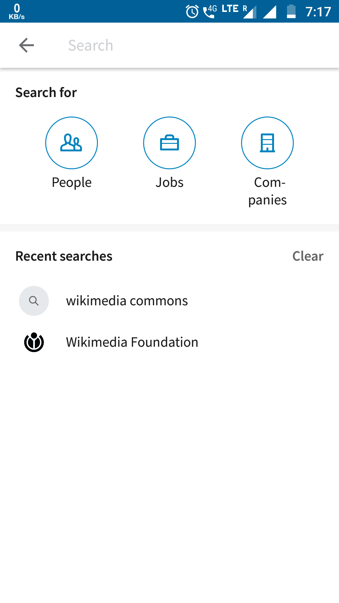
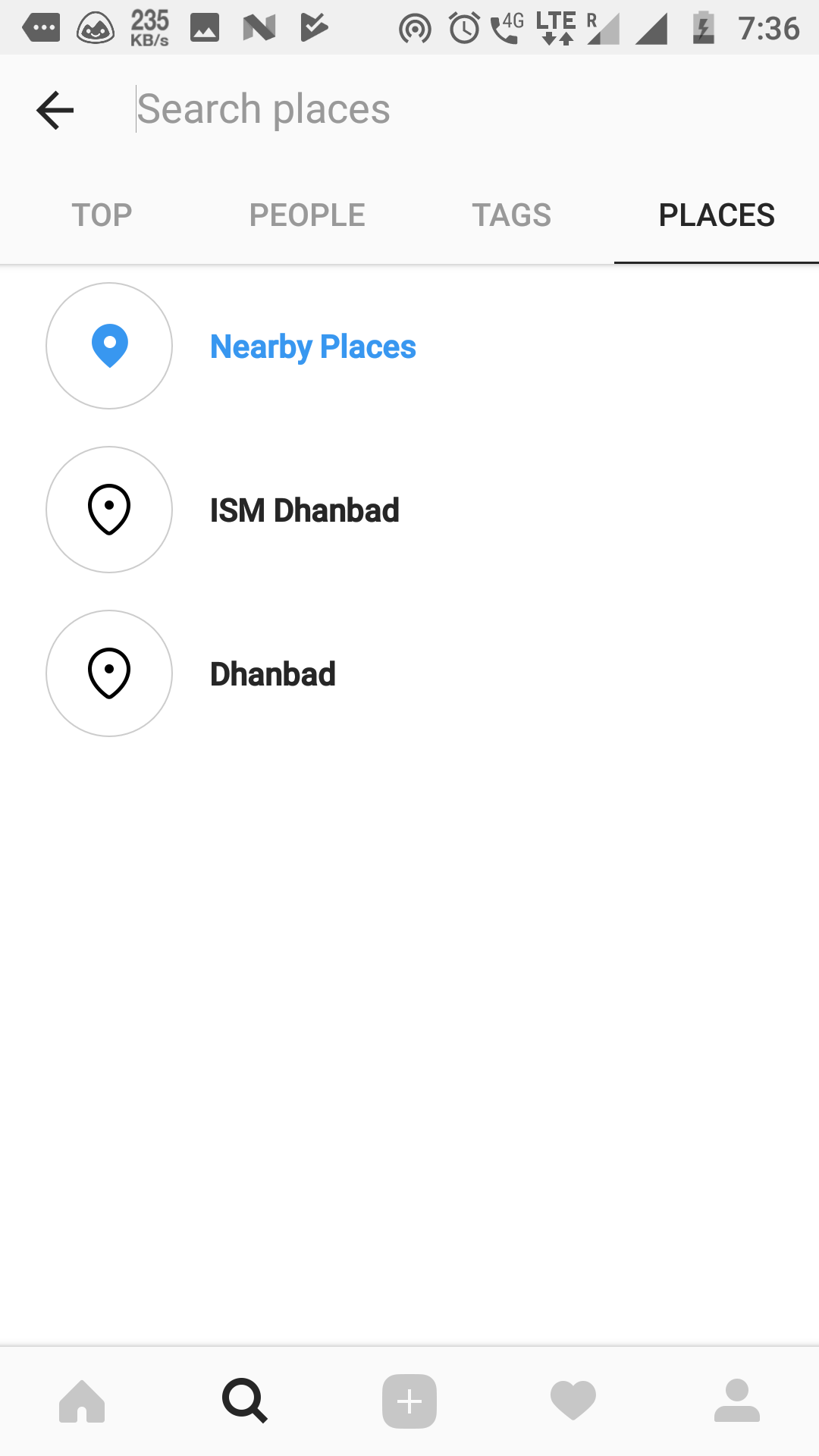
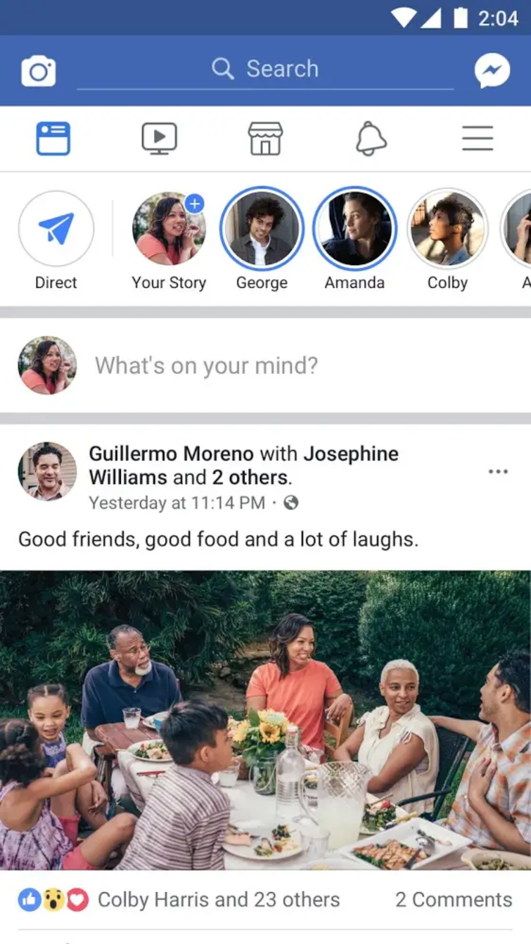
I did some research on this. Here are a screenshots from LinkedIn, Instagram, Facebook, Twitter.
|  |  |
|  |  |
|  |  |
|  | 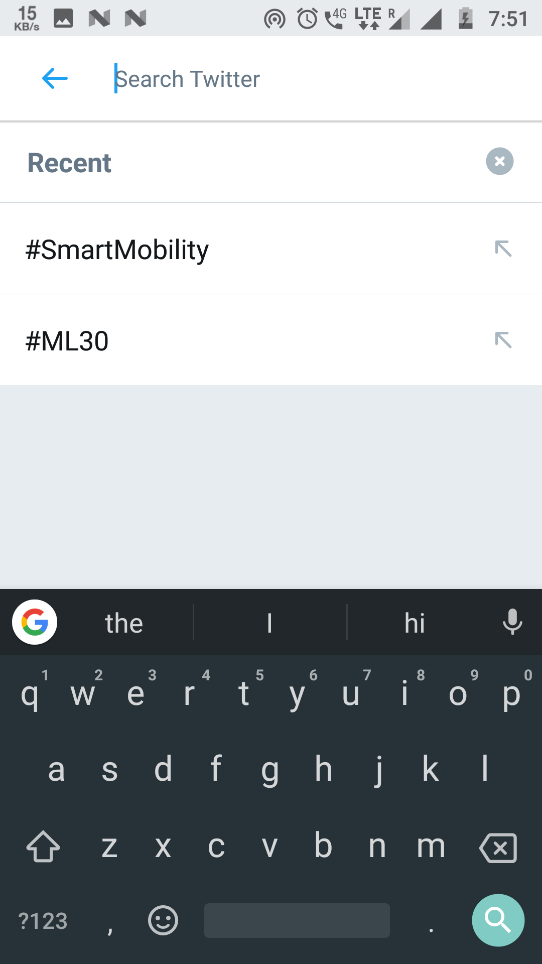 |
I think every app has a different search activity only, Also all of the apps include recent searches. We can have a layout or an icon in Home/NearbyActivity in toolbar maybe.(will save up space in nearby activity if we compare it with having tabs).
@97balakrishnan It depends on what title we will have in nav drawer for featuredImageActivity. If we have it "Browse Commons" then people will not be confused I think.
@hjoshi123 If we will integrate autocomplete how will we show search results. We should limit the autocomplete to give a maximum of 3 or 5 results so that it doesn't take the whole screen.
Related proposals so far, ordered by Phabricator id:
@ujjwalagrawal17 https://phabricator.wikimedia.org/T188597 @97balakrishnan https://phabricator.wikimedia.org/T188930 @Jatin0312 https://phabricator.wikimedia.org/T190232 @diddypod https://phabricator.wikimedia.org/T190490 @Ross65536 https://phabricator.wikimedia.org/T190640 @RiccardoGrigoletto https://phabricator.wikimedia.org/T190661
Please let me know if I forgot anyone or made a mistake :-)
Summary:
My suggestion is to enable the user to access the Mobile version of Wikimedia Commons Website within their app. This would give an integrated feel to the user. I noticed that this has been the main concern with people in playstore reviews. Sorry if this issue has already been discussed
Steps to reproduce: Adding a new activity which would display the mobile version of Wikimedia Commons app using a webView.