React + Foundation
Foundation as React components.
Demo
https://digia.online/react-foundation-docs/
Motivation
Foundation is both feature-rich and easy to customize. React on the other hand is awesome because of its simplicity. It's even more awesome when combined with Redux and Immutable.
After building quite a few applications with React and Foundation we noticed that we were writing the same components over and over again. First we tried to find a library that would do the job, but there was none that met our needs. So we collected our notes, started coding and here's the result.
We hope you enjoy it as much as we do!
What's in the box?
The goal is to wrap every part of Foundation into re-usable React components following the framework's
best practices. The primary focus is ease-of-use and extensibility. We use pure render components,
also known as stateless components, whenever possible to keep the memory usage to a minimum. Stateful
components are only used for larger components, such as ResponsiveNavigation, where state is actually necessary.
All components are unit-tested to ensure their quality.
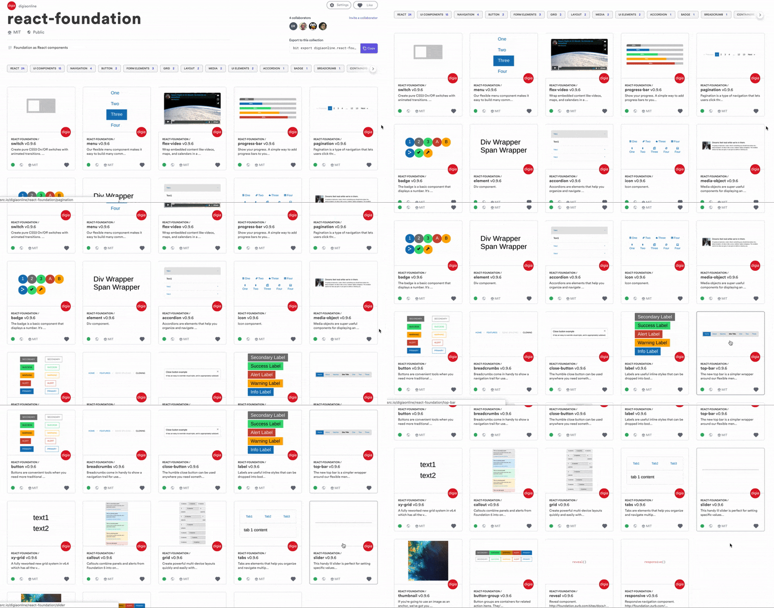
Here is a list of the available components:
- Accordion
- Badge
- Breadcrumbs
- Button
- ButtonGroup
- Callout
- CloseButton
- FlexVideo
- Grid
- Icon
- Label
- MediaObject
- Menu
- Pagination
- Progress
- ResponsiveNavigation
- Switch
- Tabs
- Thumbnail
- TopBar
More components coming soon!
Install
Install library:
npm install react-foundation --saveInstall foundation-sites:
npm install foundation-sites --saveUsage
// Add Foundation to index.js
import 'foundation-sites/dist/css/foundation.min.css';

// import components
import { Button, Colors } from 'react-foundation';

// Use components ...
function SubmitButton() {
  return <Button color={Colors.SUCCESS}>Submit</Button>;
}
Documentation is at https://digia.online/react-foundation-docs/.
Note: Newer versions of foundation-sites do not offer out of the box support for <Row/> and <Column/> components. If working with a newer version, <Grid/> and <Cell/> components should be used instead.
// Previous versions
<Row className="display">
  <Column small={2} large={4}>4 columns</Column>
  <Column small={4} large={4}>4 columns</Column>
  <Column small={6} large={4}>4 columns</Column>
</Row>

// Newer versions
<Grid className="display">
  <Cell small={2} large={4}>4 columns</Cell>
  <Cell small={4} large={4}>4 columns</Cell>
  <Cell small={6} large={4}>4 columns</Cell>
</Grid>
Contributing
Please read our guidelines.
Credits
- Thanks to Nord Software and Digia for sponsoring initial development.
- Thanks to @jmreidy for releasing the
react-foundationpackage name to us on NPM.
License
See LICENSE.


