Skyline Overlay
A modern customizable horizon FFXIV miniparse overlay.
Features: Basic overlay, extended details, customizable display/data settings, battle history, custom colors, sw cache and more. The project is based on React 18, and the dedicated ffxiv-overlay-api.


Overlay Links
- CloudFlare (Global):
https://skyline.dsrkafuu.net/ - Mirror (CN FFCafe):
https://overlays.ffcafe.cn/skyline/ - Mirror (CN DieMoe):
https://overlay.diemoe.net/skyline/
Usage
Check ngld/OverlayPlugin. For WebSocket mode, note that backdrop-filter support needs to be enabled manually on Firefox, check Can I use for more details.
2K+ (WQHD+) screen with 1.2+x scale is recommended for better experience in FFXIV.
Click the encounter can ends current battle and start a new one; zone name will be fully displayed when hover; click the DPS meter on encounter bar can switch to show HPS.
By default the overlay follows the pet-merging policy set in the FFXIV ACT Plugin. When playing on global servers with a custom language patch which causes the plugin's pet-merging not working, you can set your ID in an overlay config to manually merge your pets' data.
You can use CSSNANO to minify your CSS into single line.
Browsers Support
Supports major browser versions released at 2020 or ES2020.
- Chrome: >=87
- Firefox: >=78
- Safari: >=14
Cache Rules
The app uses Service Workers to cache all the assets, which makes it ready for offline usage after the first time.
When releasing a new version, you can wait for the pop-up notification to confirm the cache update, or use Ctrl+F5 to force refresh the app.
Environment
VITE_BASE_URL="/"     # dist base url (optional)
VITE_GA_ID=""         # google analytics id
Local Build
git clone https://github.com/dsrkafuu/skyline-overlay.git
cd skyline-overlay
pnpm install
pnpm run build
Online Debug

- Add
debug=1to the URL - Open the debug tool of ACT plugin
- Reload the overlay in ACT plugin
- Do somethings which will trigger the issue
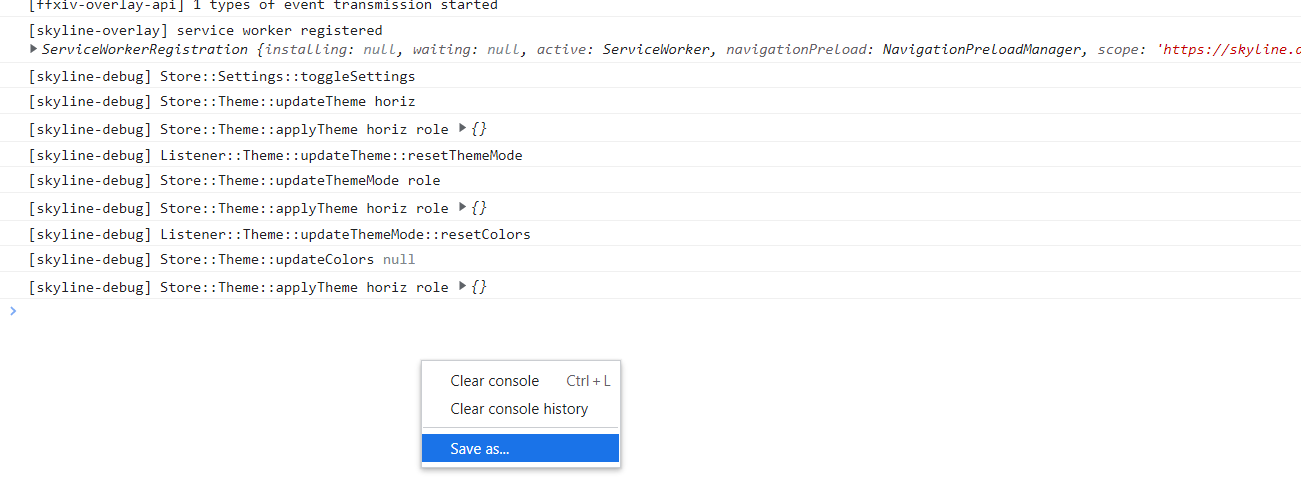
- Save the log and upload it like below

Contribute
git clone https://github.com/dsrkafuu/skyline-overlay.git
cd skyline-overlay
pnpm install
pnpm run dev
Add Translations
Please use ISO 639-1:2002 defined 2-letter code as filename, use ja as an example:
- Create a new
ja.jsonfile in@/src/lang, useen.jsonas a template - Import
ja.jsonin@/src/lang/index.js - Add a new lang in
@/src/lang/index.jsexported map, likeja: { translation: ja },
Add Custom Themes
- Add a new author in
@/src/themes/support/authors.ts - Create
@/src/themes/<name>.tsand@/src/themes/<name>.scss - Configure your theme in
@/src/themes/<name>.ts - Write theme styles in
@/src/themes/<name>.scss
Customizable Colors
All themes has pre-defined colors, check out @/src/themes/default.ts and @/src/themes/horiz.scss for examples.
If you'd like to add colors to your theme that users can customize, add a theme key to your colors object in @/src/themes/<name>.ts.
const myColors: Colors = {
  common: [0, 0, 0, 0.3],
  self: [118, 118, 118, 1],
  ...
  theme: {
    fg: [255, 255, 255],
    bg: [0, 0, 0, 0.3],
    bga: [85, 85, 85],
  },
};
These variables will now be accessible within your .scss file as var(--color-theme-<key>), where <key> is the color key name.
Contributors
@DieMoe233 @j0sh77 @Slightlyxz @thewakingsands
Credits
- ffxiv-overlay-api: https://github.com/dsrkafuu/ffxiv-overlay-api
- Job Icons: https://github.com/xivapi/classjob-icons/tree/master/svg
- jsDelivr: https://www.jsdelivr.com
- MiSans: https://home.miui.com
LICENSE
Released under Apache License 2.0, for more information read the LICENSE.
Copyright © 2020-present DSRKafuU (https://dsrkafuu.net)


