gradio_toggle

A toggle component that represents a boolean value, allowing users to switch between True and False states. Can function both as an input, to capture user interaction, and as an output, to display a boolean state.
Installation
pip install gradio_toggleUsage
import gradio as gr
from gradio_toggle import Toggle
def update(input):
output = input
return output
with gr.Blocks() as demo:
title = gr.HTML("<h1><center>gradio-toggle demo</center></h1>")
with gr.Row():
with gr.Column():
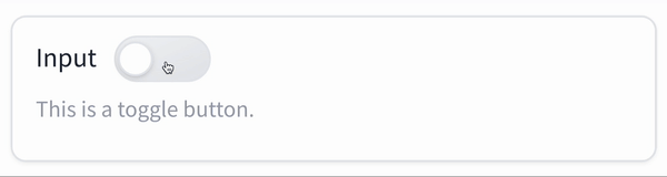
input = Toggle(
label="Input",
value=False,
info="Input version of the component",
interactive=True,
)
with gr.Column():
output = Toggle(
label="Output",
value=False,
color="green",
interactive=False,
)
input.change(fn=update, inputs=input, outputs=output)
if __name__ == "__main__":
demo.launch()Toggle
Initialization
| name | type | default | description |
|---|---|---|---|
value |
```python bool | Callable ``` | False |
Initial state of the toggle. If callable, it sets the initial state dynamically when the app loads. |
label |
```python str | None ``` | None |
Text label displayed adjacent to the toggle. If None and used within a `gr.Interface`, it defaults to the parameter name. |
info |
```python str | None ``` | None |
Text displayed below the toggle for additional guidance or information. |
color |
```python str | None ``` | None |
Optional color setting for the toggle, supporting CSS color values (e.g., names, hex codes). |
show_label |
```python bool | None ``` | None |
If True, the label is displayed; otherwise, it is hidden. |
container |
```python bool ``` | True |
If True, the toggle is placed within a styled container for visual grouping and padding. |
scale |
```python int | None ``` | None |
Relative sizing of the toggle in comparison to adjacent components when displayed in a row or block. |
min_width |
```python int ``` | 160 |
Minimum width in pixels that the toggle will occupy, ensuring it does not shrink below this size. |
interactive |
```python bool | None ``` | None |
If True, the toggle can be interacted with; if False, it is disabled. Default behavior is auto-detected based on usage. |
visible |
```python bool ``` | True |
If False, the toggle is not rendered visibly in the interface. |
elem_id |
```python str | None ``` | None |
Optional identifier for the HTML element; useful for CSS customizations. |
elem_classes |
```python list[str] | str | None ``` | None |
Optional list of class names for the HTML element; useful for CSS customizations. |
every |
```python float | None ``` | None |
If value is callable, specifies how frequently (in seconds) to refresh the value while the interface is open. |
render |
```python bool ``` | True |
If False, the component is not rendered immediately, useful for deferred rendering or conditional UI updates. |
Events
| name | description |
|---|---|
change |
Triggered when the value of the toggle changes either because of user input (e.g. a user types in a textbox) OR because of a function update (e.g. an image receives a value from the output of an event trigger). See .input() for a listener that is only triggered by user input. |
input |
This listener is triggered when the user changes the value of the toggle. |
select |
Event listener for when the user selects or deselects the toggle. Uses event data gradio.SelectData to carry value referring to the label of the toggle, and selected to refer to state of the toggle. See EventData documentation on how to use this event data |
User function
The impact on the users predict function varies depending on whether the component is used as an input or output for an event (or both).
- When used as an Input, the component only impacts the input signature of the user function.
- When used as an output, the component only impacts the return signature of the user function.
The code snippet below is accurate in cases where the component is used as both an input and an output.
- As output: Is passed, the toggle state as a boolean value.
-
As input: Should return, the toggle state to be returned.
def predict(
 value: bool | None
) -> bool | None:
 return value