Modular CSS Layout for Obsidian


This is a repository for modular CSS layout hack for use with Obsidian.md. It's meant to complement/assist Community Theme, focusing solely on providing alternative layout to standard width and standard top-bottom block view.
I mainly do casual test on select popular themes like ITS, Primary, Shimmering Focus, Prism, and Minimal. Need your help to let me know if there's anything not working right. Do log in MCL GH Issue if you find anything not working properly.
Table of Content
Installation / Download and Enable
This is actually just a CSS code snippets collection. So it isn't an installation per se, but rather download and enable in Obsidian. The best way is to use Mara Li's Snippet Downloader plugin as I have plans to update this snippets from time to time
Wide Views
CSS snippet:
MCL Wide Views.cssThis section only briefly explains Wide Views snippet. Please go through the documentation site Wide Views - Modular CSS Layout for more details.
This snippet provides you the following features:
- Full width page or blocks (dataview, table and backlinks) per page/note basis by specifying custom
cssClassat the frontmatter (YAML)wide-pagewide-dataviewwide-tablewide-calloutwide-backlinks- vault-wide toggle for each of the above
- Narrow width page per page/note basis for vault with RLL disabled by specifying custom
cssClassat the frontmatter (YAML)narrow-page
- Adjustable RLL (custom css class toggle) applicable to entire vault
- Disabled by default. Enable it via Style Settings plugin
[!TIP] Thanks to Obsidian updated Electron base to V21, I have managed to avoid using Contextual Typography plugin to support wide blocks with the release of v0.9.6
Example
---
cssClass: wide-page
---

<the rest of your note>
Multi Column
CSS snippet:
MCL Multi Column.cssThis section only briefly explains Multi Column snippet. Please go through the documentation site Multi Column - Modular CSS Layout for more details.
This snippet provides you the following features:
- Multi Column layout using Callout i.e.
> [!multi-column] - List Column/Grid/Card layout using (Unordered) list by either (a) using tag, (b) using Markdown Attributes plugin, or (c) specifying in the frontmatter (YAML)
- Float (Aside) Callout using callout metadata e.g.
> [!info|right-medium]
Multi Column Callout
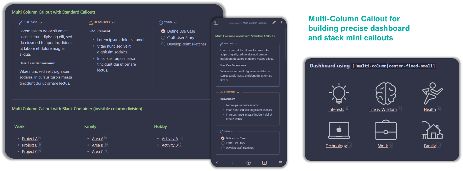
Multi Column Callout layout take advantage of Obsidian Callout - leveraging it as parent ‘div’ to house the sub callout (including Dataview results block). You can nest as many sub-callouts within it. The sub-callout will expand if [!multi-column] callout has extra space or overflow to next row if it doesn’t.

Example of Multi Column Callout
Example below is for the three callouts side-by-side in the picture above
[!multi-column]
[!note]+ Use Case Lorem ipsum dolor sit amet, consectetur adipiscing elit, sed do eiusmod tempor incididunt ut labore et dolore magna aliqua.
User Case Background
Vitae nunc sed velit dignissim sodales. In cursus turpis massa tincidunt dui ut ornare lectus.
[!warning]+ Resources
Requirement
- Lorem ipsum dolor sit amet
- Vitae nunc sed velit dignissim sodales.
- In cursus turpis massa tincidunt dui ut ornare lectus.
[!todo]+
- [x] Define Use Case
- [ ] Craft User Story
- [ ] Develop draft sketches
note that when you insert callout within callout, the line separating the callouts should only use single angle bracket (">")
List Column/Grid/Card
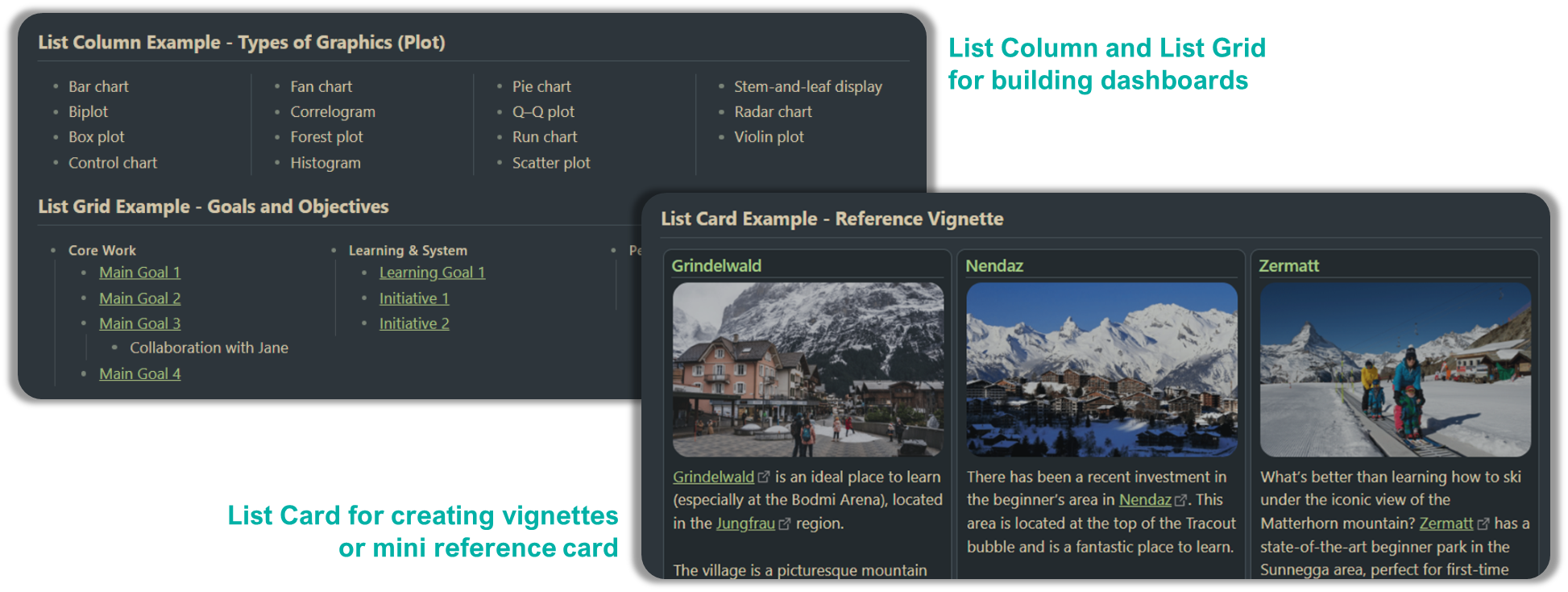
This layout take advantage of markdown unordered list (i.e. - list item) to create multi column (and multi row for List Grid/Card) layout by matching with an identifier i.e. either #mcl tag, Markdown Attributes plugin syntax, or cssclass: key at frontmatter.

Here are quick reference on the syntax for List Column/Grid/Card
| Type | Using Tag | MD Attr plugin | Frontmatter |
|---|---|---|---|
| LCol | #mcl/list-column |
two-column-list-block three-column-list-block four-column-list-block multi-column-list-block |
two-column-list three-column-list four-column-list multi-column-list |
| LGrd | #mcl/list-grid #mcl/list-grid-wide |
- | two-column-grid-list three-column-grid-list |
| LCrd | #mcl/list-card #mcl/list-card-wide |
- | - |
Note: LCol = List Column // LGrd = List Grid // LCrd = List Card
Example of List Grid
Example below is for the "Goals and Objectives" in the picture above
## List Grid Example - Goals and Objectives

- #### Core Work #mcl/list-grid
    - [[00 Home|Main Goal 1]]
    - [[00 Home|Main Goal 2]]
    - [[00 Home|Main Goal 3]]
        - Collaboration with Jane
    - [[00 Home|Main Goal 4]]
- #### Learning & System
    - [[00 Home|Learning Goal 1]]
    - [[00 Home|Initiative 1]]
    - [[00 Home|Initiative 2]]
- #### Personal
    - [[00 Home|Personal Goal 1]]
    - [[00 Home|Personal Goal 2]]
Float Callout
Float Callout will allow you to position side note or info box either to the left or right of the main note with other content wrapping around it. It uses callout-metadata to specify which side to float to and the size of the callout
You can apply to any callout as the identifier is done on the callout-metadata i.e. after the | in [!<callout-type>|<callout-metadata>]. Table below gives some understanding of the syntax structure.
| Apply in LP? | Which Side? | Preset FC Size | Example |
|---|---|---|---|
<empty> float |
leftright |
small medium large |
[!info\|float-right-medium] [!blank\|right-small] |
Gallery Cards
CSS snippet:
MCL Gallery Cards.cssThis section only briefly explains Gallery Cards snippet. Please go through the documentation site Gallery Cards - Modular CSS Layout for more details.
This snippet provides you the following features:
- Image gallery using callout by specifying the callout-metadata
gallerye.g.> [!NOTE|gallery] - Image gallery using YAML/frontmatter .
cssClass: image-gallery - Float Image using image alt-text
- Image and Mermaid Diagram Controls
- Dimension control for images in bullet list
- Image Zoom
- Mermaid Scale and Zoom
Float Image
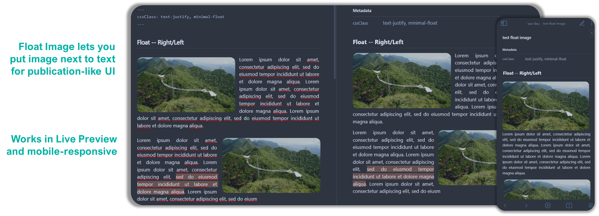
Float Image is similar to Float Callout but apply directly to the images (doesn’t require you to wrap it in a callout). Currently it uses image caption to identify how you want to float it, but in the future I intend to make it work with anchor tag # as well.

You can apply to any image as the identifier is done on the alt-text i.e. after the | in [[path/to/image.jpg|alt-text]] or the text inside [] in [alt-text](path/to/image.jpg). Table below gives some understanding of the syntax structure.
| Apply in LP? | Which Side? | Preset FC Size | Example |
|---|---|---|---|
<empty> float |
leftright |
small medium large |
[[image.jpg\|float-right-medium]] [right-small](image.jpg) |
Support Me
I do this on my free time for personal joy. However, a cup of coffee or two would motivate me further! If you like what I do, and want to contribute back, you can support me via Ko-fi
