Closed extratone closed 1 year ago
<iframe width="560" height="315" src="https://www.youtube.com/embed/vHDNdMux16g?controls=0" frameborder="0" allow="accelerometer; autoplay; clipboard-write; encrypted-media; gyroscope; picture-in-picture" allowfullscreen></iframe>
"David Blue on Social Media Software & Services" (Wiki Page)
https://github.com/extratone/bilge/wiki/David-Blue-on-Social-Media-Software-&-Services
Tapbots Founder Paul Haddad On App.net, Netbot, And What Twitter’s New API Means For Tweetbot | TechCrunch
Debug: 2: Paul Haddad and Tapbots | Apple Podcasts
Debug: 74: Paul Haddad on Tweetbot 4 | Apple Podcasts
The Pipeline: 8: Paul Haddad | Apple Podcasts
Tapbots - Iterate 06 | Apple Podcasts (Google Podcasts Link)
Interview: Tapbots' Paul Haddad talks Tweetbot, App Store and Google | The Next Web
Mark Jardine and Paul Haddad / Tapbots (Founders Talk #21) | Changelog
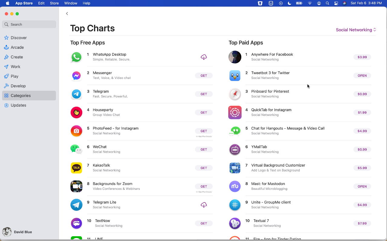
in the bleak face of twitter’s centralization, tapbots refuses to give up on its mobile client. were it just i who came to you with only my voice on this cold night, proclaiming the imminent release of a whole numerical version of a third-party mobile twitter client in 2021, you really would have no choice but to send for the laws, for you’d be left no consideration other than my comprehensive descent into absolute insanity. 807 days ago, i told you lots about the history surrounding the development of tweetbot 5, which i confidently described as “likely the last competitive third-party twitter app for ios.” after spending the past few months diving deep into ios in preparation to review and reflect upon apple’s current flagship handset, my eyes have been opened to the exponentially-increasing pace of the whole environment’s metamorphosis during the course of my lapsed attention. in the name of progress, i’ve done my best to make a point of looking back, too, yet something astonishingly personally relevant managed to slip past me until just last week: there is a sixth version of the tweetbot app. at this moment, it is listed on the app store as an “early release” version, though its predecessor can still be downloaded by those who’ve already purchased it in the past, like me. this is an unusual practice - usually, pre-release versions of ios apps can only be distributed through apple’s developer beta testing infrastructure, through testflight. notably, tweetbot developer company tapbots was apparently required to take down tweetbot 5’s store listing 30 days before releasing tweetbot 6. soundcloud embed i can’t remember exactly why - though i suspect i was just fucking around on my phone before bed, bleary-eyed - but the implications of this next numeral passed me by the first time i saw and downloaded tweetbot 6, two weeks ago. perhaps it’s because the app didn’t appear to have any new features - in fact, it’s technically got less than 5, though those that have been removed - user-specified url shortening, image hosting, and video hosting services - haven’t worked in a good while anyway. as my old fav, the verge noted in their coverage of 6, blame for these omissions rests solely on twitter, inc., itself, who’s continued to hold its api development inordinately close-to-chest. i didn’t bother to find out about this, though, because my first assumptions upon poking around the new app - especially after encountering its new subscription requirement in order to use any of its substantive features - was that its developers had ceased any actual time investment into the app long ago, and that 6 was a new version in number and rudimentary visual updates, only, shoved out in hopes of peaking old, loyal users like myself enough to get us to download it, at least. in the disappointment i’d already expected, i closed and immediately deleted the app. i’ve paused everything else to write you on this, though, because the story is actually much bigger. had i investigated any further that first time, i would have discovered an odd amount of buzz coming from even the most mainstream of tech media in a simple search. (yes, i am ashamed about it.) you’re still reading, but perhaps - as i was, originally - you are doing so from an appropriately-jaded, well-read perspective on software, generally, in 2021. perhaps you’re looking at the search results, yourself, and wondering if you’re dreaming. dedicated coverage of a fucking third-party twitter client iteration??? at this point in history? what in fuck? i’m fairly certainly neither of us are, though: fucking tweetbot made headlines on engadget, techcrunch, 9to5mac, macstories, imore, macrumors, and others. no, it’s not 2010 again. in fact, the verge, at least, has never given up on tweetbot. if my long term memory had been functioning, i would have remembered noticing its spot in “12 great apps for your new iphone in 2020:” twitter is a vaguely terrible way to spend your time these days, but if you (like me) can’t tear yourself away from the social media service / entryway into hell, you’ll want tweetbot, which actually makes using twitter far less painful. tweetbot shows you the tweets of the people you follow, in the order that they tweeted them. there are no ads or promoted tweets, powerful mute filters to block out unwanted noise, and (thanks to twitter’s unfriendly api changes) no notifications to constantly ping you to come back to the app. here’s to chaim for exposing me to a perspective i never would have otherwise considered: tweetbot’s lack of push notifications as a positive. if you’re wondering, no, this new app does not yet include any additional notification integration, and it’s not clear whether or not it’s on tapbots future roadmap for the app, or where. as for the reality of integrating tweetbot 6 into your current twitter use, i stand by my argument that deleting the native twitter app isn’t really an option if you plan to ever view your notifications on your phone. the popular assumption (i assume) if you’re still reading is that you are a “poweruser,” meaning details about my own configuration are probably irrelevant. if by chance you’ve just downloaded tweetbot for the first time, you should take the time to disable notifications for tweetbot entirely, but leave them on for the native twitter app, even if you decide to banish it to your app library. before i began any work on this review, i made sure to swap in tweetbot 6 where the native app had been in my dock for several years, now. i originally pushed the native app all the way to page 6, but immediately found this extreme. instead, i put it in the bottom-right corner in my second screen, as you can see in the screenshot below (which also serves as proof, if you needed it.) tweetbot vs. native twitter screenshot i should also note how much my own engagement on twitter has diminished in the past 3-5 years. not to manifest tiny violins - in turn, my engagement on (and investment in) mastodon has increased exponentially, and it’s of a much higher quality. i bring it up for context’s sake: i can afford to prioritize tweetbot in my twitter use because of how few daily notifications i get - a number which is unusual for someone who uses twitter as much as i do. inevitably, my own use is once again going to factor heavily in this work, as is the significance of my relationship with twitter, generally, in my life. if you didn’t already know, i’ve met basically all of my friends since high school through twitter. as of this moment, my private “friends” twitter list includes 149 accounts, and i’ve spent more than 10 years, now, reading almost every single one of their tweets. i have been as critical of the service as anyone, but - whether or not either of us are willing to acknowledge it, wholly - i believe the intimacy of this arrangement to exceed that of any in-person relationship i have ever had. footnote: though i have been trying unsuccessfully to write more on this dynamic for years, i still intend to do so, one day. reading the random thoughts of these people seconds or minutes after they’ve popped into their heads for all this time has been an experience unique to the format twitter pioneered, if not to the service, itself. i have no choice but to acknowledge that i am deeply invested in not just twitter, but twitter’s less-than-visible lists feature, emotionally and intellectually. when i hit my follow limit, several years ago, lists also became my single means of acquiring new connections on the network. if it were to be removed, i would lose this ability, entirely, as well as any reasonable means of communicating with any of my friends. perhaps you understand, now, why i have written and tweeted so extensively about lists. you should also understand just how miraculous the possibility of tweetbot’s new future now seems, personally, unless you’re new to all of these ideas and don’t feel like reading that big olé tweetbot 5 review of mine (which is fine.) before i go into the history of tweetbot, let me first share the single most telling feature in tweetbot of tapbots’ belief in using lists and share some evidence of others’ present day belief in tweetbot. shamefully, i’ve spent several years - tens, if not hundreds of thousands of hours - using lists in tweetbot, oblivious to its upmost lists integration: “use lists as timeline.” had i actually bothered to look at the support docs at any point, i would have discovered this long ago, which would have almost certainly made my given year. if you use tweetbot and lists, for the love of gourd, please take a look. here’s what those docs currently say, in full: one long time tweetbot feature is the ability to use any of your lists as your main timeline. to do this, all you have to do is hold down on the “timeline” label in the navigation bar (in the timeline tab) and a menu populated with your lists will appear. select one and that will become your current timeline. you can switch to another list or back to your main timeline any time by performing the same action. even after reading this multiple times, it still was not obvious to me what it was talking about, and i was unable to find precisely zero visuals on the world wide web of this action taking place, so i recorded and uploaded the video embedded above. good god, how i wish i’d been a more detail-oriented young man! i’ll be privatizing my self-punishment from here on out, though, so bear with me. lists integration shots the discourse surrounding tapbots’ recent announcement has already reached a higher decibel count than i would have ever expected, so it’s obvious there are plenty of users who still love tweetbot, and you already know from the beforelinked stories that the verge has also stood firmly by it as the preferred twitter experience. it takes a wee bit of digging, though, to discover the subtle bets on both tweetbots and lists from no less than apple, inc., itself. in the official apple shortcuts gallery, a curated list entitled “twitter better” includes “open twitter lists” at number 1. in 5th position is “open in tweetbot,” and “open in twitter app” (3rd,) is configured by default to first ask you to choose between tweetbot and twitter’s native app, despite its title. tweetbot’s mention in default siri shortcuts gallery as for app store rankings, the fact that tweetbot 5 was forcibly removed from public listings makes it impossible to meaningfully judge recent popularity of tweetbot on iphone/ipad. its macos-based sibling, though (called tweetbot 3,) was the second most popular paid app on the mac app store as of february 6th, 2020. that’s the day i borrowed my mom’s macbook pro for a short while to check up on macos big sur, when i downloaded the current version (3.5.2, if you wanted to know) of tapbots’ desktop twitter client and messed around with it enough to tell you that it’s as wonderful as ever. (had i not switched back to windows as my primary desktop os a decade ago, i would use it every single day.) i suspect most active twitter users in 2021 would be even more surprised to discover tweetbot’s remaining, discreet hold on today’s twitter experience than i was, assuming most of them joined more recently than myself and those i regularly interact with. for the sake of this post, i reached out to tapbots with an interview request about “tweetbot’s roadmap, apple’s requirement that [they] remove 5 from the app store 30 days beforehand, and why [they’ve] decided to take this (risky, imo) bet on making our lives better,” though i don’t expect a reply, which is fine. they did respond to my support request regarding hardware keyboard shortcut support very quickly, saying they’ll look into it. (without being verbose, i’ll just tell you that if a near future update to the app fixes the f and ⌘ + r shortcuts, i will shit out my whole ass.) all themes screenshots the business at hand before i dig into the controversy and hypotheticals surrounding what tweetbot 6 might become, let’s take a moment to qualify it vs all of one’s options to interact with twitter on ios currently (as in, feb 11, 2021 at 19:24.) it’s almost certainly premature to do so, but skeptical readers would note, i’m sure, that its listing on the app store is “early release” in name only, that i have just spent money on this specific version, which should therefore render inert the normal exceptions a review would make for beta or pre-release software. if you’ve somehow come across this post before reading anything else about tweetbot 6 and simply want to know what is new for this version compared with 5.5.3 (its predecessor’s most recent release,) the frank answer as it stands is not much. perhaps i’m doing something wrong, here, but the youtube videos and tech media articles i could find dealing with the subject of additions, specifically, were all either misleading, entirely wrong, or both. account settings comparison screenshots while 6 lists one more option (for a total of 9) under themes in the display section of the app’s settings menu, none are substantive variations of the same themes you’re familiar with from 5. “future light” is just a more turquoise variant of the “default” blue ui theme in 5. in fact, the singular change in the display menu is the addition of “san francisco rounded” under the fonts selection. below, you can see side-by-side screenshots of the tweet detail view in tweetbot 5 vs. tweetbot 6, with the regular sfui font on the left and rounded variant on the right (text size slider set to max on both apps.) tweet detail comparison screenshots to be honest, i can’t really tell the difference between the typefaces in this view, but have used the new app enough to know i prefer the latter. more topically exemplified in that image is tweetbot 6’s new support for social cards, which the tapbots boys have executed in a startlingly beautiful way that puts twitter to shame and makes one feel like you’ve taken them for granted these past few years. also in that vein and more than worthy of the same accolades is tweetbot 6’s support for twitter polls. they’ve never looked so good. poll support screenshots somewhat on-trend, the app also includes two new icons, but - if we’re being 100% frank - they’re a paltry, dated-looking afterthought and tweetbot deserves (needs, even) better branding. if i were allowed a singular compulsion to impress upon its developers, i’d make them put out a public call for new art. i’m all but dying to see what the community would come up with. so, if you were wondering what the fuck tapbots have been doing these past 3+ years, you should now have the basal bullet points of your answer. the greater truth about this gosh darned twitter app (and why its long-respected developers are now asking you for a whole dollar a month,) though, requires a broader look. slow & steady for as long as i can remember, both the macos and ios versions of tweetbot have always possessed a more-or-less undefinable (perhaps apple development- specific) quality that’s noticeably set them apart from their direct competitors. i didn’t fully understand why they “feel” so much more “right” until i started making my way through this list of all the interviews/podcast appearances by tapbots’ ios code wizard, paul haddad, who comments in variations the same argument for a very deliberate developmental pace. the first time, with a macworld journalist on some steps outside wwdc 2013, i assumed he was just tossing some self-deprecation around to casualize the interview: frankly, we’re slow at doing stuff. yes, you are, tapbot… from a returning user’s perspective, it’s hard to understand what in gourd’s name they’ve been doing. i listened and read through every tapbots interview i could find - all but one with paul, who has through the years continued to come across as a sensitive, well-read, even wise professional developer with a healthy, professional outlook on the work of his little (relatively) weathered company and its place within the warp speed nightmare that is the mobile software industry. i suppose i was expecting to find an explanation for what i saw initially as a minimal regard for tweetbot’s history, in contrast to 6’s announcement. i wouldn’t find it, though, because in truth, i was sure i already knew it: twitter made it clear over a decade ago - just after they’d purchased tweetie and slapped their own name on it - that they had no intention of competing in the client space, so third-party developers were no longer welcome. developers have told us that they’d like more guidance from us about the best opportunities to build on twitter. more specifically, developers ask us if they should build client apps that mimic or reproduce the mainstream twitter consumer client experience. the answer is no. as we point out above, we need to move to a less fragmented world, where every user can experience twitter in a consistent way. i’ve spent enough time in the app space (read: phone dude hell) to expect a lot of melodrama, largely without judgement, considering how generally awful the big vendors have made the whole situation. the business legality of the story was spiked into the mainstream conversation last year by controversy encouraged by basecamp following some pretty toxic, retaliatory correspondence from apple regarding their plan to subsidize their new email service, hey. frankly, i’ve found such stories - about clashes between big software companies over mediocre, uninspiring, and sometimes just downright bad software - ridiculously exhausting and less and less interesting, lately, as i’ve realized that the most innovative, quality work i have experienced has basically all come from the tiniest teams. the most groundbreaking projects and products i’ve bothered to show and tell, here - unichar, zalgo generator, bear, toot!, mastonaut, mast, etc. - were all built by individual developers except for shiny frog’s bear. (their team currently numbers 16, by my count.) each one of those hyperlinks eventually leads to a form of my same rant: why the fuck won’t tech media talk about genuine innovation anymore. founder’s talk clip embed as i read and listened through tweetbot’s history for this work, it occurred to me that i might be neglecting to acknowledge an age old divide in development philosophy across platforms. in the singular instance both tweetbot devs appeared together in a podcast interview - a founder’s talk episode from 10 whole years ago - paul haddad addressed the when is it gonna be done question in a comprehensive and particularly illuminating way: i personally hate that question because, you know… it just will get done when it gets done… we’re definitely slow. we go over every screen, every detail over and over again until we get it right. that takes time, which is why we don’t talk about upcoming projects. every screen, every detail, over and over again. this sort of deliberateness (which i have personally been working on appreciating, as of late) is actually - as i have come to realize - tweetbot’s defining feature, especially going forward. out of all the third-party twitter clients to come and go, tweetbot has been overwhelmingly singled out as the favorite because of how aligned it is with the traditional priorities of the apple space: thoughtful, deeply-considered robustness. pardon the cliché, but it is the only one that has always felt native - as if it could have been published by apple, itself. everything happens so much the ios poweruser community has been “allowed” to drift away from these principles since ios 12, especially, and its pandora’s box-like integration of siri shortcuts (workflow, by another name.) you may or may not be aware of the jailbreaking community’s continued efforts - i was certainly surprised to discover that the r/jailbreak subreddit has nearly 600,000 subscribers, which outnumbers all but the eldest subreddits in the apple sphere, including r/ios, r/iosbeta, and r/shortcuts (one of the primary hubs for the siri shortcut tinkering community) by a huge margin. since ios 14’s addition of sanctioned custom widgets, twitter and reddit have been host to a fairly-steady stream of personalized ios “themes” representing varying degrees of tedium/obsession/madness. one “fringe”-ish avenue i’ve explored quite thoroughly is the adjacent community of public beta tests via testflight, which allows willing app scrubs like myself to download beta/pre-release versions of ios apps. as of this moment, no less than 25 of the 227 apps installed on my iphone 12 pro max are testflight beta versions (both numbers far higher than normal because of my in-progress review.) telegram poll embed essentially, it’s now easier than ever to run incredibly janky software on your iphone or ipad, remaining well clear of a warranty violation, yet the apps that stick out most boldly in the mind (at least for myself) are unfailingly apart from any sort of experimentation. bear, for instance - the writing app i evangelize to every ios user and have continued to describe as “the most beautiful piece of software i have ever seen” - just allowed registered beta testers access to its in-progress “editor 2.0” on ios, which shiny frog describes as still in its “alpha” stage, yet even i have as yet been unable to trip it up whatsoever. this is the league tweetbot pioneered, in many ways. for the record, both tweetbot 6 and tweetbot 5 have been demonstrably more reliable for me in the past few months than twitter’s native app, which has been crashing multiple times per day on my devices for quite a while during regular use. i’m accustomed to crashes, so i can’t say with 100% confidence that tweetbot has never crashed, but it certainly hasn’t since i first downloaded 6 and began this review, despite my deliberate attempts to probe its every possible function. not only is tweetbot 6 reliable as hell - it’s also stupid frugal. currently, its app store installation weighs in at 10.9 mb, while twitter’s app is more than ten times heavier, at 116 mb. i realize sizes on disk are further from your mind than they’ve ever been in this age of outright computing gluttony and you probably couldn’t care less about my personal encounter with bandwidth famine in late 2018. in fact, i find it particularly telling that tapbots has continued to prioritize such efficiency in their development despite operating under less financial, technical, and social pressure than ever to do so. various tweetbot 6 screenshots embed future of the bot let’s say you’ve somehow made it this far without either satisfactorily resolving your confusion about tapbots’ decision to implement subscriptions, why they’ve decided to continue investing their time in third-party twitter clients, whatsoever, and/or some other app quandary, and you’re still expecting david blue of all people to articulate some pivotal element of this story that’ll put your intellect at ease. perhaps you’re still looking for a comprehensive picture of what using tweetbot as one’s main twitter client looks like in 2021. let’s change it up a bit, toss in some fucking bullet points, and list a few fundamental truths: if you intend to view your twitter notifications on ios at any point, completely deleting the native twitter app is not an option. (notably, it doesn’t look like this is going to change anytime soon, if ever.) “shopping around” for a third-party twitter client leads the at all attentive user back to tweetbot, exclusively. with the potential exception of fenix, all other twitter apps on the app store are fucking bunk and will cost you as much or more as tweetbot 6’s new subscription. if you use twitter lists regularly, you’d be an idiot not to start your tweetbot subscription right this fucking minute. all of these will probably remain true for the foreseeable future, unless i’ve totally misunderstood twitter’s stated intentions for its api 2.0. in the ~month since the tweetbot 6 story first broke (a nice birthday present!,) no less than three newish twitter features have made the news. last week, it (apparently) committed to the worst possible user-side content monetization model concept out of the dozens that have dipped in and out of rumor for virtually the service’s entire history: “super follows” are slated to shade our collective experience with putrid freemium concerns. “communities” sound in concept like a worthwhile and genuinely value-adding feature addition for actual twitter users, but any substantial expectations of the company feel far too risky to invest in. all the while, twitter spaces - the audio-only clubhouse-ish mutilation of periscope’s corpse - has been silently bestowed upon a secret set of @s at an achingly slow pace. i don’t know about you, but i still haven’t even fully digested fucking fleets, yet. what does tweetbot 6 really offer you, twitter user, in 2021? freedom from all of that bullshit. it’s just occurred to me how much more anxious the movements of twitter, inc. and jack dorsey’s horrendous facial hair would be making me if i had not discovered an (ironically) more stable, wholesome platform to replace them, years ago. no, i will not discuss mastodon beyond this remark, but readers invested enough to get to this point who haven’t heard of the federated, open source social network by that name would do well to consult this handy hyperlink. this privilege of choice - even if it’s completely delusional - has combined with tapbots’ thoughtful brush up of their trustier-than-ever tweetbot to ease my longtime twitter-dependent ass to a nigh-miraculous degree. however, stepping back from it all, i realized tweetbot’s new life bets even heavier on that single, defining feature which the company hardly mentions, and could conceivably restrict - maliciously or not - or remove entirely without real consequences to their business or public standing via tech media outcry. what if twitter killed lists? we’d all be fucked. upon this realization, i shot out of bed very late in a recent evening and went straight to fucking trello, of all places, to sift through twitter’s public development roadmap for any official word on their fate. i really did panic for a beat upon first reading the words “replacement for lists functionality” before realizing the actual intention of the card’s expression in the context’s syntax, which is probably about as positive as it could possibly be: a public suggestion that lists will continue to be supported through 2.0, at least. the card sits in the “nesting” column (which i assume to be the lowest priority group, chronologically,) right between identical cards for bookmarks and direct messages. imgur embed the grandma’s house method writing about tweetbot 6 has been an illuminating personal experience, if you haven’t yet caught on. the timing of its release has proved awfully convenient, just predating the aforementioned catastrophe of disjointed features that has descended harder than ever before on twitter’s own app, leaving it an absolute mess. when i initiated the symbolic swap maneuver documented at the very beginning of this review, i assumed i was going to find tweetbot awkward to use as my primary in the present day, but have found the opposite to be true. the social network tweetbot draws from is barely recognizable as the same property it drew upon originally, when its lists-loving configuration was simply one of a dozen different interpretations of how one should interact with twitter (by far the sharpest, i think we’d agree.) tweetbots, in contrast, is virtually identical in principle, though the unwavering bearing of its development has resulted in the true definition of refinement. the result is the most beautiful way to use twitter in 2021, no competition, and is also crucially the singular means of interacting with it on one’s “own terms” - as long as yours align with the lists method, that is - in an environment that feels predictable and fundamentally at your control. as much as i have praised the mastodon app toot! as the most innovative social app available - and will continue to do so until i encounter something more original and ingenious - it’s perhaps the singular remaining cleverly playful tweetbots feature which first opened my perspective to appreciate little easter egg-like tricks. indeed - even after all we’ve been through together these past ten years - you can still cycle through all of tweetbot’s visual themes by two-finger swiping vertically in 6. quick account switching is the other less-than-obvious swipe function of note, which i’ll rely on an embed stolen from tapbots themselves to demonstrate: stolen tapbots video clip embed i don’t think it should ever feel natural to speak sentimentally about mobile apps, but tweetbot is a worthy exception. if you glance over the respective comments sections of the articles and youtube videos i’ve hyperlinked, you’ll pick up on this phenomena of legacy twitter users chucking back some tragically nostalgic sentiments in response to the reminder surfaced by the tweetbot 6 news of just how long we’ve been doing this. from my perspective, the other majority sentiment found there catalyzes the bizarre chronobending at play even further. i can’t believe how many folks continue to be flabbergasted by the idea of paying for software in 2021, but i’ve been literally begging twitter to charge me a monthly fee in exchange for some greater curative capabilities for as long as i can remember. the whole of my gospel, again, is that tweetbot 6 has personally made using twitter a little bit better than bearable, so i have no other reasonable choice available: i’m paying the fuck up.
Share thoughtfully on HN + other Dev/legacy Twitter/Tweetbot user spaces.
Perhaps the best way to see footnotes and comments until #52 is resolved. Microsoft Word Shared Link
I just discovered yet another feature in Tweetbot lol…
hitting the spacebar on the external keyboard does a mark as read and hide sort of action, Tweet by Tweet,
See this Tweet.