Easy Vue Camera
This vue component is powered by easy-js-camera library.
How it works
This component has two sub-components. One is called FullscreenViewCamera and the other is StandardViewCamera.
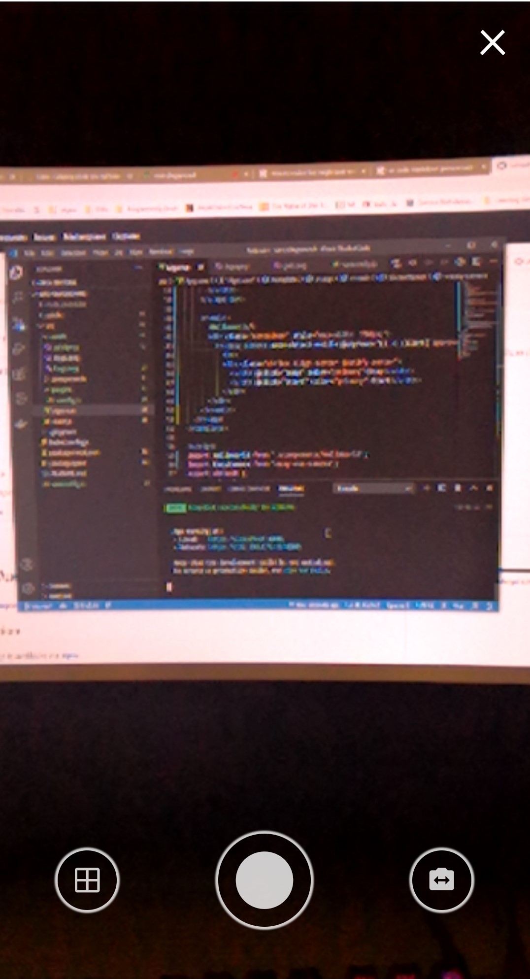
- FullscreenViewCamera: This component provides a native app like look for the camera and the only part which is customizable is the
Header. The picture below shows how it looks like.

- StandardViewCamera: This component does not provide any UI actions and just renders the Video element along with a canvas to show the snapped picture in. This component is controllable via reference.
Note: If you enable the auto-detect-mobile property the mother component will automatically will decide which of the sub-components should be rendered. If this property is off you can toggle between the two, by toggling fullscreen property.
Installation
The package is available via npm. For using this package you also need to install easy-js-camera.
npm install easy-js-camera easy-vue-cameraAfter the installation is complete you can add the component with the following code.
import EasyCamera from 'easy-vue-camera';

Vue.use(EasyCamera);
or
import EasyCamera from 'easy-vue-camera';

//inside your vue options api
export default {
    components: {
        ...
        'v-easy-camera': EasyCamera
        ...
    }
}
Usage
After adding the EasyCamera component to your vue components you can use it like below.
<v-easy-camera
    v-model="picture"></v-easy-camera>
Properties
-
autoDetectMobile: This property will let the component to decide if it is loading on a touch screen device or not.
default: true -
fullscreen: This option will make the component fullscreen.
default: false -
fullscreenZIndex: This option will allow you to change the
z-indexof the camera control in fullscreen.default: 17, -
mustApprove: Setting this option to true will make the component no to immediately send back the tooken picture to your v-model and will show a confirmation button first. This property is only effective in fullscreen mode, in standard mode you should handle it with your own code.
default: false -
output: Here you can set the
outputimage that you expect from the component. You can set this todataUrlorblob.default: dataUrl -
overlayMask: This option will set an overlay mask on the video. You can have a grid so your user can see how you excpect the picture to be taken. It accepts string and the value is the path to your
mask image. -
startOnMounted: The component will grant the persmission on mounted anyway but you can decide to run the camera on mounted or not by setting this property.
default: trueFunctions
You can access the functions inside the component by referencing the component.
-
close: This function will stop the camera if any exists and will emit
closeevent. -
snap: This function will take a picture and if the
mustApproveproperty is not set then it will emitinputand will send the picture back. -
start: This function will start the camera and emits
loadingevent on beging and end of the function. loading event has a value of true or false -
*stop: This function will let you to stop the camera. The camera will be turned off with this function.
-
switchCamera: This function will try to switch the camera if any other camera than the main one exists.
-
toggleMask: This function is only effective when the component is in
StandardViewand will let you to toggle the overlayMask. OnFullscreenViewthe mask is controlled by the component's UI actions.
Events
- loading: Whenever the component is waiting or done with waiting it will $emit the
loadingevent with the value oftrue/false. - close: Happens when either the
FullscreenViewor theStandardViewfinished a close request. - approve: This event only happens when the component is in
FullscreenView. From the inside the component it already sends aninputevent to update youv-modelvalue but it also emits this event to let you know that this new update is because of user approval. (This only occurs ifmust-approveproperty is on).
Slots
- header: This slot if only used in
FullscreenViewand will let you to set a header. Please notice that settingcustomheader will replace the default close button.
Desktop version
Please note that on desktop just the video is adjusted and no actions are shown. On desktop it is better that the actions are placed manually than using the component actions. The actions are available in fullscreen mode