gatsbyjs / gatsby

The best React-based framework with performance, scalability and security built in.
https://www.gatsbyjs.com
MIT License
55.19k stars 10.33k forks source link

Site Showcase #4392

Closed calcsam closed 6 years ago

calcsam commented 6 years ago

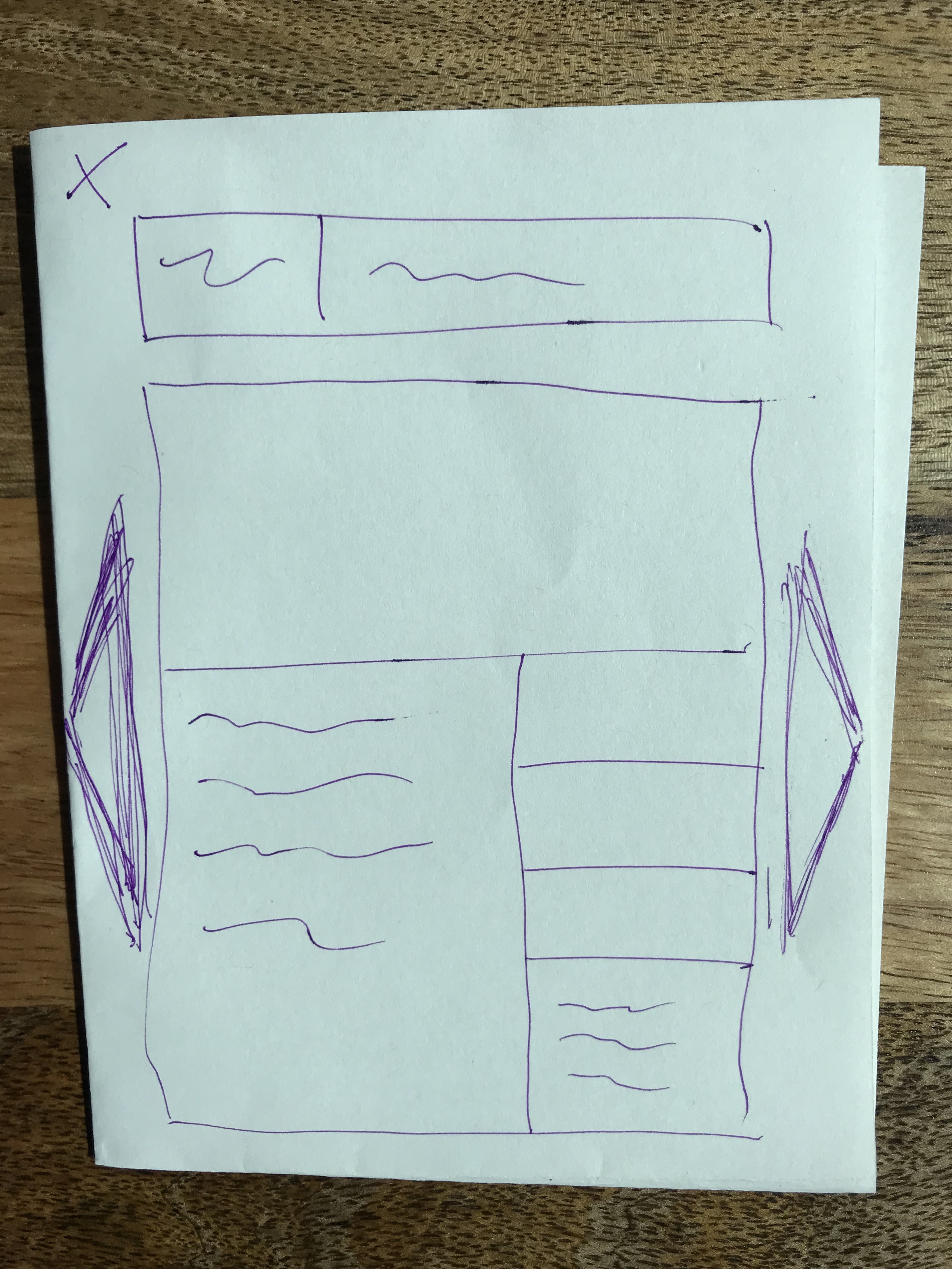
One of the most powerful demonstrations of Gatsby is clicking around sites, for example on the current showcase list and seeing how fast they are.

Following up on the heels of the recently merged in package library, we should add a site showcase to gatsbyjs.org to do this in a more powerful way, including:

shannonbux commented 6 years ago

Pain points according to interviews on this topic (see attached PDF for full quotes): (and @fk would be curious to meet together sometime to discuss how to solve these problems through effective design!)

Potential benefits of bringing a site / starter showcase (also based on interviews):

Starters.pdf

gillkyle commented 6 years ago

This is awesome! I'd be interested in hearing thoughts from @fk in what kind of format/layout something like this might have.

Are there any examples of sites that do something similar (where inspiration is maybe being drawn from)? I kind of imagine using gatsby-transformer-screenshot and some grid or list of sites, maybe akin to how Netlify displays previews of sites in it's dashboard view of sites you've published.

I agree with the pain points brought up in a lot of those bullets that these could help solve too, when I read through the docs I knew the starters would get a site up and running fast but I didn't find a ton that I loved from a design standpoint, though that also gave me the flexibility to go make exactly what I wanted and structure my project accordingly. I also think seeing how the plugins perform would be awesome, the gatsby-image demo really piqued my interest the first time I saw it and it was one of the big reasons I started experimenting with the package.

LekoArts commented 6 years ago

Are there any examples of sites that do something similar (where inspiration is maybe being drawn from)? I kind of imagine using gatsby-transformer-screenshot and some grid or list of sites, maybe akin to how Netlify displays previews of sites in it's dashboard view of sites you've published.

There are a ton of "inspiration" websites out there, one of them would be cssdesignawards.

I'd like the idea to search through the starters/showcase with the help of tags, e.g. looking for examples on how to used styled-components. Or the site category Shannon mentioned.

I didn't find a ton that I loved from a design standpoint, though that also gave me the flexibility to go make exactly what I wanted and structure my project accordingly.

Design is subjective to some point but I also find it hard to find the right balance between being open enough for extensions but also "opinionated" enough to target the overall design idea. I don't want the users of my starters to have to completely change everything but rather add their things here and there πŸ‘

I also think seeing how the plugins perform would be awesome, the gatsby-image demo really piqued my interest the first time I saw it and it was one of the big reasons I started experimenting with the package.

Totally agree that examples are important. From what I've seen all starters have a example site but not all plugins have one. That would be also something to improve on. On that note: These examples should use and showcase every option, also the advanced ones. I hate documentations with just only examples for easy things...

shannonbux commented 6 years ago

@gillkyle thanks for the additional perspective! and @LeKoArts thanks for the suggestions and can you explain more about this, like an example of what you mean?

On that note: These examples should use and showcase every option, also the advanced ones. I hate documentations with just only examples for easy things...

gillkyle commented 6 years ago

Yeah, well said @LeKoArts.

I threw a handful of showcase websites I found in a Google doc (including CSSDesignAwards πŸ‘): https://docs.google.com/document/d/1AiP-SR-gM9nAqw-9I4t9QSv9WISjztzbu7HnaF528uY/edit?usp=sharing

It seems like in almost every case there's a landscape view of the site above the fold in some sort of card format in these showcases. However, I think a lot of these examples are all about design and are trying to be more visual, whereas the gatsby starters are more about the functional parts you can piece together more than the design, so you can give whoever's using it a little more flexibility like @LeKoArts brought up.

Makes me think that maybe these examples are better suited towards displaying already made gatsby sites, but because showing a screenshot of a barebones starter site doesn't show you all the cool plugins operating under the hood more details about it would be beneficial.

LekoArts commented 6 years ago

and can you explain more about this, like an example of what you mean?

gatsby-plugin-sharp would be a positive example. Its documentation shows extensive options but nearly everyone is covered in the example site. A bad example site would only showcase the resize ("easy things") but leave out the more advanced options or more advanced ways to connect it with other things in the ecosystem.

I think a lot of these examples are all about design and are trying to be more visual, whereas the gatsby starters are more about the functional parts you can piece together more than the design, so you can give whoever's using it a little more flexibility like @LeKoArts brought up.

I have to comment back: Well said! Right now - for me - starters are not themes. Themes are all about the design, starters more about a specific "tech stack", more about the combination of things or using specific plugins for usecases (like my "portfolio" starters). Sure, I try to make my sites as beautiful as possible, but in some cases the styling part didn't get much attention on starters.

shannonbux commented 6 years ago

@gillkyle thanks for that list of examples! I'm attaching some initial wireframes to this comment that a group of us sketched for record keeping.

And @LeKoArts Thanks for that clarification. Very insightful and I think @fk would agree that starters aren't always very visually appealing, and sometimes don't need to be, so the way we present starters vs. example sites vs. themes will be different.

Google Analytics details The starter page is the 3rd highest visited page on Gatsbyjs.org. So even though some starters might not be super visually appealing, I think making that page more catchy with a few "featured" starters or something could help with drop off, because... When people land on the starters page, 2/3 of them drop off. The 1/3 that stays most commonly go next to these pages (in order): docs, deploy gatsby, homepage, plugins, awesome gatsby. If people start at another page, like the homepage, and then go to starters, about 1/3 of them drop off, and the 2/3 that stay go to the same pages as above although also the tutorial and building with components are in the mix of top pages. To me, this means that the starters page is pretty much not giving a huge percentage of people what they're looking for. And a lot of people are *not* finding the Awesome Gatsby page (it's not in our top viewed pages, which is the closest thing we have to a site showcase.

Priorities

Because of the google analytics above and this whole discussion, this is what I think we ought to do:

  1. Create a site showcase first, because the design is transferrable to starters and themes.
  2. Make the site showcase more discoverable than Awesome Gatsby page.
  3. Use the site showcase design to redesign the starter page or the way people find starters. Actually we might need to use something like Full Story and usability testing, or ask on Twitter, or all of the above, to figure out why the starter page has such huge drop off.
  4. Eventually, all these designs could grow into a theme library (far in the future).

Wireframes

From research it seems that a starter and/or theme library ought to prioritize this info (wondering how it will be different for a site showcase--maybe the first two are most relevant for now?):

Screenshots of wireframes
KyleAMathews commented 6 years ago

starters aren't always very visually appealing

This doesn't seem to me to be an argument for showing or not showing screenshots of the starters. Visually appealing or not, the screenshot is important information β€” if people want a starter that is pretty, they'll go straight to starters that are, if they don't care or are judging based on tech then a starter that's plain might be more appealing because they know there's not a ton of stuff they have to delete before they can get going.

Either way, the screenshot is helpful.

shannonbux commented 6 years ago

Some questions @ThatOtherPerson and I came up with:

KyleAMathews commented 6 years ago

How many sites should we start out with?

I don't see any reason to limit the number of sites we show. We should definitely show on the initial screen the most "impressive" sites but the more the merrier IMO. Move all the existing showcase sites over and keep encouraging people to add their sites. Everyone likes to show off the work they've done. I don't think "weird" or "ugly" sites are a negative site. People will see plenty of "beautiful" ones so they'll know the tool can do both. Let's encourage everyone to build things and share them.

How could we expand the site showcase going forward

My thought is we'd have a YAML file that people would PR their site onto β€” similar to the existing process. We'd have some required fields and automatically validate the site(s) they add against that.

fk commented 6 years ago

(Edit: Updated with latest version, minor edits for clarity, and the link to the Sketch source β€” edits in italic.)

Hey y'all! Here's a first shot at mocking up the Site Showcase UI β€” "Desktop HD" only for now. I haven't invested much thought in IA design for now β€” this becomes quite obvious in the "Filter and Refine" sidebar. More on that later.

v1

site showcase

Have to run, so let me break down the better things real quick:

Will add a link to the Sketch source when I'm back at the keyboard. ✌️ Here it is: https://www.dropbox.com/s/mjvuaaugmbdtr5q/gatsbyjs.org%3Ashowcase.sketch?dl=0 You'll need the "Futura PT" and "Spectral" fonts to properly edit this … :-/ … at least the latter is open source (https://fonts.google.com/specimen/Spectral); Futura PT is available on Typekit.

shannonbux commented 6 years ago

Looks awesome, @fk! Wondering how to make horizontal scrolling action discoverable with the featured sites and then make it clear that sites below are vertical scroll.

re: convo with @KyleAMathews and @calcsam Here's how we can select initial sites to showcase:

  1. Pull from current "Awesome Gatsby" showcase
  2. Manually select others we like
  3. Create submission form (I see Flo is already thinking of that)
jlengstorf commented 6 years ago

Can we make this a Google Sheet and just build the showcase from that? This would allow us to periodically rebuild the site showcase with no manual steps because the Google Form would populate our data source automatically.

KyleAMathews commented 6 years ago

@jlengstorf my thought was we use a yaml file β€” that's pretty easy for people to edit + we can validate new entries on travis.

Google form => google sheet would be fun but then the data wouldn't be editable by the person who submitted the data or anyone else in the community.

KyleAMathews commented 6 years ago

@fk really beautiful work!

calcsam commented 6 years ago

@fk this looks awesome! It's hard to identify which part looks the best because it's the combination of all the little details that making it amazing.

fk commented 6 years ago

Thanks guys! πŸ€— πŸ‘

Wondering how to make horizontal scrolling action discoverable with the featured sites and then make it clear that sites below are vertical scroll.

@shannonbux Google and e.g. Airbnb use horizontal scrolling a lot for mobile/smaller screens, so I hope that our audience is familiar enough with the general concept. We just need to ensure that there's always a part of the "next" card visible ("Deliveroo.Design" in the mock).

Laptop Touchpad (MacBook and the like) users should be able to scroll not only vertically but horizontally as well with a gesture, and it's also possible with an Apple "Magic Mouse". We can't forget the users with a classic "vertical mousewheel" mouse though. Maybe it's best to show a scrollbar for devices that do not support touch, but only show that scrollbar when the mouse is hovering the "Featured Sites" container.

That said, I'm not suuuuuper attached to the horizontal scroller β€” but it is a very nice pattern for mobile, and has the great benefit of making the content below that section discoverable without having to scroll through n cards (vertically). It also helps to clearly separate the long-ish list of "regular" showcase items from the featured ones.

fk commented 6 years ago

PS: The second version of the mock now uses "Spectral" for the featured card descriptions, places "Featured" and "Github source" icons next to each other horizontally instead of vertically, and adds a "Built by…" line to the featured items.

fk commented 6 years ago

Here's a quick shot at the mobile version β€” maybe we want "real" cards here (with a border and subtle box-shadow):

site showcase mobile

Also threw in a first version of an icon for the mobile navigation. Braindump:

fk commented 6 years ago

Here's a stub at showcase.yaml: https://gist.github.com/fk/5ec0dbdaeb7f4e1839c99b18cbd42332

FWIW, I started trying to (way too late) find parent categories for (source) plugins and transformers, but eventually dropped that for now:

- Analytics/Tracking
  - Google Analytics
  - Yandex Metrika
  ...
- Comments
  - Talkyard
- CSS (~Frontend/UI?)
  - Emotion
  - Glamor
  - PostCSS
  - Sass/Scss
  - styled-components
  - styled-jsx
  - styletron
  ...
- eCommerce
   - Shopify
   - Snipcart
- (Headless) CMS
   - Contentful
   - DatoCMS
   - Drupal
   - GraphCMS
   - NetlifyCMS
   - WordPress
- Markdown
- React replacements
  - Preact
  - Nerv
- Search
  - Algolia
  - Elasticlunr
shannonbux commented 6 years ago

@fk this is looking amazing! Today I'll come up with a list of possible categories for plugins (from some UX research) that could possibly also help with categories for the site showcase.

I tend to agree with you that the purple titles might be a bit much on mobile, since there is limited space anyway. Hopefully the discoverability of swiping will speak for itself, so people just focus on the sites and don't have to bother with words??

As far as placing sorting within the filter icon, I tend to think they are distinct and ought to be separated visually. To save space, we could do what some designs do and hide them until after someone has already searched for something. UX designers tend to like that stripped down / minimal design and developers like to see their options for filtering and sorting up front :)

shannonbux commented 6 years ago

@ThatOtherPerson what else do you need in order to start working on this? I'm hopelessly new to development so just tell me if we're missing crucial steps here!

shannonbux commented 6 years ago

@fk! @ThatOtherPerson and I are starting a googlesheet to fill with showcase data according to the examples in your .yaml file! Do you have ideas of how to get the "date updated" date easily? Also we're thinking of getting the description from either meta data for google searches or the "About Us" page on each site, depending on which is available / a better description. Any other ideas for how to get the description?

Also, @KyleAMathews and @calcsam David and I determined that we'll need some tips on how to easily search for which plugins each site uses and which version of Gatsby it's using.

KyleAMathews commented 6 years ago

how to easily search for which plugins each site uses and which version of Gatsby it's using.

I think this can wait for a follow-up PR. It'll be really valuable but it's always better to ship a simple/small version of the final vision first. Basically what we'll do though is any site that has a link to a GitHub repo (so it's open source), we can go to that repo, and look at their package.json file to see what version of Gatsby & which plugins they're using.

shannonbux commented 6 years ago

Ideas from a conversation with @davidluhr today (thanks, David! And feel free to clarify/add stuff here):

davidluhr commented 6 years ago

@shannonbux You're most welcome! Very excited to see this project coming to life.

A couple other thoughts from looking at the mockup:

Looking great so far!

fk commented 6 years ago

@shannonbux @davidluhr Great thoughts and feedback! πŸ™ πŸ€—


Re: @shannonbux

Do you have ideas of how to get the "date updated" date easily?

It would be updated (and only exist) once an existing showcase site has been updated manually. I mainly threw it in because it adds another sort criteria. Didn't put too much thought in it :-/, but figured it's an easy thing to add.

What is the clickable tap target pointing to?

Oh man, I didn't do my homework regarding the detail view; TBH I didn't think we'd need one for version one. Looks like I focused a little too much on the available content for the sites in the showcase that do not have their source available (so that we can look into package.json and compile information based on that), and didn't even think of generating a description automatically for those. We (potentially) do have the README content for the open sourced sites, so … I will mock up a detail view (x2 β€” one with lots, and one with very little information). πŸ˜ƒ

I personally dislike having to click through to the detail view just to get to click the link to the site, so I would suggest

That said I can see some advantages for forcing the user to visit the detail view before being able to access the link to the site, so not very attached to add one more button to the card.

Probably stating the obvious: A card's category labels are clickable, too, and result in a filter being set (and the view updating accordingly).

The side-scrolling probably ought to stop after a set # of sites, and then either have a "View all" card OR nothing, so that people just start scrolling down.

πŸ‘ I thought of a "View all" that would set filters to just show the featured sites. The "All 236 sites" headline would change to "x featured sites" and we'd have a button to remove/reset filters…somewhere. ;-)

Having two ways to view all featured sites and view all sites below and two ways to view filters could be a bit confusing (I think @fk you already anticipated this).

As I understand it, there's three :-) ways of viewing all featured sites:

I don't think this is too confusing, but I completely agree that my mock wasn't thought through in terms of filtering (I think I even might have mentioned that when posting the mockups). @davidluhr has a great suggestion on moving the "Showcase header/navigation" below the "Featured Sites" block. I'll share more of my thoughts when addressing his comment.


Re: @davidluhr

The "Showcase Header/Navigation" feels disassociated from the list of all Showcase Sites that these controls are tied to. I'd expect filtering, searching, and sorting to affect the list of 236 sites in real-time, but I'd miss these controls if I had already scrolled down to look at the full list. I think moving the controls between the heading "All 236 (blazing fast) Showcase Sites" and the grid of actual sites would provide more clarity around what content these controls will affect.

Totally agree! πŸ€¦β€β™‚οΈ πŸ‘ πŸ‘πŸ‘ What are your thoughts about persistently showing the filter sidebar for ~desktop and up? Should we give the list of sites more room and only show the filter menu "on demand" (when the user clicks the "Filter" button), essentially treating the desktop UI the same as we would do for mobile?

I strongly suspect our filters (at least partly) not to be mutually exclusive at some point, which IMO would speak for making the filter sidebar persistent as soon as screen size allows it.

Sidenote: For mobile we need to convey that the list of sites is filtered once a filter has been set. Airbnb does that by simply changing the color of the "

I was confused by the feather icon and had no idea what it signified. […] I think that for this main showcase page, it doesn't add any helpful disclosure or interest to a particular showcase site.

Agreed!

[…] I think it'd be helpful to have some micro text that mentions how the list is sorted. If we move the filter/search/sort controls into this section, we can indicate the current sort state next to the control.


Both of you addressed the "Submit your own site" CTA:

The CTA to "Submit your own plugin" Could be more prominent and might be useful at the top (for those who come to the page looking for a way to submit) AND at the bottom (for those who feel inspired to submit after they've looked around a while)

To add to the above point regarding the "Submit your site" CTA, I think this could use more visual affordance. […] A dedicated section appealing to the "Want to get featured? Submit your site!" call-to-action feels useful here […]

πŸ‘ Agree with both, leaning towards @davidluhr's suggestion to give that CTA a sedicated section on the page β€” let's unclutter the UI and make that CTA more prominent.

fk commented 6 years ago

Here's a quick shot at the "View all Featured Sites" card:

site showcase - all featured sites card

fk commented 6 years ago

A first shot at the detail view for Desktop β€” mobile up next:

site showcase desktop detail view

calcsam commented 6 years ago

Ooh, these are nice Flo :)

On Wed, Apr 11, 2018 at 7:53 AM, Florian Kissling notifications@github.com wrote:

A first shot at the detail view for Desktop β€” still missing a close button for the modal πŸ˜¬β€” that and mobile up next:

[image: site showcase desktop detail view] https://user-images.githubusercontent.com/21834/38624573-ad690e74-3da8-11e8-878a-9c37d4ef9111.png

β€” You are receiving this because you were mentioned. Reply to this email directly, view it on GitHub https://github.com/gatsbyjs/gatsby/issues/4392#issuecomment-380481506, or mute the thread https://github.com/notifications/unsubscribe-auth/AEL3W9yGfk2PWR7Blo2jw_uq_kH5vlzpks5tnhjugaJpZM4SfWNe .

davidluhr commented 6 years ago

@fk This is looking amazing! I really like the visual reward of reaching the end of the scrollable featured sites with the View All card.

The details modal looks great too. The ability to tap the arrow to go back/forth between sites is awesome for those who want to binge on all the showcases. My only thought is what happens if a user arrives at this page directly? Being in a modal might be a little confusing since they don't have the context of opening it from a main page.

Instagram address this by conditionally showing the modal only if the user opened it from a grid of images:

instagram-post-modal

Otherwise, if the user navigates directly to the URL, a full page is shown with global navigation:

instagram-post-standalone

This "standalone" version would probably be a common use case for people sharing their featured site with their network. Some navigation/CTA to visit the showcase page from this standalone version might be a good idea to keep users engaged in this content area.

What do you think?

KyleAMathews commented 6 years ago

Definitely agree about not loading the modal if you visit a URL directly. That's what we do on gatsbygram and we can use the same pattern https://gatsbygram.gatsbyjs.org/1677771511187112561/

shannonbux commented 6 years ago

These look awesome, @fk! And great points David and Kyle about how to handle the modal thing. @ThatOtherPerson is working hard on coding and will reach out to Florian for any more clarification on design. I'll spend next Mon/Tues (after workshops) getting all the data ready! We're getting closer!

On Wed, Apr 11, 2018 at 1:30 PM, Kyle Mathews notifications@github.com wrote:

Definitely agree about not loading the modal if you visit a URL directly. That's what we do on gatsbygram and we can use the same pattern https://gatsbygram.gatsbyjs.org/1677771511187112561/

β€” You are receiving this because you were mentioned. Reply to this email directly, view it on GitHub https://github.com/gatsbyjs/gatsby/issues/4392#issuecomment-380585663, or mute the thread https://github.com/notifications/unsubscribe-auth/Ae9o2uKokEFHhZ-BzLrqoj8jZPkL-UsUks5tnmfjgaJpZM4SfWNe .

fk commented 6 years ago

Fully agree (again ;-)) @davidluhr! Thanks for taking the time to comment so thoroughly!

Shame on me again :-) β€” I implied that we'd have a "permalink page" along with the modal … probably because I'm a little too familiar with that pattern.

Your comment made me realize that it makes total sense to mock this up, too, to get things defined. I agree we should have a clear link back to the showcase home page. Also we probably want to show links to the previous/next site below the content here, etc. … Will mock it up!

fk commented 6 years ago

@shannonbux @KyleAMathews Dang, had the tab open with David's answer and submitted mine w/o refreshing β€” just saw your comments.

@KyleAMathews Actually was thinking about http://gatsbygram.com/ :-D @shannonbux @ThatOtherPerson πŸ™Œ πŸ’ͺ

fk commented 6 years ago

Just updated the mock in https://github.com/gatsbyjs/gatsby/issues/4392#issuecomment-380481506 to contain a close button for the modal. Not sure if I like it being so close to the "Featured Site" label/link, however I like the proximity to the modal itself (as opposed to place it in the upper right corner of the window).

Also here's a first shot at a Desktop "Permalink Page":

desktop hd permalink page

I'm also not sure if I really like the whole sidebar treatment here or not 😁 β€” but I thought why not try something at least a little different for a change. Easy to revert to a more traditional approach. The "Previous Featured Sites" only appear for "featured" sites.

fk commented 6 years ago

First shots at the detail view modal for mobile:

galaxy s8 detail view modal

I decided to place "Category/Technology/Date" at the bottom for now, but I can see different approaches β€” e.g. trade places with explicit URL and "Built by", sit with the other meta information below the site image on top but be initially collapsed, putting description and Category/Technology/Date in collapsible containers with the description expanded and Category/Technology/Date sticking to the bottom of the viewport … ;-)

Here's that bottom part:

galaxy s8 detail view modal bottom

fk commented 6 years ago

Picking up from https://github.com/gatsbyjs/gatsby/issues/4392#issuecomment-379012628, here's an update to the "Showcase" home page for "Desktop HD":

desktop hd rinse 2
shannonbux commented 6 years ago

These are looking great @fk! I really like the big images (put.io and GraphCMS) at the bottom of the detailed desktop view with the "previous" and "next" arrow buttons.

On Wed, Apr 11, 2018 at 6:36 PM, Florian Kissling notifications@github.com wrote:

Picking up from #4392 (comment) https://github.com/gatsbyjs/gatsby/issues/4392#issuecomment-379012628, here's an update to the "Showcase" home page for "Desktop HD":

[image: desktop hd rinse 2] https://user-images.githubusercontent.com/21834/38651581-526f50b4-3e02-11e8-9572-84359876bf62.png

  • More prominent "Submit your Site" CTA in the header of the "Featured Sites" block, picking up the copy suggested by @davidluhr https://github.com/davidluhr. After playing around a little with a dedicated section placed in between "Featured Sites" and the list of all Showcase sites, I felt that was a bit too heavy and somewhat distracting. TBH I'm still not happy with that thing… πŸ™ƒ
  • Moves "Search" and "Sort" down to the header of the "All Showcase Sites" list and drops the "Filter" button in favor of the sidebar with ~the same headline.
  • Removed the "feather" icon.

β€” You are receiving this because you were mentioned. Reply to this email directly, view it on GitHub https://github.com/gatsbyjs/gatsby/issues/4392#issuecomment-380646846, or mute the thread https://github.com/notifications/unsubscribe-auth/Ae9o2ryDiQ6wKhqiriLnXtRwNwNFK1Zvks5tnq-XgaJpZM4SfWNe .

shannonbux commented 6 years ago

Some UX process notes that I'd love feedback on. I will turn the User story / MVP drawing into a checklist at the top of this issue. img_5958 img_5957 ![Uploading IMG_5955.jpg…]() ![Uploading IMG_5956.jpg…]()

shannonbux commented 6 years ago

I didn't know whether to add this to top or as new comment or start new issue. Lmk your ideas on where to put this list and if you agree with it:

@fk @ThatOtherPerson MVP (minimum viable product) Users should be able to:

Not strictly MVP but seems like we're gonna do it anyway

Phase 2 Users ought to be able to:

Problems to fix:

Very cool, not necessary right away It'd be awesome if users could:

shannonbux commented 6 years ago

Great question from @ThatOtherPerson about what if we don't have certain pieces of metadata for a particular site? For example, if there is no source code available, we'd want to make sure that the site creator can still add the URL later (some of them probably have a github URL that we just don't know about). As far as from a design standpoint, I'm not sure what the best practice is. Would it be hard to just leave that area blank if there's no data to populate it (I guess the disadvantage here is what if there is a case study but no source code? A blank space above the case study icon and line would look wierd)? Another option is to leave the icon and text and just have them greyed out and clearly not clickable. I want to ask Florian what he thinks @fk

fk commented 6 years ago

As far as from a design standpoint, I'm not sure what the best practice is. Would it be hard to just leave that area blank if there's no data to populate it

I think it's perfectly fine to just omit meta information that we do not have for a site. If a site doesn't have its source code available, we just don't show the corresponding icon and label β€” not hard to implement at all.

For example, if there is no source code available, we'd want to make sure that the site creator can still add the URL later (some of them probably have a github URL that we just don't know about).

We could encourage people to add information on e.g. the "Built by" by including a CTA along the lines of "Created this site? Claim your credits!". We'd "just" need to make sure to verify this information somehow… :-/

LekoArts commented 6 years ago

We'd "just" need to make sure to verify this information somehow… :-/

To verify at least that someone has access to the FTP/server/repo you could use a file with random name and content. Like Google does it with its Webmaster Tools

fk commented 6 years ago

Apologies for the super slow updates here from my side. FWIW I built a prototype of the mobile version showing

You can see it at https://invis.io/T9H9LRCG8Z5#/292717380_Index

shannonbux commented 6 years ago

Wow, @fk! Looks great! I love the filter layout and the animations are just what I would expect. Very smooth and comfortable. Also the State of European tech screenshot is so spectacular, it makes the showcase look amazing. That is another awesome thing about this showcase; not only is the showcase really beautiful in and of itself, it will also show off the design work of hundreds of designers because the screenshots will be so awesome!

In the detail view, what list do the "prev" and "next" sites belong to? Featured sites, alphabetical list, etc.? I wasn't sure.

davidluhr commented 6 years ago

@fk Prototype is awesome! One small thing I noticed is on the detail page, the top link to "Showcase" has a right-pointing arrow, which is a little confusing. In this case, should the arrow be on the left to point "back" to the full site showcase page?

fk commented 6 years ago

One small thing I noticed is on the detail page, the top link to "Showcase" has a right-pointing arrow, which is a little confusing. In this case, should the arrow be on the left to point "back" to the full site showcase page?

@davidluhr Good call, updated! πŸ™

fk commented 6 years ago

Here's an updated "Desktop" modal view that removes its sidebar.

desktop hd

It does to take into account that we possibly have

Going horizontally avoids ugly whitespace in case either the description or taxonomy content is very long while their counterpart in sidebar or the main column isn't.

It also adds a thumbnail and title to the "show next site" arrow right to the modal, pulls the "close modal" button into the modal, and abandons the purple overlay background color. What do you think?

fk commented 6 years ago

In the detail view, what list do the "prev" and "next" sites belong to? Featured sites, alphabetical list, etc.? I wasn't sure.

@shannonbux That's another good question that I've been wondering about myself while working on the new modal view as well as as preparing the "Mobile" prototype.

The "Featured Sites" section on the "Showcase" index page makes things a bit more complicated than they need to be. If we want to keep it, I'd suggest the following:

1) When viewing the details for a site listed in the "Featured Sites" section on the "Showcase" index page, the previous/next links IMO should show the previous/next site from the "Featured Sites" section list β€” at least that's what I'd expect as a user. That said, we would need to decide wether to allow browsing through all sites in the "Featured" category, or just the sites listed in the "Featured Sites" section (e.g. ten), and show the "View all featured Sites" card as last item (e.g. after the tenth item). Clearly leaning towards the latter here. 2) When viewing the details for a site listed in the "All Sites in Showcase" section, previous/next should show the previous/next site in the list, reflect the current filter and sort settings.