Solid Theme Provider
Lightweight component that allows for theme switching by injecting css variables into the document's root element.

Features
- Auto detect system theme (light vs dark)
- Browser theme-color control
- click to toggle theme
- handle invert of select images for light/dark modes
- dropdown list when more than 2 themes configured
- fully customizable
- automatically generates complementary transparencies when hex colors are provided as theme variables
Installation
npm install solid-theme-providerUsage
Props:
All of these properties are optional
- default - string
the key of the theme that should be set upon first load.
defaults to the system preference - id - string
an id that will be applied to the root<ThemeProvider>element for easily selecting it from external stylesheets - label - string
a text label that will display inside the theme toggle button.
defaults to an empty string - prefix - string
override the css variable prefix.
defaults to'stp-' - styles - style object
override the styles that get applied to the toggle button. - themes - json
override the default variables that will be injected to the document's root element styles upon theme switching - menu_placement - string
a key that indicates the direction the menu will open to. the options available represent ordinal, or intercardinal, directions.
['ne','se','sw','nw']
defaults to'se' - calculate_variants - (name: string, value: string) => { [key: string]: string }
override the default behavior of adding complementary transparencies to any hex color code value.
Instead, you can computationally augment the variables of your theme.json in any way you please.
Component:
<ThemeProvider> serves as both the UI handle and the receiver of the themes json which will control the themes available for switching
// Example with a modified label
import { ThemeProvider } from "solid-theme-provider";

<ThemeProvider label="Toggle Theme" />
CSS Variables
This component provides a few variables by default.
/* 'Light' theme values as an example */
--stp-background: #fffff5;
--stp-foreground: #111100;
--stp-button_radius: 0.5em;
These variables are used to render the button of the <ThemeProvider> component and should also be used within your application's style sheets to adopt the theme globally.
For Example:
It may be common for the --stp-background and --stp-foreground variables to be used as follows.
body,
html {
  background: var(--stp-background);
  color: var(--stp-foreground);
}
Note
If you implement custom themes for this component then you can add as many variables to the theme config as you want. The variables listed above are just the defaults.
Special Considerations - Color
Note
This behavior can be overriden, see theCalculating Variantssection below this one.
In addition to the default variables this package also detects hex colors (e.g. #FFFFFF) and auto calculates complementary transparent versions for use throughout your project. They are accessed by appending a suffix to the variable name.
| suffix | transparency |
|---|---|
-alpha_primary |
95% |
-alpha_secondary |
60% |
-alpha_tertiary |
30% |
-alpha_quaternary |
9% |
For Example:
You might use the quaternary of the foreground as a hover state on a button.
.btn {
  background: var(--stp-background);
}

.btn:hover {
  background: var(--stp-foreground-alpha_quaternary);
}
Calculating Variants
The behavior outlined above is just the default calculate_variants function. You can supply an override to this behavior by passing a function into the ThemeProvider's calculate_variants prop.
The function will be passed the name and value of each variable in the current theme. It expects an object returned which contains the variants of the key/value to be added to the css variables written to the root element of the dom.
for instance, our default function looks like this:
const calculate_variants = (name: string, value: string) => {
  // if the current value is a hex color
  // add complementary transparencies
  let pattern = /^#[0-9A-F]{6}$/i;
  if (value.match(pattern)) {
    return {
      [name + "-alpha_primary"]: value + "f2", // 95%
      [name + "-alpha_secondary"]: value + "99", // 60%
      [name + "-alpha_tertiary"]: value + "4d", // 30%
      [name + "-alpha_quaternary"]: value + "17", // 9%
    };
  }
  return {};
};
to override this behavior you would pass your own function to the ThemeProvider
const my_custom_variants = (name: string, value: string) => {
  // your custom logic
};

<ThemeProvider calculate_variants={my_custom_variants} />
Inverting Images
This component injects styles that can be applied by your application. When a theme that is configured as one of your system themes is selected, it can cause select images to invert.
Note
This feature works great on black and white line art style images. It also attempts to preserve the original hues within an image and can therefore sometimes work well on more complex or colorful images.For Example
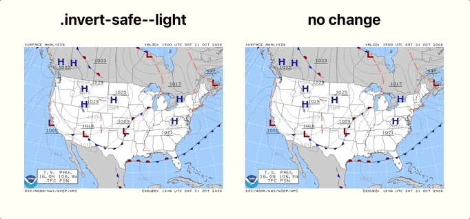
To cause a primarily white element to invert when the dark theme is selected, apply the .invert-safe--light class.
<img class="invert-safe--light" src="https://github.com/gnomical/solid-theme-provider/raw/main/.." />To cause a primarily black element to invert when the light theme is selected, apply the .invert-safe--dark class.
<img class="invert-safe--dark" src="https://github.com/gnomical/solid-theme-provider/raw/main/.." />You may also wish to use this feature on images you cannot control the class names on. The library also supports watching for images whose src attribute ends with the class names.
<img src="https://github.com/gnomical/solid-theme-provider/raw/main/example.png#invert-safe--light" />Custom Themes
// Example with custom themes configured
import { ThemeProvider } from "solid-theme-provider";
import myThemes from "./themes.json";

<ThemeProvider label="Theme" themes={myThemes} />
Example themes.json:
{
  "system_theme_config": {
    "dark": "humid_night",
    "light": "warm_light"
  },
  "themes": {
    "humid_night": {
      "config": {
        "icon": "base64 encoded svg or html",
        "browser_theme_color": "#110000"
      },
      "vars": {
        "background": "#110000",
        "background_active": "#2b1d1c",
        "foreground": "#ddddcc",
        "foreground_muted": "#999988",
        "button_radius": "0.5em"
      }
    },
    "warm_light": {
      "config": {
        "icon": "base64 encoded svg or html",
        "browser_theme_color": "#f1efe5"
      },
      "vars": {
        "background": "#fffff5",
        "background_active": "#f1efe5",
        "foreground": "#111100",
        "foreground_muted": "#777755",
        "button_radius": "0.5em"
      }
    },
    "turtle": {
      "config": {
        "icon": "base64 encoded svg or html",
        "browser_theme_color": "#f1efe5"
      },
      "vars": {
        "background": "#115522",
        "background_active": "#226633",
        "foreground": "#eeffee",
        "foreground_muted": "#ddcccc",
        "button_radius": "1.2em"
      }
    }
  }
}system_themes:
this object represents which of the themes listed in your root object should be used applied when accommodating system settings for theme preference
all other root objects:
Everything else is keyed by the theme name. If/when presented in the UI they will have their first first letters capitalized and underscores converted to spaces
-
config:
- icon: base 64 encoded svg or html
This is presented within the toggle button to represent which theme will be applied if the button is clicked. - browser_theme_color: (optional) hex color code
Sets the<meta name="theme-color">tag value in the documents<head>element so as to apply the theme to the browser's surrounding user interface or "chrome".
- icon: base 64 encoded svg or html
-
vars:
each property within this object becomes a css variable that is injected into the document's root element styles. the key name becomes the variable name and all variables will be prefixed. For example,backgroundwould be combined with the default prefix,stp, to become the css variable--stp-background.
You can store any value within these variables that would normally be accepted by the CSS standard.
Advanced Integrations:
currentTheme and setTheme are exposed for applications that wish to extend the functionality of this component
// Example of passing a string of the theme name to a 3rd party component
import { ThemeProvider, currentTheme } from 'solid-theme-provider';

<ThemeProvider label="Toggle Theme" />
<MyComponent theme={currentTheme()}>
Custom Styles
// Example Button Styling
.button {
  cursor: pointer;
  display: inline-block;
  padding: 0.25em 0.5em;
  border-radius: var(--stp-button_radius);
  background: var(--stp-background);
  color: var(--stp-foreground_muted);
  vertical-align: top;

  .icon,
  .text {
    vertical-align: middle;
    display: inline-block;
    -webkit-user-select: none;
    user-select: none;
  }

  .icon {
    padding-top: 0.2em;
  }

  .text:not(:empty) {
    padding-left: 0.25em;
  }

  .icon svg {
    width: 1.5em;
    fill: var(--stp-foreground_muted);
  }

  &:hover {
    background: var(--stp-background_active);
    color: var(--stp-foreground);

    .icon svg {
      fill: var(--stp-foreground);
    }
  }
}
Note
The styles used to override the toggle button should leverage the theme variables, just as everything else in your project.