![]()

![]()
![]()
![]()
Vote for new features
Or help feed my hungry children by donating a few bucks :sweat_smile:

I'm also available for custom plugin development contracts [and other technology projects]
grafana-diagram
This is a Grafana panel plugin that provides a way to create flow-charts, sequence diagrams, and gantt charts by leveraging the mermaid.js library.
- A diagram can be defined using the Mermaid JS syntax.
- Metric series are used to color the text or background of the shape/node.
- The target or 'alias' of the series is compared to the ID of the diagram node to find a match, then applies a style to the shape.
- Composites can be used to aggregate multiple series for a single node, with custom thresholds for each series.
**Note - Special characters in an alias are replace with an underscore. See character replacement below
Quick Start
A diagram definition uses a Markdown like syntax called Mermaid
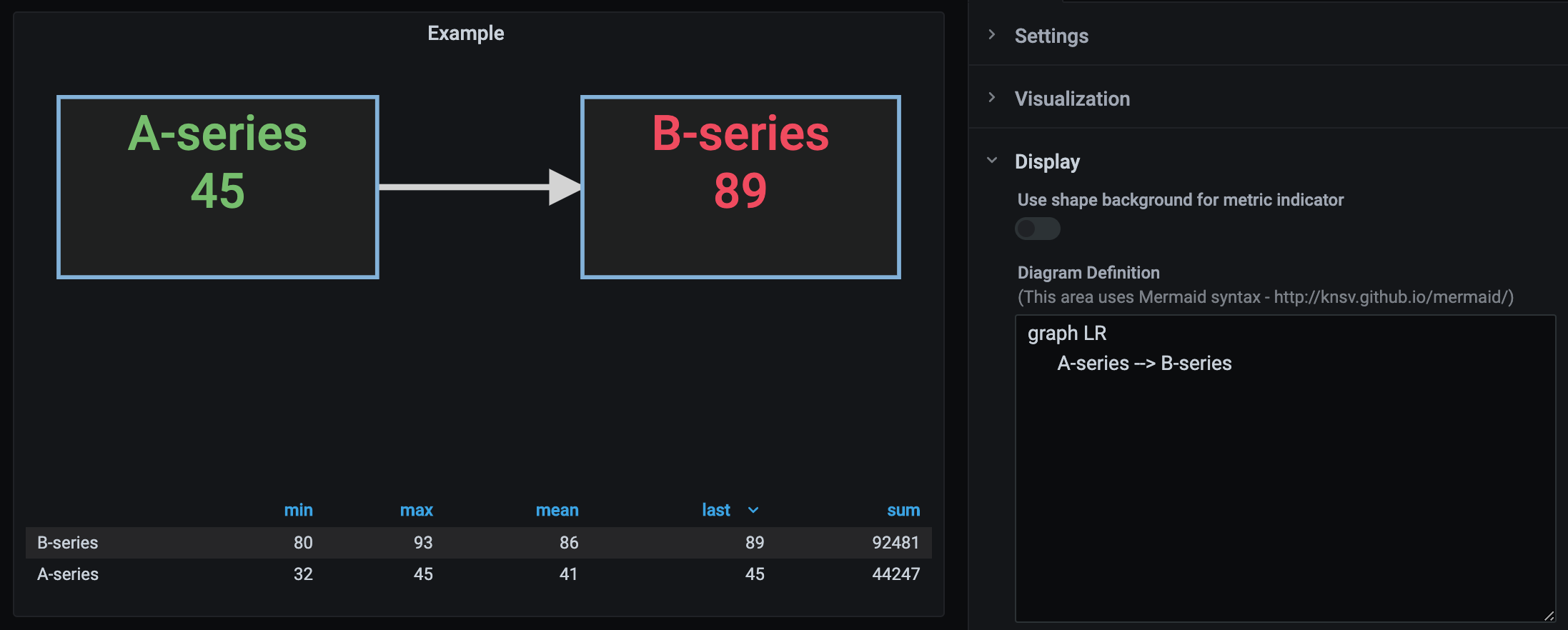
This is a simple flow chart definition -
graph LR
      A --> B
Producing this graph

Supposing you have 2 series with aliases A-series and B-series
In the diagram plugin, you can modify the definition to match the identities of the data -
Character Replacement
The following characters in metric names are automatically replaced with an underscore.
" , ; = : { }TODO
You can add additional metric replacements in the Display tab, under the section Metric Character Replacement:
A single character can be specified or a regular expression, along with the text to be used for the replacement (the default is underscore).
Examples
With Subgraph
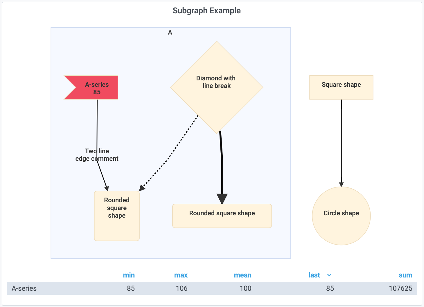
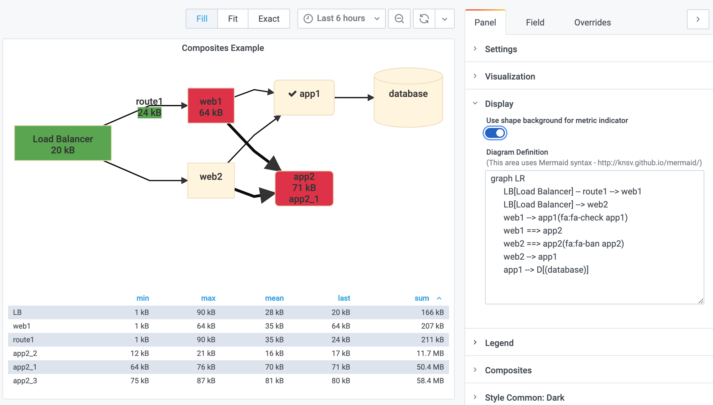
With custom shapes, aliases, and icons
graph LR
      LB[Load Balancer] -- route1 --> web1
      LB[Load Balancer] --> web2
      web1 --> app1(fa:fa-check app1)
      web1 ==> app2
      web2 ==> app2(fa:fa-ban app2)
      web2 --> app1
      app1 --> D[(database)]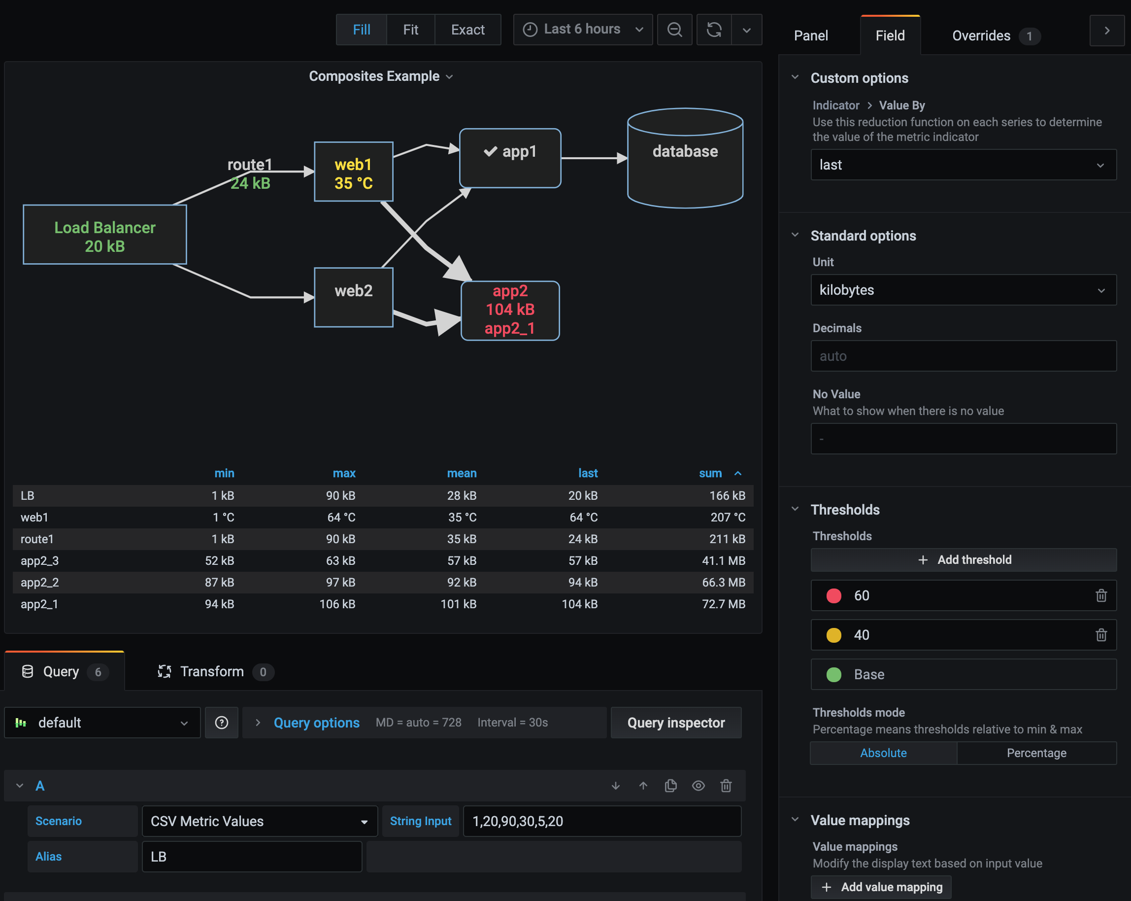
Field Options
Field Overrides

Custom Theme

CSS Override

Using Variables

Using background as indicator
Options
- Thresholds [field can override]
- Aggregation Options [field can override]
- Unbound Color Levels [field can override]
- Value mapping to text [field can override]
- Unit Format [field can override]
- Value of metric to display (min/max/mean/last/) [field can override]
- Decimal precision [field can override]
- CSS Override
- Indicator as background or text color
- Theme reactive
- Theme customization
- Variable replacement in the diagram definition
Link Metrics
Mermaid Notation is the same, but now supports supplying a metric name in the "text".
Specify the metric name in double quotes (for escaping purposes).
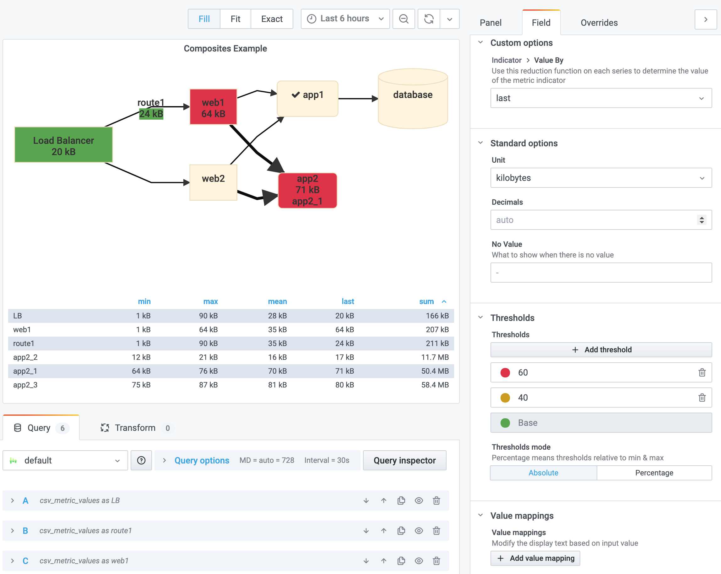
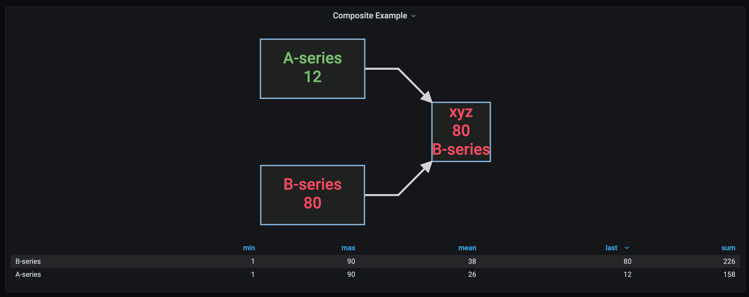
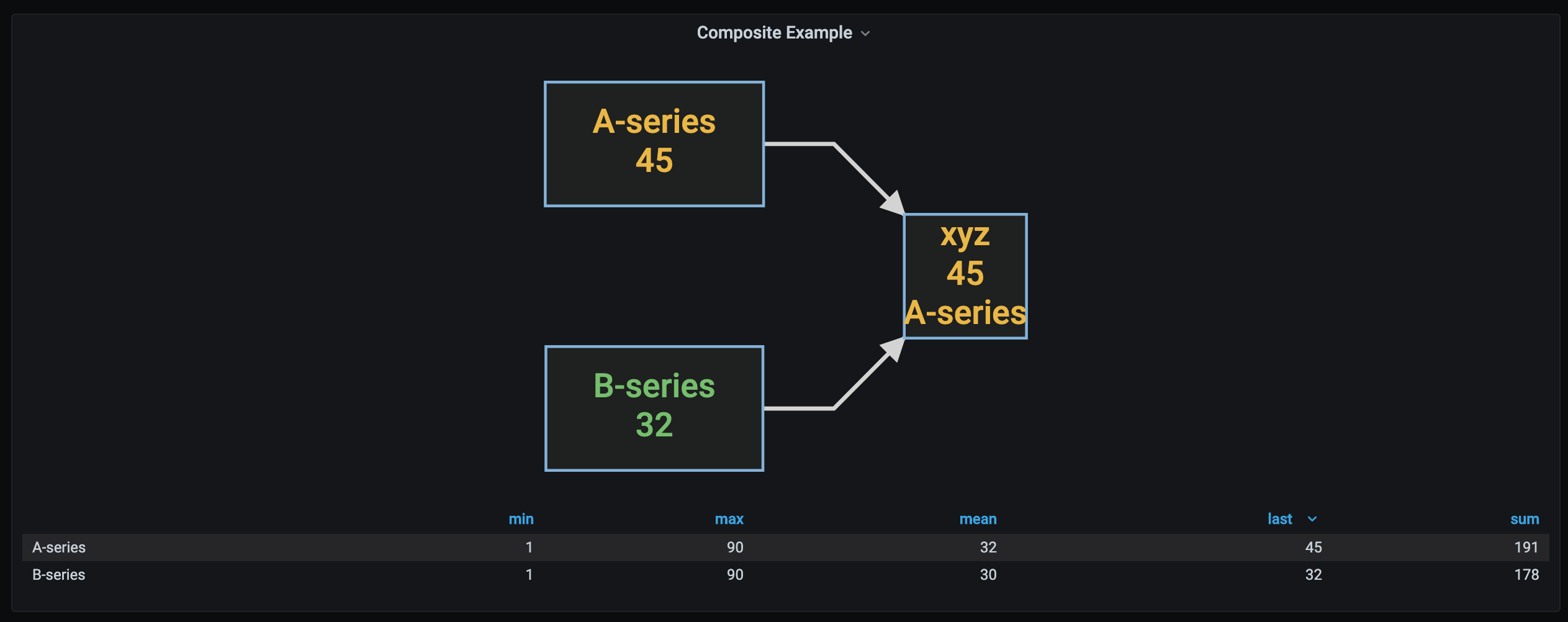
Metric Composites
To reflect multiple metrics and their thresholds on a single node, use metric composites to specify a composite name, and the metrics to be evaluated for the composite.
Series/Field specific overrides will be evaluated for each metric, and the "worst" state of the composite is displayed.
The composite name is evaluated in the Diagram definition.

For example, combining two series "A-series" and "B-series" into a single composite named "xyz", the following can be used:
When data is received for each series, the thresholds will be evaluated to find the "worst" threshold level, and the metrics and color value will be reflected in the "xyz" composite in the diagram.
Here are examples of the composite in action:
This diagram has "xyz" node, with "all green" threholds for both series A and B:

This diagram has "xyz" node, where the A-series is green, but B-Series is yellow. The diagram node shows yellow, along with the value:

This diagram has "xyz" node, where the A-series is green, but B-Series is red. The diagram node shows red, along with the value:
This diagram has "xyz" node, where the A-series is yellow, and B-Series is green. The diagram node shows yellow, along with the value:
Value or Range to Text Mapping
Value and range mapping can be used to replace numeric values by human readable text.
In the diagram the value of the matching series will be mapped to text:

Roadmap
- Custom character replacement
- Implement the Hash Prefix Notation Processor??
[New field mapping may replace this] - Remote Diagram Definition URL
- [suggest something]
Development
Thanks!
Special thanks to the Mermaid contributors -
https://github.com/mermaid-js/mermaid/graphs/contributors
https://mermaid-js.github.io/
and the D3 contributors -
https://github.com/d3/d3/graphs/contributors
And especially the Grafana contributors -
https://github.com/grafana/grafana/graphs/contributors
http://grafana.org/
Learn more
- Build a panel plugin tutorial
- Grafana documentation
- Grafana Tutorials - Grafana Tutorials are step-by-step guides that help you make the most of Grafana
- Grafana UI Library - UI components to help you build interfaces using Grafana Design System